Crafting Memorable User Experiences with Intuitive Design
In the ever-evolving digital landscape, the art of crafting intuitive design stands as a pivotal factor in shaping user experiences that are not only memorable but also foster a deeper connection with the product. Intuitive design transcends mere aesthetics, embedding itself in the very fabric of user interaction, guiding users with an invisible hand through a seamless journey of discovery and engagement. This article delves into the multifaceted realm of intuitive design, exploring its foundational pillars, visual and interactive enhancements, and strategies that culminate in a harmonious blend of usability and beauty. We unravel the essence of intuitive design and its profound impact on user experience, providing insights that empower designers to create interfaces that resonate with users on an instinctual level.
Key Takeaways
- Intuitive design is essential for creating user experiences that are seamless, efficient, and enjoyable, ultimately leading to increased user satisfaction and loyalty.
- Understanding user psychology and simplifying the design are key to making interfaces that users find familiar and easy to navigate.
- Incorporating responsive feedback mechanisms and adopting a user-centric approach to personalization can significantly enhance user interactions.
- The integration of usability and aesthetics is crucial, as it ensures that designs are not only functional but also visually appealing, contributing to a more engaging user experience.
- Continuous evaluation and iteration based on user feedback and analytics are vital for refining design elements and maintaining relevance in a dynamic digital environment.
The Pillars of Intuitive Design

Understanding User Psychology
At the heart of intuitive design lies a profound understanding of user psychology. This understanding is not static; it evolves with each interaction and is refined through continuous cycles of improvement and user testing. User research plays a pivotal role in this process, offering insights into user behaviors, preferences, and challenges. By empathizing with users, designers can create experiences that not only meet functional needs but also resonate on an emotional and psychological level.
The psychology of intuitive UI/UX design is a journey, not a destination. It requires a commitment to learning and adapting to user feedback over time.
For example, when designing a mobile banking app, uncovering user pain points such as difficulty in managing finances or navigating complex banking terms can lead to a more accessible and user-friendly interface. This approach prioritizes user research to minimize the risk of designing based on assumptions or personal biases, ensuring that the final product aligns with user expectations and goals.
- Conduct extensive user interviews
- Perform usability testing
- Analyze data to understand user needs
- Map user journeys for better experience design
By integrating these practices, designers can craft experiences that enhance user satisfaction, drive higher engagement levels, and foster brand loyalty.
Simplicity as the Ultimate Sophistication
In the realm of intuitive design, simplicity reigns supreme. It’s not just about reducing the number of buttons or streamlining a color palette; it’s about creating an environment where users can achieve their goals with minimal effort and distraction. Clarity is the cornerstone of this approach, ensuring that every interaction is straightforward and predictable.
Intuitive design focuses on user behavior, usability, microinteractions, privacy, and strategic planning for effective and delightful user experiences.
To achieve this, designers must embrace the art of elimination, constantly asking what can be removed without sacrificing essential functionality. The result is a product that feels almost invisible to the user, allowing them to focus on their tasks rather than the tool they are using.
- Understand user goals and mental models
- Eliminate unnecessary elements
- Streamline workflows
- Focus on core functionalities
AM2 Studio’s strategic web development approach underscores the importance of a user-centric design that is not only functional but also respects the user’s time and cognitive load. By prioritizing the user’s needs and perspectives, designers can create digital products that are not only efficient but also a pleasure to use.
Feedback and Adaptation: The Responsive Design Approach
In the realm of intuitive design, responsiveness is not just a technical feature; it’s a fundamental aspect that shapes user confidence and satisfaction. When interfaces react instantly to user input, without lags or ambiguous load states, they align with the user’s expectations, fostering a sense of reliability and trust.
Responsiveness in design goes beyond mere speed. It encompasses a forgiving nature that guides users back on track from errors, and a dynamic interaction that feels alive to touch and commands.
To achieve this, several best practices can be implemented:
- Optimizing performance through techniques like caching and lazy loading.
- Providing clear, instructive feedback through micro-interactions.
- Ensuring the interface is universally intuitive by testing with diverse user groups and assistive technologies.
Challenges such as maintaining consistency across devices and adapting to various screen sizes are inherent to responsive design. However, by addressing these challenges, designers can enhance user satisfaction and engagement, creating digital experiences that are not only functional but also inclusive and engaging across all devices.
Enhancing User Experience through Visual Design

The Role of Color and Typography
The strategic use of color and typography is fundamental in creating an intuitive and memorable user experience. These elements are not just aesthetic choices; they are powerful tools that can evoke emotions, convey meaning, and establish visual hierarchy, guiding users through the interface with ease.
-
Color can influence mood and behavior, making it essential for branding and creating the right atmosphere. For example, blue often instills a sense of trust and professionalism, while yellow can evoke happiness and energy.
-
Typography is about more than just readability. It’s about personality and function. The right typeface can communicate a brand’s voice and ensure information is digested effortlessly.
By mastering the interplay between color and typography, designers can create experiences that not only look appealing but also resonate on an emotional level with users.
It’s important to remember that these visual elements must align with the overall design principles and the goals of the product or service. Consistency in visual language across all platforms ensures a cohesive user experience that reinforces brand identity.
Navigational Clarity and Information Architecture
Effective information architecture is the backbone of navigational clarity, ensuring that users can find what they need without confusion or frustration. It’s about organizing content in a way that makes sense to the user, often through a logical hierarchy and intuitive categorization.
To achieve this, it’s essential to understand the user’s needs and expectations. This involves creating clear pathways for users to follow, which can be facilitated by features such as breadcrumb trails, clear labeling, and a well-thought-out navigation menu. Consider the following steps to enhance navigational clarity:
- Organize content into clearly defined categories.
- Use consistent and predictable navigation patterns.
- Provide search functionality to allow users to quickly find specific items.
- Implement micro-interactions that guide and inform users.
By focusing on user-centric design, we emphasize simplicity, clarity, and intuitive navigation to enhance user experience and engagement. This includes the strategic use of microinteractions, responsive design, and inclusive design principles.
Remember, the goal is to create a seamless experience where users can navigate effortlessly. This not only improves user satisfaction but also contributes to higher engagement and conversion rates.
Interactive Elements that Engage and Guide
Interactive elements are not just functional; they are the keystones of user engagement and guidance within an application. Animations, transitions, and gestures add a layer of depth to the user interface, making interactions feel dynamic and responsive. For instance, clicking an e-commerce product image might enlarge it, providing more information in a way that feels intuitive and natural.
Proximity groups related elements, while white space separates distinct sections. Icons, illustrations, and text style provide cues about relationships and priorities, guiding attention and eliminating confusion.
It’s crucial to leverage known interaction patterns to maintain user familiarity. When introducing new concepts, clear communication through the UI is essential to reinforce understanding. Below is a list of interactive elements that can significantly enhance user experience:
- Buttons that trigger meaningful actions
- Forms that are easy to navigate and submit
- Menus that are clear and concise
- Sliders that smoothly transition between values
- Wizards that guide users through a process step by step
These components, when designed thoughtfully, ensure that users know where to look and what to focus on, providing context and clarity throughout their journey.
Strategies for Seamless User Interactions
Designing for Familiarity and Predictability
Creating an intuitive user experience hinges on the familiarity and predictability of the interface. Users should not have to guess how to navigate or interact with your product. By leveraging common design patterns and workflows, we can tap into existing mental models, making the experience immediate and clear. For instance, a shopping cart icon universally suggests a place to review items for purchase, and blue underlined text is recognized as a clickable link.
To ensure that users find their way with ease, consider the following best practices:
- Use clear affordances to signal actionable elements
- Craft predictable workflows that align with user expectations
- Guide attention with strategic visual cues
- Provide context to support decision-making
- Limit choices to reduce cognitive load
- Design for error prevention to streamline the user journey
By designing for familiarity and predictability, we create an environment where users feel confident and in control. This not only enhances the user experience but also contributes to the overall success of the product.
Remember, the goal is to minimize the learning curve and maximize efficiency. Sensible defaults and immediate feedback help users make correct selections and reduce the need for corrections. Anticipating and preventing errors before they occur can eliminate confusion and the need for recovery efforts, making the experience as seamless as possible.
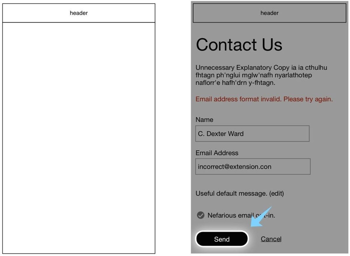
Error Prevention and Recovery
In the realm of user experience, error prevention is a critical aspect that can significantly enhance the intuitiveness of a design. By providing sensible defaults and disabling invalid choices based on context, we guide users along productive paths, minimizing the need for corrections. This approach not only prevents frustration but also streamlines the user journey.
A forgiving interface is essential for a positive user experience. It should allow users to recover from errors with ease, offering clear instructions and the ability to undo actions when necessary.
To further bolster error prevention, consider the following best practices:
- Anticipate common user errors and design to prevent them.
- Use inline validation to provide immediate feedback on user input.
- Offer hover tooltips to explain correct formatting of data.
When errors do occur, recovery should be straightforward. Clear error messaging, confirmation screens for irreversible actions, and options to revert changes are all elements that contribute to a system that is forgiving of user mistakes. By designing with these principles in mind, we create an environment where users feel confident and in control.
Personalization and User-Centric Customization
In the realm of user experience (UX), personalization is the key to fostering a sense of connection and relevance for the user. By tailoring the digital landscape to individual preferences and behaviors, we create a more engaging and intuitive environment. Personalization in UX involves adapting and customizing a user experience on a website or platform to a user’s specific preferences, needs, and behavior, ensuring that each interaction feels uniquely tailored to them.
Personalization not only enhances the user’s journey but also solidifies brand loyalty by making users feel valued and understood.
To achieve this, a deep dive into user data is essential. Analyzing patterns and preferences allows for the creation of a dynamic experience that evolves with the user. Below is a list of steps to consider when implementing personalization:
- Conduct thorough user research to understand needs and pain points.
- Utilize data analytics to identify user trends and preferences.
- Create user profiles or personas to guide the customization process.
- Implement adaptive content and features that respond to user behavior.
- Regularly update and refine personalization strategies based on user feedback.
By prioritizing these steps, we ensure that our design practices are not just user-friendly, but user-centric, paving the way for a memorable and delightful user experience.
The Intersection of Usability and Aesthetics
Balancing Functionality with Visual Appeal
In the quest for creating the perfect balance between functionality and aesthetics, designers often face the challenge of integrating practicality with visual elegance. The goal is to craft an experience that is not only efficient and easy to use but also pleasing to the eye. This balance is critical in ensuring that a product is both intuitive and engaging.
To achieve this, start by assessing the layout to support the intended activities. Consider the placement of elements to facilitate a natural flow of interaction.
Designers must guide attention to essential elements, allowing less critical ones to recede. This is achieved through the use of visual hierarchy, spacing, color contrast, and strategic placement. The most critical actions and information should be made prominent to create a purposeful flow. Additionally, ensuring that all visual and interactive elements are accessible to all users is crucial for inclusivity.
- Draw attention to essential elements
- Use visual hierarchy and color contrast
- Ensure accessibility for inclusivity
Ultimately, the design should be intuitive enough that users require no explanations to understand workflows. While aesthetics enhance appeal, usability and understanding should always take precedence. By focusing on intuitiveness first, the visual presentation can then be optimized to complement the user experience.
Case Studies: Successful Integrations of Form and Function
The fusion of usability and aesthetics is not just a goal but a journey of continuous refinement. Integrating usability and visual design principles in web development ensures a seamless user experience, emphasizing intuitive interfaces and engaging aesthetics. This balance is not only crucial but also achievable, as demonstrated by numerous case studies.
For instance, the Croatian Geological Society’s website combines custom design with functional WordPress development, creating an informative yet visually appealing platform. Similarly, the GLOW Christmas event’s website provided families with an easy-to-navigate and beautifully designed experience, enhancing the festive spirit.
The key to successful design lies in the meticulous attention to both form and function, ensuring that every element serves a purpose and contributes to the overall user experience.
Balancing aesthetics and usability is crucial in user-centric web design. Visual appeal and functionality must work together for a seamless user experience, emphasizing intuitive navigation and clear design elements. By examining these case studies, designers and developers can gain insights into effective strategies for their own projects.
Designing for Accessibility: Inclusivity in User Experience
In the realm of user experience, designing for accessibility is not just a feature—it’s a fundamental aspect of creating an inclusive digital environment. The first step in creating an inclusive user experience is to know your audience. Understanding your users’ needs and preferences can help you design a UI/UX that accommodates a diverse range of abilities and situations.
To ensure that no one is excluded, consider the following points:
- Design for inclusion from the start.
- Consider how those with visual, motor, or cognitive disabilities will interact with your product.
- Provide multiple ways for users to input and output information.
By adhering to accessibility guidelines and best practices, we enable a wider range of users to fully engage with and appreciate the experience.
Testing your design with assistive technologies and conducting user research with diverse participants are crucial steps. An intuitive interface should be universally intuitive. When things go wrong, the interface should help users quickly recover. For example, clear error messaging and confirmation screens for risky actions like deletions are essential. It’s about creating a forgiving system that allows users to undo changes or revert to prior states.
Evaluating and Iterating on User Feedback

The Importance of Usability Testing
Usability testing is a critical step in the design process, revealing how real users interact with your product. By observing users as they navigate through the interface, designers can identify pain points and areas that may cause confusion, leading to a more intuitive user experience.
Usability testing allows for the refinement of user-centric design, focusing on intuitive navigation, clear labeling, and responsive interfaces. This iterative process is essential for enhancing user satisfaction.
A common approach to usability testing includes A/B testing, where different iterations of a design are evaluated to determine which one performs better. This method not only improves the user experience but also helps in building a stronger connection with the user base.
- Conducting usability testing regularly
- Analyzing user behavior and feedback
- Implementing changes based on testing results
By incorporating these practices, designers can ensure that the product remains user-friendly and effective, ultimately leading to a product that resonates with its audience and stands out in the market.
Leveraging Analytics for Continuous Improvement
In the realm of user experience design, analytics are crucial for enhancing user experiences by providing insights into how users interact with digital products. By tracking user interactions and analyzing data, designers can identify patterns and areas for improvement. This iterative process leads to the creation of more intuitive and engaging digital products.
Analytics tools offer various metrics that can be monitored to gauge user satisfaction and engagement. Here’s a brief overview of key metrics:
- Pageviews: Indicates the total number of pages viewed.
- Bounce Rate: The percentage of visitors who navigate away after viewing only one page.
- Conversion Rate: The percentage of users who take a desired action.
- User Flow: The path users take through a site or app.
By continuously monitoring these metrics, teams can make data-driven decisions to refine and optimize the user experience.
Furthermore, setting up A/B testing and user behavior analysis can lead to actionable insights. For instance, if a high bounce rate is detected on a specific page, designers can hypothesize reasons and test changes to layout, content, or navigation to reduce it. The goal is to create a seamless user journey that not only meets but exceeds user expectations.
Incorporating User Feedback into Design Cycles
Incorporating user feedback into design cycles is a crucial step in ensuring that products evolve in alignment with user needs and expectations. It’s not just about collecting feedback, but also about analyzing and acting upon it to drive product growth. Here are some strategies to help you incorporate user feedback seamlessly into your user-centered design processes:
- Gather feedback through multiple channels to get a comprehensive view of user sentiment.
- Prioritize feedback based on its potential impact on user experience and business goals.
- Use user journey mapping to understand how feedback fits into the overall user experience.
- Implement interventions and enhancements based on feedback to improve the product.
- Refine and iterate continuously, using feedback as a guide to evolve the product.
By empathizing with users and understanding their needs, designers can craft experiences that not only meet functional requirements but also resonate on an emotional level. This approach not only minimizes the risk of designing on assumptions but also leads to increased user satisfaction and brand loyalty.
Regular usability testing and performance monitoring post-launch are essential to identify opportunities for further improvements. This iterative process ensures that the product remains relevant and continues to meet user needs effectively.
At the heart of our digital solutions is a commitment to refining our services through user feedback. Your insights drive our innovation, ensuring that every WordPress development, eCommerce solution, and custom design we craft not only meets but exceeds your expectations. We invite you to share your thoughts and help us continue to deliver excellence. Visit our website to see our work, learn about our services, and tell us how we can support your digital journey. Together, we can make the digital world better, one project at a time. [Visit us and share your feedback](#).
Conclusion
In the realm of digital interfaces, the art of crafting memorable user experiences hinges on the principles of intuitive design. Throughout this article, we’ve explored the essence of creating interfaces that resonate with users by being immediate, clear, and responsive. By prioritizing user needs and aligning with their goals, designers can construct experiences that are not only functional but also delightful. The real-world examples and strategies discussed underscore the transformative power of intuitive design in fostering seamless interactions and ensuring user satisfaction. As we continue to navigate the ever-evolving landscape of user interface design, let us remember that at the core of every successful digital product lies an intuitive experience that effortlessly guides and engages users.
Frequently Asked Questions
What is intuitive design in user experience?
Intuitive design refers to creating user interfaces that are easy to understand and use without the need for detailed instructions. It’s about leveraging familiarity, simplicity, and responsiveness to minimize confusion and make the user feel in control.
Why is simplicity important in intuitive design?
Simplicity is crucial because it reduces cognitive load, making it easier for users to navigate and interact with a product. It helps in creating a clear and efficient experience by focusing on essential elements and removing unnecessary complexity.
How does color and typography influence user experience?
Color and typography play significant roles in visual design by affecting readability, drawing attention to important elements, and conveying mood or brand identity. They guide users’ emotions and behaviors, contributing to the overall intuitiveness of the design.
What are some strategies for seamless user interactions?
Strategies include designing for familiarity and predictability, ensuring easy error recovery, and providing personalized experiences. These approaches help create a smooth user journey by aligning with users’ expectations and preferences.
How do usability and aesthetics intersect in intuitive design?
Usability and aesthetics intersect by balancing functionality with visual appeal. Aesthetics can enhance usability by making interfaces more appealing and engaging, while usability ensures that the design is practical and meets users’ needs effectively.
What role does user feedback play in the design process?
User feedback is essential for identifying areas of improvement and validating design decisions. It helps designers understand user behavior and preferences, leading to iterative enhancements that refine the user experience over time.