Enhancing User Experience with Seamless Website Navigation
In today’s digital landscape, the ease with which users can navigate a website significantly impacts their overall experience and satisfaction. A well-designed navigation system not only helps users find information quickly and efficiently but also enhances user engagement and conversion rates. This article delves into the various strategies and optimizations that can be employed to create a seamless navigation experience, ultimately leading to a more enjoyable and effective user interaction with websites.
Key Takeaways
- Intuitive and hierarchical menu structures, along with breadcrumbs, significantly improve website usability and user journey.
- Website performance, including site speed, image optimization, and effective caching, is crucial for user engagement and retention.
- Responsive design and personalized content are key factors in satisfying users and driving conversions across multiple devices.
- Regular website health audits, quality assurance, and post-launch monitoring are essential for maintaining optimal user experience.
- Analytics and user feedback are invaluable for continuously refining website navigation and enhancing the overall user experience.
Strategies for Streamlined Website Navigation
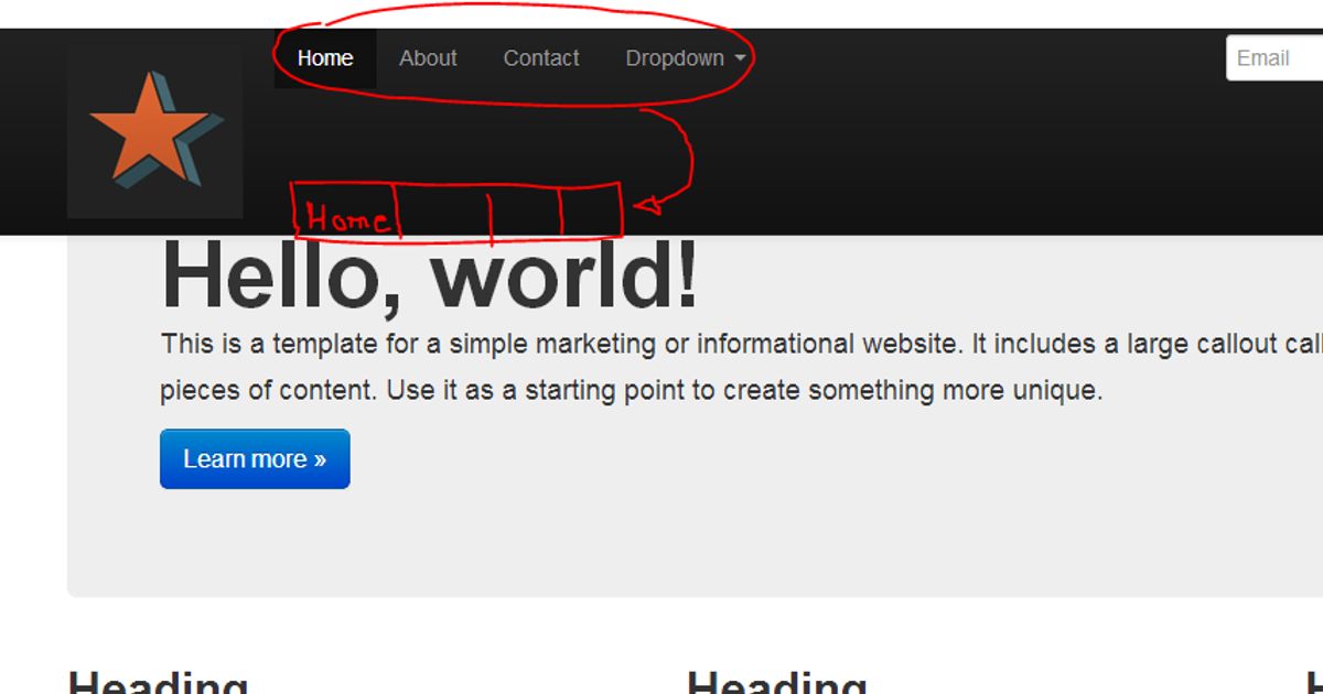
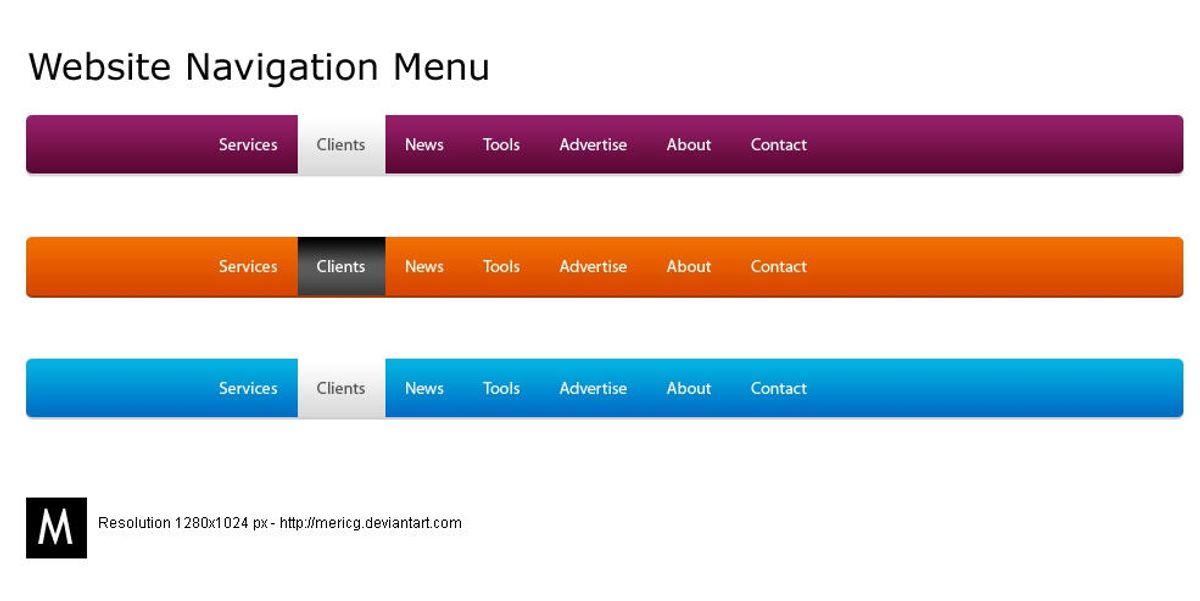
Implementing Intuitive Menu Structures
To foster a user-friendly environment, effective website navigation design is paramount. Intuitive menu structures with clear labels and organized content are essential for guiding visitors through your site. A search bar should be prominently placed, and a responsive design is crucial, especially with a mobile-first approach in mind.
A streamlined navigation system not only enhances user experience but also supports better search engine performance, leading to increased conversions.
Best practices suggest that menus should not be cluttered and should follow conventional placement conventions. This ensures a reduced learning curve for new visitors and a consistent flow throughout the user’s journey. Below is a list of modern navigation menus that can be considered:
- Hamburger Menu
- Mega Menu
- Sticky or Fixed Menu
- Breadcrumb Navigation
- Voice Navigation
- Personalized Navigation
By focusing on intuitiveness and prioritizing important links, users save time, which can directly influence the likelihood of conversion.
Leveraging Breadcrumbs for Enhanced Usability
Breadcrumbs serve as an essential tool in enhancing the usability of a website by providing a clear trail for users to follow back to the starting or entry point of their navigation. This feature is particularly beneficial on websites with multiple layers of content, where users can easily lose track of their location. By implementing breadcrumbs, users can navigate with ease, understanding their current position within the site’s hierarchy at a glance.
Effective website navigation is not just about getting from point A to point B; it’s about creating a journey that feels intuitive and effortless. Breadcrumbs complement this by offering shortcuts to previously visited pages, thereby saving users’ time and improving the overall user experience. They are a subtle yet powerful way to guide users, ensuring that the paths they take are always clear and accessible.
Breadcrumbs are not just a navigational aid but also contribute to a website’s SEO by defining a clear path for search engines to follow, which can enhance the site’s visibility.
Incorporating breadcrumbs into a website’s design requires careful consideration of the site’s structure and the user’s journey. Here’s a simple list to ensure breadcrumbs are used effectively:
- Ensure they reflect the site’s hierarchy
- Keep the design consistent and unobtrusive
- Use descriptive labels for each breadcrumb
- Provide a link back to the home page
- Make sure they are mobile-friendly
By adhering to these guidelines, breadcrumbs can significantly improve navigation and, by extension, the user experience.
Interactive Elements to Guide User Journey
Interactive elements are pivotal in creating a seamless user journey on any website. They serve as visual cues and tactile responses that guide users through the digital landscape, enhancing their overall experience. For instance, hover effects on buttons can indicate interactivity, while animated transitions can provide feedback on user actions, ensuring a more engaging journey.
By incorporating interactive elements thoughtfully, websites can significantly improve user engagement. These elements can transform a static page into a dynamic interface, encouraging users to explore further.
Effective interactive elements include:
- Descriptive labels for menu items
- Consistent placement of navigational elements
- Breadcrumb trails or site maps
- Contrasting colors or typography for visual separation
- Call-to-action (CTA) buttons
Each of these components plays a role in maintaining a connection between the user and the website. It’s not just about aesthetics; it’s about creating an intuitive path that users can follow with ease, from the homepage to their desired destination.
Optimizing Website Performance for Seamless User Experience

The Impact of Site Speed on User Engagement
The speed at which a website loads is pivotal to user engagement. Fast-loading websites are not just a convenience; they are an expectation. Users are more likely to stay on a site that loads quickly, reducing bounce rates and increasing the likelihood of conversion. It’s a domino effect; slow speed leads to high bounce rates, which in turn affects conversions, SEO rankings, and even your brand’s reputation.
Optimizing site speed is essential for providing a positive user experience and can significantly impact your business’s bottom line.
Here are some key points to consider:
- Faster loading times improve user satisfaction and engagement.
- Slower page speeds correlate with higher bounce rates and lower conversion rates.
- Search engines prioritize fast-loading sites, affecting your site’s visibility and organic traffic.
AM2 Studio offers a methodical yet flexible approach to website development, ensuring excellence from discovery to post-launch monitoring. Services include quality assurance, maintenance, support, and strategic design and development. By addressing factors such as server hardware, traffic volume, and file sizes, we can enhance site speed and performance.
Image Optimization Techniques
Optimizing visual content is crucial for improving website performance. Using image compression tools can significantly reduce file sizes without sacrificing quality, striking a balance between aesthetics and efficiency. Popular formats such as JPEG, PNG, and WebP each serve different purposes, with WebP often providing the best compression and quality.
Image optimization not only accelerates page load times but also contributes to a more seamless user experience, which can lead to increased engagement and conversions.
To achieve optimal results, consider the following steps:
- Choose the right format for your images (JPEG for photos, PNG for graphics).
- Utilize tools like ImageOptim, JPEGmini, or Kraken for compression.
- Implement responsive image techniques with HTML attributes to adjust images based on user display properties.
- Serve images in next-gen formats like WebP for enhanced performance.
Remember, a faster website can result in up to a 2% increase in conversion rates for every 1-second improvement in load time.
Effective Caching to Reduce Load Times
Effective caching is a cornerstone of website performance optimization. Caching stores copies of files to serve on subsequent requests, which can significantly reduce the time it takes to fetch data. By leveraging browser caching, a website can access resources locally, leading to faster load times for repeat visitors. Google reports that this can result in a 20-30% improvement in speed.
To maximize the benefits of caching, it’s essential to configure your server to set proper cache-control headers. This ensures that static elements of your site are stored in the browser cache, ready for future visits. Additionally, server-side caching can temporarily store dynamically generated content, reducing the processing time required to serve these pages.
Caching not only saves local resources on your website server but also enhances the overall customer experience.
Streamlining code and scripts is another vital step. Minifying HTML, CSS, and JavaScript files removes unnecessary characters, reducing file sizes. It’s also crucial to eliminate render-blocking scripts that can delay page rendering. Here’s a simple list of actions to optimize caching:
- Utilize browser caching for static elements
- Implement server-side caching for dynamic content
- Minify HTML, CSS, and JavaScript files
- Eliminate render-blocking scripts
Remember, the impact of caching goes beyond performance. It can lead to better conversion rates, with studies showing an 8% increase for every 0.1-second improvement in website speed.
Designing for User Satisfaction and Conversion
Responsive Design for Multi-Device Accessibility
In the era of ubiquitous computing, optimizing user experience across devices is not just a luxury—it’s a necessity. Responsive design techniques and adaptive design strategies are at the forefront of creating a seamless digital environment. By ensuring that websites adapt to the screen size and capabilities of each device, businesses can maintain consistency in user experience, which is essential for fostering brand loyalty and increasing conversion rates.
The focus on simplicity and accessibility in design is paramount. A cluttered or confusing interface can deter users, whereas a clean and intuitive layout encourages longer engagement and repeat visits.
Furthermore, mobile responsiveness is an essential aspect of navigation. As users switch between devices, they expect the navigation to be fluid and effortless. This requires a thoughtful approach to menu structures and touch gestures, ensuring that all elements are easily accessible on any device.
- **Key Benefits of Responsive Design: **
- Enhances SEO
- Improves website performance and load times
- Increases user satisfaction and conversion rates
By embracing responsive design, businesses not only cater to the current market but also future-proof their digital presence against the ever-evolving landscape of devices and user expectations.
Personalized Content for Targeted User Experience
In the realm of user experience, personalization is a cornerstone that can dramatically shift how users interact with a website. By analyzing user data, websites can create dynamic interfaces that cater to individual preferences, leading to a more engaging and satisfying experience. Tailoring content to user behavior not only meets their specific needs but also streamlines navigation, making it more intuitive and less frustrating.
Personalization and streamlined navigation are key in UX design. Analyzing user data for dynamic interfaces and clear navigation enhances user engagement and satisfaction.
Statistics underscore the importance of personalized content; a study by Instapage indicates that 74% of consumers feel frustrated when website content is not personalized. To combat this, consider the following steps:
- Leverage user data and segmentation to deliver targeted recommendations.
- Utilize dynamic content elements like personalized greetings and recommended products.
- Implement behavior-based triggers, such as personalized email campaigns and pop-ups, to further engage users.
By embracing these practices, businesses can foster enhanced user satisfaction and loyalty, ultimately leading to better conversion rates and a stronger brand-customer relationship.
Improving Shopping Experience with Clear Navigation
A well-structured navigation system is the cornerstone of a seamless shopping experience. Clear navigation not only guides users effortlessly to their desired products but also encourages exploration and engagement. By simplifying the search process and making items easily accessible, businesses can significantly enhance user satisfaction and increase the likelihood of conversion.
To achieve this, consider the following steps:
- Utilize a modern navigation menu that is intuitive and responsive.
- Implement predictive search suggestions to expedite product discovery.
- Offer personalized recommendations to cater to individual user preferences.
- Ensure that all navigation elements function correctly across devices.
By focusing on user-centric navigation design, you can create a shopping environment that is both inviting and efficient, leading to a positive impact on performance and sales.
Remember, the goal is to minimize the time users spend searching and maximize the time they engage with your content. This approach not only improves the shopping experience but also contributes to better search engine performance, as a user-friendly site is more likely to be rewarded with higher rankings.
Post-Launch Strategies for Maintaining Optimal UX
Regular Website Health Audits
To maintain an optimal user experience, regular website health audits are essential. These audits encompass a variety of checks, from performance analysis to security reviews. By conducting these audits, businesses can identify and rectify issues that may impact user engagement and site security.
Regular checks will protect your online business from performance setbacks and security risks.
A comprehensive website health audit should include, but not be limited to, the following areas:
- Performance: Measuring website performance scores and identifying areas for improvement, which can significantly influence SEO and user experience.
- Security: Reviewing elements that could compromise website security, such as SSL certificates, outdated plugins, and code vulnerabilities.
- SEO: Ensuring all on-site SEO elements are correctly implemented to boost organic traffic.
- Usability: Analyzing the user interface to provide suggestions for improved user experience and increased conversion rates.
By diversifying content with multimedia and optimizing site performance, businesses can further enhance user engagement. It’s crucial to implement these audits especially after updates or when new content is added to ensure continuous optimal performance and user experience.
Quality Assurance and Bug Fixes
After the rigorous process of quality assurance and bug fixes, the focus shifts to post-launch monitoring to ensure the website remains in top condition. This phase is critical as it helps in identifying any issues that may have slipped through the cracks and in understanding how real users interact with the site.
The goal is to maintain a seamless user experience by quickly addressing any new bugs and making iterative improvements based on user feedback.
Regular website health audits are essential to this process. They involve a thorough examination of the site’s performance, security, and usability. By conducting these audits, you can pinpoint areas that need attention and prevent potential setbacks that could harm the user experience or your online business.
To facilitate this, a variety of tools and services can be utilized:
- Optimizely for robust A/B and multivariate testing.
- PageSpeed Insights for real-time performance analysis.
- Accessibility checkers to ensure compliance with standards.
Each tool offers unique features, such as error summaries, code inspections, and contrast checkers, which are invaluable for maintaining an accessible and user-friendly website.
Post-Launch Monitoring and Updates
After the excitement of a website launch, the real work begins with post-launch monitoring. It’s crucial to keep a vigilant eye on the website’s performance to ensure that any bugs or issues are swiftly addressed. This phase is about maintaining the integrity of the user experience and ensuring the site remains secure and performs well under various conditions.
Regular monitoring and updates are not just about fixing problems; they’re about proactively improving the website to meet evolving user needs and technological advancements.
Utilizing tools for real-time monitoring and uptime reporting can provide immediate insights into the website’s health. Transaction monitoring is especially important for e-commerce sites, where the checkout process must remain flawless to avoid losing sales. Here’s a quick checklist to keep your website in top shape:
- Implement tools like Google Alerts to monitor content changes.
- Conduct regular maintenance and support for ongoing security.
- Analyze performance reports to identify slow-loading elements.
- Stay updated with design trends and user feedback for continuous optimization.
By embracing these practices, you can ensure that your website remains a reliable and effective tool for your business long after its initial launch.
Leveraging Analytics to Refine Navigation and UX

Using Data to Understand User Behavior
In the quest to enhance user experience, data plays a pivotal role in understanding how users interact with a website. By tracking user behavior, website owners can make informed decisions to optimize navigation and overall UX. Tools like Google Analytics provide a wealth of information about user activity, such as the most visited pages, the paths users take through a site, and where they tend to drop off. This data can be used to refine the user journey and ensure that the most important content is easily accessible.
To effectively analyze user behavior, it’s essential to look at both quantitative and qualitative data. Quantitative data offers a numerical insight into user interactions, while qualitative data, gathered from tools like on-site surveys, sheds light on user motivations and feedback. Below is a list of steps to leverage both types of data:
- Utilize analytics tools to track key performance indicators (KPIs).
- Conduct on-site surveys to collect user feedback.
- Analyze heatmaps to understand where users click and scroll.
- Review session recordings to observe real user interactions.
- Implement A/B testing to determine the most effective design elements.
By combining these methods, website owners can gain a comprehensive understanding of user behavior, leading to a more intuitive and user-friendly website design.
A/B Testing for Navigation Improvements
A/B testing is a powerful strategy for refining website navigation and overall user experience. By creating multiple versions of a page or element, such as menus or call-to-action buttons, and presenting them to different segments of users, we can gather valuable data on performance. Metrics like click-through and conversion rates provide insights into which designs are most effective, allowing for informed decisions that enhance user engagement.
To ensure the most impactful changes, it’s crucial to incorporate user feedback, analyze behavior, and conduct A/B testing regularly. Clear labels, consistency, and user orientation are key factors that can significantly enhance user engagement and conversion rates.
Successful A/B testing campaigns often follow a structured approach:
- Identify key elements that influence user navigation.
- Develop alternative designs for these elements.
- Randomly assign users to different versions.
- Collect and analyze performance data.
- Implement the most successful version.
By adopting a user-centric design philosophy, we can focus on continuous improvement, leveraging A/B testing as a tool to optimize engagement and satisfaction. This iterative process is a cornerstone of a strategy that prioritizes user experience and accessibility.
Adapting to User Feedback for Continuous Enhancement
In the dynamic landscape of web design, embracing user feedback is crucial for ongoing enhancement. Collecting insights through surveys, feedback forms, and direct user interactions provides a wealth of data to inform iterative improvements. This feedback loop is essential for understanding user preferences and pain points, allowing for targeted refinements.
By continuously adapting to user feedback, websites can evolve to meet the changing needs and expectations of their audience, fostering a cycle of perpetual improvement.
A structured approach to integrating feedback includes:
- Reviewing and categorizing feedback for actionable insights
- Prioritizing changes based on impact and feasibility
- Implementing updates in a controlled manner
- Monitoring the effects of changes on user behavior and satisfaction
This process ensures that user feedback directly shapes the user experience, leading to a more engaging and effective website.
In today’s digital landscape, the power of analytics cannot be overstated. By leveraging data-driven insights, businesses can refine their website navigation and user experience (UX) to meet the evolving needs of their customers. At [Our Company], we specialize in custom web design and development solutions that harness the potential of analytics to create intuitive and engaging online environments. Don’t let your website fall behind; visit us to discover how our expertise in WordPress development, eCommerce solutions, and performance optimization can elevate your digital presence. Take the first step towards a more effective and user-friendly website today!
Conclusion
In the digital age, seamless website navigation is not just a feature—it’s a necessity for ensuring a positive user experience. Throughout this article, we’ve explored various strategies and insights from industry leaders on how to create intuitive and effective navigation systems. From implementing responsive designs and optimizing website speed to organizing content with logical menu structures and providing personalized content, the goal is to make the user’s journey as effortless as possible. As we’ve seen, streamlined navigation can lead to increased user engagement, improved shopping experiences, and a competitive edge in the online marketplace. Remember, the easier it is for users to find what they’re looking for, the more likely they are to engage with your content, trust your brand, and ultimately convert into loyal customers. Embrace these navigation best practices to elevate your website’s user experience and drive business success.
Frequently Asked Questions
How does intuitive menu structure improve website navigation?
Intuitive menu structures help users find information quickly and effortlessly, acting as a roadmap to guide them through the website. This enhances the overall user experience by making navigation logical, straightforward, and accessible.
What are breadcrumbs and how do they enhance usability?
Breadcrumbs are navigational aids that display the user’s location within a website’s hierarchy. They enhance usability by allowing users to track their browsing path and easily navigate to previous sections without using the back button.
Why is website performance optimization important for user experience?
Optimizing website performance, such as improving site speed and image loading times, is crucial for user experience. It reduces bounce rates, increases engagement, and improves overall satisfaction, as users expect quick and responsive websites.
How does responsive design contribute to user satisfaction?
Responsive design ensures that a website is accessible and visually appealing across different devices and screen sizes. This flexibility contributes to user satisfaction by providing a consistent and optimal viewing experience regardless of the device used.
What role does analytics play in refining website navigation?
Analytics provide insights into user behavior, enabling website owners to understand how visitors interact with their site. This data can be used to make informed decisions about navigation improvements, leading to a more intuitive and user-friendly experience.
What is the importance of post-launch monitoring for maintaining UX?
Post-launch monitoring is essential for identifying and fixing any new bugs that may arise, ensuring the website continues to function optimally. It helps maintain a high-quality user experience by addressing issues promptly and keeping the website up-to-date.