Enhancing User Experience with Seamless Website Navigation
In the digital landscape, the ease with which users can navigate a website is a critical determinant of its success. Effective website navigation ensures that users can find what they’re looking for without frustration, leading to a better user experience, increased engagement, and higher conversion rates. This article delves into the best practices for creating seamless website navigation, discussing strategies to guide user journeys, adaptive design for consistency across devices, intuitive menu and link structures, tools for enhancing navigation, and aligning navigation with business goals.
Key Takeaways
- Streamlined navigation should act as a roadmap, guiding users effortlessly and reducing the cognitive load by strategically placing elements and leveraging tools like breadcrumbs.
- Adaptive design is essential for providing a consistent user experience across various devices, with responsive navigation elements that maintain visual and functional harmony.
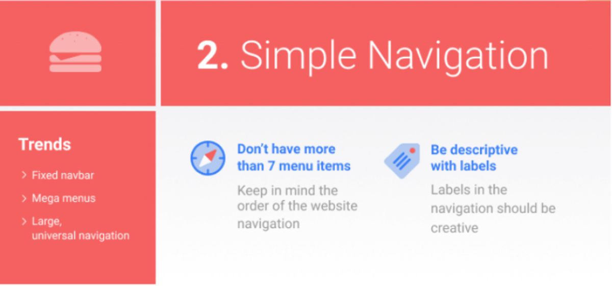
- Intuitive menus and links, with logical structure and clear labeling, are crucial for optimizing click paths and ensuring efficient information retrieval.
- Enhancing navigation can be achieved through the use of analytics, A/B testing to gauge effectiveness, and by avoiding common pitfalls such as overly complex or inconsistent navigation schemes.
- Tying website navigation with business priorities involves aligning design decisions with business objectives, facilitating user access to key content areas to improve conversion rates.
Streamlining Navigation: Guiding User Journeys
The Role of Menus in User Orientation
Menus serve as the compass for website visitors, providing direction and guiding user journeys through the digital landscape. Effective content organization enhances the user experience by enabling users to quickly navigate and comprehend the information presented on the site.
Menus and links should not only be intuitive but also reflect the logical structure of the website, aligning with user expectations and facilitating a seamless experience.
To achieve this, several strategies can be employed:
- Using descriptive labels for menu items to convey clear meaning.
- Maintaining consistent placement of navigational elements to foster familiarity.
- Incorporating breadcrumb trails to help users track their navigation path.
By prioritizing user orientation, websites can ensure that visitors are not only satisfied with their experience but are also more likely to engage with the content and complete desired actions.
Strategic Placement of Navigation Elements
The strategic placement of navigation elements is crucial for a seamless user experience. Consistency is key; users should find navigation elements in the same location on every page. This includes the main menu, search bar, and any call-to-action buttons. A well-structured layout with strategically placed navigation aids in quick orientation and reduces user frustration.
By thoughtfully arranging navigation elements, we guide users through the content, encouraging them to stay longer and explore deeper into the website.
Effective navigation aligns with the natural reading pattern of users. For left-to-right readers, important navigation links are best placed on the top left, where the gaze typically begins. Here’s a simple list of best practices for navigation placement:
- Position the main menu prominently at the top or left side of the page.
- Place search bars near the top, as users often look for them there.
- Ensure call-to-action buttons are visible and accessible, without scrolling.
- Utilize footer navigation for secondary links and information.
Remember, the goal is to minimize the effort required to navigate, making the journey through your website as intuitive as possible. AM2 Studio’s approach to web development embodies this philosophy, blending creativity with technology for standout digital experiences.
Leveraging Breadcrumbs for Enhanced Usability
Breadcrumbs serve as an essential tool in the realm of website navigation, offering users a way to trace their steps back through the website hierarchy. They provide a clear path from the current page back to the homepage, enhancing the user’s ability to understand their location within the site. This feature is particularly useful on websites with multiple layers of content, where users can easily lose track of their browsing path.
- Breadcrumbs are usually a horizontal path of links.
- The current page is typically the last link in the breadcrumb trail.
- They help users retrace their steps in a website’s structure.
By implementing breadcrumbs, designers can significantly improve the navigational experience, making it more intuitive and efficient. This not only aids in user orientation but also contributes to a reduction in the number of actions required to navigate to previous sections of the site.
Consistency in navigation, including the use of breadcrumbs, imparts a sense of stability and orientation. Analytics can provide insights into how users interact with breadcrumbs, allowing for further optimization of this navigational tool. A/B testing can also be employed to measure the effectiveness of different breadcrumb designs, ensuring the best user experience.
Adaptive Design: Ensuring Cross-Device Consistency
Responsive Navigation for Mobile Users
In the age of smartphones, responsive navigation is not just a feature—it’s a necessity. Mobile users expect a seamless experience, with navigation elements that are easy to interact with, regardless of the device they are using. This means menus must be touch-friendly, with large enough targets for fingers, and layouts should adjust to various screen sizes without compromising functionality or aesthetics.
Ensuring that website navigation is optimized for different screen sizes and touch gestures is crucial in providing a seamless experience across devices.
To achieve this, developers employ techniques such as collapsible menus and off-canvas navigation, which conserve screen space while remaining accessible. It’s also important to consider the performance of the site on mobile devices; slow loading times can deter users and increase bounce rates. Below is a list of key considerations for mobile navigation:
- Touch-friendly interface with appropriately sized targets
- Collapsible menus for space efficiency
- Off-canvas navigation for better content accessibility
- Quick loading times to maintain user engagement
- Consistent navigation patterns across different pages
By focusing on flexibility, performance, and mobile usability, we can create engaging and efficient user interactions that enhance the overall user experience.
Maintaining Visual and Functional Harmony
Achieving a balance between visual appeal and functional design is essential for a user-friendly website. Uniform design elements, such as consistent color schemes and typography, contribute to a sense of visual harmony that makes navigation intuitive. This consistency aids users in recognizing patterns and understanding the website’s structure, leading to a more seamless experience.
By prioritizing both aesthetics and usability, designers can create an environment that not only looks good but also operates efficiently. The strategic use of visual components should captivate users without overwhelming them, ensuring that the design complements the brand identity while guiding users through the interface.
It’s a delicate balance to strike, as functionality often demands complexity, which can clutter the user experience. Designers must ask tough questions to ensure that features are not overshadowing each other and that users can easily find what they need. The ultimate goal is to satisfy both usability and functionality without sacrificing the overall design quality.
The Impact of Adaptive Menus on User Experience
Adaptive menus are a cornerstone of modern web design, ensuring that users have a consistent and accessible navigation experience regardless of the device they use. The adaptability of these menus significantly enhances user satisfaction, especially when screen real estate is limited. Studies have shown that adaptive menus that maintain high accuracy can greatly improve performance and user satisfaction under these constraints.
Adaptive menus cater to the needs of users by adjusting to various screen sizes, which is crucial for maintaining usability across devices.
With the rise of mobile browsing, it’s imperative that websites employ navigation systems that are both flexible and responsive. This not only aids in user retention but also contributes to a positive overall impression of the website. The following list highlights the benefits of adaptive menus:
- Improved navigation on small screens
- Consistent user experience across devices
- Increased user engagement
- Potential for higher conversion rates
Elevating User Experience with Intuitive Menus and Links

Creating Logical Structure in Navigation
A logical structure in website navigation is not just about aesthetics; it’s about creating a clear path for users to follow. This involves organizing content in a way that is intuitive and aligns with user expectations. By doing so, we can guide visitors through the site with ease, making sure they find what they need without frustration.
To achieve this, consider the following points:
- Clear and Predictable Navigation: Ensure that the navigation menu is easily visible and consistently placed across all pages.
- Logical Information Hierarchy: Group related information together under clear headings and subheadings.
- Consistent Design Patterns: Use a consistent design language to help users quickly learn how to navigate your site.
By providing a navigation structure that users can understand and predict, we empower them to navigate the site with confidence, enhancing their overall experience.
Remember, the goal is to make the user’s journey through your website as seamless as possible. This not only improves user satisfaction but also supports your business outcomes by encouraging longer visits and more interactions with your content.
The Importance of Clear Labeling
Clear labeling in navigation design is not just about aesthetics; it’s about communicating purpose and direction effectively to users. Descriptive labels serve as signposts, guiding users through a website with ease and preventing confusion. For instance, a label such as ‘Products’ is more informative than a vague ‘What We Offer’, aligning with both user expectations and search engine optimization (SEO) practices.
- Consistency is key across all pages, ensuring that users don’t have to relearn navigation patterns.
- Predictability in navigation aids users in forming a mental model of the website structure.
- Logical hierarchy groups related information, making it easier to find content.
By prioritizing clarity in labeling, websites can enhance usability and improve the overall user experience.
Clear calls to action (CTAs) are also part of effective labeling. They should be prominent and guide visitors towards desired actions, such as making a purchase or signing up for a newsletter. Streamlined navigation, supported by engaging visuals, further contributes to a satisfying user journey.
Optimizing Click Paths for Efficient Information Retrieval
Optimizing click paths is essential for a streamlined navigation experience that leads to efficient information retrieval. By analyzing user behavior, we can design navigation structures that are intuitive and reduce the number of clicks required to reach desired content. This not only enhances the user experience but also supports the user’s journey through the website, making it more likely that they will engage with the content and convert.
A well-optimized click path minimizes user frustration and maximizes the effectiveness of the navigation design.
To achieve this, consider the following steps:
- Conduct user behavior research to understand the most common tasks and goals.
- Simplify the menu structure to reflect user expectations and common journeys.
- Implement search functionality to provide a direct path to specific information.
- Utilize analytics to refine navigation paths based on actual user data.
- Regularly review and adjust the navigation structure to ensure it remains effective and relevant.
By prioritizing these actions, website owners can create a navigation experience that feels almost invisible to the user, allowing them to focus on the content rather than how to find it.
Enhancing Website Navigation with Tools and Techniques
Utilizing Analytics to Refine Navigation
Google Analytics and similar tools are indispensable for understanding how visitors interact with your website’s navigation. By tracking user behavior, you can identify which areas of your site are engaging and which may require refinement. For instance, a high bounce rate on a specific page could indicate a navigation issue that needs addressing.
Analytics data can guide you in restructuring your navigation to better align with user expectations and behavior patterns.
Here’s how you can leverage analytics to enhance navigation:
- Observe visitor interactions and flow through the site
- Identify pages with high exit rates
- Analyze the click-through rates of navigation links
- Adjust the placement of links and calls to action based on data
By continuously monitoring and tweaking your navigation based on analytics, you can create a more intuitive and user-friendly experience. This proactive approach can lead to increased engagement and, ultimately, conversions.
A/B Testing for Navigation Effectiveness
A/B testing is a critical step in refining website navigation. By creating multiple versions of navigation elements and measuring their performance, designers can make informed decisions to enhance user experience. A/B testing can reveal which navigation structures are most intuitive and lead to better engagement and conversion rates.
For instance, a test might compare the effectiveness of a drop-down menu versus a mega menu. Key metrics such as click-through rates and time spent on page can indicate user preference and guide design choices. Here’s a simplified example of how A/B testing results might be presented:
| Navigation Type | Click-Through Rate | Time on Page |
|---|---|---|
| Drop-down Menu | 3.2% | 2 min |
| Mega Menu | 5.4% | 2.5 min |
By systematically analyzing A/B testing data, website owners can optimize navigation paths and remove barriers to information access, ultimately creating a smoother journey for the user.
It’s important to note that A/B testing should be conducted carefully to avoid disrupting SEO. Changes in navigation menus or link placements can impact the flow of PageRank, which is crucial for discoverability and authority.
Avoiding Common Navigation Pitfalls
To ensure a seamless user experience, it’s crucial to avoid common navigation pitfalls that can frustrate users and hinder website performance. One such pitfall is overloading the menu with too many options, which can overwhelm visitors and make it difficult for them to find what they’re looking for. Instead, aim for a minimalist approach that guides users to their desired content without unnecessary clutter.
Consistency in design across all pages of a website is another key factor in providing a predictable and comfortable navigation experience for users. Inconsistent navigation can disorient users and detract from the overall usability of the site.
In addition to these considerations, it’s important to prioritize mobile navigation and ensure that your website is fully responsive. This means adapting the navigation to work seamlessly across different devices, maintaining functionality and ease of use no matter the screen size. By addressing these common issues, you can significantly improve the user journey on your website.
Tying Navigation with Business Priorities
Aligning Navigation Design with Business Goals
To effectively align navigation design with business goals, it’s crucial to prioritize the user’s journey towards the areas that matter most to your business. This means creating a navigation structure that not only serves the user’s needs but also guides them to key content areas that drive conversions and engagement.
- Prioritize information structure for a user-centric UX design.
- Streamline menu hierarchy with logical categories, concise labels, and visual hierarchy.
- Effective navigation enhances user retention, conversion, and brand-customer relationship.
By strategically placing calls-to-action and optimizing the click paths, businesses can facilitate user access to important features, improving the overall conversion rates.
Remember, the ultimate goal is to create a seamless experience that not only satisfies the user’s informational needs but also subtly steers them towards the actions that align with the business’s objectives. Utilizing analytics and A/B testing can further refine this alignment, ensuring that the navigation design is continuously improved based on user behavior and business performance data.
Facilitating User Access to Key Content Areas
To enhance user experience, it’s crucial to ensure that users can easily find and access the most important areas of your website. This involves a strategic approach to content placement and navigation design. By analyzing user behavior and preferences, you can prioritize content and tailor navigation paths that lead users to key areas effortlessly.
- User-Focused Content: Develop content that speaks directly to the user’s needs and is easily accessible.
- Accessibility Considerations: Make your site accessible to all users, including those with disabilities.
- Performance Optimization: Ensure that your site loads quickly and runs smoothly to reduce bounce rates and improve user satisfaction.
By streamlining the path to important content, you not only improve the user experience but also support your business objectives, such as increased engagement and higher conversion rates.
Improving Conversion Rates through Optimized Navigation
Optimized navigation is a powerful tool for improving conversion rates. By streamlining the user’s journey, we prioritize responsive design for accessibility and functionality. Intuitive navigation and a clear visual hierarchy are essential in guiding users to the desired action, whether it’s making a purchase, signing up for a newsletter, or contacting customer service.
A well-structured navigation system not only enhances the user experience but also supports business objectives by leading customers to key areas that drive conversions.
To achieve this, consider the following steps:
- Analyze user behavior to identify common navigation paths.
- Simplify navigation menus to reduce cognitive load.
- Ensure that calls to action are prominent and persuasive.
- Regularly test and refine navigation elements through A/B testing.
By focusing on these areas, businesses can create a seamless navigation experience that aligns with their goals and encourages users to take the next step in their journey.
In a digital landscape where every click counts, aligning your navigation with your business priorities is not just a necessity—it’s a strategic advantage. Our team at AM2 specializes in crafting custom WordPress and eCommerce solutions that resonate with your brand and drive results. Ready to elevate your online presence? Visit our website to explore our services and see how we can help your business thrive in the competitive online marketplace. Let’s make the digital world better, together.
Conclusion
In conclusion, seamless website navigation is not just a component of design; it is the cornerstone of a superior user experience. By implementing intuitive menus, consistent page layouts, and responsive designs, we can guide users through a digital journey that feels natural and effortless. The benefits of such an approach are clear: increased user engagement, higher conversion rates, and a solid brand reputation. As we’ve explored various strategies and tools to enhance navigation, it’s evident that a user-centric approach is paramount. By aligning navigation with business priorities and continuously refining it through analytics and user feedback, we can create websites that not only meet but exceed user expectations. Remember, the ultimate goal is to make the complex simple and the journey enjoyable. With the right navigation design, your website can become a beacon of user satisfaction and business success.
Frequently Asked Questions
How does a well-designed navigation structure impact user experience?
A well-designed navigation structure acts as a roadmap for users, allowing them to easily find information and complete tasks. It improves usability, reduces frustration, and can lead to increased engagement and conversions.
What are some best practices for designing user-friendly website navigation?
Best practices include maintaining simplicity, ensuring consistency across pages, creating responsive layouts, and using clear labels. Leveraging analytics and A/B testing can optimize navigation, and common mistakes like menu overload and inconsistency should be avoided.
Why is responsive navigation important for mobile users?
Responsive navigation ensures that the website is easily accessible and navigable on mobile devices, providing a consistent user experience across different screen sizes and improving overall usability.
How can breadcrumbs enhance website usability?
Breadcrumbs provide visual indicators of the user’s location within the website’s hierarchy, allowing them to understand their current position and navigate to previous levels without getting lost.
What role do analytics play in refining website navigation?
Analytics provide insights into user behavior, which can be used to identify navigation issues, understand user preferences, and make data-driven decisions to refine and improve the navigation structure.
How can website navigation align with business goals?
Navigation should be designed to guide users towards key content areas and conversion points, aligning with the business’s objectives to improve conversion rates and support the overall business strategy.