Enhancing User Experience with Seamless Website Navigation
Mastering website navigation is not just about creating a functional interface; it’s about providing a seamless and intuitive user journey that enhances satisfaction and drives conversions. This article explores the essential strategies and practices for designing effective website navigation, ensuring that users can find what they’re looking for with ease and efficiency. From understanding user behavior to leveraging analytics for continuous improvement, we’ll guide you through the key components that make website navigation a cornerstone of a successful online presence.
Key Takeaways
- Intuitive navigation design relies on understanding user behavior, creating a logical structure, and implementing consistent navigation patterns.
- Website performance optimization, including improving page load speed and minimizing HTTP requests, is vital for smooth navigation.
- Effective content organization strategies, such as categorization and the use of breadcrumbs, enhance usability and help users find information faster.
- Accessibility and mobile responsiveness are critical for inclusive navigation, ensuring that all users, regardless of device or ability, have a positive experience.
- Analytics tools, such as tracking user navigation patterns and A/B testing, are instrumental in refining navigation for optimal user engagement.
The Pillars of Intuitive Navigation Design
Understanding User Behavior
To enhance user experience, it’s crucial to understand user behavior and its influence on website design. User behavior refers to the interactions, preferences, and decision-making processes of users as they navigate a website. By analyzing these behaviors, designers can create more engaging and intuitive interfaces.
Effective web design can significantly influence user behavior, leading to increased engagement and conversion rates. For instance, employing layouts that align with natural reading patterns, such as the F-Layout and Z-Layout, can direct users’ attention to critical information and calls to action (CTAs).
Color psychology is another tool in the designer’s arsenal, where specific colors can evoke emotions and drive actions. For example, a contrasting color for a CTA button can make it more noticeable and prompt clicks. Additionally, ensuring that online forms are user-friendly, error messages are helpful, and the website is cross-browser compatible can further refine the user experience.
Understanding and shaping user behavior is not just about aesthetics; it’s about creating a user-centric environment that facilitates discovery and interaction, ultimately enhancing satisfaction and guiding users toward their goals.
Creating a Logical Structure
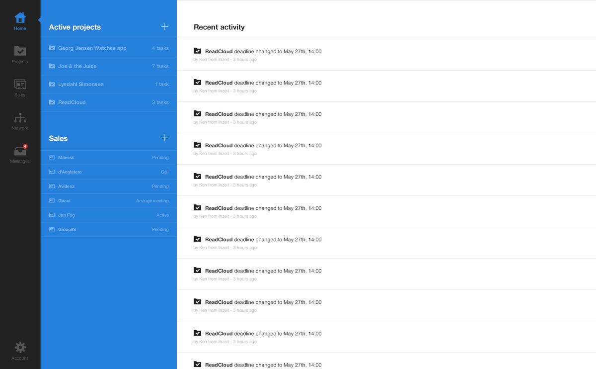
A logical structure is the backbone of seamless website navigation. Simplified navigation is achieved by organizing content hierarchically, with main categories and subcategories that guide users naturally to their desired destination. This not only enhances the user experience by reducing confusion but also supports SEO efforts.
A clear hierarchy allows users to understand their location within the site and navigate effortlessly to higher-level pages.
To ensure simplicity and intuitiveness, limit the number of menu items and use clear, concise labels. Complex structures can deter users, making it harder to locate desired information. Below is a list of key principles to consider when creating a logical structure for your website:
- Use Hierarchical Content: Organize information logically with main categories and subcategories.
- Consistent Design Elements: Maintain uniformity in navigation bars, breadcrumb trails, and search functions.
- Refine with User Feedback: Utilize insights from user behavior to optimize the structure continuously.
Implementing Consistent Navigation Patterns
Consistency in navigation design is not just about aesthetics; it’s about creating a predictable and familiar environment for users. Maintaining a consistent navigation design throughout your website is crucial. This includes the placement, style, and behavior of navigation elements. When users can easily predict where to find navigation elements on different pages, they spend less time learning how to use your site and more time engaging with your content.
Simplified navigation is the cornerstone of an intuitive UI. By prioritizing simplicity, consistency, and responsiveness, you can create a navigation system that guides users effortlessly through your interface.
Here are some essential practices to enhance website navigation:
- Keep the navigation simple and intuitive.
- Use clear and concise labels for menu items.
- Implement features like sticky navigation bars and breadcrumb trails.
- Ensure that the overall layout guides users naturally toward their desired destination.
By following these principles, you can create a website navigation system that is user-friendly, easy to understand, and effective in guiding users to the content they are seeking. Streamlined navigation, adaptive design, and intuitive menus are key for user experience. Enhance navigation with analytics and align with business objectives for improved conversion rates.
Optimizing Website Performance for Smooth Navigation
Improving Page Load Speed
A key aspect of enhancing user experience is ensuring that your website loads quickly and efficiently. Optimizing page load speed is not just about keeping visitors on your site, but also about improving your site’s overall performance and search engine ranking. Here are some steps to consider:
-
Optimize Images: Compress and resize images to reduce their file size without compromising quality. This can significantly decrease loading times.
-
Implement Caching: Utilize browser and server caching to store frequently accessed resources, reducing the need for repeated downloads.
-
Minify Scripts: Minimize the size of CSS, JavaScript, and HTML files by removing unnecessary characters and whitespace.
-
Reduce HTTP Requests: Combine files where possible, use CSS sprites, and streamline the number of elements on your page to lower the number of server requests.
By focusing on these areas, you can create a smoother and more responsive user experience. Remember, a faster website not only retains users but also contributes to higher engagement and conversion rates.
It’s important to conduct regular performance checks and keep abreast of the latest optimization techniques. As AM2 Studio suggests, familiar layouts and recognizable design patterns are essential, but speed optimization is crucial for seamless navigation. This includes image compression, caching, and script minification. Ultimately, to optimize website loading times is to gain a competitive edge, as it enhances user experience and retention.
Utilizing Caching Techniques
Caching is a powerful technique that significantly enhances the user experience by speeding up page load times. Implementing caching on your website can lead to substantial performance improvements, ensuring that visitors can navigate your content swiftly and without interruption. By storing frequently accessed data on the user’s device or within the server’s memory, caching reduces the need to fetch the same information repeatedly from the server, thus minimizing load times and server load.
Caching not only saves local resources on your website server but also improves the overall customer experience.
Here are some key benefits of utilizing caching techniques:
- Speed: Cached content loads faster, providing a more responsive experience.
- Scalability: Caching can help your website handle increased traffic without compromising performance.
- Efficiency: Reduces server load, leading to potential cost savings on hosting.
To effectively implement caching, consider the following steps:
- Identify static resources that can be cached, such as images, CSS, and JavaScript files.
- Set appropriate cache expiration times to ensure content remains up-to-date.
- Utilize browser and server-side caching mechanisms to optimize performance.
- Regularly monitor and update your caching strategy to adapt to changing website content and user behavior.
Minimizing HTTP Requests
One of the most effective strategies to enhance user experience is by minimizing HTTP requests. Each element on a page, from images to scripts, initiates a separate HTTP request; reducing these can significantly speed up page loading times. Here are some practical steps to achieve this:
- Combine CSS/JavaScript files: Instead of multiple files, use a single combined file to reduce requests.
- Use CSS sprites: Combine multiple images into one and use CSS to display only the parts needed.
- Minify CSS and JavaScript: Remove unnecessary characters from code to decrease file sizes.
By implementing these techniques, you can create a smoother and more responsive user experience, which is particularly crucial for retaining users and improving engagement.
Additionally, consider using techniques like lazy loading for images and asynchronous loading for scripts to further reduce initial load times. Remember, a faster website not only retains users but also contributes to better SEO rankings.
Strategies for Effective Content Organization

Categorization and Taxonomies
Effective categorization and taxonomies are foundational to a user-friendly website, guiding visitors through a seamless journey from homepage to checkout. By creating a logical classification system, websites can significantly enhance user experience, making it easier for users to find the information they seek.
- Use Hierarchical Content: Establish a clear hierarchy with main categories and subcategories.
- Clarity in Labels: Ensure navigation labels are clear and descriptive.
- Visual Cues: Provide icons or hover effects for better clarity.
A website taxonomy involves creating a classification system that balances aesthetics with usability, improving both navigation and user experience.
Remember, a well-structured website taxonomy not only aids users but also contributes to SEO performance, as search engines favor sites with clear and logical organization.
Using Breadcrumbs for Enhanced Usability
Breadcrumbs serve as an essential navigational aid on websites, providing a clear trail of where a user is within the site’s hierarchy. They enhance usability by allowing users to navigate to higher-level pages with ease, reducing confusion and improving the overall user experience. This is particularly beneficial on websites with deep content structures or complex navigation paths.
- Breadcrumbs show the path from the home page to the current page.
- They encourage exploration by suggesting related or previous content.
- Breadcrumbs can improve SEO by making site content more accessible to search engines.
Breadcrumbs not only guide users through a website effectively but also help search engines understand the importance of specific pages, potentially improving site visibility.
Implementing breadcrumbs is a straightforward process that involves displaying a row of clickable links at the top of a page. These links reflect the structure of the website and provide a quick way for users to backtrack or proceed to related sections. When designing breadcrumbs, it’s crucial to ensure they are consistent and intuitive, complementing the overall navigation system of the site.
Leveraging Mega Menus for Complex Sites
Mega menus have become a staple in managing complex site architectures, providing users with a comprehensive overview of available content at a glance. These expansive menus are particularly beneficial for sites with a wide array of topics or products, as they allow for the display of many options in a clean and organized manner.
To ensure that mega menus enhance the user experience rather than complicate it, it’s crucial to balance the number of items and the way they are categorized. A well-structured mega menu can lead to a significant increase in user engagement by making it easier to find specific content. Here’s a simple guideline to follow:
- Keep categories distinct and limit the number of items under each.
- Use clear, descriptive labels for all menu items.
- Organize items in a way that reflects user expectations and behavior.
- Consider the visual hierarchy to guide users’ eyes to important items.
By thoughtfully implementing mega menus, websites can offer ease of access and clarity, which are essential for a positive user experience. This approach not only serves the functional needs of users but also contributes to the visual appeal of the site.
Remember, the goal is to create a user-centric website where aesthetics meet functionality. Incorporating breadcrumbs and intuitive menu structures can further enhance usability and encourage deeper exploration of the site.
Enhancing Accessibility and Mobile Responsiveness
Designing for Different Screen Sizes
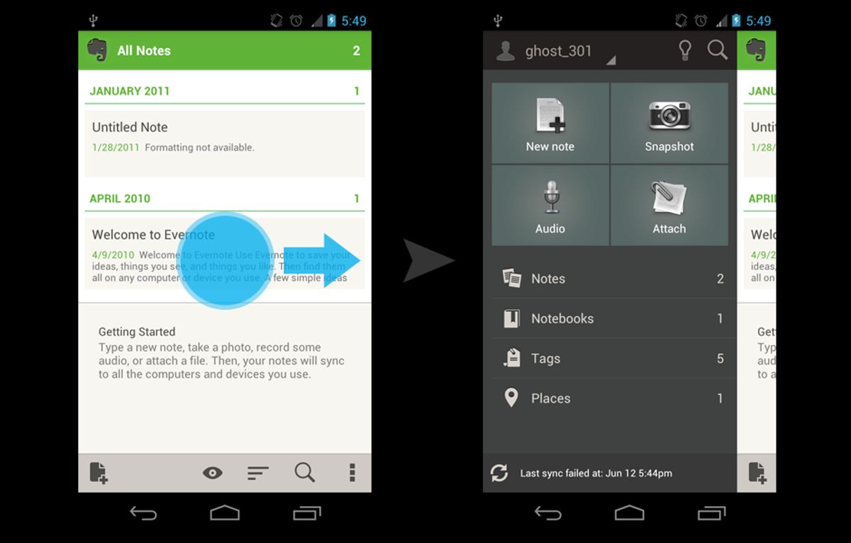
In the realm of web design, responsiveness is key. A website must fluidly adapt to various screen sizes to ensure a consistent and engaging user experience. This adaptability is achieved through responsive design techniques, which allow layouts, images, and content to dynamically adjust across devices such as desktops, tablets, and smartphones.
- Responsive Design: Ensures smooth content flow on all devices.
- Adaptive Design: Targets specific devices with tailored solutions.
By prioritizing mobile responsiveness, we cater to the growing number of users who access the internet via mobile devices. This approach not only enhances usability but also contributes to higher conversion rates and brand loyalty.
Moreover, mobile friendliness is not just about scaling down—it’s about rethinking navigation to suit touch interactions. Menus may transform into collapsible formats, and buttons should be sized for easy tapping. The goal is to create an environment where users can navigate with ease, regardless of the device in use.
Ensuring Keyboard and Screen Reader Accessibility
In the realm of web design, ensuring that all functionalities are accessible via keyboard is not just a best practice—it’s a necessity for inclusivity. Users with physical disabilities, or those who prefer keyboard navigation, must be able to interact with all elements of a website without the need for a mouse. This commitment to accessibility compliance is a testament to a website’s dedication to inclusive design and cross-platform compatibility.
To achieve this, developers must use semantic HTML and ARIA roles to enhance the website structure for assistive technologies. This includes defining proper tab orders and ensuring that interactive elements are focusable and provide feedback when activated.
Additionally, testing with real assistive devices and incorporating user feedback are crucial steps in refining the accessibility of a website. It’s not enough to rely on automated testing tools; direct input from users who rely on these technologies provides invaluable insights into the user experience.
By prioritizing seamless interactions and responsive design, we ensure a consistent experience across devices and browsers, making the digital world more accessible to everyone.
Touch-friendly Interfaces for Mobile Users
In the age of ubiquitous mobile devices, touch-friendly interfaces are crucial for providing a seamless user experience. Ensuring that interactive elements are easily tappable with a finger and that gestures are recognized accurately is not just a matter of convenience—it’s a fundamental aspect of modern web design.
Mobile users expect navigation that is intuitive and forgiving of the imprecise nature of touch interactions. Designers must prioritize touch ergonomics, making sure that buttons, links, and other controls are of sufficient size and spaced appropriately to prevent accidental taps.
Moreover, the implementation of touch-friendly interfaces goes beyond mere sizing. It involves understanding the ergonomics of software design, where information is treated as a physical object that users interact with. This approach leads to better affordance in UI elements, ensuring that users have clear signals about what actions are possible and how to perform them. Avoiding the pitfall of reverse engineering—mapping your design to the constraints of the device rather than the needs of the user—is essential for creating an environment where users feel in control and navigation feels like second nature.
Leveraging Analytics to Refine Navigation

Tracking User Navigation Patterns
Understanding how visitors interact with your website is essential for creating an intuitive user experience. Tracking user navigation patterns is a powerful method to gain insights into user behavior and preferences. By analyzing the paths users take, the features they interact with, and the points where they drop off, you can identify areas for improvement and optimize your site’s navigation accordingly.
To effectively track user navigation patterns, it’s important to implement a variety of tools and techniques. Feature tagging, session recordings, and heat maps are among the most effective tactics for gaining a comprehensive understanding of user interactions.
Utilizing analytics tools can provide a wealth of data that informs design choices. By conducting usability testing and analyzing this data, you can refine your website’s design to ensure clear and intuitive navigation paths. Monitoring the impact of these changes is crucial for continuous improvement and maintaining an enhanced user experience.
A/B Testing for Optimal Menu Layouts
A/B testing is a critical step in refining website navigation to ensure that users find the most intuitive and efficient path to their desired content. By comparing different menu layouts, we can gather data on user preferences and behaviors, leading to informed decisions that enhance the user experience. This method involves presenting two variants of a menu to different segments of website visitors and measuring which one performs better in terms of user engagement and conversion rates.
A/B testing is not just about choosing the better of two options, but understanding why one option outperforms the other. This insight is invaluable for creating a navigation structure that resonates with users.
To conduct effective A/B testing, follow these steps:
- Identify the goal of your test, such as increasing click-through rates or reducing bounce rates.
- Create two or more variations of the menu layout.
- Use analytics tools to divide your audience and serve each group a different version.
- Collect and analyze the data to determine which layout achieves the desired outcome.
- Implement the winning layout and continue to refine as needed.
Remember, A/B testing is an iterative process. It’s about making incremental changes and continuously measuring their impact. By doing so, you can ensure that your website remains user-friendly and effective at guiding visitors to their destination.
Utilizing Heatmaps for Insightful Feedback
Heatmaps are a powerful tool for visualizing user engagement and identifying patterns that can inform website improvements. By tracking where users click, scroll, and linger, heatmaps provide a visual representation of user activity that can highlight areas of interest as well as elements that may be overlooked.
Utilizing heatmaps effectively requires a strategic approach. Start by identifying key pages or sections where user interaction is critical. Next, analyze the heatmap data to understand how users are navigating these areas. Are there hotspots indicating high engagement, or cold spots where users seem to lose interest? This analysis can lead to actionable insights, such as rearranging content to better align with user expectations or simplifying navigation to enhance the user journey.
Heatmaps can also reveal if users are attempting to interact with non-clickable elements, suggesting a need for design changes. Additionally, comparing heatmaps from different time periods can show the impact of design updates or content changes.
To illustrate the benefits of heatmap analysis, consider the following table showing the percentage increase in user engagement after optimizing a website’s navigation based on heatmap insights:
| Page Section | Before Optimization | After Optimization |
|---|---|---|
| Homepage CTA | 15% | 35% |
| Product Page | 20% | 50% |
| Contact Form | 5% | 25% |
By continuously monitoring heatmap data and implementing changes based on user behavior, websites can create a more intuitive and satisfying experience for their visitors.
In today’s digital landscape, understanding how your users interact with your website is crucial. By leveraging analytics, you can refine your website’s navigation to provide a seamless user experience that keeps visitors engaged and returning. Don’t miss out on the opportunity to enhance your site’s performance. Visit our website to explore our comprehensive WordPress Development and eCommerce solutions, and let us help you transform your digital presence. Take the first step towards a more intuitive and effective website today!
Conclusion
In conclusion, seamless website navigation is a cornerstone of exceptional user experience. By prioritizing clarity, consistency, and intuitive design, businesses can guide visitors effortlessly through their digital space, leading to increased engagement and conversions. The strategies discussed in this article, from maintaining a logical structure to optimizing for performance, are essential for any website looking to stand out in the competitive online landscape. Remember, your website’s navigation is more than just a means to explore content; it’s an opportunity to showcase your commitment to user satisfaction and to leave a lasting impression. Implement these practices to ensure that your website not only meets but exceeds user expectations, fostering a positive and memorable journey for every visitor.
Frequently Asked Questions
What are the key components of intuitive navigation design?
Intuitive navigation design is built on understanding user behavior, creating a logical structure, and implementing consistent navigation patterns to ensure a seamless user experience.
How can website performance be optimized for better navigation?
Optimizing website performance involves improving page load speed through techniques such as caching, minimizing HTTP requests, and optimizing images and scripts for faster loading times.
What strategies can be employed for effective content organization?
Effective content organization can be achieved by using clear categorization and taxonomies, implementing breadcrumbs for usability, and leveraging mega menus for complex sites to guide users through the content.
How does accessibility and mobile responsiveness enhance navigation?
Enhancing accessibility and mobile responsiveness involves designing for various screen sizes, ensuring keyboard and screen reader accessibility, and creating touch-friendly interfaces, all of which contribute to a more inclusive and navigable website.
Why is leveraging analytics important for refining website navigation?
Leveraging analytics helps in tracking user navigation patterns, conducting A/B testing for optimal menu layouts, and utilizing heatmaps to gain insightful feedback, which can be used to refine and improve navigation structures.
What impact does website performance have on user experience and conversions?
Website performance, particularly speed, has a significant impact on user experience, engagement, and overall satisfaction. Faster loading times can lead to higher conversion rates, better search engine rankings, and increased customer retention.