Enhancing User Experience with Seamless Website Navigation

In this article, we’ll dive into the art and science of maximizing user experience through effective website navigation. From intuitive menus to smart search functions, get ready to discover some best practices that will keep your users happily engaged and navigating with ease. Say hello to a world where getting lost is a thing of the past!
Key Takeaways
- Intuitive website navigation is essential for user satisfaction and engagement, guiding visitors effortlessly through a site’s content.
- Leveraging analytics and user feedback can provide valuable insights for optimizing navigation structure and improving the overall user experience.
- Accessibility and responsiveness are key components of website navigation, ensuring that all users can navigate the site effectively, regardless of device or ability.
- SEO plays a significant role in navigation design, contributing to better site crawling, enhanced menu labels, and mobile-friendly navigation.
- Regular audits, monitoring, and staying updated with the latest web navigation trends are crucial for maintaining a seamless and user-friendly navigation system.
The Pillars of Intuitive Website Navigation
Understanding User Behavior and Preferences
To create a website that resonates with users, it’s essential to understand their behavior and preferences. This understanding forms the foundation of intuitive navigation design, which is not just about aesthetics but also about how easily users can find what they’re looking for.
User research is the cornerstone of this process. By employing methods such as surveys, interviews, and observation, designers can gather data on user preferences, behaviors, goals, and pain points. This information is crucial for creating user personas—fictional representations of the target audience that guide the design process.
A well-designed navigation system takes into account the various ways users interact with a website. While some users may be browsing without a specific goal, others are goal-directed and may interact with different elements, such as ads, based on their intent.
Understanding the context in which users will engage with the product—how, where, when, and why—is vital for crafting a navigation system that feels natural and effortless. This insight helps in structuring information hierarchically and ensuring that the navigation is accessible and responsive to the needs of all users.
Structuring Information Hierarchically
A well-structured website guides users effortlessly through the layers of content, much like a well-organized filing system. The primary navigation should feature the most important pages, with secondary and tertiary levels detailing sub-categories and related pages. This logical arrangement not only facilitates the discoverability of content but also instills a sense of order that users find reassuring.
Effective hierarchical structuring can be achieved by grouping related pages under appropriate categories and prioritizing pages based on their significance. Visual cues such as breadcrumbs or highlighted menu items can further reinforce the website’s structure and guide users through their navigation journey.
By establishing a clear hierarchy, users can easily understand the relationships between different sections and navigate the website with confidence.
The benefits of a clean information hierarchy extend to improved user understanding and enhanced user engagement. It is a strategic element that significantly impacts user experience and performance metrics.
Designing for Accessibility and Responsiveness
Ensuring that a website is accessible to all users, including those with disabilities, is not just a legal requirement but also a moral imperative. Providing alternative text for images and using sufficient color contrast are fundamental steps towards inclusivity. Designing for keyboard navigation and adherence to the Web Content Accessibility Guidelines (WCAG) are equally crucial.
Responsive design is no longer optional in our mobile-first world. A website must adapt fluidly across various devices and screen sizes to provide a consistent user experience. This adaptability is key to keeping users engaged, regardless of their device.
By integrating responsive design with accessibility features, we create a navigation bar that serves the widest possible audience. This approach not only meets compliance standards but also reflects a commitment to user-centric design.
To achieve this, consider the following steps:
- Utilize media queries to ensure proper display on different devices.
- Implement ARIA (Accessible Rich Internet Applications) roles for assistive technologies.
- Test navigation patterns for ease of use across various input methods.
Optimizing Navigation for Enhanced User Engagement

Leveraging Analytics for Navigation Insights
To optimize user experience and achieve website goals, it’s essential to monitor and adjust website navigation using analytics data. Tools like Google Analytics 4 Exploration offer valuable insights into user behavior, allowing for the measurement of navigation performance. By analyzing key metrics, we can make data-driven improvements to ensure the navigation system is both user-centric and adheres to UX best practices.
Analytics-driven adjustments to navigation can lead to increased user engagement and satisfaction, directly impacting the success of a website.
Understanding the paths users take through a website can reveal much about their needs and preferences. For instance, analyzing where users go after viewing a blog post can inform content strategy and navigation improvements. Regular analysis and optimization of the navigation system are not one-time tasks but ongoing processes that respond to user behavior and evolving expectations.
Balancing Aesthetics with Usability
When designing a website, it’s crucial to maintain a balance between appealing visuals and effective usability. Visual aesthetics are not just about beauty; they create a strong first impression and can entice users to explore further. However, the true art in UI/UX design lies in its ability to fulfill functional purposes, ensuring that users can interact with the site and achieve their goals effortlessly.
A website should not only capture the eye but also provide a seamless and intuitive user journey.
To achieve this balance, consider the following points:
- Select appropriate colors and engaging layouts that align with your brand identity.
- Optimize intuitive navigation to reduce interaction barriers.
- Ensure that typography and graphic elements contribute to readability and user engagement.
By integrating visual aesthetics with functional purposes, designers craft experiences that are both memorable and efficient. The synergy between these elements is what distinguishes exceptional UI/UX design, inspiring users and driving engagement.
Implementing Predictive Search Features
Predictive search is a powerful tool that enhances the user experience by anticipating the user’s search intent and offering suggestions in real-time. This proactive approach not only speeds up the search process but also helps in guiding users towards the most relevant content, products, or information on your website.
To effectively implement predictive search, consider the following steps:
- Prominent Placement: Ensure the search bar is easily accessible on every page, ideally at the top-right corner or center of the header.
- Auto-Suggestions: Offer real-time suggestions as users type, including relevant keywords and popular searches.
- Search Result Sorting: Provide options to sort results by relevance, popularity, or date.
- Advanced Search Options: Include features like Boolean operators and exact phrase matching for more refined searches.
- Error Handling: Gracefully manage incorrect queries by offering alternative suggestions.
- Analytics and Optimization: Use analytics to monitor search trends and optimize the search experience.
By streamlining the search experience, you not only improve usability but also encourage deeper engagement with your site’s content.
Regular testing and user feedback are crucial for maintaining an effective predictive search feature. It’s important to stay responsive to user needs and continuously refine the search functionality to meet evolving expectations.
Strategies for Streamlining Website Navigation
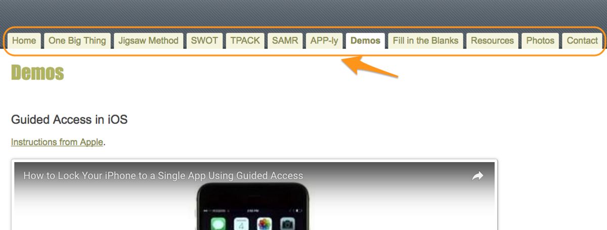
Simplifying Menu Design
To enhance user experience, simplifying the menu design is a critical step. By minimizing unnecessary menu items and prioritizing essential pages, users can quickly find what they’re looking for. This approach involves grouping related items and using descriptive, concise labels.
Consider the example of a restaurant website. Organizing the navigation menu by categories like appetizers, main courses, desserts, and drinks, with clear labels, makes it easy for visitors to navigate.
- Group related items: Ensure that similar pages are categorized together to reduce complexity.
- Use clear labels: Opt for descriptive and concise labels for each menu item.
- Limit choices: Avoid overwhelming users with too many options by limiting drop-down menus.
An optimized menu design not only prioritizes key features but also maintains consistency and familiarity, which are essential for intuitive navigation.
Remember, adaptive design and finger-friendly touch targets are especially important for mobile users, where screen space is limited. Simplifying menus on smaller screens is crucial to maintaining usability and ensuring a seamless experience.
Utilizing Breadcrumbs for Easy Backtracking
Breadcrumbs serve as an essential navigational tool that guide users through a website’s structure, allowing them to trace their steps back to the homepage or any other previous section. By displaying a clear trail of their browsing path, breadcrumbs enhance the user’s ability to understand their current location and how they arrived there.
- Home
- Category
- Subcategory
- Product Details
This simple yet effective method reduces confusion and improves the overall user experience. It’s particularly useful on websites with multiple layers of content, where users might need to navigate back to a specific point in their journey.
Breadcrumbs are not just a convenience; they are a cornerstone of good UX design, contributing to a website’s performance optimization and continuous improvement.
Incorporating breadcrumbs is a straightforward process, but it requires careful consideration of the website’s hierarchy to ensure that each link adds value and clarity to the navigation experience.
Incorporating Mega Menus for Complex Sites
Mega Menus provide a comprehensive overview of a website’s offerings, making them ideal for complex sites with extensive content. By organizing information into columns and categories, they enhance the user’s ability to quickly locate desired information. A well-designed mega menu can transform the user experience from frustrating to fluid, especially when dealing with a large inventory of products or services.
To ensure mega menus are effective, limit the number of items to prevent overwhelming the user. Here’s a simple guideline to follow:
- Group related items together
- Use clear and concise labels
- Prioritize items based on user needs
- Include a search bar within the menu for direct navigation
Mega menus should be seen as an extension of your site’s organizational structure, providing a bird’s-eye view of available content while maintaining a clean and navigable interface.
Remember, the goal is to facilitate a seamless journey through your site, leading to increased user engagement and satisfaction. Regularly review your mega menu’s performance and be ready to adjust as needed to keep up with evolving user behaviors and preferences.
The Role of SEO in Navigation Design

Improving Site Architecture for Better Crawling
To ensure that search engines can effectively crawl and index your website, it’s crucial to optimize your site architecture. A well-structured website not only benefits users but also search engine crawlers, which can lead to improved SEO rankings. Here are some key steps to consider:
- Streamline your URLs to be descriptive and keyword-rich. Avoid complex parameters that can confuse crawlers and users alike.
- Implement XML sitemaps to guide search engines through your site, ensuring that all pages are discovered.
- Strengthen your internal link structure to establish a clear hierarchy and distribute page authority throughout your site.
By focusing on these areas, you can create a more navigable website for both users and search engines, which is a fundamental aspect of SEO.
Remember, a website that is easy to navigate is more likely to retain visitors, leading to increased engagement and potentially higher conversion rates. Regularly reviewing and refining your site architecture is an ongoing process that can significantly impact your online presence.
Using Keywords to Enhance Menu Labels
Incorporating relevant keywords into your website’s navigation labels is not just about SEO; it’s about creating a bridge between user intent and your content. Conducting keyword research is the first step towards aligning your menu labels with the terms your audience is searching for. This strategic approach can lead to improved user engagement and a more intuitive user experience.
By using keywords that resonate with your audience in your navigation, you’re guiding them effortlessly towards the content they seek, enhancing both usability and findability.
For instance, a travel website might use ‘Top Vacation Spots’ instead of a generic ‘Destinations’ label. This not only boosts SEO but also provides clear expectations for users. Similarly, an e-commerce site could replace ‘Products’ with more descriptive categories like ‘Men’s Running Shoes’ to direct users more precisely. Here’s a simple list to ensure your menu labels are optimized:
- Use action-oriented terms like ‘Explore’ or ‘Discover’
- Prioritize clarity over creativity
- Reflect the language of your audience
- Avoid technical jargon unless it’s audience-appropriate
Remember, optimizing website navigation with keywords enhances the user experience and contributes to a stronger brand identity.
Ensuring Mobile-Friendly Navigation
In the era of smartphones, ensuring mobile-friendly navigation is not just an option—it’s a necessity. A mobile-optimized navigation system should be designed to accommodate the limitations and capabilities of mobile devices. This includes larger touch targets, simplified menus, and responsive design that adapts to various screen sizes.
Key aspects of mobile-friendly navigation:
- Responsive design that adjusts to different screen sizes
- Simplified menu options to avoid overwhelming users
- Easily tappable links and buttons for touch interfaces
- Use of familiar icons, like the hamburger menu, for easy recognition
By prioritizing mobile navigation, websites can cater to the growing number of users who rely on their mobile devices for internet access. This focus on mobile usability can significantly enhance the overall user experience, leading to increased engagement and conversions.
The website emphasizes the importance of intuitive navigation for user experience. Strategies include clear labeling, responsive design, and post-launch monitoring for optimal engagement and conversions. As mobile internet usage continues to rise, the investment in mobile-friendly navigation becomes a critical component in a website’s success.
Monitoring and Maintaining Navigation Usability
Conducting Regular Website Health Audits
To ensure that your website remains a robust platform for user engagement, regular health audits are essential. These audits encompass various aspects of the site, including performance, security, SEO, and usability. By systematically examining these areas, you can identify and rectify issues that may impede user experience or hinder your site’s visibility in search engine results.
- Performance: Check loading times and optimize for speed.
- Security: Update systems and scan for vulnerabilities.
- SEO: Ensure tags and keywords are effectively implemented.
- Usability: Assess navigation and overall user interface.
Regular A/B testing, mobile optimization, and accessibility improvements are pivotal in enhancing user experience. It’s crucial to maintain security standards through updates, audits, and regular testing to provide a seamless website experience.
Incorporating feedback from these audits into your website’s maintenance routine can lead to significant improvements in user satisfaction and engagement. Staying proactive with these health checks not only benefits your users but also bolsters the overall longevity and success of your website.
Gathering User Feedback for Continuous Improvement
The essence of gathering feedback is to make informed improvements that resonate with users and align with business objectives. Prioritizing feedback is crucial; not all comments will necessitate immediate action, but those that significantly impact user experience should be addressed promptly.
Continuous improvement is an iterative process. By regularly collecting and analyzing feedback, you can make data-driven decisions that enhance navigation and overall user satisfaction.
To effectively analyze user feedback, discern patterns, and identify problem areas, consider the following steps:
- Conduct online surveys to gauge user experience directly.
- Engage in usability testing to observe real user interactions.
- Utilize analytics tools to track and measure user behavior.
- Implement A/B testing to compare different navigation strategies.
Documenting changes and measuring their impact over time will inform future navigation design strategies, ensuring that your website remains intuitive and user-friendly.
Staying Updated with Web Navigation Trends
In the ever-evolving landscape of web design, staying abreast of the latest navigation trends is essential for ensuring a seamless user experience. As technology and user expectations change, so too must our approach to website navigation. To maintain a competitive edge, it’s important to keep an eye on emerging patterns and incorporate those that align with your users’ needs.
Effective website navigation and accessibility are crucial for user experience. Simplify design, prioritize accessibility, and utilize user feedback for iterative improvements.
One practical method for staying current is to participate in web design forums and follow thought leaders in the industry. Additionally, attending webinars and workshops can provide valuable insights into what’s new and what’s next. Here’s a quick checklist to help you stay informed:
- Subscribe to industry newsletters and blogs
- Follow relevant hashtags and influencers on social media
- Attend web design and UX conferences
- Experiment with new tools and frameworks
- Analyze competitor websites for innovative navigation features
By continuously learning and adapting, you can ensure that your website’s navigation remains intuitive, efficient, and aligned with the latest user experience best practices.
Ensuring your website’s navigation remains user-friendly and efficient is crucial for keeping visitors engaged and converting them into customers. At [Highlight], we specialize in WordPress Development, including performance optimization and website health audits, to guarantee your site’s navigation is top-notch. Don’t let poor usability hinder your online success. Visit our website now to learn how we can help you maintain a seamless user experience.
CONCLUSION
As we’ve explored throughout this article, seamless website navigation is pivotal to crafting a user experience that is not only satisfying but also conducive to achieving your site’s objectives. By prioritizing intuitive design, leveraging visual cues, and adhering to best practices, you can guide visitors effortlessly through your digital landscape. Remember, the journey through your website should be as smooth as the content is compelling. Continual refinement and responsiveness to user feedback are key to maintaining an optimal navigational structure. Embrace the principles discussed here, and watch as your website becomes a beacon of user-friendliness, where every click leads to discovery and every path to satisfaction.
Frequently Asked Questions
What are the key elements of intuitive website navigation?
Intuitive website navigation includes understanding user behavior, structuring information hierarchically, designing for accessibility, responsiveness, and implementing features like predictive search to guide users efficiently.
How can website navigation impact user engagement?
Effective navigation can significantly increase user engagement by making it easier for users to find the information they seek, reducing frustration, and encouraging them to spend more time on the site.
What are some strategies to streamline website navigation?
Strategies to streamline navigation include simplifying menu design, using breadcrumbs for easy backtracking, and incorporating mega menus for complex sites to provide a clear path for users.
How does SEO influence website navigation design?
SEO can enhance navigation design by improving site architecture for better crawling, using keywords in menu labels for clarity, and ensuring mobile-friendly navigation for better search engine ranking.
What steps should be taken to maintain navigation usability?
To maintain navigation usability, conduct regular website health audits, gather user feedback for continuous improvement, and stay updated with the latest web navigation trends and best practices.
Why is performance optimization important for website navigation?
Performance optimization is important because it improves loading times, enhances user experience, and can lead to increased sales, conversions, and customer satisfaction by providing a seamless browsing experience.