Enhancing User Experience with Seamless Website Navigation
In the realm of website design, navigation is a critical element that can make or break the user experience. A seamless, intuitive navigation system not only helps users find the information they need quickly and efficiently but also enhances their overall experience, leading to increased engagement and satisfaction. This article delves into the nuances of website navigation, exploring strategies and techniques that can elevate the user journey, improve website performance, and align with business goals.
Key Takeaways
- Intuitive website navigation is essential for guiding users through a site’s content and improving their overall experience.
- Strategic placement of menus and links, along with simplified paths, can significantly enhance website usability.
- Website navigation has a direct impact on performance, affecting factors like speed, responsiveness, SEO, and user behavior analysis.
- Advanced navigation techniques, such as the use of mega menus and breadcrumbs, can foster enhanced interaction and ease of use.
- Aligning navigation structure with business objectives is crucial to drive conversions and achieve a balance between aesthetics and functionality.
Streamlined Navigation: Guiding Journeys

The Importance of Intuitive Layouts
An intuitive layout is the cornerstone of a seamless user experience. It ensures that visitors can navigate your website effortlessly, finding the information they need without confusion or delay. The goal is to create a browsing journey that feels natural and requires minimal cognitive effort from the user.
- Intuitive Navigation: Users should be able to move through your site intuitively, with clear calls-to-action and a logical flow.
- Responsive Design: A layout must adapt to various devices, maintaining usability and consistency across platforms.
- Prioritize Pages: Important content should be easily accessible, with secondary pages reachable through simple navigation.
By focusing on user-centric design, we can reduce friction and enhance satisfaction, making the user’s journey through the website a delightful experience.
AM2 Studio’s strategic approach to web development focuses on user-centric design, cutting-edge technology, and post-launch monitoring for excellence and success in the digital space. This holistic view is essential for creating layouts that not only look good but also perform well, ensuring that your website stands out in today’s competitive online landscape.
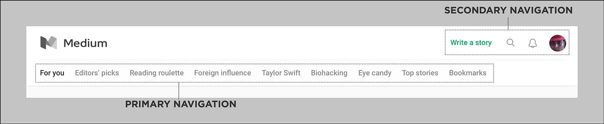
Strategic Placement of Menus and Links
The strategic placement of menus and links is crucial for a seamless user experience. Menus should be positioned to align with the natural navigation flow of a website, often at the top or side, to provide optimal visibility and accessibility. Consistency in the placement of these elements is key, as it allows users to develop a sense of familiarity and efficiency when navigating through different pages.
By using clear and descriptive labels for menu items, visitors can easily understand and predict the content they will encounter, reducing the cognitive load and enhancing the overall usability of the website.
It’s important to consider the layout and objectives of the design when deciding on the placement of navigation elements. For instance, a top menu may be preferred for its prominence, while a sidebar menu could be beneficial for sites with extensive content categories. The goal is to guide users to their desired destination within the website in the fewest clicks possible.
Enhancing Usability Through Simplified Paths
In the pursuit of enhancing usability, the simplification of navigation paths plays a pivotal role. Users appreciate when they can find what they need without unnecessary complexity. Simplified paths mean fewer clicks, less confusion, and a more direct route to the desired content or action. This approach not only improves the user experience but also supports the accessibility of the website, making it more inclusive.
By focusing on streamlined navigation, we guide users through a journey that is both intuitive and efficient. The goal is to create a seamless flow that users can navigate with ease, regardless of their technical proficiency.
To achieve this, consider the following steps:
- Use descriptive labels for menu items to clearly indicate their function.
- Maintain consistent placement of navigational elements to avoid disorientation.
- Incorporate breadcrumb trails or site maps for easy orientation and backtracking.
These strategies ensure that users spend less time figuring out how to get around and more time engaging with your content, which can lead to increased satisfaction and loyalty.
Elevating User Experience: Intuitive Menus and Links

Creating a Roadmap for Users
A well-defined navigation roadmap is essential for guiding users through a website’s content, ensuring they can find what they’re looking for with ease. Creating a sitemap serves as the foundation for this roadmap, outlining the hierarchy and relationship between pages. This visual representation aids in the strategic placement of menus and links, fostering an intuitive user experience.
Effective navigation is not just about the structure, but also about the visual cues that guide users. Employing descriptive labels, consistent navigational elements, and visual elements like icons and tooltips can significantly enhance the user’s journey. Feature intuitive icons and imagery to provide feedback and direction, making the navigation process as seamless as possible.
By analyzing user behavior, we can continuously refine the navigation to better align with user expectations and improve overall website performance.
Remember, the goal is to create a smooth and intuitive journey for your users, steering them towards their desired content without confusion or delay. This not only improves user engagement but also supports the website’s SEO and visibility.
The Role of Modern Navigation in User Engagement
Modern navigation is more than just a way to traverse a website; it’s a strategic tool that can enhance user engagement and foster a positive user experience. By providing clear and intuitive pathways, users can find the information they need with ease, which in turn encourages them to interact more deeply with the content.
Navigation latches a steady hook on visitors, deepening engagement and improving the overall experience.
A well-structured navigation system is essential for keeping users on the site and reducing bounce rates. It’s not just about the aesthetics; it’s about creating a seamless flow that guides users naturally from one section to another, aligning with their expectations and needs.
- Simplify the user journey
- Increase time spent on site
- Encourage exploration of content
Ultimately, modern navigation is a key player in the success of a website. It impacts not only the usability but also the business’s bottom line by enhancing SEO, fostering trust, and boosting conversions.
Designing for Clarity and Quick Information Retrieval
In the realm of web design, clarity and quick information retrieval are paramount. Users should be able to navigate a website without confusion, which is why clear labeling and streamlined menu hierarchies are key for user-centric design. This approach not only guides users intuitively but also enhances user experience and engagement.
A cluttered navigation hinders the ability to find what they need efficiently. Prioritize important links and simplicity to streamline the navigation process.
For instance, consider the following steps to ensure a website is designed for optimal clarity and information retrieval:
- Design a navigation menu that is easily visible and consistently placed across different sections of the website.
- Organize content in a logical manner, grouping related information together under clear headings and subheadings.
- Maintain a consistent design language throughout the website to reduce cognitive load and foster familiarity.
By focusing on these elements, we can create a roadmap for users that not only meets the core elements for modern web design but also aligns with the strategic placement of menus and links to drive user engagement.
The Impact of Navigation on Website Performance

Optimizing for Speed and Responsiveness
In the digital age, speed is synonymous with success. Websites that load quickly not only provide a better user experience but also contribute to higher engagement, retention, and conversion rates. To achieve this, certain strategies are paramount:
- Minimize Page Load Time: Compress images, leverage browser caching, and use content delivery networks (CDNs) to enhance loading speed.
- Streamline Code and Scripts: Minify HTML, CSS, and JavaScript files, and eliminate render-blocking scripts to accelerate page rendering.
- Implement Caching Techniques: Utilize browser and server-side caching to reduce load times for repeat visitors and decrease server processing time.
By focusing on these areas, we can significantly improve website performance, which in turn, can lead to an increase in sales, conversions, and overall customer satisfaction.
Responsive design is also a critical factor in optimizing for speed and responsiveness. A single, responsive version of a website eliminates the need for multiple versions and can lead to faster loading times. Moreover, optimizing navigation for mobile devices with formats like collapsible menus ensures that the user experience is seamless across all platforms.
Navigation’s Role in SEO and Visibility
Effective navigation is a cornerstone of SEO and online visibility. A well-structured navigation system not only guides users through a website’s content but also helps search engines understand the site’s hierarchy, leading to better indexing and higher rankings. Descriptive labels and a clear hierarchy in navigation are essential for aligning with both user expectations and search engine algorithms.
Navigation directly influences user engagement metrics, which are critical to SEO performance. A seamless navigation experience can reduce bounce rates and increase time on site, signaling to search engines that the website is valuable to visitors.
Additionally, strategic navigation design can drive more traffic to high-priority pages, enhancing the visibility of key services or products. For instance, a website that offers WordPress and eCommerce development services can structure its navigation to highlight these offerings, thereby improving its SERP positioning for related queries.
- Strategic Navigation Design: Key Points
- Prioritize high-value pages
- Use descriptive labels for clarity
- Maintain a clear hierarchy
- Analyze user behavior for improvements
Analyzing User Behavior to Improve Navigation
To enhance website navigation, a deep dive into user behavior is essential. Utilizing tools like heatmaps, scroll maps, and interaction analysis provides valuable insights. These analytics help identify which areas of the site engage users and which may cause them to bounce. By analyzing this data, we can streamline the user journey, making it more intuitive and efficient.
Consistency across all pages is a best practice that should not be overlooked. It aids in orientation and usability, reducing user frustration.
A/B testing is another powerful method for refining navigation. It allows for comparing different design variations to see which one yields better engagement and conversion rates. Implementing search functionality can also significantly improve the user experience by enabling quick information retrieval.
Here’s a simple list of steps to optimize navigation based on user behavior:
- Observe visitor interactions with website navigation
- Pinpoint areas for improvement
- Implement changes and measure the impact
- Repeat the process to continuously refine the user experience
Advanced Navigation Techniques for Enhanced Interaction
Implementing Forward, Horizontal, and Backward Navigation
In the realm of website navigation, the implementation of forward, horizontal, and backward navigation techniques plays a pivotal role in creating a user-friendly experience. Forward navigation guides users through a logical sequence of content, enhancing the discovery process and ensuring that each step leads to the next relevant piece of information. Horizontal navigation, often represented by top-level menus, allows users to quickly scan and access different categories or sections of a website.
Backward navigation, on the other hand, is indispensable for providing users with the means to easily retrace their steps. This is particularly useful in multi-step processes like online shopping or form submissions, where the ability to review or correct previous actions can significantly improve user satisfaction.
By integrating these navigation types thoughtfully, designers can create a cohesive and intuitive navigational structure that aligns with the visual hierarchy and interactive features of a website, ultimately enhancing user engagement.
To achieve this, consider the following points:
- Employ clear and consistent labeling for navigation elements.
- Ensure that navigation aids like breadcrumbs are visible and accurately reflect the user’s journey.
- Optimize the navigation flow to minimize the number of clicks required to reach a destination.
Remember, the goal is to provide a seamless navigational experience that feels natural and effortless for the user.
Utilizing Dropdown Menus and Mega Menus Effectively
Dropdown menus are a staple in web design, allowing for a clean and organized presentation of subcategories under main navigation items. Utilize mega menus for complex sites to enhance user experience. They provide a comprehensive overview of available content, enabling users to navigate to specific areas of interest efficiently. Mega menus are particularly beneficial for e-commerce platforms, where the breadth of categories can be vast.
When designing dropdown and mega menus, it’s crucial to balance the number of categories and items. Overloading menus can overwhelm users, while too few options might oversimplify the site’s offerings.
Here are some best practices for implementing effective dropdown and mega menus:
- Use clear, descriptive labels for all menu items.
- Organize content logically, grouping related items together.
- Design with a visual hierarchy in mind to guide the user’s eye.
- Ensure menus are responsive and function well on various screen sizes.
By adhering to these guidelines, you can create a navigation system that not only looks good but also facilitates a seamless user journey.
Incorporating Breadcrumbs for Easy Backtracking
Breadcrumbs serve as an essential tool for enhancing user orientation within a website. By clearly displaying the hierarchical path of pages, they provide a straightforward way for users to navigate back to previous sections or the homepage. This feature is particularly useful in websites with multiple layers of content, such as e-commerce platforms or extensive blogs.
Breadcrumbs improve the overall navigability of a site, making the user’s journey through your content more intuitive and efficient.
In practice, breadcrumbs are typically placed horizontally across the top of a webpage, beneath the navigation bar or header. They offer a visual representation of the user’s current location and a quick method to return to any previous state. Here’s an example of how breadcrumbs might appear on a website:
- Home > Category > Subcategory > Product Page
Implementing breadcrumbs can also contribute to better SEO performance, as they help search engines understand the structure of your site. This can lead to improved visibility in search results, which is a key factor in driving organic traffic to your site.
Aligning Navigation with Business Goals
Prioritizing Content Based on Business Objectives
Aligning website navigation with business objectives is a strategic approach that can significantly influence user behavior and conversion rates. For instance, placing product pages or contact information prominently can lead to higher engagement and sales. Simplifying navigation paths and incorporating clear calls-to-action are essential for directing users effectively.
By prioritizing content that aligns with business goals, websites can create a more focused and result-driven user experience.
Understanding the user journey is crucial for effective content prioritization. Limiting the main navigation to essential items ensures clarity and improves usability. Here’s a practical approach:
- Analyze user preferences and needs
- Prioritize key pages in the navigation
- Use descriptive labels for menu items
- Consider the logical flow of information
These steps help in creating a navigation structure that is not only user-friendly but also tailored to meet business needs.
Using Navigation to Drive Conversions
To effectively drive conversions, website navigation must be strategically designed to guide users towards desired actions. Clear labeling and logical grouping of menu items can significantly enhance user engagement and retention. By aligning navigation with business goals, you can prioritize content that leads to conversion, such as product pages or contact information.
Strategic navigation design is not just about aesthetics; it’s about creating a clear path for users to follow, leading them to the conversion points that are vital for business success.
Incorporating calls-to-action within the navigation and ensuring a responsive design are key factors in optimizing the user journey. Monitoring user interaction and feedback is essential for ongoing optimization, ensuring that the navigation remains intuitive and effective at converting visitors into customers.
Balancing Aesthetic Appeal with Functional Design
In the digital realm, creating a seamless user journey is paramount. A website must not only captivate with its aesthetic appeal but also provide a functional and intuitive navigation system. This balance is a cornerstone of user-centric design, where every microinteraction is crafted to enhance the user experience.
The challenge lies in integrating complex functionalities into a design that appears effortless and coherent. Users should feel guided through their online journey, finding what they need with ease and without unnecessary complexity.
To achieve this, consider the following points:
- Evaluate the necessity of each feature for the end-user.
- Prioritize content and functionality that align with business objectives.
- Simplify paths to reduce cognitive load and streamline user tasks.
Ultimately, the goal is to deliver a website that is both visually pleasing and highly functional, ensuring that users not only enjoy their visit but are also encouraged to convert, be it through sales, sign-ups, or other interactions.
At the heart of every successful business lies a robust online presence, and our tailored WordPress and eCommerce development services are designed to align your website’s navigation with your business goals. Elevate your digital strategy with our expert team, who are committed to delivering custom web solutions that drive growth and ensure a seamless user experience. Ready to transform your online platform? Visit our website and discover how we can help you achieve digital excellence.
Conclusion
In conclusion, seamless website navigation is not just a feature but a fundamental aspect that can significantly enhance the user experience. By providing intuitive and streamlined navigation, we guide users through a journey that is both enjoyable and efficient. The importance of navigation design in user satisfaction and engagement cannot be overstated, as it serves as the roadmap for users to access the information they seek swiftly. As we’ve explored various types of navigation and their impact on website performance, it’s clear that a well-executed navigation strategy is crucial for increasing user engagement, improving SEO, and driving conversions. Remember, the ultimate goal is to create a smooth and intuitive path for your users, leading to a positive brand perception and a successful online presence.
Frequently Asked Questions
Why is streamlined navigation important for a website?
Streamlined navigation is crucial as it guides users through a website, making their journey intuitive and efficient. This improves the overall user experience, increases engagement, and helps visitors find information or products quickly.
How can intuitive menus and links elevate user experience?
Intuitive menus and links act as a roadmap for users, enabling them to navigate a website with ease. This seamless browsing experience can lead to improved user satisfaction, higher conversion rates, and better engagement.
What impact does website navigation have on performance?
Good navigation enhances website performance by optimizing speed and responsiveness. It also plays a role in SEO and visibility, as search engines favor well-structured sites that provide a good user experience.
What are some advanced navigation techniques?
Advanced navigation techniques include implementing forward, horizontal, and backward navigation, using dropdown and mega menus effectively, and incorporating breadcrumbs for easy backtracking through the website.
How should navigation align with business goals?
Navigation should align with business goals by prioritizing content based on business objectives, using navigation to drive conversions, and balancing aesthetic appeal with functional design to support the company’s strategy.
What are the benefits of a positive user experience through navigation?
A positive user experience through navigation leads to increased user engagement, improved site usability, reduced visitor frustration, and a stronger brand perception, all contributing to higher conversions and business success.