Enhancing User Experience with Seamless Website Navigation
The digital landscape is continually evolving, and with it, the importance of seamless website navigation comes to the forefront. A well-structured navigation system is not just a convenience but a necessity to enhance user experience and engagement. In this article, we will delve into the various aspects of website navigation, understanding user behavior, and the best practices for creating intuitive navigation structures. We’ll explore strategies for optimizing user journeys, content organization, advanced navigation features, and the importance of post-launch maintenance to ensure that users can navigate your website with ease and efficiency.
Key Takeaways
- Intuitive website navigation is essential for user engagement and satisfaction, requiring a deep understanding of user behavior and expectations.
- Clear and logical navigation structures, responsive menus, and accessible design are fundamental to providing a seamless user experience.
- Analyzing user flow and leveraging analytics are crucial for optimizing navigation paths and improving the overall user journey.
- Effective content organization, including the use of categories, breadcrumbs, and related links, guides users and enhances content discoverability.
- Regular website audits, incorporating user feedback, and monitoring performance are vital for maintaining navigation efficiency post-launch.
The Fundamentals of Intuitive Website Navigation

Understanding User Behavior and Expectations
To create a website that resonates with users, it’s essential to grasp their behavior and expectations. This understanding forms the foundation of intuitive navigation, guiding visitors effortlessly through the site. Users typically expect familiar patterns, such as a logo at the top left that redirects to the home page, a menu across the top or side, and a footer with additional information.
By analyzing user interactions, we can identify inconsistencies and areas for improvement. For instance, if users frequently click on non-interactive elements, it suggests a need for clearer visual cues. Similarly, if they struggle to find information, enhancing search functionality could be beneficial.
A seamless user experience is not just about aesthetics; it’s about creating an environment where users can achieve their goals with minimal friction.
Ultimately, the goal is to build trust and confidence, allowing users to navigate with ease. Consistency in design and interaction language plays a crucial role in this, as it conveys professionalism and reliability. Regularly tracking and measuring user interaction helps in refining the navigation to meet evolving user needs.
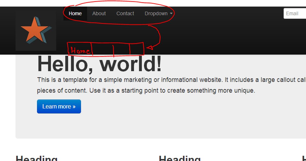
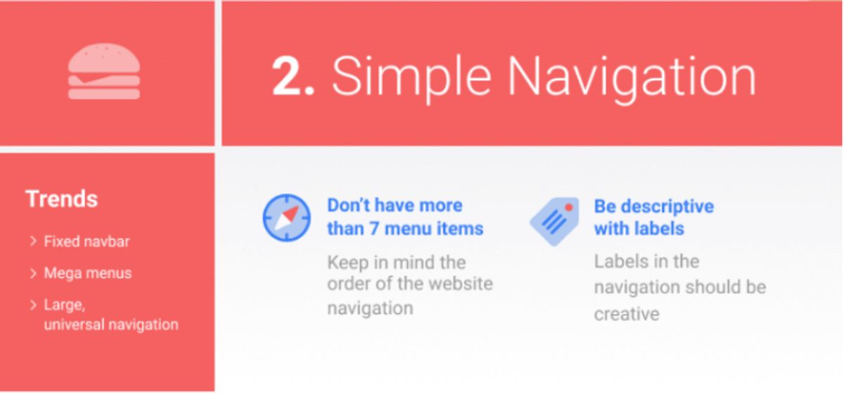
Designing Clear and Logical Navigation Structures
To create a flawless navigation design, it’s essential to keep navigation options concise and straightforward. Users should not be burdened with complex decisions or intricate paths. Instead, they should find a clear and consistent menu structure that guides them effortlessly through the site’s content.
- Clear and Consistent Menu Structure: Ensure that your menu is intuitive, with logical categorization and straightforward labels.
- Breadcrumbs: Include breadcrumbs to help users understand their current location and navigate back without confusion.
- Search Functionality: Incorporate a search bar to allow for quick content retrieval, enhancing the overall user experience.
By simplifying navigation and avoiding excessive dropdowns, we can significantly improve user engagement and satisfaction. This approach not only makes the site more accessible but also supports better user flow and interaction.
Remember, the goal is to reduce friction points and make the journey through your website as smooth as possible. Analyzing user behavior and leveraging analytics can provide valuable insights into how to optimize navigation paths for your audience.
Implementing Responsive and Accessible Menus
In the era of mobile-first design, ensuring that your website’s navigation is optimized for mobile devices is paramount. Responsive menus that adapt to various screen sizes provide a consistent experience across all devices. This not only caters to the growing number of mobile users but also aligns with accessibility standards, making your website more inclusive.
To build an accessible dropdown menu, start with a basic HTML structure using semantic elements. This foundational step is crucial for accessibility and usability.
It’s essential to limit the number of clicks required to reach a destination within your website. A streamlined user journey reduces frustration and enhances the overall user experience. Here are some key considerations for implementing responsive and accessible menus:
- Utilize familiar design patterns, like the hamburger menu, for mobile optimization.
- Keep menus concise to avoid clutter and confusion.
- Ensure easy-to-tap buttons and interactive elements for touch screens.
- Conduct user testing to identify and rectify usability issues.
By focusing on these aspects, you can create a navigation system that is both intuitive and accommodating to all users.
Optimizing the User Journey for Enhanced Engagement
Analyzing User Flow to Improve Navigation Paths
To create a seamless navigation experience, it’s essential to analyze user flow meticulously. This involves understanding how different segments of your audience interact with your website. By tracking their journey, you can identify common paths that lead to conversion and areas where users may encounter friction.
A deep dive into user behavior can reveal insights that transform the user journey from satisfactory to exceptional.
For instance, consider the following steps to optimize user flow:
- Review analytics to pinpoint popular entry and exit points.
- Map out the most frequented navigation paths and highlight any common drop-off points.
- Conduct A/B testing to compare the effectiveness of different navigation structures.
- Implement changes based on data-driven insights and user feedback.
By continuously monitoring and refining the navigation paths, you can reduce friction points and enhance user engagement, ultimately leading to improved conversion rates.
Leveraging Analytics for Data-Driven Navigation Design
In the quest to optimize the user journey, leveraging analytics is pivotal for data-driven navigation design. By analyzing user behavior, site owners can identify patterns and trends that inform strategic changes to the navigation structure. For instance, high bounce rates on specific pages may indicate confusing navigation or lack of relevant content, prompting a redesign or content update.
Analytics provide a wealth of information that, when interpreted correctly, can lead to significant improvements in user experience and engagement.
A systematic approach to leveraging analytics involves several key steps:
- Collecting comprehensive data on user interactions and flow.
- Identifying the most visited pages and paths taken by users.
- Pinpointing areas where users encounter difficulties or drop off.
- Testing variations of navigation layouts to determine the most effective design.
By continuously monitoring and analyzing website data, businesses can create a navigation experience that not only meets user expectations but also drives engagement and conversions.
Reducing Friction Points for a Smoother User Experience
To enhance user engagement and satisfaction, it’s essential to minimize friction points within the website navigation. This involves streamlining the user’s journey from the initial landing page to the desired destination. Simplifying navigation structures and employing clear labels can significantly reduce user confusion and drop-offs. For instance, incorporating sticky navigation bars ensures that users always have access to the main menu, regardless of their position on the page.
A seamless user experience is underpinned by swift and responsive website performance. Optimizing page load speeds through techniques such as image compression, script minification, and caching can lead to a more fluid navigation experience.
Additionally, regular website health audits play a crucial role in maintaining an intuitive UI/UX design. These audits help identify areas that may cause delays or errors, allowing for timely improvements. Below is a list of key actions to optimize website performance:
- Compress and optimize images while retaining quality
- Implement caching to save server resources and enhance user experience
- Minify CSS and JavaScript files to reduce HTTP requests
- Limit the use of external scripts to minimize third-party dependencies
By addressing these aspects, businesses can create a navigation experience that feels natural and effortless, encouraging users to stay engaged and complete their intended actions on the site.
Strategies for Effective Content Organization
Categorizing Content for Easy Discovery
To enhance user experience, categorizing content is crucial for easy discovery on a website. By organizing information into clear and relevant categories, users can navigate with ease and find the content they seek without frustration. This approach aligns with understanding user behavior and expectations, as it simplifies the search process and leads to a more intuitive user journey.
Effective categorization involves several key practices:
- Assign relevant categories to your content to reflect the main topics of your website. This allows users to explore related content with ease.
- Display related posts using plugins or tools that suggest content based on the user’s current viewing, encouraging further exploration.
- Include category links within posts or pages, linking to relevant category pages that encompass related content.
- Optimize category pages for SEO with keyword-rich content and relevant internal links.
By leveraging related posts and categories, website owners can guide users to more content they may be interested in, enhancing the overall user experience.
Remember, the more you know about your customers, the better you can cater to their content preferences, making personalization a powerful tool in content categorization.
Using Breadcrumbs and Related Links to Guide Users
Breadcrumbs and related links serve as essential tools for enhancing website navigation, providing users with a clear path to trace their journey and discover additional relevant content. Effective website navigation is enhanced by breadcrumbs and interactive elements, improving user experience and SEO. Intuitive menu structures and leveraging breadcrumbs streamline navigation for better usability and engagement.
To effectively implement breadcrumbs and related links, consider the following steps:
- Assign relevant categories to your content to facilitate easy exploration of related topics.
- Display related posts using plugins or tools that suggest content based on the user’s current engagement.
- Periodically review and update related posts to ensure they remain relevant and valuable.
By thoughtfully integrating breadcrumbs and related links, websites can create a cohesive and user-friendly environment that encourages deeper engagement and exploration.
Remember, the goal is to reduce friction points and guide users effortlessly through your site’s content. Balancing aesthetic design with functional layouts, including these navigational aids, can significantly enhance the overall user experience.
Balancing Aesthetic Design with Functional Layouts
When it comes to web design, balancing aesthetics with functionality is crucial for a seamless user experience. A visually appealing site can attract and retain visitors, but if they can’t navigate it easily, they’ll leave frustrated. Designers must ensure that the visual elements do not overshadow the site’s usability.
By focusing on the user’s journey, designers can create a layout that is both beautiful and intuitive. This involves understanding the psychological weight of visual placement and the power of negative space to guide the user’s gaze.
For example, consider the strategic use of directional shapes within negative space to create a seamless visual flow. This not only enhances the visual hierarchy but also contributes to a more engaging and intuitive user experience. Additionally, capitalizing on the natural reading pattern allows for a clear visual hierarchy, ensuring that key content receives the focus it deserves.
Here are some principles to consider when integrating aesthetics and functionality:
- Activating negative space to harness the power of emptiness
- Establishing a clear visual hierarchy
- Crafting emotion through strategic design
- Ensuring every design element serves a purpose
Ultimately, the goal is to deliver a product that users will find both attractive and easy to use, leading to higher engagement and satisfaction.
Incorporating Advanced Features for Seamless Interaction

Integrating Search Functionality and Filters
Incorporating a search functionality into your website is akin to providing a personal assistant for your visitors, guiding them swiftly to the information they seek. A well-designed search bar, typically consisting of a text field and a search button placed horizontally adjacent, can significantly enhance the user experience, especially on data-rich or complex websites.
Effective search implementation should include features like auto-complete suggestions and filters, which help users refine their queries and reach desired content with precision.
Understanding user search behavior through testing and monitoring is crucial for continuous improvement. It allows you to adjust navigation and content to better meet user needs and to identify any inconsistencies in user interactions. This proactive approach can reveal areas for enhancement, ensuring that users find accurate information without clicking on irrelevant elements.
Utilizing Mega Menus for Complex Site Structures
Mega Menus have become a staple in managing complex site structures, offering a comprehensive overview of available content at a glance. They enable users to see all their options simultaneously, without the need to scroll or navigate away from the current page. This approach aligns with the principle of providing the shortest possible route to desired content, as highlighted in the snippet about crafting the ideal Avada Mega Menu.
When designed effectively, Mega Menus can balance aesthetics with functionality, ensuring that users are not overwhelmed by choices. To achieve this, consider the following steps:
- Organize menu items into logical groups.
- Use clear, descriptive labels for each section.
- Implement visual hierarchy to guide the eye.
- Ensure that the menu is fully responsive across devices.
By leveraging AI for user navigation, websites can offer personalized menu options, further enhancing the user experience.
Remember, while Mega Menus can significantly improve navigation for complex websites, they must be used judiciously to avoid clutter and maintain professionalism. Regular testing and analytics can help measure their effectiveness and inform continuous improvements.
Adopting Predictive Navigation for Anticipatory Design
Predictive navigation is at the forefront of enhancing user experience by anticipating user needs and facilitating a more intuitive journey through a website. By analyzing past user behavior, websites can dynamically adjust their navigation options, presenting the most relevant content and reducing the time spent searching. This proactive approach aligns with the growing trend of personalized user experiences, where AI-driven solutions tailor the digital landscape to individual preferences.
Predictive navigation systems leverage data to create a seamless user experience, often resulting in increased user satisfaction and engagement.
To implement predictive navigation effectively, consider the following steps:
- Collect and analyze user data to understand behavior patterns.
- Utilize machine learning algorithms to predict future actions.
- Continuously refine the system based on user interactions and feedback.
This strategy not only improves the user experience but also supports business goals by encouraging deeper exploration of the website’s content and services.
Maintaining and Improving Navigation Post-Launch

Conducting Regular Website Health Audits
To maintain a high standard of user experience, regular website health audits are essential. These audits encompass a variety of checks and balances designed to ensure that your website remains secure, responsive, and user-friendly.
Regular A/B testing, mobile optimization, and accessibility improvements are key to enhancing user experience. It’s crucial to maintain security standards through updates, audits, and usability enhancements.
A comprehensive website health audit should include, but not be limited to, the following areas:
- Performance analysis to identify slow-loading elements
- Security checks for vulnerabilities and outdated components
- SEO assessments to ensure visibility and ranking
- Usability evaluations to confirm intuitive user interactions
By addressing these areas, you can preemptively tackle issues that may deter users from engaging with your site. Post-launch, it’s imperative to monitor and ensure quality assurance, adapting to user feedback and technological advancements.
Implementing User Feedback for Continuous Improvement
Incorporating user feedback is essential for the continuous improvement of a website’s navigation. By actively seeking out and analyzing feedback, web developers and designers can pinpoint areas that may cause confusion or frustration. A structured approach to collecting and implementing feedback can be summarized in a few key steps:
- Step 1: Ask for feedback at various interaction points.
- Step 2: Collect feedback in a centralized location for ease of analysis.
- Step 3: Analyze feedback to identify common themes and issues.
- Step 4: Implement changes based on user suggestions and observed behavior.
- Step 5: Notify users about the improvements made and invite further feedback.
It’s not just about making changes; it’s about creating a dialogue with users where their input is valued and acted upon.
Tools like Hotjar, which offer screen recording and heatmaps, are invaluable for interpreting user feedback and turning it into actionable insights. By leveraging such tools, businesses can ensure that their website remains user-centric and evolves in line with user needs and expectations.
Monitoring Performance to Ensure Speed and Reliability
Maintaining optimal website performance post-launch is not just about fixing bugs; it’s about ensuring a consistently fast and reliable user experience. Regular performance monitoring is crucial to detect any issues that could affect site speed and stability. Tools like PageSpeed Insights offer immediate insights into your website’s performance, providing actionable reports to help you make necessary adjustments.
By continuously tracking key performance metrics, you can preemptively address potential slowdowns before they impact your users.
To systematically approach performance monitoring, consider the following steps:
- Implement real-time monitoring tools such as New Relic or Datadog for instant alerts on performance dips.
- Schedule regular website health audits to identify areas for improvement.
- Analyze server logs to pinpoint recurring issues or bottlenecks.
- Optimize website assets, including images and scripts, to ensure quick load times.
Remember, a website that performs well directly contributes to higher user satisfaction, engagement, and conversion rates.
Ensuring your website remains navigable and user-friendly after launch is crucial for retaining visitors and improving their experience. At [Highlight], we specialize in WordPress Development, including performance optimization and website health audits, to keep your site running smoothly. Don’t let post-launch challenges hinder your online success. Visit our website to learn more about our services and how we can help you maintain and enhance your website’s navigation.
Conclusion
In conclusion, seamless website navigation is a critical factor in enhancing user experience and driving successful business outcomes. By simplifying navigation, employing intuitive design, and ensuring consistency across the site, businesses can facilitate effortless exploration for users, leading to increased engagement and higher conversion rates. The strategies and insights discussed throughout this article serve as a guide to creating navigation that not only meets user expectations but also supports the overall objectives of your website. Remember, the smoother the navigation, the more enjoyable the journey for your users, making them more likely to return and advocate for your brand. As we continue to evolve in a digital-first world, prioritizing seamless navigation is not just a best practice—it’s a necessity for staying competitive and relevant in the ever-changing online landscape.
Frequently Asked Questions
What are the best practices for designing intuitive website navigation?
Best practices include understanding user behavior, creating a clear and logical navigation structure, ensuring responsiveness and accessibility, categorizing content effectively, and maintaining a balance between aesthetic design and functionality.
How can website navigation impact user engagement and conversion rates?
Well-designed navigation facilitates seamless exploration, enhances user satisfaction, and promotes engagement, which can lead to increased conversion rates and better business outcomes.
What role do analytics play in optimizing website navigation?
Analytics provide insights into user flow and behavior, allowing designers to make data-driven decisions to improve navigation paths and reduce friction points for a smoother user experience.
How important is it to incorporate advanced navigation features like search functionality and mega menus?
Advanced features such as search functionality and mega menus can greatly improve the user experience by making it easier for users to find information quickly, especially on complex websites.
What should be done to maintain and improve website navigation post-launch?
Post-launch, it’s important to conduct regular website health audits, implement user feedback for continuous improvement, and monitor performance to ensure speed and reliability.
How does website performance optimization affect user experience?
Website performance optimization, including speed and loading time, leads to higher conversion rates, better user experience, visitor engagement, and improved search engine rankings.