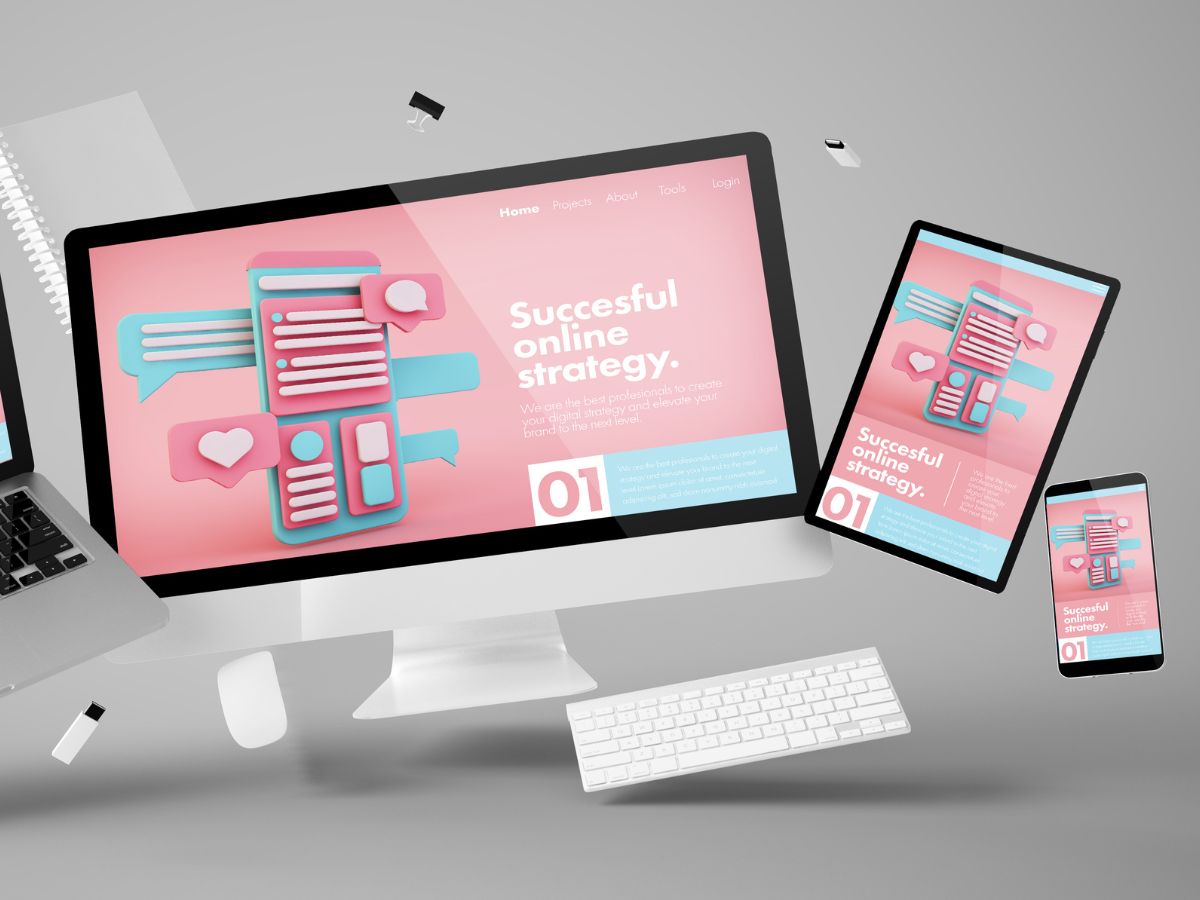
Enhancing User Experience with Seamless Website Navigation

In the digital age, a website’s navigation system is not just a tool; it’s the backbone of user experience. A seamless and intuitive navigation structure ensures that users can easily find what they’re looking for, which is critical for engagement and conversion. This article will explore the essentials of crafting a navigation system that not only meets user expectations but also enhances their interaction with your website. From the basics of intuitive design to advanced techniques and performance optimization, we’ll delve into strategies that create a navigational experience so fluid that users move through your site with ease.
Key Takeaways
- Intuitive website navigation is predicated on understanding user behavior and expectations, ensuring clarity and consistency, and incorporating responsive design.
- Optimizing website structure involves creating a strategic layout, using breadcrumbs for easy tracking, and considering accessibility for a diverse audience.
- Advanced navigation techniques like mega menus and AI-driven personalized paths can significantly enhance the user experience for complex and dynamic websites.
- Website performance, including speed optimization, caching, and efficient coding, is crucial for smooth navigation and overall user satisfaction.
- Continuous improvement through analytics, A/B testing, and adapting to emerging trends is essential for maintaining effective website navigation.
The Fundamentals of Intuitive Website Navigation
Understanding User Behavior and Expectations
To create a website that resonates with users, it’s essential to grasp their behavior and expectations. This involves analyzing user data and identifying patterns that reveal preferences and needs. For instance, understanding the goals of users on a fitness app can guide the creation of a customer-centric interface.
- Conduct user interviews and surveys to gather direct insights into pain points and preferences.
- Examine inconsistencies in user behavior to pinpoint areas for improvement.
- Implement search functionality to address user needs efficiently.
By deeply understanding the target audience, including demographics and specific needs, we can tailor the website navigation to enhance user engagement and satisfaction.
Effective navigation is not static; it evolves with the user’s journey. Tracking conversions, performance, and user interaction allows for continuous refinement, ensuring that the website remains aligned with user expectations and behaviors.
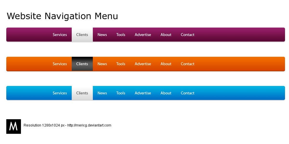
Designing for Clarity and Consistency
To achieve a flawless navigation design, it’s essential to keep navigation options concise and straightforward. Users should not be faced with complex decisions or jargon that could hinder their experience. Instead, focus on clear language that resonates with your target audience, ensuring that every user can navigate your site with ease.
- Consistency is key in creating an intuitive user experience. This includes maintaining uniformity in visual styles, interactions, and terminology.
- Simplicity is paramount. Aim to provide clear paths and minimize user journey friction by eliminating unnecessary elements.
- Ensure that your navigation is clear and predictable, with a menu that is easily visible and consistently placed.
- Organize your content with a logical information hierarchy, grouping related information and using clear headings for easy scanning.
By reducing cognitive load and enhancing user trust, a consistent and clear navigation structure empowers users to interact with your website confidently, leading to higher satisfaction and engagement.
Remember, a predictable and learnable interface, with repeated visual treatments for common UI patterns, allows users to apply their knowledge efficiently when navigating your site. Error messages should be devoid of technical terms and provide enough context to guide users forward.
Implementing Responsive and Adaptive Design
In the realm of web development, responsive design is not just a trend but a principle. By employing fluid grids, flexible images, and media queries, it allows content to flow seamlessly across different screen sizes, ensuring that users have a consistent experience regardless of the device they use. This approach is crucial for maintaining user engagement and satisfaction in a multi-device world.
Adaptive design takes a slightly different route. It detects the device and other features and then provides the optimal layout based on predefined screen sizes. This can lead to faster load times and a more tailored experience, but it requires more maintenance and is less fluid than responsive design.
Both responsive and adaptive designs aim to enhance user experience but choose different paths to achieve the same goal. The choice between them should be informed by the specific needs of the website and its audience.
Understanding the differences and applications of these design strategies is essential for developers and designers alike. Here’s a quick comparison:
- Responsive Design: One size fits all approach. Content adjusts dynamically to fit the screen size.
- Adaptive Design: Multiple fixed layout sizes. Content is optimized for specific devices.
AM2 Studio’s commitment to excellence from strategy to maintenance aligns with these principles, ensuring that the user experience is at the forefront of their design and development processes. Meanwhile, the distinction between adaptive and responsive design is well articulated in the title ‘Adaptive vs Responsive Web Design: Understanding the Differences,’ highlighting the importance of choosing the right approach for your website.
Optimizing Website Structure for Enhanced Usability
Strategic Layout and Content Hierarchy
A strategic layout and content hierarchy are crucial for creating a user-friendly website that guides visitors effortlessly through your content. Clear labeling and hierarchy ensure that users can navigate your site with ease, finding the information they need without confusion. A logical structure, with related content grouped together and the most important information prioritized, enhances the overall user experience.
Effective content organization reduces user effort and frustration. By implementing a consistent layout across the site, users become familiar with the navigation patterns, which helps in building a seamless browsing experience. Thoughtful visual hierarchy, using techniques such as size, color, and placement, directs attention to key elements, encouraging desired actions from users.
To truly optimize user experience, it’s essential to consider the performance aspects of your website. Speed optimization, through image compression, caching, and script minification, not only improves navigation but also boosts search engine visibility.
Lastly, it’s important to regularly review and update the website’s structure to adapt to user feedback and changing behaviors. This ensures that the navigation remains intuitive and the content hierarchy relevant.
Utilizing Breadcrumbs and Clear Categorization
Breadcrumbs serve as a critical navigational aid on websites, guiding users through the site’s hierarchy and enabling them to trace their steps back to higher-level pages. This feature not only enhances user experience but also supports better SEO by defining a clear path for search engines to follow.
Effective categorization goes hand in hand with breadcrumbs. By organizing content into distinct, logical categories, users can navigate with ease and find related content without confusion. Here’s a simple breakdown of how to implement these features:
- Breadcrumbs: Display the path from the home page to the current page, using ‘>’ as a separator (e.g., Home > Category > Subcategory > Article).
- Categories: Group related pages together and label them clearly to establish a hierarchy.
- Subcategories: Use subcategories to further refine groupings within larger categories.
Accessibility is paramount when considering diverse audiences. Ensure that all navigational elements are keyboard-navigable and screen-reader friendly to accommodate users with disabilities.
By thoughtfully integrating breadcrumbs and clear categorization, websites can offer a more structured and intuitive navigation experience, ultimately leading to increased user satisfaction and retention.
Accessibility Considerations for Diverse Audiences
Creating an accessible website is not just a matter of compliance; it’s a fundamental aspect of providing a positive user experience for everyone. Accessibility should be integrated into the design process from the start, ensuring that all users, including those with disabilities, can navigate and interact with your site effectively.
- Perceivable: Information and user interface components must be presentable to users in ways they can perceive. This includes text alternatives for non-text content and captions for videos.
- Operable: User interface components and navigation must be operable. This means that the website must be navigable by keyboard for users who cannot use a mouse, and it should offer sufficient time for users to read and use content.
- Understandable: Information and the operation of the user interface must be understandable. This involves using clear and concise language and predictable navigation patterns.
- Robust: Content must be robust enough to be interpreted reliably by a wide variety of user agents, including assistive technologies.
By prioritizing accessibility, you not only open your website to a wider audience but also often improve the overall usability for all users. Simple, consistent, and responsive design elements are key to achieving an inclusive digital space.
Remember, accessibility is an ongoing commitment. Regularly reviewing your site with accessibility checks and user feedback is essential for maintaining an inclusive environment. This proactive approach ensures that your website evolves alongside emerging web trends and user behaviors, maintaining optimal usability through effective navigation and information architecture.
Leveraging Advanced Navigation Techniques

Incorporating Mega Menus for Complex Sites
Mega menus are a powerful tool for websites with extensive content, such as e-commerce platforms. They provide a comprehensive overview of the site’s offerings, allowing users to access all pages from a single location. To ensure a positive user experience, it’s crucial to balance item categories and use clear labels. Visual hierarchy plays a significant role in guiding users through the menu, making it easier to find what they’re looking for.
When designed effectively, mega menus can make browsing efficient and prevent the feeling of being overwhelmed. It’s important to structure content thoughtfully, keeping the most important items at the top level.
Additionally, mega menus should be designed with accessibility and mobile responsiveness in mind. Implementing responsive and adaptive design techniques ensures that all users, regardless of device, can navigate your site seamlessly. Remember, the goal is to enhance the user experience, not to complicate it with decision paralysis.
Dynamic Navigation Based on User Interaction
Dynamic navigation tailors the user journey through a website based on their interactions, creating a personalized experience that can significantly boost engagement and satisfaction. By analyzing user behavior, websites can adapt in real-time, presenting the most relevant content and options to each visitor. This approach not only enhances the user experience but also streamlines the path to conversion.
For instance, an e-commerce site might adjust its navigation menu to highlight previously viewed categories or suggest items related to past purchases. Similarly, a content-rich platform could dynamically generate links to articles that align with the user’s reading history. Below is a list of benefits that dynamic navigation offers:
- Personalized user experience
- Increased relevance of displayed content
- Improved user engagement and retention
- Streamlined conversion pathways
Embracing dynamic navigation requires a deep understanding of user behavior and a robust technological framework to implement changes on the fly. It’s a strategy that places the user at the center of the design process, ensuring that their needs and preferences are anticipated and met with every click.
As we move towards more interactive website design, it’s clear that dynamic navigation is not just a trend but a fundamental shift in how we think about user experience. It’s about creating a dialogue between the user and the website, where each interaction informs the next, making the entire experience feel more intuitive and responsive.
Utilizing AI for Personalized Navigation Paths
The integration of Artificial Intelligence (AI) into website navigation is revolutionizing the way users interact with online platforms. AI-driven systems analyze user behavior to provide tailored navigation paths, enhancing the overall user experience. By predicting user preferences and suggesting relevant content, AI ensures that each visitor’s journey is both efficient and personalized.
AI’s predictive capabilities not only improve user satisfaction but also increase the likelihood of achieving business goals, such as higher engagement rates and conversions.
To illustrate the impact of AI on navigation, consider the following points:
- AI algorithms can dynamically adjust website menus and content displays based on user interaction history.
- Personalized recommendations encourage users to explore deeper into the site, potentially discovering products or information they hadn’t initially sought.
- Real-time adjustments to navigation structures can reduce bounce rates by keeping users engaged with relevant content.
By leveraging technology for improved navigation and utilizing AI to predict user navigation patterns, websites can create a more intuitive and seamless experience for their visitors.
Improving Site Performance for Smooth Navigation

Speed Optimization and Its Impact on UX
The correlation between website speed and user experience is undeniable. Fast-loading websites not only retain visitors but also encourage deeper engagement. A swift website minimizes frustration and maximizes user satisfaction, leading to a more positive interaction with your brand.
Speed optimization is a crucial factor that influences SEO rankings. Faster page loading speeds can improve the user experience, which in turn can lead to better search engine positioning and increased visibility.
Here are some key steps to enhance website speed:
- Compressing images while maintaining quality.
- Implementing caching to save server resources and speed up content delivery.
- Minifying CSS and JavaScript files to reduce load times.
- Reducing the use of external scripts to decrease the number of HTTP requests.
By focusing on these areas, businesses can see a notable improvement in performance metrics such as bounce rates, conversion rates, and overall customer satisfaction. Remember, even a one-second delay can significantly impact conversions, making speed optimization an essential aspect of website maintenance.
The Role of Caching and Content Delivery Networks
To achieve a seamless user experience, speed is of the essence. Caching and Content Delivery Networks (CDNs) are pivotal in enhancing website performance. Caching stores copies of files in a temporary storage location so that they can be accessed more quickly. CDNs, on the other hand, distribute the load by serving the website from multiple locations closer to the user, thus reducing latency.
By leveraging both caching and CDNs, websites can significantly decrease load times and improve user satisfaction.
Here are some key benefits of using caching and CDNs:
- Reduced Latency: By serving content from the nearest server to the user, CDNs minimize delays.
- Bandwidth Savings: Caching frequently accessed files reduces bandwidth consumption.
- Scalability: CDNs can handle traffic spikes without compromising performance.
- Enhanced Security: CDNs can provide additional security layers, such as DDoS protection.
Understanding the difference between caching and CDNs is crucial for website optimization. While both aim to improve performance, they do so through different mechanisms. Caching is about storing content locally to avoid repeated downloads, whereas CDNs distribute content across a network to optimize delivery speed.
Minimizing Load Times with Efficient Code and Image Optimization
Ensuring a swift website experience is pivotal for user satisfaction. Optimizing images and streamlining code are essential steps in reducing load times. Image compression without sacrificing quality is a key activity that can significantly speed up your website. Similarly, minifying HTML, CSS, and JavaScript files by removing unnecessary characters can reduce file sizes and improve load times.
By focusing on efficient code and image optimization, websites can achieve faster page speeds, which not only enhances user experience but also benefits search engine ranking positions (SERPs).
Implementing caching techniques, such as browser and server-side caching, can also lead to quicker subsequent page visits. Additionally, optimizing database queries and enabling Gzip compression can further improve website performance. Here’s a quick checklist to ensure your website is optimized for speed:
- Compress images while retaining quality
- Minify HTML, CSS, and JavaScript files
- Implement browser and server-side caching
- Optimize database queries
- Enable Gzip compression
Remember, a faster website not only retains users but also contributes to higher conversion rates and customer satisfaction.
Monitoring and Evolving Navigation Strategies
Using Analytics to Understand Navigation Patterns
The valuable ally in your path to enhance website navigation is the usage of insights through analytics. Tools like Google Analytics are helpful in this regard. You can track user behavior by analyzing metrics like clicks on navigation elements, time spent on diverse pages, bounce rates, and so on to understand how users interact with your site’s navigation.
Analytics are crucial for revealing how users actually interact with your navigation. Heatmaps and click tracking tools can uncover areas where users may get stuck or important pages that are being overlooked. This data is instrumental in making informed decisions to optimize the navigation structure.
With insights from analytics, website owners can optimize their navigation and improve the overall user experience.
A/B testing is another powerful tool that allows you to compare variations against the current design. This method helps in identifying which navigation elements engage users more effectively and lead to better conversion rates. Implementing search functionality is also a key aspect of enhancing navigation, making it easier for users to find what they are looking for.
A/B Testing for Continuous Improvement
A/B testing is a powerful tool in the arsenal of user experience enhancement. By creating multiple versions of a website or its elements, such as navigation menus or call-to-action buttons, and presenting them to different segments of users, we can gather valuable data on performance. Metrics like click-through and conversion rates provide insights into which designs are most effective, allowing for informed decisions that lead to a better user experience.
Testing and iterating is an ongoing process that ensures continuous improvement and keeps up with evolving user preferences.
Incorporating A/B testing into the development cycle is not just about identifying the superior option, but also about understanding user behavior and preferences. A structured approach to A/B testing might include the following steps:
- Define clear objectives for each test.
- Develop hypotheses based on user behavior data.
- Create variations for testing.
- Run the tests and collect data.
- Analyze the results and implement the winning design.
- Repeat the process to refine and optimize continuously.
By regularly refining navigation based on user behavior data, we can optimize website navigation and ensure a seamless user experience. This iterative process, supported by tools like analytics and heatmaps, helps in making data-driven decisions that contribute to the website’s success.
Adapting to Emerging Web Trends and User Behaviors
As the digital landscape evolves, so do the expectations and behaviors of users. Websites must adapt to stay relevant and provide a frictionless experience. To keep pace with emerging web trends, it’s essential to monitor user interactions and adapt navigation strategies accordingly. This continuous process ensures that navigation remains intuitive and efficient, even as new technologies and design paradigms emerge.
By embracing a user-centric approach, websites can evolve alongside their users, fostering loyalty and improving engagement.
Understanding that user behavior is not static, here are some steps to consider:
- Regularly review analytics to identify changing patterns in navigation.
- Implement A/B testing to refine navigation elements based on real user data.
- Stay informed about new web technologies and design trends that could influence user expectations.
- Encourage feedback from users to gain insights into their needs and preferences.
Adapting to user behavior is not just about adopting new trends; it’s about creating a seamless experience that resonates with users and encourages them to return.
As the digital landscape continues to evolve, so must our strategies for navigating it. At the heart of any successful online presence is a robust and adaptable navigation system. Our team at [Your Company Name] specializes in crafting custom web solutions that grow with your business, ensuring that your website remains efficient, user-friendly, and ahead of the curve. Don’t let your online strategy become outdated—visit our website to learn how we can support your navigation needs and drive your business forward.
Conclusion
In conclusion, seamless website navigation is a critical component of user experience that can significantly influence the success of a website. By implementing intuitive and responsive design elements, optimizing for speed and accessibility, and ensuring clear and consistent navigation paths, businesses can foster a positive user journey that encourages engagement and conversion. The strategies and insights discussed throughout this article serve as a guide to creating a navigation experience that not only meets but exceeds user expectations. Remember, the goal is to make the user’s journey through your website as effortless and enjoyable as possible, ultimately leading to increased satisfaction and business growth.
Frequently Asked Questions
What are the key components of intuitive website navigation?
Intuitive website navigation typically includes a clear and consistent layout, responsive design, easy-to-use menus, and visual indicators such as breadcrumbs and highlighted links that help users understand their location on the site.
How does responsive design improve website navigation?
Responsive design ensures that a website’s navigation elements adapt seamlessly to various screen sizes and devices, providing a consistent user experience that is easy to navigate regardless of how users access the site.
What are the benefits of optimizing website speed for navigation?
Optimizing website speed enhances user experience by reducing load times, which can lead to increased user engagement, lower bounce rates, and improved conversion rates. It also contributes to better search engine rankings.
How can mega menus be used effectively for complex sites?
Mega menus can effectively organize and display large amounts of content in a structured and accessible way, allowing users to quickly find the information they need without navigating through multiple pages.
Why is monitoring post-launch navigation important?
Monitoring post-launch navigation helps identify any issues or areas for improvement, ensuring that users continue to have a seamless experience. It also allows for the optimization of navigation elements based on user behavior.
What role does A/B testing play in improving website navigation?
A/B testing allows website owners to compare different navigation layouts and elements to determine which ones perform better in terms of user engagement and conversion rates, leading to a more effective navigation strategy.