Enhancing User Experience with Seamless Website Navigation

Navigating a website should be an effortless and intuitive experience, akin to gliding through the aisles of a well-organized library. In the digital realm, seamless website navigation is not just about helping users find what they are looking for; it’s about enhancing their overall experience. By prioritizing user-centric design, websites can become more than just collections of pages and links – they can transform into engaging, efficient, and memorable spaces that encourage exploration and interaction. This article delves into the strategies and principles that can elevate user experience through seamless website navigation.
Key Takeaways
- Effective website navigation is crucial for user retention and satisfaction, as it directly impacts the ease with which users can find information and complete tasks.
- A clear information hierarchy, intuitive menu structures, and responsive design are foundational elements that contribute to a seamless navigation experience.
- Optimizing website performance, including loading speed and image/script optimization, is essential for maintaining user engagement and reducing bounce rates.
- Incorporating UX design principles in web development ensures that functionality and aesthetics are harmoniously integrated, resulting in a cohesive user experience.
- Continuous improvement post-launch, through quality assurance testing, user feedback, and regular updates, is vital for sustaining a high-quality user experience.
The Role of Navigation in User Experience
Understanding Breadcrumb Navigation
Breadcrumb navigation is a critical component for enhancing user experience on websites. It provides a clear path for users to follow, tracing their journey from the homepage to their current location. This navigational aid not only simplifies the user’s ability to explore a website but also improves their overall experience by making it more intuitive.
Breadcrumb navigation is particularly useful on websites with multiple layers of content. It helps users maintain awareness of their context within the site’s hierarchy without cluttering the interface.
Here are some key benefits of using breadcrumb navigation:
- It allows users to keep track of their locations within complex websites.
- Breadcrumbs reduce the number of actions a user must take to return to higher-level pages.
- They provide shortcuts to previously visited pages, facilitating easy navigation.
By implementing breadcrumb navigation thoughtfully, websites can achieve a balance between functionality and design, leading to a more satisfying user journey.
Designing for Device Diversity
In the realm of web design, device diversity is a critical factor that can make or break the user experience. As users access websites from an array of devices, including smartphones, tablets, laptops, and desktops, it’s essential to ensure that your site is responsive and adaptable to various screen sizes and resolutions. This adaptability not only keeps users engaged regardless of their device but also favors your site’s ranking in search engine results.
Prioritizing accessibility is a cornerstone of designing for device diversity. It involves making design choices that cater to users with disabilities, such as ensuring color contrast ratios are sufficient, providing keyboard navigation, and ensuring compatibility with screen readers.
Maintaining uniformity across design elements like color schemes, typography, and button styles is also vital. It helps in creating a cohesive experience that fosters trust and recognition among users. Additionally, embedding feedback mechanisms can ensure that the product evolves according to user needs and preferences, leading to continuous improvement.
Here’s a list of essential considerations for device diversity in web design:
- Responsive design to accommodate different screen sizes
- Touchscreen-friendly interfaces for mobile and tablet users
- Scalable vector graphics (SVGs) for crisp visuals on all resolutions
- Media queries to adjust layout and content based on device capabilities
By integrating these practices, designers and developers can create websites that offer a seamless experience across all devices, which is a hallmark of AM2 Studio’s approach to web development.
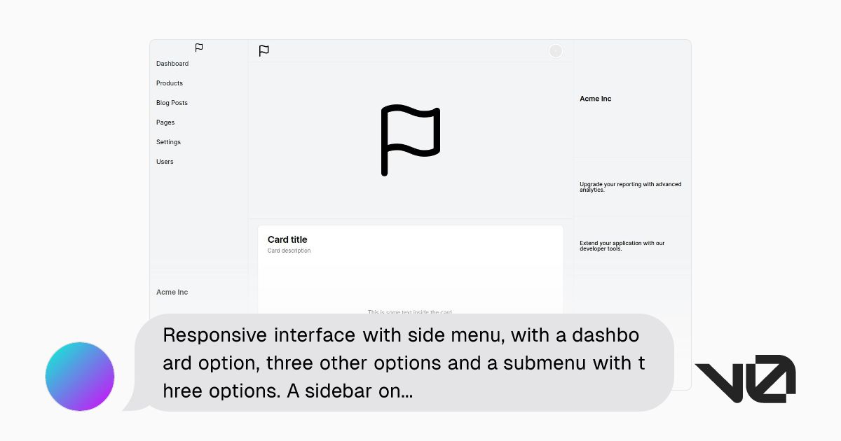
Implementing Intuitive Menu Structures
Creating an intuitive menu structure is pivotal for a seamless user experience. Users should be able to navigate through a website with ease, finding information quickly and efficiently. To achieve this, consider the following points:
- Emphasize Intuitiveness: Design with new users in mind, ensuring they can navigate without needing extensive tutorials. Utilize familiar UI patterns and clear labeling.
- Simplify the Interface: Avoid cluttered interfaces that can overwhelm users. Focus on core functionalities and use whitespace to highlight important elements.
A logical structure and digestible sections encourage user engagement and facilitate the accomplishment of their goals.
Additionally, responsive design ensures that the navigation adapts to different devices, enhancing engagement with the material. Remember, effortless navigation supports smooth transitions between pages, which is essential for user retention and satisfaction.
Strategies for Effective Information Architecture

Establishing a Clear Hierarchy
Establishing a clear hierarchy within a website’s structure is crucial for guiding users to the information they seek with ease. By prioritizing content and utilizing contrasting colors, clear typography, and strategic spacing, users can navigate through the site effortlessly.
For instance, a well-defined hierarchy ensures that essential information is immediately accessible, enhancing user satisfaction and reducing frustration. Consider the following steps to achieve a clear hierarchy:
- Use contrasting colors to differentiate between levels of importance.
- Employ clear and legible typography to facilitate quick comprehension.
- Strategically space elements to guide the user’s eye through the content.
A clear hierarchy not only aids in navigation but also contributes to a non-linear customer journey, allowing users to find what they need without unnecessary detours.
Remember, simplicity in design can lead to a more enjoyable user experience. Avoid clutter and focus on delivering a familiar layout that resonates with your audience.
Categorization and Labeling for Better Findability
Effective categorization and labeling are fundamental to a website’s information architecture, guiding users through a seamless journey from landing page to desired content. Clear and intuitive labels not only enhance findability but also contribute to a cohesive brand experience. To achieve this, consider the following points:
- Use familiar and consistent terminology across all categories.
- Ensure labels are concise and reflective of the content they represent.
- Group related items together to facilitate quick scanning by users.
By prioritizing user-centric design, we organize content to enhance navigation and optimize for various devices, ensuring consistency, simplicity, and a clear visual hierarchy.
Remember, the goal is to minimize user effort in locating information. This can be achieved by adopting a logical structure for categorization that resonates with the user’s expectations. For instance, an e-commerce site might organize products into categories such as ‘Men’s Clothing’, ‘Electronics’, and ‘Home & Garden’, with further subdivisions as needed. Here’s a simplified example of how this might look:
| Category | Subcategory | Items |
|---|---|---|
| Men’s Clothing | Shirts | Casual, Formal |
| Electronics | Mobile Phones | Smartphones, Accessories |
| Home & Garden | Furniture | Sofas, Tables |
By streamlining the path to information, we not only improve the user experience but also support the strategic goals of the website, such as increased engagement and conversion rates.
Balancing Aesthetics with Usability
While aesthetics capture the user’s attention, usability ensures their journey is smooth and purposeful. A website’s design should not only be visually appealing but also facilitate easy navigation and task completion. This balance is crucial for maintaining user engagement and satisfaction.
To achieve this equilibrium, designers must consider user expectations and behaviors, creating interfaces that are both intuitive and beautiful.
Key strategies include:
- Prioritizing accessibility to cater to a diverse audience, including those with disabilities.
- Emphasizing intuitiveness so that users can navigate without needing extensive guidance.
- Simplifying the interface to focus on core functionalities and avoid overwhelming users.
By integrating these principles, websites can deliver experiences that are not only aesthetically pleasing but also highly functional, leading to a seamless and engaging user experience.
Optimizing Website Performance for Enhanced UX

The Impact of Loading Speed on User Retention
The speed at which a website loads is a critical factor in retaining visitors. A slow or poorly performing website will likely lead to a higher bounce rate, affecting not just user satisfaction but also the overall perception of a brand. To combat this, it’s essential to analyze user behavior and optimize for fast load times. Utilizing analytics to identify issues, conducting A/B testing, and implementing speed optimization strategies can result in improved user satisfaction and business outcomes.
Fast loading times are not just a convenience; they are an expectation in today’s digital landscape. Ensuring that your website performs quickly and efficiently is a key component in providing a positive user experience.
Here are some steps to consider for optimizing your website’s performance:
- Use a high-quality host to ensure reliable performance.
- Implement caching to save resources and improve load times.
- Optimize images and scripts to reduce file sizes and request counts.
- Minify CSS and JavaScript to streamline code execution.
- Regularly update your website to maintain security and performance.
By focusing on these areas, you can enhance your website’s usability and ensure that visitors remain engaged, thereby increasing the likelihood of conversion and retention.
Image and Script Optimization Techniques
Optimizing images and scripts is a pivotal step in enhancing website performance. Compressing images before uploading them to your site can significantly reduce file sizes without compromising quality. For instance, aiming for a file size of 100kb or smaller per image can be a good benchmark. Plugins like WP Smush, Shortpixel, and Imagify can automate this process, ensuring that images are optimized as soon as they’re uploaded.
Script optimization involves minifying and rearranging code to reduce total page size and improve load order. Tools such as WP Rocket and Autoptimize can help achieve this by removing unnecessary spaces and optimizing the loading sequence of files. It’s important to configure these tools correctly to avoid affecting the functionality of essential scripts, such as ad scripts.
By implementing these optimization techniques, you can expect a smoother user experience, with faster loading times and improved site performance.
Remember to regularly check the effectiveness of your optimizations. Tools like Cloudinary’s webspeed test can provide insights into how well your images are compressed and highlight opportunities for further improvement.
Leveraging Caching for Smoother Interactions
Caching is a critical component in enhancing the user experience by ensuring that web pages load swiftly and efficiently. By storing frequently accessed data in a cache, websites can reduce server load and speed up response times. This not only improves the user experience but also conserves server resources.
Effective caching strategies involve a combination of server-level caching and browser caching. Server-level caching can be optimized by working with your hosting provider, while browser caching relies on setting appropriate cache headers to instruct browsers on how long to store the cached resources.
Caching is not just about speed; it’s about creating a seamless experience for the user, where interactions feel instantaneous and natural.
To implement caching effectively, consider the following steps:
- Collaborate with your hosting provider to maximize server-level caching.
- Utilize caching plugins or tools that complement your host’s setup.
- Configure cache headers for browser caching to leverage local storage.
- Regularly monitor and update your caching strategy to adapt to new content and changes in user behavior.
Remember, a well-implemented caching system can lead to significant improvements in website performance, which is a key factor in retaining users and encouraging repeat visits.
Integrating UX Design Principles in Web Development

Harmonizing Visual Design with Functionality
In the realm of web development, harmonizing visual design with functionality is a pivotal aspect of creating a user-friendly experience. Aesthetic appeal can capture users’ attention, but it is the seamless integration of design and function that keeps them engaged. To achieve this balance, certain principles must be adhered to.
- Maintain Uniformity: Consistency in design elements like color schemes, typography, and button styles fosters a seamless user experience, cultivating trust and recognition.
- Prioritize Accessibility: Designing with accessibility in mind broadens usability, ensuring that individuals with disabilities can navigate the site effectively.
- Embed Feedback Mechanisms: Incorporating user feedback channels into the design process allows the product to adapt to real user demands, enhancing the design iteratively.
By focusing on the user’s journey, developers can create interfaces that not only look appealing but also support users in achieving their goals with ease. This approach ensures that the visual elements serve a purpose beyond mere decoration, leading to a more intuitive and productive user interaction.
It is essential to remember that while visual aesthetics are meaningful, usability and comprehensibility should take precedence. A thorough understanding of users fosters designing experiences that cater directly to how people naturally interact online to fulfill their purposes productively.
Responsive Design for Cross-Device Compatibility
In today’s multi-device landscape, responsive design is no longer a luxury, but a necessity. A website must fluidly adapt to various screen sizes to ensure a consistent user experience across all devices. This adaptability not only keeps users engaged but also contributes to a site’s SEO rankings, as search engines favor user-centric designs.
Prioritizing accessibility is crucial when creating responsive designs. By considering factors such as color contrast ratios, keyboard navigation, and screen reader compatibility, designers can cater to a wider audience, including individuals with disabilities. Here are some key considerations for responsive design:
- Fluid grid layouts that adjust to any screen size
- Flexible images and media queries
- Readable and navigable text without the need for zooming
- Adequate touch target sizes for interactive elements
By strategically blending user experience design principles with technical construction, we can develop digital experiences that not only attract visitors but retain them through seamless interaction, regardless of device or ability.
Testing for cross-device compatibility is essential. The aim of responsive website design is to build web pages that look and function uniformly across all platforms. There are several methods to test and ensure that a website meets these standards, maintaining the integrity of the user experience.
User-Centric Approach to Interaction Design
Adopting a user-centric approach to interaction design is pivotal in creating a digital environment where users feel understood and their needs are prioritized. This approach involves a deep dive into user behaviors and preferences, ensuring that every aspect of the website is crafted with the end-user in mind.
- Optimizing navigation enhances user satisfaction by supporting their workflow and reducing unnecessary complexity.
- Designing for accessibility is not just about meeting legal requirements; it’s about inclusivity and ensuring usability for all, which in turn enhances the overall user experience.
By focusing on the users’ perspective, designers can create interfaces that are not only functional but also intuitive and enjoyable to use. This commitment to user-centricity can shape the digital product to offer maximum value, leading to increased user engagement and loyalty.
It’s essential to remember that good UX transcends aesthetics; it’s about creating experiences that resonate with users on a practical level. Through continuous adaptation to user feedback and maintaining clarity in design, we can weave a digital experience that truly delights and retains users.
Post-Launch Strategies for Continuous UX Improvement

The Importance of Quality Assurance Testing
Quality Assurance (QA) testing is a pivotal step in the web development process, ensuring that products and services meet or exceed customer expectations. It involves a variety of activities aimed at identifying and resolving defects, maintaining consistency, and fostering continuous improvement.
QA testing is not just about bug hunting; it’s about affirming the user-centric design of a website and its maintainability over time. Automation testing, user research, and performance optimization are integral to this process, contributing to a website’s longevity and inclusivity.
By implementing robust QA processes, organizations can proactively address potential risks before they escalate into more significant issues, safeguarding the user experience post-launch.
Post-launch, the QA team’s role shifts to vigilant monitoring, ensuring that any new bugs are swiftly identified and rectified. This ongoing commitment to quality is what ultimately builds trust and sustains business success.
Monitoring User Feedback and Behavior
Monitoring user feedback and behavior is a critical step in the continuous improvement of user experience (UX). By analyzing customer interactions and feedback, we can gain valuable insights into user needs and preferences. Tools such as heatmaps, session recordings, and usage data are instrumental in revealing which elements of your website are engaging and which areas may require enhancements.
Employing analytics is not just about collecting data; it’s about making informed design choices that resonate with users.
For example, instead of analyzing user behavior on every page, focus on those that are problematic. You can identify these pages through tools like Google Analytics. This targeted approach allows for efficient use of resources and more impactful improvements. Additionally, regular reviews of analytics and feedback post-launch can significantly enhance your understanding of how people use your digital offerings. With user-centricity as a guiding principle, design can be tailored to provide maximum value.
To systematically track and measure user interaction, consider the following steps:
- Utilize analytics to identify successful elements and areas for improvement.
- Implement tools that track conversions, performance, and user interaction.
- Learn from the data collected to suggest further enhancements.
- Follow up post-launch to identify new opportunities for improvement.
Regular Updates and Iterative Design
The digital landscape is ever-evolving, and websites must adapt to stay relevant and user-friendly. Regular updates and iterative design are not just about fixing bugs; they’re about enhancing functionality and ensuring that the user experience remains top-notch. By incorporating user feedback and analyzing usability, websites can evolve in a way that consistently meets user needs and expectations.
- Incorporate User Feedback: Actively seek out and apply user suggestions to improve the site.
- Analyze Usability: Use tools like heatmaps and session recordings to understand how users interact with your site.
- Iterative Improvements: Make small, continuous changes rather than large, infrequent updates.
Embracing a cycle of testing, feedback, and refinement leads to a more robust and user-centric website. This approach not only addresses user concerns but also anticipates future needs, fostering a sense of trust and loyalty among users.
Staying ahead requires vigilance and a commitment to excellence. Utilize analytics to inform design choices, and never underestimate the power of a well-timed update. As user preferences shift and new technologies emerge, the iterative process ensures that your website remains at the forefront of usability and design.
Launching your website is just the beginning. To truly excel in the digital space, continuous UX improvement is key. At [Highlight], we specialize in elevating your online presence through expert WordPress Development, eCommerce solutions, and a commitment to ongoing support and optimization. Don’t let your website become stagnant; visit us now to learn how we can help you keep your site dynamic, engaging, and ahead of the competition. Let’s make the digital world better, together.
Conclusion
In conclusion, seamless website navigation is a cornerstone of exceptional user experience. By implementing strategies such as clear information hierarchy, intuitive user interface design, and responsive layouts, businesses can ensure that their websites not only captivate users visually but also facilitate effortless interaction. The integration of UX design principles into web development is not merely a trend but a necessity in today’s digital landscape, where user satisfaction is paramount. As we’ve explored throughout this article, a well-designed navigation system can significantly enhance user engagement, satisfaction, and ultimately, conversion rates. Remember, a user’s journey through your website should be as smooth and straightforward as the information they seek. By prioritizing user-centric design, we pave the way for more accessible, enjoyable, and successful online experiences.
Frequently Asked Questions
What is breadcrumb navigation and how does it enhance UX?
Breadcrumb navigation is a secondary navigation system that shows a user’s location within a website’s hierarchy. It enhances UX by providing clear pathways, allowing users to easily switch between sections, and aiding in efficient navigation across various devices.
How important is device diversity in website design?
Designing for device diversity is crucial as it ensures that a website provides a responsive and seamless user experience across all types of devices, from desktops to smartphones, thereby improving user engagement and SEO rankings.
What are the benefits of a clear information hierarchy on a website?
A clear information hierarchy makes essential information easily accessible, enhancing user satisfaction, reducing frustration, and guiding users intuitively to find what they are looking for, which improves overall engagement with the website.
How does website performance optimization impact user experience?
Website performance optimization directly impacts user experience by reducing loading times, improving site responsiveness, and ensuring smooth interactions. Faster websites lead to higher conversion rates, better user engagement, and increased customer satisfaction.
Why is it important to integrate UX design principles in web development?
Integrating UX design principles in web development is important because it ensures that websites are not only visually appealing but also functionally intuitive, enabling users to accomplish their intended tasks without difficulty or frustration.
What post-launch strategies are essential for continuous UX improvement?
Essential post-launch strategies for UX improvement include quality assurance testing to remove bugs, monitoring user feedback and behavior to identify areas for enhancement, and implementing regular updates and iterative design to evolve with user needs.