Enhancing User Experience with Seamless Website Navigation
In the digital age, a website’s navigation can make or break the user experience. Seamless navigation not only satisfies users but also contributes to higher engagement, retention, and conversions. This article delves into the best practices for enhancing user experience through effective website navigation, ensuring that visitors can find what they’re looking for with ease and efficiency.
Key Takeaways
- Streamlined navigation is essential for guiding users through their online journey, reducing frustration and improving overall satisfaction.
- Optimizing for usability and accessibility ensures that all users, including those with disabilities, can navigate a website effortlessly.
- Website performance, including speed and reliability, is crucial for maintaining seamless navigation and preventing user drop-offs.
- Strategically laid out content with visual hierarchies and contextual aids like breadcrumbs enhances navigability and user understanding.
- Continuous monitoring and improvement post-launch, using analytics and user feedback, are key to refining navigation and maintaining a superior user experience.
Streamlined Navigation: Guiding User Journeys

Understanding User Behavior and Expectations
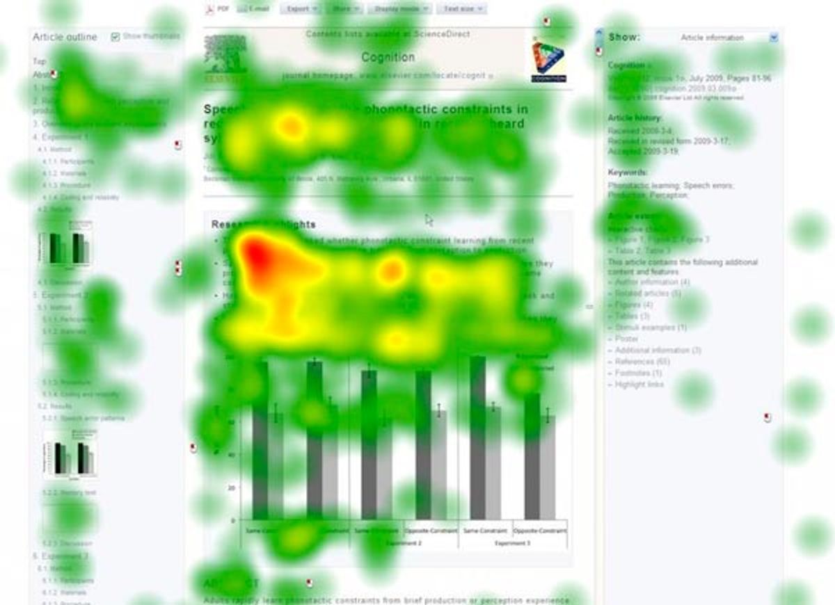
To enhance user experience, it’s essential to grasp the intricacies of user behavior and expectations. By observing and analyzing user behavior, designers can refine and optimize their interfaces to better align with user expectations and preferences. Tools like heatmaps can reveal navigation patterns, highlight popular click zones, and expose elements that visitors may ignore, providing valuable insights into user interactions.
A website’s success hinges on its alignment with the user’s mental model. Implementing the right measures based on user behavior analysis is crucial for a seamless navigation experience.
Understanding user behavior goes beyond mere observation. It involves a systematic approach to gather and analyze data, which can be structured as follows:
- Utilize analytics tools to gain insights into site usage patterns.
- Conduct user testing sessions to observe real interactions.
- Analyze feedback to inform UX design decisions.
- Implement tracking tools to measure performance and user interaction post-launch.
These steps ensure that the design decisions are informed and targeted towards creating a user-centric navigation system that resonates with the audience.
Designing for Clarity and Consistency
Achieving clarity and consistency in website navigation is paramount for a seamless user experience. By prioritizing simplicity, users find navigating your website intuitive and straightforward. This involves organizing content logically and maintaining a uniform design across all pages, which helps in building user familiarity and confidence.
- Clear Navigation: Ensure menus and navigation elements are easily discoverable and logically structured.
- Consistent Design: Use consistent visual elements, such as color schemes and typography, to create a cohesive look.
- Responsive Design: Implement responsive design practices to maintain navigation clarity across different devices.
By focusing on these aspects, you not only cater to user expectations but also foster a sense of predictability that enhances the overall user journey.
Remember, a well-designed navigation system acts as a roadmap to your content, guiding users effortlessly to their desired destination. It’s not just about aesthetics; it’s about creating a user-centric environment that resonates with your audience’s needs and behaviors.
Implementing Intuitive Site Architecture
To create a seamless and intuitive browsing experience, it’s essential to focus on user-focused information architecture. This involves organizing content in a way that reflects the logical structure of user expectations. Clear labels and a hierarchy that users can easily follow are crucial.
- Clear Navigation: Ensure menus and navigation elements are easily discoverable and guide users effectively.
- Consistent Design: Use consistent visual and functional design to help users navigate with ease.
- Fast Load Times: Optimize for quick loading to reduce frustration and abandonment.
By developing personas and using scenarios, you can frame your design decisions to better meet user needs. Sketching, wireframing, and prototyping are key steps in refining the site architecture.
Remember, an inconsistent interface can lead to confusion. Users have preconceived notions of how a website should function, and it’s important to align your navigation design with these habits. Analyzing user navigation patterns post-launch can provide insights for continuous improvement.
Optimizing for Usability and Accessibility
Ensuring Compatibility Across Devices
In the digital age, ensuring compatibility across devices is crucial for a seamless user experience. With a multitude of devices available, from smartphones to tablets and desktops, a website must provide a consistent and accessible experience on all platforms. This adaptability not only caters to user preferences but also contributes to better search engine rankings, as mobile responsiveness is a significant factor in search algorithms.
Responsive design principles are key to achieving cross-device harmony. By implementing fluid grids, flexible images, and media queries, websites can adapt their layout and functionality to any screen size, ensuring that content is always accessible and navigation remains intuitive. Consider the following aspects when optimizing for device compatibility:
- Media query adjustments for different screen resolutions
- Touchscreen-friendly navigation elements
- Scalable vector graphics for high-resolution displays
By prioritizing user experience on mobile devices, businesses can enhance customer satisfaction and potentially increase conversion rates.
Regular user feedback is invaluable for continuous improvement. It helps identify areas where the navigation might not be as device-friendly as intended, allowing for timely enhancements. This iterative process is essential for maintaining an optimal user experience across all devices.
Adhering to Web Accessibility Standards
Ensuring that your website is accessible to all users, including those with disabilities, is not just a legal requirement but also a moral imperative. Implementing web accessibility standards such as the Web Content Accessibility Guidelines (WCAG) can expand your audience and promote inclusivity. A WCAG compliance checker can be a valuable tool in this process, helping to certify that your website meets these essential standards.
By prioritizing accessibility, you not only comply with regulatory requirements but also enhance the overall usability of your site. This commitment can lead to a broader user base and lower bounce rates.
To effectively address web accessibility, consider the following best practices:
- Optimize your website to load quickly, reducing user frustration.
- Provide clear and helpful error messages to guide users when issues arise.
- Regularly update WordPress core and plugins to ensure security and performance.
- Perform website health audits to identify and improve on-site SEO, performance, and usability.
Simplifying Interactions for Enhanced Usability
To achieve a user-focused website, it’s essential to simplify interactions to enhance usability. This involves creating straightforward pathways for users to complete actions, such as making a purchase or subscribing to a newsletter. By reducing complexity, we boost engagement and conversion rates.
Key elements of simplified interactions include:
- Clear calls-to-action (CTAs)
- Streamlined forms and processes
- Minimized steps to complete tasks
Ensuring that users can effortlessly find the information they seek and accomplish their objectives is at the heart of website usability.
Adopting these best practices not only improves the user experience but also supports the overall performance of the website. As we optimize for usability, we create an intuitive and seamless online interaction that resonates with users and meets their expectations.
Performance and Speed: Enhancing Navigation Experience
Leveraging Efficient Coding Practices
Efficient coding practices are fundamental to enhancing the navigation experience of a website. Minimizing the size of code files through minification and compression can significantly reduce load times, ensuring that users can navigate the site swiftly. This involves stripping unnecessary characters from CSS, JavaScript, and HTML without altering their functionality.
Moreover, adopting modern coding standards like HTML5 and CSS3 can lead to cleaner, more semantic code that is easier for browsers to interpret. Utilizing these standards also opens the door to advanced features that can improve the user experience without compromising on performance.
By focusing on efficient coding practices, developers can create a robust foundation for a website that loads quickly and responds promptly to user interactions.
Here are some key techniques to consider for optimizing your website’s code:
- Employing CSS3 and web fonts to reduce HTTP requests
- Implementing lazy loading for off-screen images
- Utilizing AI-driven tools for code optimization
- Leveraging browser caching to minimize server requests
These strategies not only improve the speed of a website but also contribute to a smoother user journey, which is essential for maintaining engagement and reducing bounce rates.
Utilizing Caching for Faster Load Times
To optimize website performance, implementing effective caching strategies is crucial. Caching can dramatically reduce the load on servers and speed up content delivery to the user, leading to a more responsive site. AI technologies now play a pivotal role in enhancing traditional caching methods. By analyzing user behavior, AI can determine which content to cache and the duration, ensuring a high cache hit ratio and that users always receive the most updated content.
Caching not only conserves server resources but also significantly improves the user experience. It’s a win-win for both website owners and visitors.
Moreover, code optimization is essential in minimizing HTTP requests. AI can scrutinize your code to eliminate redundancies, while image optimization tools can resize and compress images without quality loss. These optimizations contribute to a smoother user experience and improved engagement. Additionally, predictive prerendering can lead to almost instantaneous page navigations by loading pages before they are explicitly requested.
Minimizing Redirects and Broken Links
Ensuring a smooth navigation experience is crucial for retaining visitors and improving website performance. Minimizing redirects and broken links is essential to maintain user engagement and reduce frustration. When URLs change, it’s important to implement proper redirects to prevent 404 errors. However, excessive redirects can slow down page loading times and negatively impact SEO.
To address broken links, regular audits should be conducted. Tools like broken link checkers can automate this process, making it easier to identify and fix issues promptly. Additionally, when planning URL changes, consider the following steps to prevent broken links:
- Avoid changing URLs unless necessary.
- If a URL must change, ensure a redirect is in place.
- Regularly update internal links to reflect changes.
By proactively managing redirects and repairing broken links, websites can offer a more reliable and user-friendly experience.
Strategic Content Layout for Improved Navigation
Categorizing Content for Easy Discovery
Effective categorization of website content is not just about aesthetics; it’s about creating a user-friendly experience that guides visitors to the information they seek with minimal effort. Balancing aesthetics with usability is crucial for user engagement and satisfaction. For example, a fashion brand like LeatherCult might organize its offerings into distinct sections for different clothing types, directly addressing the common customer query: "Where can I find the product I’m looking for?"
By designing with the user’s journey in mind, we ensure that menus, links, and categories are intuitive, consistent, and prominently displayed. This approach not only simplifies the user’s navigation but also enhances the overall findability of products and information.
Here are some key strategies for categorizing content effectively:
- Intuitive navigation: Ensure that menus and links are easy to understand and consistent across pages.
- Scannable content: Use clear headings, bullet points, and bold text to help users quickly find what they need.
- Simple layouts: Keep page layouts clean and uncluttered, with ample white space to focus on essential content.
Remember, the goal is to create a seamless path for users to discover content, which in turn can lead to increased engagement and conversions.
Using Visual Hierarchies to Guide Users
Effective navigation relies on a clear visual hierarchy that intuitively guides users through a website’s content. Visual cues such as size, color, and placement can significantly influence how users interact with a site. For instance, larger elements are often perceived as more important, while color can be used to indicate interactivity or highlight active sections.
A well-structured visual hierarchy simplifies the decision-making process for users. By prioritizing content and navigation elements, users can quickly identify the most relevant information. This approach reduces cognitive load and enhances the overall user experience. Consider the following list of visual hierarchy techniques:
- Use contrasting colors for navigation menus to distinguish them from the rest of the content.
- Employ typography strategically, with varied font sizes and weights to denote importance.
- Implement spacing and alignment to create clear separations between different sections.
Regular optimization and updates to navigation systems are crucial for user engagement. Different navigation structures cater to various layouts and content hierarchies, enhancing usability and accessibility.
Remember, the goal is to create a navigation experience that feels familiar and effortless. Users should not have to learn how to navigate your site; they should be able to do so naturally. By adhering to these principles, you can ensure that your website’s navigation is both effective and aesthetically pleasing.
Incorporating Breadcrumbs for Contextual Awareness
Breadcrumbs serve as an essential navigational aid on websites, providing users with a clear path of their journey from the homepage to their current location. They enhance the user experience by offering a visual representation of the site’s hierarchy, making it easier for users to understand their context within the website’s structure.
- Breadcrumbs reduce the number of actions a user must take to return to a higher-level page.
- They encourage exploration by making it less likely for users to feel lost or overwhelmed.
- Breadcrumbs support a better understanding of the website layout, especially in complex or content-rich sites.
By strategically placing breadcrumbs, websites can significantly improve navigation efficiency and user satisfaction. This approach aligns with the user-centric design philosophy, where ease of navigation is paramount.
Incorporating breadcrumbs is not just about improving navigation; it’s also about respecting the user’s time and cognitive load. A well-implemented breadcrumb trail can reduce the need for excessive backtracking and ensure a more enjoyable browsing experience.
Post-Launch Monitoring and Continuous Improvement

Analyzing User Navigation Patterns
To truly understand how visitors interact with your website, analyzing user navigation patterns is essential. Tools like heatmaps can reveal where users click most frequently and which areas they ignore, providing valuable insights into their behavior. By examining these patterns, you can align your website’s design with user expectations, enhancing the overall navigation experience.
By leveraging data-driven insights from user behavior analysis, you can make informed decisions that balance aesthetics with usability, ensuring a seamless user journey.
It’s not just about tracking where users go; it’s about understanding why they make certain choices. This understanding allows for the optimization of navigation elements to improve engagement. Consider the following steps:
- Review heatmaps to identify popular areas and points of confusion.
- Utilize analytics tools to track browsing patterns and exit points.
- Implement A/B testing to refine navigation based on real user feedback.
Each of these steps contributes to a navigation system that is intuitive, user-friendly, and conducive to a positive user experience.
Gathering Feedback for Iterative Design
In the pursuit of excellence in user experience, the integration of user feedback into the design process is indispensable. It’s a cycle of gathering insights, prioritizing modifications, and refining the website to better align with user needs. This feedback loop is the cornerstone of a responsive and evolutionary design approach, ensuring that the website not only meets but exceeds user expectations over time.
By establishing clear channels for user feedback, such as surveys, contact forms, and user testing sessions, we can tap into a wealth of information that informs our design decisions. This direct line to the user’s voice allows for a more tailored and effective user experience.
To effectively organize and act upon the feedback, consider the following steps:
- Identify the most common pain points and areas for improvement.
- Categorize feedback to prioritize actionable items.
- Implement changes in a controlled manner, monitoring impact.
- Repeat the process, refining the design iteratively.
This structured approach to feedback integration is a testament to the iterative nature of design, where there is no final endpoint, but a continuous journey of improvement. It’s about creating a dialogue with users and making them an integral part of the design evolution.
Implementing A/B Testing for Navigation Elements
A/B testing is a critical step in the iterative design process, allowing for data-driven decisions that enhance the user experience. By comparing two versions of a navigation element, we can determine which variant resonates more effectively with users. This approach not only helps in refining the design but also in aligning with the user’s expectations and behaviors.
A/B testing provides insights into user preferences, which can be used to tailor the navigation experience to meet their needs.
To conduct effective A/B testing, consider the following steps:
- Identify key navigation elements to test, such as menu layouts or button styles.
- Define clear metrics for success, such as click-through rates or time spent on a page.
- Use tools like Google Optimize or Optimizely to run the tests and collect data.
- Analyze the results to understand user behavior and preferences.
- Implement the winning variation and monitor the impact on user engagement and satisfaction.
Remember, A/B testing is not a one-time task but an ongoing process that contributes to the continuous improvement of the website. It’s essential to keep testing and refining to ensure that the navigation remains intuitive and user-friendly.
Ensuring the success of your website doesn’t end at launch. With our comprehensive post-launch monitoring and continuous improvement services, we keep your digital presence robust and competitive. From WordPress development to eCommerce solutions, we provide the support and maintenance necessary to keep your site at peak performance. Don’t let your website fall behind – visit our [Services] page to learn how we can help you stay ahead of the curve.
Conclusion
In conclusion, seamless website navigation is a pivotal factor in enhancing user experience, fostering customer satisfaction, and driving business success. By implementing intuitive menus, ensuring cross-device compatibility, and optimizing load times, businesses can create a user-friendly environment that not only retains visitors but also encourages conversions and repeat visits. Moreover, a well-designed navigation structure contributes to improved SEO performance, as search engines favor websites that offer a positive user experience. As we’ve explored various strategies and real-world examples throughout this article, it’s clear that investing in seamless navigation is not just about facilitating movement through a website—it’s about creating a journey that is enjoyable, efficient, and effective for every user.
Frequently Asked Questions
How does streamlined navigation enhance user experience?
Streamlined navigation simplifies the user journey, making it easier for users to find what they need without confusion or frustration. This leads to a more enjoyable and efficient experience, increasing user satisfaction and engagement.
What are the key factors in optimizing website usability and accessibility?
Key factors include ensuring compatibility across devices, adhering to web accessibility standards, and simplifying interactions to make the website easy to use for all users, regardless of their abilities or the device they are using.
How does website performance impact navigation experience?
Website performance, particularly speed, directly impacts navigation by reducing load times and preventing delays. Efficient coding, caching, and minimizing redirects contribute to a smoother, faster user experience.
Why is strategic content layout important for website navigation?
Strategic content layout helps users quickly find the information they are looking for. By categorizing content, using visual hierarchies, and incorporating breadcrumbs, users can navigate the site with ease and understand their location within it.
How can post-launch monitoring improve website navigation?
Post-launch monitoring allows you to analyze user navigation patterns and gather feedback, which can be used to make iterative design improvements. A/B testing of navigation elements can also help refine the user experience.
What role does performance optimization play in user satisfaction?
Performance optimization, such as improving load times and optimizing images, leads to a faster and more responsive website. This enhances user satisfaction by providing a seamless experience that meets users’ expectations for speed and efficiency.