Enhancing User Experience with Seamless Website Navigation

In the digital age where first impressions are crucial and user patience is thin, having seamless website navigation is more important than ever. This article delves into the nuances of crafting intuitive and user-friendly website navigation to enhance the overall user experience. We explore the significance of responsive design, the psychology behind user-friendly navigation, and how to avoid common pitfalls. Additionally, we discuss strategies for creating conversion-focused menus that align with business goals, ensuring that every element of the website contributes to a successful user journey.
Key Takeaways
- Responsive design and mobile-friendly navigation are essential for accommodating multi-device users and improving SEO performance.
- Understanding the psychological impact of navigation on user decision-making can lead to more confident and satisfied users.
- Intuitive design that prioritizes ease of use and logical content categorization is key to enhancing user experience.
- Common navigation pitfalls, such as overly complex menus and poor mobile responsiveness, can significantly detract from user engagement.
- Navigation should be strategically aligned with business goals to drive conversions and foster a seamless user experience.
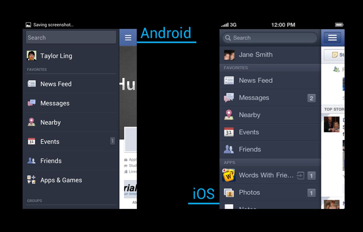
Streamlining Navigation for Multi-Device Accessibility

Understanding Responsive Design
Responsive design is not just a trend but a fundamental approach to ensure multi-device compatibility for websites. It allows a site to fluidly change and respond to fit any screen or device size, providing an optimal viewing experience. Key features of responsive design include flexible images, fluid grids, and media queries that enable the layout to adapt to various screen resolutions.
Statistics show that over 50% of internet traffic now comes from mobile devices, making responsive design a critical factor in user engagement and retention. A website that is not responsive is likely to suffer from a high bounce rate as users encounter difficulties in navigation and readability.
By prioritizing responsive design, businesses can maximize their reach and maintain user satisfaction across all platforms. This approach not only caters to current user behavior but also future-proofs the website against new devices and screen sizes that may emerge.
Implementing responsive design is a step towards seamless website navigation. It’s essential for businesses to adapt to the ever-changing landscape of device usage to ensure that their website remains accessible, intuitive, and engaging, no matter how users choose to access it.
Optimizing Navigation Menus
To create a user-centric navigation menu, it’s essential to focus on simplicity and functionality. A well-optimized menu facilitates quick access to information and enhances the overall user experience. Here are some key steps to consider:
- Reduce clutter by limiting the number of menu items. This helps users make decisions more efficiently.
- Use descriptive labels for menu items to improve clarity and help with SEO.
- Implement hierarchical structures to organize content logically, making it easier for users to navigate.
By streamlining the navigation menu, we not only improve user experience but also contribute to better SEO performance and increased mobile traffic.
Regularly testing and analyzing your navigation structure using analytics tools can provide valuable insights into user behavior and menu performance. This data-driven optimization ensures that your website evolves with user needs and preferences.
Mobile-Friendly Navigation Features
In today’s digital landscape, where the majority of internet users access websites via mobile devices, it’s crucial to implement mobile-friendly navigation features to enhance the user experience. Features such as collapsible menus, swipe gestures, and touch-friendly buttons are not just a convenience but a necessity. These elements should be designed with the goal of minimizing cognitive load, allowing users to navigate with ease and confidence.
By integrating mobile-friendly features, websites can significantly improve their accessibility and user satisfaction. This is especially important considering that a seamless mobile experience can lead to increased mobile traffic and better SEO performance.
Testing your navigation on various devices ensures consistency across platforms. Remember to employ clear and consistent navigation patterns to help users build familiarity with your site. Below is a list of essential mobile navigation features to consider:
- Implementation of a sticky navigation menu
- Clear and concise menu labels
- Easy access to important pages
- Use of hamburger menus for compact spaces
- Dropdowns for detailed navigation options
Each feature plays a pivotal role in creating a fluid and intuitive mobile user experience, which can keep users engaged and reduce the likelihood of them turning to a competitor’s site.
The Psychology of User-Friendly Navigation

Cognitive Load and Decision Making
When it comes to website navigation, reducing cognitive load is crucial for a smoother user experience. A high cognitive load can significantly hinder users’ ability to make decisions efficiently, leading to frustration and potentially causing them to abandon their tasks. By simplifying the decision-making process, we can enhance user satisfaction and improve overall engagement with the website.
- Less overwhelm: Offering fewer choices prevents decision paralysis and reduces frustration.
- Clearer navigation: With streamlined options, users can navigate more intuitively.
- Faster decision-making: Limiting options helps users make choices more quickly, benefiting e-commerce sites in particular.
Embracing the principle of ‘less is more’ can lead to a digital space where clarity prevails and decisions are made with ease. This approach not only improves the user experience but also supports better conversion rates and customer satisfaction.
Menu Organization and User Confidence
A well-organized navigation menu is not just a matter of aesthetics; it’s a crucial component that directly influences user confidence and decision-making. Users crave simplicity and efficiency when navigating a website. A cluttered or confusing menu can lead to frustration, driving potential customers away. Conversely, a clear and logical menu structure encourages exploration and can boost engagement and conversions.
Clarity in navigation is paramount. Use legible fonts, contrasting colors, and appropriate spacing to make menu items easily distinguishable. This fosters a sense of confidence in users, assuring them they are on the right path.
To avoid overwhelming users, it’s better to have fewer but clearer choices. Here are some tips to streamline your navigation menu:
- Resist the temptation to cram too many items into your navigation menu.
- Stick to clear and familiar terminology for menu labels.
- Arrange menu items in a logical order, prioritizing the most important pages.
- Clearly define the primary call-to-action to guide users effectively.
Remember, the goal is to create a seamless experience that aligns with the psychological needs of the user. By doing so, you not only enhance the usability of your website but also pave the way for increased user satisfaction and higher conversion rates.
Testing and Refining Navigation Structures
The journey to perfecting website navigation is ongoing and iterative. Regular optimization and updates to navigation systems are crucial for a seamless user experience. Different navigation structures cater to various layouts and content hierarchies, enhancing usability and accessibility. To ensure that your navigation remains effective, consider the following steps:
- Conduct usability tests to gather direct feedback from users.
- Employ analytics tools to track user behavior and identify patterns.
- Make data-driven decisions to refine navigation elements.
- Monitor performance post-launch and react quickly to any issues.
By embracing a cycle of testing, analyzing, and refining, you can create a navigation experience that feels intuitive and effortless for your users.
Remember, what works today may not suffice tomorrow. Stay vigilant and responsive to the evolving needs of your audience and the ever-changing digital landscape.
Enhancing User Experience Through Intuitive Design

Prioritizing Ease of Use
In the quest to enhance user experience, prioritizing ease of use is paramount. A website should be designed with the user in mind, ensuring that navigation is straightforward and intuitive. This approach not only reduces frustration but also encourages longer visits and deeper engagement with the content.
User-centric design emphasizes simplicity, clarity, and intuitive navigation to enhance user experience. Strategies include microinteractions, animations, and responsive design for inclusivity and engagement. These elements work together to create a seamless flow that guides users effortlessly from one section to another.
By focusing on ease of use, we can significantly improve the overall user experience. This means designing for quick choices and ensuring that users can find what they need with minimal effort.
Consider the following benefits of a user-friendly website:
- Quick choices can lead to a smoother shopping experience.
- Higher conversion rates are often the result of an easy-to-use site.
- Increased user confidence comes from effortless navigation and decision-making.
To achieve these benefits, it’s essential to analyze and refine the user interface continuously. Our design team is dedicated to providing suggestions for improved user experience, which in turn can increase conversion rates.
Logical Categorization of Content
The foundation of intuitive website navigation lies in the logical categorization of content. This approach not only streamlines the user journey but also enhances the overall user experience. Effective categorization and labeling improve findability, ensuring that users can quickly locate the information they seek without unnecessary confusion or frustration.
For instance, a news website might categorize content under headings such as ‘Latest News’, ‘Features’, and ‘Opinions’, with the option to delve into more specific subcategories. This hierarchical structure guides users through the site with ease. To determine the most user-friendly arrangement, techniques like card sorting can be invaluable in developing a robust information architecture.
Clarity in navigation is paramount. Users should encounter a clear roadmap of the website, with menu labels that accurately reflect the content they correspond to. Visual clarity is equally important; utilizing legible fonts, contrasting colors, and appropriate spacing can make navigation elements stand out, instilling user confidence and reducing cognitive load.
By prioritizing user-centric design, we can create a balance between aesthetics and usability, which is crucial for user engagement and satisfaction. Regular testing and refinement based on user feedback are essential for continuous improvement of the navigation structure.
Continuous Improvement and User Feedback
The journey to an optimal user experience is never-ending. Continuous improvement is essential, as it ensures that your website evolves with changing user needs and technological advancements. To achieve this, actively seek and incorporate user feedback into your design process. This feedback provides a roadmap for identifying areas of improvement and prioritizing optimization efforts, ensuring that your website resonates with your users.
By implementing a cycle of feedback, hypothesis, optimization, and validation, you create a dynamic environment where your website can thrive. Regularly update your site based on this cycle to maintain a fresh and engaging user experience.
Here are some practical steps to turn user feedback into actionable insights:
- Collect feedback through surveys, feedback forms, and usability testing.
- Analyze the data to understand user behavior and preferences.
- Prioritize changes based on the impact they will have on the user experience.
- Implement the changes and monitor their effect on user engagement and satisfaction.
- Repeat the process to ensure ongoing enhancement of the website.
Remember, the goal is to build trust and loyalty by responding to user needs promptly and effectively. By doing so, you not only improve the user experience but also foster a sense of community and ownership among your users.
Avoiding Common Navigation Pitfalls

Overcoming Overly Complex Menus
When it comes to website navigation, simplicity is key. An overly complex menu can deter users, leading to frustration and a higher bounce rate. To enhance user experience, focus on quality over quantity, ensuring that your menu is easy to read and navigate. Use clear labels and organize your items into intuitive categories.
A streamlined menu not only improves usability but also guides visitors smoothly through your website, encouraging them to engage with your content and services.
Here are some practical steps to simplify your navigation menu:
- Resist the temptation to cram too many items into your navigation menu.
- Stick to clear and familiar terminology to ensure users easily understand the purpose of each menu item.
- Use legible fonts, contrasting colors, and appropriate spacing to make menu items easily distinguishable.
- Establish a logical hierarchy to help users navigate effortlessly through your site.
By decluttering your navigation and adhering to these principles, you can create a more pleasant browsing experience that caters to the needs of your audience.
Balancing Aesthetics with Functionality
When designing a website, it’s crucial to strike a balance between a visually appealing interface and a functional user experience. Aesthetic elements should not overshadow the usability of the site. Instead, they should complement the navigation and guide the user through the content seamlessly.
- Overcomplicating or overcrowding the navigation can lead to user frustration. Aim for a clean design that highlights the most important sections of your site.
- Use clear and familiar terminology in your menus to avoid confusion and ensure users can easily find what they’re looking for.
- Remember that images and graphics are powerful tools that, when used effectively, can enhance the user journey rather than distract from it.
By focusing on a user-centered design, you align your website with the expectations and needs of your audience, leading to enhanced engagement and better outcomes for your business.
Ultimately, the goal is to deliver a website that is both attractive and intuitive, allowing users to navigate with ease and confidence. This balance is not only beneficial for the user but also contributes to the overall success of the website in achieving its business objectives.
Responsive Design Considerations
Responsive design is not just a trend but a principle that underpins a seamless user experience across all devices. It’s essential to ensure that your website’s navigation is as intuitive on a mobile device as it is on a desktop. This means rethinking navigation structures to be touch-friendly, collapsible, and easily accessible on smaller screens.
By optimizing usability for a seamless user experience, we cater to the growing number of users who access the internet on mobile devices. Simplifying navigation and ensuring mobile responsiveness are key to a user-centric website.
Statistics show that a significant percentage of users will not recommend a business if its mobile site is poorly designed. To avoid falling into this trap, consider these points:
- Adapting for mobile use to provide a consistent experience across devices.
- Maintaining visual and functional harmony to facilitate easier navigation.
- Implementing clear calls-to-action that are easily clickable on all devices.
Remember, responsive design is about more than just adjusting screen sizes—it’s about creating an environment where users can navigate your site with ease, no matter the platform.
Navigating Towards Success: Conversion-Focused Menus
Aligning Navigation with Business Goals
To transform your website’s navigation into a powerful tool for achieving business objectives, it’s essential to align it with your conversion goals. This means designing a navigation structure that not only serves the informational needs of your users but also guides them towards actions that benefit your business, such as making a purchase or signing up for a newsletter.
- Clarity in labeling ensures that users can easily find what they’re looking for, reducing frustration and bounce rates.
- Tracking & measuring user interactions with the navigation can reveal insights into behavior and preferences, informing further refinements.
- Post-launch support and monitoring allow for continuous optimization, ensuring that the navigation remains effective over time.
By focusing on these key areas, you can create a navigation menu that not only enhances the user experience but also drives conversions and supports your business’s growth.
Simplifying Design Elements for Clarity
In the pursuit of a user-centric navigation design, simplicity reigns supreme. A clear hierarchy and labels are essential for guiding users effortlessly through a website. By stripping away unnecessary complexity, we can enhance the user experience significantly.
Clarity in navigation menus is not just about the words we choose; it’s also about the visual cues that accompany them. Legible fonts, contrasting colors, and appropriate spacing are crucial in making menu items easily distinguishable and fostering user confidence.
To achieve this, consider the following points:
- Resist the temptation to overcrowd your navigation menu. A sleek and uncluttered interface layout prevents users from feeling overwhelmed.
- Use clear and familiar terminology for menu labels. Ambiguous or overly creative labels can lead to confusion.
- Prioritize essential information with clear headings and visual hierarchy to guide users to key actions.
By focusing on these elements, we can create a navigation structure that is not only aesthetically pleasing but also functionally intuitive.
Leveraging Navigation for Improved Engagement
To truly engage users and guide them towards conversion, a website’s navigation must be more than just functional; it must be strategic. By designing your navigation with descriptive, user-friendly labels, you avoid the pitfalls of jargon or vague terminology, making the user’s journey through your site intuitive and rewarding.
A well-structured navigation menu not only enhances user experience but also serves as a powerful tool for increasing mobile traffic and improving SEO performance.
Data-driven optimization is key. Analytics tools can reveal insights into user behavior, popular menu items, and areas needing improvement. This empowers continuous refinement of your navigation strategy, ensuring it aligns with user needs and business goals. Consider the following points to optimize your navigation for engagement:
- Implement sticky or fixed menus for easy page access
- Use clear call-to-action buttons to guide users
- Minimize cognitive load with organized menus
- Regularly review performance data to inform adjustments
By focusing on these aspects, you can create a navigation experience that not only satisfies users but also drives them towards the actions that matter most to your business.
Embark on a journey to digital excellence with our conversion-focused menus that are designed to guide your visitors effortlessly towards the actions that matter most. Our expertise in WordPress Development, eCommerce solutions, and custom web design ensures that your website not only looks stunning but also performs optimally to drive success. Ready to transform your online presence? Visit our website and let’s navigate towards success together!
Conclusion
In conclusion, seamless website navigation is a pivotal element in enhancing user experience across various devices. By focusing on responsive design, optimizing navigation menus, and ensuring mobile-friendly navigation, businesses can significantly improve site usability and SEO performance. Testing and refining navigation structures are essential to avoid common pitfalls and to provide a consistent and enjoyable experience for all users. Remember, a user-friendly website not only captivates visitors but also supports your conversion goals, making it an indispensable asset in today’s digital landscape.
Frequently Asked Questions
What is responsive design and why is it important for website navigation?
Responsive design ensures that a website’s layout and content adjust smoothly to various screen sizes and devices. It’s crucial for navigation as it provides a consistent and user-friendly experience across desktops, tablets, and smartphones, which can improve engagement and reduce bounce rates.
How can I optimize my website’s navigation menu for better user experience?
To optimize your navigation menu, consider simplifying the structure, using clear and descriptive labels, implementing a sticky or fixed menu for easy access, and ensuring it’s responsive for all devices. Regular testing and user feedback can also help refine the navigation experience.
What are some common pitfalls to avoid in website navigation design?
Common navigation pitfalls include overly complex menus, confusing or inconsistent layout, neglecting mobile users, and sacrificing usability for aesthetics. To avoid these, focus on clarity, simplicity, and functionality in your navigation design.
How does website navigation impact conversions and business goals?
Effective navigation guides users towards desired actions, such as making a purchase or signing up for a newsletter. Clear and intuitive navigation can enhance user experience, build trust, and ultimately lead to higher conversion rates, aligning with business objectives.
What role does cognitive load play in user-friendly navigation?
Cognitive load refers to the amount of mental effort required to navigate a website. User-friendly navigation minimizes cognitive load by providing a straightforward path to information or actions, making the website easier to use and reducing the likelihood of user frustration.
Can performance optimizations improve user experience on a website?
Yes, performance optimizations like faster loading times, image compression, and script minification can significantly improve user experience. They enhance the responsiveness and speed of a website, which are key factors in retaining users and encouraging them to engage with the content.