Enhancing User Experience with Seamless Website Navigation

In today’s digital landscape, the importance of seamless website navigation cannot be overstated. As a critical component of user experience (UX), it serves as the guiding hand that leads visitors through the maze of information and services a website offers. This article delves into the nuances of crafting a navigation system that not only meets but exceeds user expectations, enhances engagement, and drives conversion rates. By exploring strategic design, advanced tools, and insightful case studies, we’ll uncover the pivotal role navigation plays in shaping a positive brand reputation and ensuring a website’s success.
Key Takeaways
- Strategic navigation design is essential for user engagement and involves creating intuitive structures, maintaining consistency, and integrating visual aesthetics with user interaction.
- Advanced navigation tools such as breadcrumbs, responsive menus, and mega menus optimize website usability, particularly for complex site structures and mobile users.
- Effective navigation directly influences conversion rates and brand reputation by acting as a conversion tool and building user trust through clear, user-friendly pathways.
- Incorporating user feedback and leveraging analytics and A/B testing are crucial for refining navigation elements and ensuring continuous improvement in UX.
- Future-proofing website navigation requires adapting to UI/UX trends, integrating AI for personalized experiences, and prioritizing accessibility and inclusivity.
Strategic Navigation Design for Enhanced User Engagement
Intuitive Navigation Structures
Creating an intuitive navigation structure is essential for a positive user experience. It allows users to find what they’re looking for with ease, which is crucial for keeping them engaged. To achieve this, consider the following points:
- Use descriptive labels for menu items to clearly communicate the content behind them.
- Ensure the placement of navigational elements is consistent across all pages.
- Incorporate breadcrumb trails or site maps to aid in user orientation.
By focusing on these aspects, you can create a navigation system that feels familiar and easy to use, encouraging users to stay on your site longer.
Optimizing website navigation is not just about aesthetics; it’s about creating a logical flow that aligns with user expectations. This can lead to improved engagement, conversions, and a stronger brand identity. Remember, a seamless navigation experience is a cornerstone of user-centric design.
Consistency Across Pages
Achieving consistency across pages is a cornerstone of user-friendly website navigation. It allows users to predict where to find information and how to interact with your site, leading to a more intuitive experience. Consistency in design elements, such as layout, typography, and color schemes, ensures that users feel at home on any page of your website.
Consistency not only aids in navigation but also reinforces brand identity, making every interaction with your site a reinforcement of your brand’s values and aesthetic.
To maintain a seamless experience, consider the following points:
- Use the same navigation menu structure on every page.
- Ensure that interactive elements like buttons and links have a uniform style.
- Apply consistent labeling and terminology throughout the site.
- Keep the placement of key elements like logos and search bars uniform.
By adhering to these principles, you create a cohesive user journey that can enhance user engagement and satisfaction.
Visual Aesthetics and User Interaction
The intersection of visual aesthetics and user interaction forms the cornerstone of a website’s user experience. Well-designed icons can simplify navigation and provide visual cues, improving the user’s understanding of how to interact with the website. Consistent use of color schemes, typography, and imagery not only captivates the user’s attention but also reinforces brand identity.
Interactive elements such as buttons, forms, and menus must be intuitive and easy to use. Incorporating hover effects, animations, and micro-interactions can significantly enhance usability, making the user’s journey through the website both enjoyable and efficient. It’s essential to reduce the number of steps required to complete actions, streamlining the process and minimizing user frustration.
By focusing on the synergy between visual design and user interaction, websites can create an environment that is not only visually appealing but also functionally seamless.
Ultimately, the goal is to deliver a cohesive experience that encourages exploration and engagement. This is achieved by meticulously crafting every visual and interactive detail to align with the overall user experience strategy.
Optimizing Website Usability with Advanced Navigation Tools
Leveraging Breadcrumbs for Better Orientation
Breadcrumbs serve as an essential navigational aid on websites, guiding users through a site’s hierarchy without cluttering the interface. They offer a way to trace the path back to the starting or entry point and are particularly useful for websites with multiple layers of content. By displaying a clear trail of where users have been, breadcrumbs enhance user orientation and facilitate easy navigation.
Breadcrumbs not only aid in navigation but also contribute to a cleaner design by providing context without the need for additional navigational buttons or links.
Implementing breadcrumbs effectively requires understanding their types and best practices. Location-based breadcrumbs, for instance, show the user’s current position within the site’s structure, ideal for sites with complex hierarchies. Here’s a simple list of breadcrumb types:
- Location-based: Indicate the page’s position in the site hierarchy.
- Attribute-based: Show attributes or categories related to the current page.
- Path-based: Display the unique path the user has taken to arrive at a page.
While breadcrumbs enhance user experience, they should be used judiciously, especially on mobile devices where screen real estate is limited. Vertical or dropdown breadcrumbs can be a solution for such interfaces, ensuring that the navigation aid adapts to different screen sizes and user interactions.
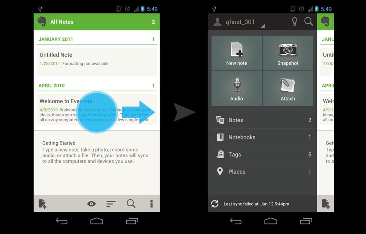
Implementing Responsive Menus for Mobile Users
In the era of mobile-first design, responsive menus have become a cornerstone of user-friendly website navigation. As screen sizes vary from desktop monitors to smartphones, menus must adapt to ensure ease of use and accessibility. A responsive menu restructures itself to fit the device, often transforming into a hamburger menu on smaller screens, which expands to reveal navigation options when tapped.
- Prioritize mobile responsiveness to ensure that navigation is effortless on any device.
- Streamline the navigation and content layout to enhance user satisfaction and engagement.
- Tailor the design to your audience demographics to create a successful mobile experience.
By focusing on responsive design, we not only cater to the current mobile user base but also future-proof our websites for emerging devices and screen sizes. This proactive approach is essential for maintaining a competitive edge in today’s digital landscape.
Utilizing Mega Menus for Complex Site Structures
Mega menus have become a staple in managing complex site structures, especially for e-commerce platforms with extensive product categories. These expansive menus display multiple options in a two-dimensional dropdown layout, allowing users to see all available categories and subcategories at a glance.
Benefits of mega menus include:
- Improved organization of site content
- Easier navigation for users, leading to a more intuitive user experience
- Accommodation of a large number of items without overwhelming the user
However, the implementation of mega menus must be strategic to avoid cognitive overload. It’s crucial to group items logically and to use visual cues to guide the user’s eye. For instance, Amazon and Sephora are known for their effective use of mega menus, which help users navigate their vast array of products with ease.
By carefully structuring mega menus, websites can significantly enhance user interaction and satisfaction, ultimately contributing to better conversion rates and a stronger brand reputation.
Impact of Navigation on Conversion Rates and Brand Reputation
Navigation as a Conversion Tool
Effective navigation is not just about enabling users to find what they are looking for; it’s a strategic tool that can significantly increase conversion rates. By prioritizing an information structure that aligns with user-centric UX design, businesses can streamline their menu hierarchy with logical categories and concise labels, fostering a seamless experience that encourages users to proceed to checkout or engage further with the site.
A well-organized navigation system not only simplifies the user’s journey but also serves as a silent salesman, subtly guiding potential customers through the sales funnel.
For instance, features like predictive search suggestions and personalized recommendations can empower users to make informed decisions, optimizing their online journey and leading to increased conversions. Analyzing user behavior and leveraging analytics are crucial for continuously refining navigation strategies to meet business goals and user needs.
Building Trust through Clear Navigation
Clear navigation is not just a convenience—it’s a cornerstone of user trust. By designing navigation that is predictable and consistent, users can find the information they need without confusion or frustration. This transparency in design fosters a sense of reliability and credibility with your audience.
A user-friendly navigation system is integral to a positive user experience. It should enable users to locate desired information swiftly and with ease.
To achieve this, consider the following steps:
- Employ descriptive labels for menu items to avoid ambiguity.
- Ensure the placement of navigational elements remains consistent across all pages.
- Incorporate breadcrumb trails or site maps to aid user orientation.
These strategies not only improve the usability of a website but also reinforce the user’s confidence in the brand. When users trust the navigation, they are more likely to engage with the content, leading to increased conversion rates and a stronger brand reputation.
Case Studies: Successful Navigation Strategies
The proof of effective navigation lies in real-world success stories. Apple and Amazon stand as exemplary cases, demonstrating how strategic navigation can lead to enhanced user experiences. Apple’s minimalist navigation bar simplifies the user journey, while Amazon’s flyout menus manage extensive content without overwhelming users. These approaches not only improve usability but also reinforce brand identity.
A well-designed navigation system aligns with business priorities, supporting key objectives and driving conversions.
Analyzing these cases reveals common threads in successful navigation strategies:
- Clear, descriptive labels for menu items
- Consistent placement of navigational elements
- Use of breadcrumbs or site maps for orientation
These elements contribute to a navigation experience that feels intuitive and reliable, encouraging user engagement and ultimately, conversion. As highlighted in the WebFX article, understanding different navigation types and UX best practices is crucial for website improvement.
Incorporating User Feedback to Refine Navigation Elements
Analyzing User Behavior and Patterns
Understanding how users interact with your website is crucial for creating a navigation system that meets their needs. Tracking the user journey provides insights into the most frequented paths and potential roadblocks. Tools like heatmaps and session recordings can reveal where users click, how far they scroll, and where they may experience confusion. This data is invaluable for optimizing the navigational structure to enhance the user experience.
To effectively analyze user behavior, it’s important to prioritize information access. Simple and concise labels for navigation options facilitate an effortless journey for users. Additionally, communicating the user’s orientation on the website can significantly reduce frustration and bounce rates. For instance, you can identify them through Google Analytics by looking for pages with the largest exit rates.
By continuously monitoring and analyzing user behavior, website owners can make data-driven decisions to enhance user experience. Collecting and analyzing user feedback through surveys or feedback tools provides direct insights into user preferences and pain points.
Ultimately, the goal is to create a seamless and intuitive navigation that not only satisfies users but also encourages them to engage more deeply with the content, thereby increasing conversion rates and improving brand reputation.
A/B Testing for Navigation Effectiveness
A/B testing is a critical component in the iterative process of enhancing website navigation. By comparing two versions of a webpage, website owners can discern which layout, design, or navigation structure yields better user engagement and conversion rates. This method involves presenting the variants to different user segments and analyzing the resulting data to make informed decisions.
The following steps outline the A/B testing process:
- Identify the navigation elements to test, such as menu layouts or call-to-action buttons.
- Create two or more variations of these elements.
- Randomly assign users to each version.
- Collect and analyze user interaction data.
- Determine the most effective version based on the data.
A/B testing not only refines user experience but also provides quantitative insights that can drive strategic business decisions. It’s a powerful technique to ensure that website navigation aligns with user expectations and business objectives.
Regularly conducting A/B tests allows for continuous improvement and adaptation to user feedback, ultimately leading to a more intuitive and user-friendly website.
Continuous Improvement and User-Centric Updates
The journey towards perfecting website navigation is never-ending. Embracing continuous improvement is crucial for adapting to user expectations and technological advancements. Regularly collecting and analyzing user feedback leads to actionable insights that can refine navigation elements, ensuring they remain intuitive and effective.
By prioritizing user-centric design, websites can evolve with their users, maintaining relevance and providing a seamless experience.
A/B testing, user behavior analysis, and heatmaps are just a few tools that can shed light on how users interact with your site. This data-driven approach allows for informed updates that resonate with users. Below is a list of steps for a continuous improvement cycle:
- Collect user feedback and analyze data
- Identify areas for improvement
- Implement changes and conduct A/B testing
- Monitor results and user satisfaction
- Repeat the process for ongoing refinement
This iterative process ensures that your website’s navigation stays ahead of the curve, offering a frictionless path to the content users seek.
Future-Proofing Website Navigation for Evolving User Expectations

Adapting to Emerging UI/UX Trends
As the digital landscape evolves, so do the expectations of users. Staying current with UI/UX trends is not just about aesthetics; it’s about meeting users where they are and anticipating where they will be. Prioritize responsive design for user accessibility and functionality. Intuitive navigation and visual hierarchy enhance user experience, leading to higher conversion rates.
To ensure that your website remains at the forefront of user experience, consider these steps:
- Regularly review and incorporate the latest design trends and statistics.
- Analyze user behavior to adapt navigation and interface elements.
- Implement voice search capabilities, especially for multilingual audiences.
- Embrace minimalism and declutter interfaces to improve focus and ease of use.
By proactively adapting to changes, you can maintain a competitive edge and provide a seamless experience that resonates with your audience.
Remember, the importance of intuitive UI/UX design cannot be overstated. Website performance optimization, communication strategies, responsive design, and regular audits are essential for user satisfaction and trust. These elements work together to create a cohesive and enjoyable user journey, which is paramount in today’s fast-paced digital world.
Integrating AI and Machine Learning for Personalized Navigation
The integration of AI and machine learning into website navigation is revolutionizing the way users interact with online platforms. By analyzing user behavior and patterns, AI personalization tailors the browsing experience to individual preferences, ensuring that visitors encounter content and recommendations that resonate with their interests. This approach not only enhances user engagement but also streamlines the path to conversion.
With the power of AI, websites can dynamically adjust navigation menus and content displays, providing a more relevant and engaging experience for each user.
For instance, companies like Netflix, Amazon, and Spotify have pioneered personalized navigation, setting a standard for a user-centric online journey. The benefits of such tailored experiences are clear:
- Increased user satisfaction
- Higher engagement rates
- Improved conversion metrics
By prioritizing information access and utilizing concise labels, navigation becomes an effortless journey, guiding users to their desired content with predictive search suggestions and personalized recommendations.
Ensuring Accessibility and Inclusivity in Navigation Design
In the pursuit of a universally accessible web, ensuring that navigation is inclusive is not just a legal mandate but a moral imperative. Adhering to the Web Content Accessibility Guidelines (WCAG) is a foundational step in this process. These guidelines serve as a benchmark for creating web content that is accessible to people with a wide range of disabilities.
Accessibility in navigation design is about more than just compliance; it’s about creating an experience that is usable for everyone. This includes providing keyboard navigation to support users who cannot use a mouse, and ensuring that navigational elements are clearly labeled for screen reader users.
To truly embrace inclusivity, it’s essential to consider the diverse needs of all users. This means implementing features such as:
- High contrast modes for users with visual impairments
- Text-to-speech functionality for users with reading difficulties
- Sign language interpretation for deaf users
- Easy-to-understand language for users with cognitive disabilities
By integrating these elements into your website’s navigation, you demonstrate a commitment to inclusivity and enhance the overall user experience.
In a digital landscape that’s constantly evolving, it’s crucial to ensure your website’s navigation meets and exceeds user expectations. At the heart of a successful online presence is a seamless, intuitive navigation system that guides visitors effortlessly to the information they seek. Our expert team specializes in crafting custom web solutions, including WordPress development, eCommerce platforms, and performance optimization, to create a user experience that’s not just satisfactory, but delightful. Don’t let your website fall behind – visit our website to explore our services and see how we can help you stay ahead of the curve. Let’s build a future-proof navigation system together!
Conclusion
In conclusion, seamless website navigation is a critical component of user experience that can significantly impact user engagement, brand reputation, and overall business success. By leveraging appropriate tools and techniques, businesses can create intuitive and consistent navigation structures that guide users effortlessly to their desired content. As we’ve explored throughout this article, the benefits of a positive user experience are manifold, leading to increased engagement, higher conversions, and a strong brand perception. It’s essential for businesses to stay abreast of the latest UI/UX trends and prioritize navigation in their digital strategy to ensure they meet and exceed user expectations. Remember, the journey through your website should be as smooth and intuitive as the destination it leads to.
Frequently Asked Questions
What is strategic navigation design and why is it important for user engagement?
Strategic navigation design involves creating an intuitive and consistent navigation structure that aligns with the goals of a website and its users. It’s important for user engagement because it helps visitors find information quickly and easily, which can lead to a more satisfying user experience and increased engagement with the website’s content.
How do breadcrumbs enhance website navigation?
Breadcrumbs are a type of secondary navigation that reveal the user’s location within a website’s hierarchy. They enhance navigation by providing a clear path back to previous pages, allowing users to understand their current context and navigate the site with ease.
Can website navigation impact conversion rates?
Yes, website navigation can significantly impact conversion rates. Clear and effective navigation can guide users to conversion points more efficiently, reducing frustration and abandonment while increasing the likelihood of completing a desired action, such as making a purchase or signing up for a newsletter.
What role does user feedback play in refining website navigation?
User feedback is crucial in refining website navigation as it provides insights into how real users interact with the navigation elements. By analyzing behavior patterns, conducting A/B tests, and making user-centric updates, website owners can continuously improve navigation to meet user expectations and enhance the overall experience.
How is AI being integrated into website navigation for personalization?
AI and machine learning are being integrated into website navigation to analyze user behavior and provide personalized navigation experiences. This can include dynamically changing menus, suggesting relevant content, and creating user-specific pathways that improve engagement and satisfaction.
Why is it important to ensure accessibility in navigation design?
Ensuring accessibility in navigation design is important because it allows people with disabilities to use the website effectively. Accessible navigation considers various needs, such as keyboard navigation for those unable to use a mouse, and screen reader compatibility, making the website inclusive and usable for everyone.