Enhancing User Experience with Seamless Website Navigation
The digital era has ushered in an expectation of seamless online experiences, with website navigation playing a pivotal role in user satisfaction. A website’s navigational structure can make or break the user experience, directly impacting engagement, conversion rates, and overall success. In this article, we explore the intricacies of crafting a navigation system that not only looks good but also enhances the user’s journey through intuitive design, performance optimization, and accessibility considerations. By understanding user behavior, leveraging visual cues, and implementing responsive solutions, we can create a navigational framework that caters to the needs of a diverse audience, ensuring a smooth and enjoyable interaction with your website.
Key Takeaways
- Understanding user behavior and navigation patterns is crucial for designing a website that offers a seamless user experience, guiding visitors efficiently to their desired content.
- A well-designed visual navigation system, using consistent and recognizable elements, can significantly improve pathfinding and user engagement while maintaining aesthetic appeal.
- Optimizing website performance, including page load speeds and minimizing HTTP requests, is essential for smooth navigation and reducing user frustration and bounce rates.
- Incorporating feedback mechanisms such as analytics and user feedback is vital for continuously refining navigation and achieving optimal results through A/B testing.
- Ensuring accessibility in website navigation is not only a legal compliance matter but also a moral obligation, enhancing the experience for users with diverse abilities and contributing to a wider audience reach.
Streamlining Website Navigation: A Path to Enhanced User Experience
Understanding User Behavior and Navigation Patterns
To create a website that users find easy to navigate, it’s crucial to understand their behavior and navigation patterns. This involves analyzing how users interact with your site, what paths they take, and where they encounter difficulties. By leveraging tools like heatmaps and user interaction analysis, you can gain valuable insights into user experience.
Effective website navigation is not just about aesthetics; it’s about creating a user-centric environment that guides visitors through your content seamlessly. Consider the following best practices:
- Using clear and consistent labels for navigation items
- Organizing content in a logical manner
- Implementing visual elements for guidance
- Conducting user testing for feedback
By prioritizing user experience in navigation design, you ensure that your website not only looks good but also functions efficiently, leading to increased user satisfaction and reduced bounce rates.
Remember, consistent navigation elements across all pages help users orient themselves and enhance usability. Continuously refine your navigation by incorporating user feedback, which allows for ongoing improvements tailored to real user preferences.
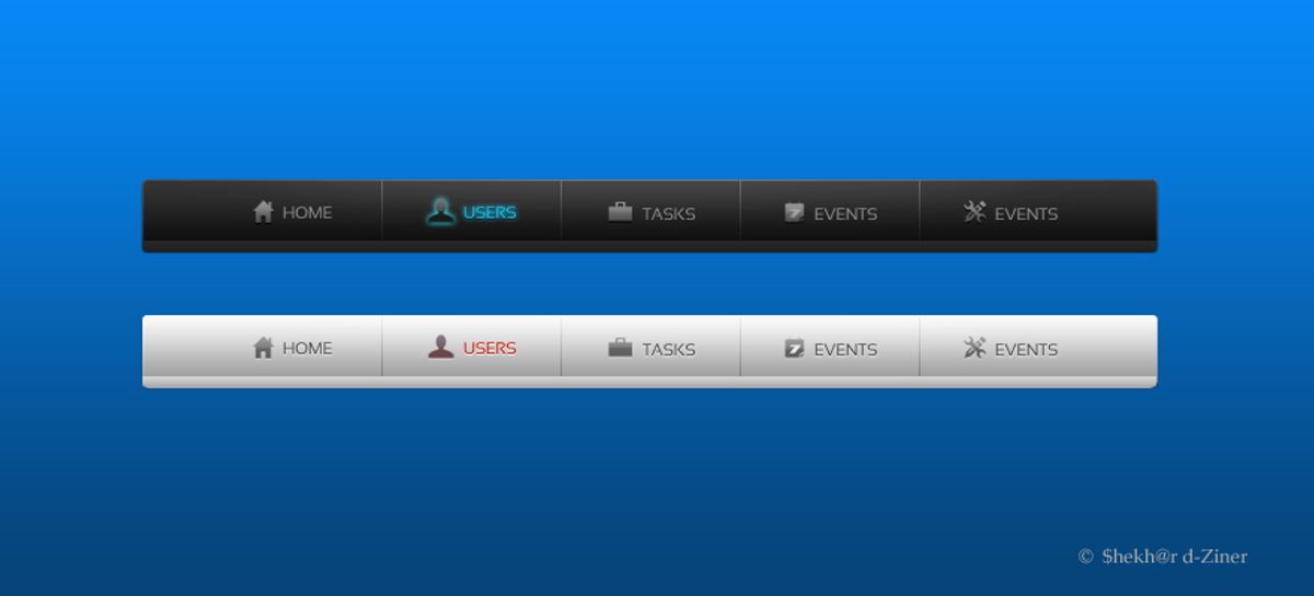
Designing Intuitive Menu Structures
Creating an intuitive menu structure is pivotal for a seamless user experience. Industry best practices highlight the significance of simplicity and user alignment. By placing frequently used features within easy reach, navigation becomes more efficient and user-friendly.
- Prioritize simplicity and consistency: Keep navigation straightforward to avoid user confusion.
- Clear labeling and hierarchy: Ensure each menu item is descriptive and organized logically.
- Optimize for mobile responsiveness: Implement mobile-friendly navigation solutions like collapsible menus.
Intuitive menus act as a roadmap, guiding users effortlessly through your website.
Understanding the user’s journey is essential. Analyze navigation patterns to refine menu structures continually. This methodical yet flexible approach ensures that your website remains accessible and convenient for all users.
Implementing Responsive Navigation for Mobile Users
In today’s mobile-centric world, responsive navigation is imperative for a seamless user experience. Websites must adapt to various screen sizes, ensuring that navigation elements are easily accessible and intuitive, regardless of the device. This adaptability not only engages users but also positively impacts search engine rankings.
- Simplify navigation by using touch-friendly elements.
- Place important calls-to-action within easy reach.
- Employ responsive grid layouts for consistent experiences across devices.
To provide a consistent user experience on any device or window size, use a single navigation graph where the layout of each content destination is responsive.
Developing navigation tailored for mobile devices involves design elements and visual indicators that minimize confusion and enhance the overall navigational experience. By focusing on mobile responsiveness, you ensure that your website’s usability is optimized for touch interactions and smaller screens, which is no longer just a bonus—it’s a necessity.
The Role of Visual Design in User Navigation

Leveraging Visual Cues for Better Pathfinding
Effective navigation is crucial for a positive user experience on any website. Visual cues play a pivotal role in guiding users through a digital landscape, making their journey intuitive and efficient. Well-chosen typography, such as size, weight, and color, along with tasteful spacing and subtle icons, can significantly enhance usability. For example, a clear visual indicator on the current page helps users maintain their bearings, acting as a simple ‘You Are Here’ signal.
Incorporating icons or directional arrows can quickly convey information, reducing reliance on text and streamlining the browsing process. This not only boosts the visual appeal but also aids in finding content with ease. Amazon’s mobile app, for instance, uses a bright orange ‘Buy Now’ button with a shopping cart icon, making it visually prominent and encouraging purchases.
To achieve intuitive navigation, consistency is key. Using clear labels, organizing content logically, and utilizing visual elements for guidance are best practices that should not be overlooked. Regular testing with users to gather feedback is essential for continuous improvement.
Lastly, intuitive labels and clear language in navigation menus can significantly improve user experience. Descriptive labels that resonate with the target audience are more effective than generic terms like ‘Products’ or ‘Services’.
Balancing Aesthetics and Functionality
Achieving a balance between aesthetics and functionality is crucial for a successful website. While a visually appealing design can attract users, it’s the seamless functionality that keeps them engaged. To ensure a harmonious blend, consider the following points:
- Prioritize User-Friendly Navigation: Users should find navigating your website intuitive and straightforward.
- Optimize Website Load Time: A fast-loading site reduces bounce rates and enhances user satisfaction.
- Embrace Responsive Design: Ensure your website is accessible and navigable on all devices.
- Emphasize Minimalistic Design: A clean and uncluttered layout can improve user focus and interaction.
In the dynamic interplay of usability and functionality, we find the true essence of web design: crafting experiences that inspire, engage, and empower users in the digital realm.
Remember, the goal is not to sacrifice one for the other but to integrate both aspects to create a cohesive user experience. Regularly reviewing your website’s design and functionality can help maintain this balance and cater to evolving user expectations.
Creating Consistent and Recognizable Navigation Elements
Consistency in navigation design is not just about aesthetics; it’s about creating a seamless experience for users as they move through a website. Consistent labels, logical content organization, and familiar visual elements are the cornerstones of intuitive navigation. By maintaining uniformity across pages, users can rely on their learned experience, reducing cognitive load and increasing overall satisfaction.
To ensure navigation elements are both consistent and recognizable, consider the following steps:
- Use clear and consistent labels for navigation items.
- Organize content in a logical and user-friendly manner.
- Incorporate visual elements like icons and animations to guide users.
- Test navigation with real users to gather feedback and make improvements.
By adhering to these principles, designers can craft navigation that feels familiar and easy to use, regardless of the user’s journey through the site.
Cross-device consistency is also vital. Whether accessed from a laptop or a phone, the navigation should offer a predictable and unified experience. This approach not only aids usability but also reinforces brand identity across different platforms.
Optimizing Website Performance for Smooth Navigation

Improving Page Load Speeds to Reduce Bounce Rates
The speed at which a website loads is a critical factor in keeping visitors engaged. Optimizing page load speed is essential to reduce bounce rates, as users are likely to abandon a site that doesn’t load quickly. To achieve this, several strategies can be implemented:
- Image Optimization: Compressing images without sacrificing quality helps in faster loading.
- Caching: Utilizing browser and server caching saves resources and speeds up return visits.
- Script Minification: Reducing the size of CSS and JavaScript files through minification improves load times.
- Reducing HTTP Requests: Limiting the number of requests a browser makes to the server enhances performance.
By focusing on these areas, websites can offer a smoother experience, encouraging users to stay longer and explore more content.
It’s not just about the initial load time; ongoing performance optimization is crucial for maintaining a competitive edge. Regularly reviewing and updating the website’s technical aspects ensures that the user experience remains seamless.
Utilizing Caching and Content Delivery Networks
To ensure quick loading times, caching stores frequently accessed data in temporary storage, allowing for faster retrieval on subsequent visits. Content Delivery Networks (CDNs) distribute this data across multiple servers worldwide, reducing the distance it travels to reach the user, thus minimizing latency.
- Caching: Saves server resources and enhances customer experience.
- CDNs: Improve global access speed by serving content from the nearest location.
By strategically implementing caching and CDNs, websites can achieve significant performance gains, leading to improved user satisfaction and retention.
Understanding the distinction between caching and CDNs is crucial for optimal resource utilization. While both aim to accelerate content delivery, their approaches differ. Caching focuses on reusing locally stored data, whereas CDNs distribute data across a network to bring it closer to end-users.
Minimizing HTTP Requests for Faster Response Times
Every additional HTTP request that a webpage makes adds to the time it takes for the page to load. Minimizing these requests is crucial for enhancing user experience by ensuring quick loading times. This can be achieved by combining files like CSS and JavaScript, using CSS sprites, and streamlining the number of elements on your page.
- Combine CSS/JavaScript files to reduce the number of requests.
- Use CSS sprites to create a template for images that are used frequently.
- Optimize images to maintain quality while reducing file size.
- Limit the use of plugins that add extra HTTP requests.
By focusing on reducing HTTP requests, we not only improve website performance but also contribute to a seamless user experience.
Employing best practices in web development, such as minimizing external scripts and optimizing file sizes, can lead to significant improvements in site responsiveness. This approach aligns with strategies that enhance website efficiency and user satisfaction.
Incorporating Feedback Mechanisms to Refine Navigation
Using Analytics to Track Navigation Effectiveness
The valuable ally in your quest to enhance website navigation is the strategic use of analytics. By leveraging tools like Google Analytics, you can gain insights into user behavior. Metrics such as clicks on navigation elements, time spent on pages, and bounce rates are instrumental in understanding how visitors interact with your site’s navigation.
Analytics not only reveal which areas of your site are performing well but also highlight where users may be experiencing friction. This data is crucial for making informed decisions to optimize the user journey.
Dive into your website analytics to uncover patterns. Heatmaps and click tracking tools can show you how users actually navigate your site. Are there pages that are consistently overlooked? Do users encounter obstacles that cause them to leave? Here’s a simple list to guide your analysis:
- Identify high traffic pages and navigation paths
- Pinpoint pages with high bounce rates
- Analyze the effectiveness of menu structures
- Track conversions from navigation clicks
By optimizing navigation with analytics insights, you can enhance user engagement and create a seamless user journey that balances aesthetics and usability.
Gathering User Feedback for Continuous Improvement
The pursuit of a flawless user experience is an ongoing process that hinges on user feedback. By actively engaging with users and soliciting their insights, we can uncover valuable information about their navigation experiences. This feedback is crucial for identifying areas that require refinement and for validating new design implementations.
To prioritize simplicity and accessibility in website navigation, it’s essential to incorporate user feedback into iterative design improvements. This approach not only enhances user experience but also boosts user engagement.
A structured method for gathering feedback might include user testing sessions, surveys, and real-time analytics. Below is a list of common feedback mechanisms:
- Observing real users during testing sessions to pinpoint navigation issues.
- Deploying surveys or website popups with targeted questions about usability.
- Analyzing user interactions through heatmaps and click tracking.
- Implementing A/B testing to compare the effectiveness of different navigation structures.
A/B Testing Navigation Changes for Optimal Results
A/B testing is a critical step in the iterative process of enhancing website navigation. By comparing different versions of navigation elements, such as menu layouts and button placements, designers can gather data on user preferences and behaviors. This data-driven approach ensures that changes lead to improved user engagement and conversion rates.
A/B testing allows for a nuanced understanding of how small changes can have a significant impact on user experience. It’s not just about choosing between two options, but about finding the subtle tweaks that resonate with users.
To effectively conduct A/B tests, it’s essential to track specific metrics that reflect user interaction with the site. These metrics might include click-through rates, time spent on page, or conversion events. Below is a list of steps to consider when setting up an A/B test:
- Define clear objectives for the test.
- Select the navigation elements to be tested.
- Create the variations for each element.
- Use a controlled environment to serve the different versions to users.
- Collect and analyze the data to determine which version performs better.
- Implement the winning variation and monitor the results for any long-term effects.
It’s important to note that A/B testing can influence SEO performance. Tests that alter navigation menus or link placements can disrupt the flow of PageRank, potentially weakening the discoverability and authority of a site. Therefore, it’s crucial to balance the immediate benefits of user experience improvements with the long-term goals of SEO optimization.
Ensuring Accessibility in Website Navigation
Adhering to Web Content Accessibility Guidelines (WCAG)
Ensuring that your website navigation is accessible to all users is not just a matter of inclusivity; it’s also a matter of legal compliance and broadening your audience reach. Adhering to the Web Content Accessibility Guidelines (WCAG) provides a framework for making web content more accessible to people with disabilities. These guidelines are divided into three levels of conformance: A, AA, and AAA, with AA being the level most commonly targeted for compliance.
To meet these standards, consider the following best practices:
- Use clear and descriptive labels for navigation elements.
- Ensure that all interactive elements are operable through keyboard inputs.
- Provide alternative text for images that serve a functional purpose.
- Design with sufficient color contrast to accommodate users with visual impairments.
By integrating these accessibility practices into your website’s design and development, you not only comply with accessibility standards for inclusivity but also improve the overall user experience, which can positively impact SEO and user retention.
Remember, accessibility is an ongoing commitment. Regularly reviewing and updating your website to address new accessibility issues is crucial for maintaining an inclusive digital environment.
Designing for Keyboard Navigation and Screen Readers
Ensuring that all users, including those with disabilities, can navigate your website is a cornerstone of inclusive design. Keyboard navigation is essential for individuals who rely on assistive technologies or prefer not to use a mouse. To achieve this, it’s important to make all interactive elements accessible through the keyboard alone. This includes providing clear focus states, which visually indicate the currently selected element, and implementing common keyboard shortcuts, such as using the ‘Enter’ key to activate links and the ‘Esc’ key to close menus.
By designing with keyboard accessibility in mind, we not only comply with accessibility standards but also enhance the overall user experience.
Additionally, screen readers require well-structured content to interpret and convey information to users effectively. This means using proper HTML tags, providing text alternatives for non-text content, and ensuring that the reading order is logical and intuitive. A well-designed website will seamlessly integrate these elements, creating a navigable experience for all users, regardless of their abilities.
Providing Alternative Navigation Options for Diverse Users
To create an inclusive digital environment, it’s crucial to offer alternative navigation options that cater to the diverse needs of all users. This approach not only adheres to accessibility standards but also reflects a commitment to user-centric design.
- Keyboard Navigation: Ensuring that all interactive elements are accessible via keyboard is fundamental for users who cannot use a mouse.
- Voice Commands: Integrating voice navigation can greatly benefit users with mobility or visual impairments.
- Alternative Text: Providing text descriptions for non-text content enables screen readers to convey information to visually impaired users.
- High Contrast Modes: Implementing modes with higher contrast helps users with visual impairments distinguish between elements.
By prioritizing simplicity and consistency in navigation design, we can optimize the user experience for a broader audience. Testing with diverse user groups is essential to ensure usability across different abilities and preferences.
In the spirit of continuous improvement, it’s beneficial to look to comprehensive guides and best practices that focus on designing accessible websites. These resources often include valuable insights on creating user-friendly and inclusive websites that are optimized for various user interactions, including forward, horizontal, and backward navigation.
Navigating a website should be effortless and inclusive, ensuring that everyone, regardless of ability, can access the information and services they need. At AM2, we specialize in creating custom WordPress websites that are not only visually stunning but also prioritize accessibility. From performance optimization to website health audits, our team is dedicated to making the digital world better for all. Don’t let your website be a barrier; let us help you make it a gateway to growth and opportunity. Explore our services and see how we can enhance your online presence. [Ensure your website’s accessibility with AM2](#).
Conclusion
In conclusion, seamless website navigation is a cornerstone of exceptional user experience. By implementing user-centric design, intuitive menus, and strategic placement of elements, businesses can guide visitors through their digital journey with ease. As we’ve explored throughout this article, the benefits of well-crafted navigation are manifold, from increased user satisfaction to improved conversion rates. It’s essential to prioritize navigation in the design process, ensuring that users can find what they’re looking for efficiently and without frustration. Whether you’re developing a new website or refining an existing one, remember that intuitive navigation is not just a feature—it’s the backbone of a successful online presence that resonates with users and supports business objectives.
Frequently Asked Questions
What is the importance of streamlining website navigation?
Streamlining website navigation enhances user experience by making it easier for users to find and access the content they need without confusion or frustration. It guides users smoothly through a website, improving satisfaction and engagement.
How does visual design influence user navigation?
Visual design plays a crucial role in user navigation by providing clear and intuitive visual cues that guide users through a website. It balances aesthetics with functionality, creating a cohesive and recognizable navigation system.
Why is website performance optimization important for navigation?
Optimizing website performance ensures that pages load quickly, reducing bounce rates and improving the overall navigation experience. Techniques like caching, content delivery networks, and minimizing HTTP requests contribute to smoother navigation.
How can feedback mechanisms improve website navigation?
Feedback mechanisms such as analytics, user feedback, and A/B testing provide insights into navigation effectiveness and areas for improvement. They help refine navigation structures and enhance the user journey for better results.
What are the best practices for ensuring accessibility in website navigation?
Best practices for accessibility include adhering to Web Content Accessibility Guidelines (WCAG), designing for keyboard navigation and screen readers, and providing alternative navigation options to accommodate diverse user needs.
How can responsive navigation benefit mobile users?
Responsive navigation adapts to different screen sizes and devices, ensuring that mobile users have an equally smooth and intuitive experience as desktop users. It allows for easy and efficient navigation on smaller screens.