Enhancing User Experience with Seamless Website Navigation
In the fast-paced world of digital design, creating a visually appealing interface is only half the battle. The true measure of success lies in the user experience (UX), and at the heart of that experience is navigation. Designing user-centric navigation is not just about creating pretty buttons; it’s about crafting a seamless journey that guides users effortlessly through your interface. In this blog, we’ll explore the importance of user-centric navigation and how it can elevate your UI/UX design.
Key Takeaways
- Responsive design is crucial for multi-device compatibility, ensuring a seamless navigation experience across all platforms.
- Strategic placement of navigation elements and a reduction in cognitive load are essential for an intuitive user journey.
- Clear and consistent navigation practices, including descriptive labels and avoiding jargon, enhance user understanding.
- Regular user feedback and adaptation are vital for improving website usability, accessibility, and navigability.
- Optimizing navigation menus and mobile-friendly features is key to maintaining user engagement and satisfaction.
Streamlining Navigation for Multi-Device Use

The Importance of Responsive Design
In today’s digital age, responsive design is a fundamental element in enhancing user experience. It ensures that a website is accessible and functional across a variety of devices, from desktops to smartphones. The goal is to provide a seamless interaction, regardless of screen size or platform, which is essential for keeping users engaged and reducing bounce rates.
Responsive design is not just about adjustable screen resolutions and automatically resizable images, but also about a holistic approach to web design that takes into account the user’s environment and behavior. Here are some key benefits of implementing responsive design:
- Ensures consistency in user experience across different devices
- Improves site performance and loading times on mobile devices
- Increases the reach of your website to mobile users
- Contributes to higher conversion rates by optimizing user experience across devices
By prioritizing responsive design, businesses can cater to the growing number of users who access the internet via mobile devices. This approach is crucial for optimizing user experience and engagement, ultimately leading to better business outcomes.
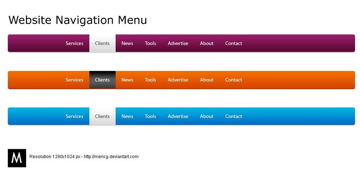
Optimizing Navigation Menus
Optimizing navigation menus is crucial for a seamless user experience across all devices. A sticky or fixed navigation menu that remains visible while scrolling can significantly enhance accessibility to important pages.
Consider the balance between too many and too few options in your navigation design. The Nielsen Norman Group emphasizes that hidden menus, such as Hamburger Menus, are less likely to be used at the start of a task. Therefore, visible and intuitive navigation aids in getting users started quickly.
Intuitive navigation with a well-structured menu and clear hierarchy, along with an easily accessible search function, can greatly improve the mobile user experience.
Here are some key points to keep in mind:
- Implementation of sticky navigation menus
- Clear and concise menu labels
- Easy access to important pages
- Regular testing on various devices to ensure functionality
By adhering to these principles, you can create navigation that not only looks good but also facilitates a smoother journey for your users.
Mobile-Friendly Features and Testing
In the era of ubiquitous mobile internet access, ensuring that your website is equipped with mobile-friendly features is paramount. Features such as collapsible menus, swipe gestures, and touch-friendly buttons are not just conveniences—they are necessities for a modern website. These elements contribute to a seamless user experience, particularly on smaller screens where space is at a premium.
Testing these features across various devices is crucial. It’s not enough to design with mobile in mind; one must also verify functionality through rigorous testing. This includes checking compatibility with different browsers and operating system versions to ensure consistent performance.
To effectively prioritize and optimize your website’s mobile navigation, consider the following points:
- Prioritize Important Links: Ensure that the most critical content is easily accessible.
- Optimize button size and placement for natural interaction.
- Implement a responsive layout that adapts to any screen size.
- Replace outdated technologies like Adobe Flash with modern, mobile-compatible alternatives.
Remember, a mobile-friendly website is not just about aesthetics; it’s about providing a frictionless path for users to access the content they need, when they need it. Failing to do so can lead to a significant loss in traffic, as users may turn to competitor sites that offer a better mobile experience.
Simplifying the User Journey with Intuitive Navigation
Strategic Placement of Navigation Elements
The strategic placement of navigation elements is a cornerstone of intuitive website layouts. Users should be able to find what they’re looking for with minimal effort, which is why menus and links must be prominently displayed and consistent across pages. Here are some key considerations for strategic navigation placement:
- Visibility: Ensure that navigation elements are easily noticeable and accessible.
- Familiarity: Place elements where users expect them, such as the top or left side of the page.
- Hierarchy: Organize navigation to reflect the importance and relationship between items.
By reducing the number of steps a user must take to reach their destination, we enhance the overall user experience and facilitate a seamless journey through the website.
Incorporating mobile-friendly features, such as a sticky header or a ‘back to top’ button, can further improve navigation efficiency. It’s also essential to avoid hidden navigation elements that can frustrate users and lead to a poor experience. Regular testing on various devices ensures that navigation remains user-friendly and effective, regardless of how the site is accessed.
Reducing Cognitive Load for Better User Experience
To enhance user experience, it’s crucial to reduce cognitive load by simplifying the decision-making process. This can be achieved by presenting information in a clear and concise manner, avoiding overwhelming users with too many choices or complex navigation paths. For instance, pairing an icon with a label can significantly decrease the time users spend interpreting the interface, leading to a more intuitive experience.
Effective error handling also plays a role in reducing cognitive load. Providing users with helpful error messages and clear guidance allows them to recover from mistakes without frustration. Here are some key strategies to consider:
- Fast Load Times: Ensure your website loads quickly to minimize user frustration.
- Accessibility: Adhere to web accessibility standards to accommodate all users.
- Error Handling: Offer clear error messages and recovery options.
By streamlining the user journey and minimizing the number of steps required to reach a desired outcome, we create a more enjoyable and efficient experience for all users.
Remember, the goal is to make the user’s interaction as simple and effortless as possible. This not only improves the overall user experience but also increases the likelihood of user retention and conversion.
Aligning with User Mental Models
Understanding and aligning with user mental models is crucial for creating intuitive navigation. Users bring preconceived notions of how a website should function based on their past experiences. Deviating from these expectations can lead to confusion and a greater cognitive burden, as users must adapt to a new system. To ensure a seamless user journey, it’s essential to balance functionality and aesthetics, incorporating microinteractions and a user-centric design that resonates with the user’s way of thinking.
By strategically placing navigation elements where users naturally expect them, we can simplify the user journey and reduce the risk of frustration. This approach not only enhances the user experience but also encourages deeper engagement with the website.
Equally important is conducting user research to gain insights into the behaviors and preferences of your target audience. With this knowledge, you can tailor your content architecture to meet both your goals and the users’ needs, ensuring that your navigation design is not only beautiful but also highly functional and intuitive.
Embracing Clear and Consistent Navigation Practices

Descriptive Menu Labels and Link Text
Clear and descriptive menu labels are the cornerstone of effective website navigation. Users should be able to understand the purpose of each link at a glance, ensuring a frictionless journey through your site. For instance, instead of vague labels like ‘Products’ or ‘Services’, specify what kind of products or services are offered, such as ‘Outdoor Gear’ or ‘IT Consulting’.
When designing navigation, it’s crucial to anticipate the needs of your users and provide direct paths to the information they seek.
A well-structured navigation menu not only aids in user orientation but also contributes to search engine optimization (SEO). Here’s a simple list of guidelines to enhance your navigation labels:
- Use familiar terms that resonate with your audience
- Keep labels short and to the point
- Avoid technical jargon unless your audience is specialized
- Reflect the content that users will find after clicking
By adhering to these principles, you can create a navigation experience that is both intuitive and informative, leading to increased user satisfaction and engagement.
Maintaining Consistency Across Web Pages
Consistency in web design is not just about aesthetics; it’s about creating a predictable and reliable user experience. Consistency breeds familiarity, and familiarity breeds comfort. When users know what to expect as they navigate through a website, they are more likely to feel confident and comfortable, which can lead to increased engagement and conversion rates.
To ensure consistency, consider the following points:
- Use a style guide to define and adhere to consistent design elements such as colors, typography, and layout.
- Implement standard navigation patterns like breadcrumbs, top and side menus, and footer links.
- Maintain uniformity in menu placement and button styling across different sections.
By establishing a clear and consistent navigation structure, you not only enhance user experience but also improve the site’s overall usability and accessibility.
Remember, a well-structured website not only improves UX but also boosts search engine optimization, driving more traffic to your site. Use descriptive page titles and headers to guide users and maintain a consistent style and format throughout your site.
Avoiding Jargon and Industry-Specific Terms
To foster an inclusive atmosphere, it’s essential to avoid jargon and industry-specific terms that could alienate or confuse visitors. Instead, opt for language that is universally understood. This approach ensures that your website speaks to a broader audience, enhancing the user experience for all visitors.
When designing navigation, clarity trumps complexity. Aim for straightforward labels that are easily understood at a glance.
Here are some tips to keep your navigation accessible:
- Use concise and descriptive labels for navigation items.
- Prioritize navigation items to guide users naturally through your site.
- Test your website with users from various backgrounds to ensure comprehensibility.
By adhering to these practices, you create a welcoming environment that encourages exploration and interaction, ultimately leading to a more successful website.
Enhancing Website Usability, Accessibility, and Navigability

Best Practices for Usability and Accessibility
To create a website that is both usable and accessible, it’s essential to focus on a variety of best practices that cater to the needs of all users. Ensuring that your website is navigable and understandable for everyone is not just a legal requirement, but a moral imperative.
- Accessible Typography: Use fonts that are easy to read across different devices and resolutions. Legible font sizes and appropriate line spacing are crucial for readability.
- Performance Optimization: Aim for fast load times to reduce user frustration. This includes optimizing images and implementing caching strategies.
- Web Accessibility Standards: Follow the Web Content Accessibility Guidelines (WCAG) to make your site accessible to users with disabilities.
- Error Handling: Provide clear error messages and recovery options to help users when they encounter problems.
By integrating these best practices into your website design, you can significantly improve the user experience for a wider audience, including those with disabilities, older adults, and users on various devices.
Remember, a website that is easy to use and accessible not only meets compliance standards but also reflects positively on your brand’s commitment to inclusivity.
Improving Navigational Efficiency on Mobile Devices
To ensure that mobile users have an efficient and enjoyable experience, it’s essential to focus on optimizing navigation. This involves creating a user interface that is both intuitive and responsive to touch interactions. Features such as a sticky header, which remains at the top of the screen as users scroll, can greatly enhance navigability. Additionally, a ‘back to top’ button can simplify the journey through long pages.
By simplifying the navigation structure and including easily accessible search functions, websites can cater to the on-the-go nature of mobile usage.
Regularly testing and refining the mobile experience is crucial. This includes assessing the performance of menus and ensuring that they are clear and concise across different devices. The goal is to provide a seamless transition from desktop to mobile, maintaining a consistent user experience that meets user expectations and drives engagement.
- Intuitive navigation structure
- Responsive and touch-friendly interfaces
- Sticky headers for easy access
- ‘Back to top’ buttons for convenience
- Regular usability testing and feedback
Remember, a user-friendly website is not just about aesthetics; it’s about creating a path that leads users to their desired content with minimal effort and maximum satisfaction.
Regular User Feedback and Adaptation
In the realm of website navigation, regular user feedback is indispensable for continuous improvement. By actively seeking out and analyzing user input, website owners can adapt their navigation strategies to better align with user expectations and preferences. This iterative process not only enhances the user experience but also keeps the website up-to-date with the latest usability trends.
To ensure that your website remains user-centric, consider implementing the following feedback mechanisms:
- Feedback Surveys: Directly engage with users to gather insights on their navigation experience.
- Customer Support Analysis: Use support interactions to identify common navigation issues.
- Usability Testing: Regularly test your website with real users to uncover navigational challenges.
- Analytics Review: Employ analytics tools to track user behavior and identify patterns that suggest navigation improvements.
By embracing these practices, you can create a feedback loop that continuously informs and refines your website’s navigation structure. Remember, effective navigation and accessibility are key for user experience. Simplify design, prioritize accessibility, and utilize user feedback for iterative improvements.
At the heart of a successful online presence lies a website that is not only visually appealing but also highly functional and user-friendly. Our team at AM2 specializes in crafting custom web solutions that enhance website usability, accessibility, and navigability, ensuring your visitors have an exceptional experience. From WordPress development to eCommerce solutions, we are dedicated to making your digital vision a reality. Don’t let your website be just another URL lost in the vastness of the internet. Visit our website to discover how we can elevate your online presence and help your business grow. Let’s create something amazing together!
Conclusion
In conclusion, seamless website navigation is a cornerstone of exceptional user experience. By implementing intuitive, responsive, and consistent navigation strategies, businesses can ensure that their websites cater to the needs of users across various devices. The integration of user-centric design principles, such as clear menus, fast load times, and accessible features, not only enhances usability but also contributes to improved SEO performance and increased mobile traffic. As we’ve explored throughout this article, prioritizing the user journey and embracing simplicity in navigation can lead to higher engagement, satisfaction, and ultimately, conversion rates. Remember, a navigable website is not just about facilitating movement; it’s about creating a journey that is enjoyable and effortless for the user.
Frequently Asked Questions
What is responsive design and why is it important?
Responsive design is an approach to web design that makes web pages render well on a variety of devices and window or screen sizes. It’s important because it ensures that users have a good viewing experience no matter what device they’re using, which is essential for retaining visitors and improving SEO.
How can I optimize my website’s navigation menus for better user experience?
To optimize your website’s navigation menus, ensure they are clear, concise, and consistent across all pages. Use descriptive labels and consider the hierarchy of information, making the most important items easily accessible. Implementing a sticky or fixed navigation menu can also improve accessibility.
What are some mobile-friendly features I should test on my website?
Mobile-friendly features to test include responsive design, touch-friendly buttons and links, readable fonts, optimized images, and fast loading times. Also, test for the accessibility of navigation menus and the ease of completing forms on mobile devices.
Why is it important to align website navigation with user mental models?
Aligning website navigation with user mental models is important because it creates an intuitive user experience. When navigation matches users’ expectations, they can find information more quickly and easily, leading to higher satisfaction and reduced frustration.
How does maintaining consistency across web pages enhance user experience?
Maintaining consistency across web pages helps users learn the navigation and layout of a website more quickly. It builds user confidence, reduces cognitive load, and makes the website feel more reliable and professional, thus enhancing the overall user experience.
What are some best practices for website usability and accessibility?
Best practices for website usability and accessibility include using clear and legible fonts, providing sufficient color contrast, ensuring that all functionality is available from a keyboard, using alt text for images, and structuring content with proper headings for screen reader users.