Enhancing User Experience with Seamless Website Navigation

In today’s digital landscape, a website’s navigation system is a pivotal aspect of the overall user experience. Effective navigation ensures that users can find the information they need quickly and with ease, which in turn, increases engagement and conversion rates. The article ‘Enhancing User Experience with Seamless Website Navigation’ delves into the various strategies and principles that can be employed to optimize navigation, thus creating a more intuitive and satisfying experience for users.
Key Takeaways
- Simplifying navigation structures and creating intuitive layouts are essential for user-friendly website journeys.
- Optimizing usability through responsive design and accessible content can significantly reduce bounce rates and improve engagement.
- Analyzing user behavior and navigation patterns with analytics provides valuable insights for enhancing navigation strategies.
- Advanced navigation features such as mega menus and sticky headers can contribute to a dynamic and efficient user experience.
- Post-launch maintenance, including regular audits and user feedback, is crucial for the continuous improvement of website navigation.
Streamlining Navigation for Enhanced User Journeys

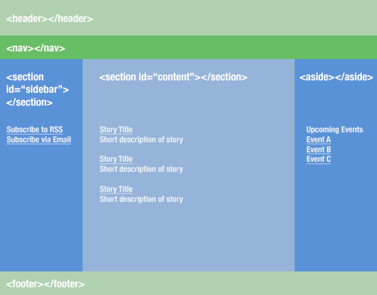
Designing Intuitive Site Layouts
Creating an intuitive site layout is pivotal for a seamless user experience. Menus and links serve as the roadmap, guiding users through your website’s content. They must be clear, reflecting a logical structure that aligns with user expectations. By maintaining simplicity and ensuring consistency across pages, users can navigate with ease, reducing friction in their journey.
A user-friendly layout begins with a clear hierarchy of information. Visitors should intuitively understand where to focus their attention, with essential elements like headlines and calls-to-action (CTAs) prioritized.
Responsive design is no longer optional; it’s a necessity for cross-device harmony. Mobile users, in particular, require intuitive navigation due to limited screen space. A well-designed website will feature a concise menu, possibly using a hamburger icon to save screen real estate while maintaining accessibility. This approach not only improves site usability but also positively impacts conversion rates.
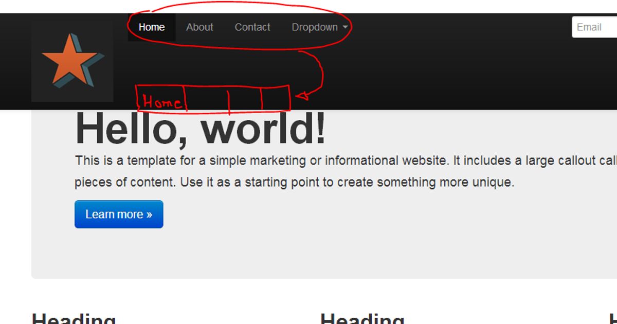
Implementing Clear Menu Structures
A well-structured navigation menu is the cornerstone of a seamless user experience. Menus should be easy to find and logically organized, with descriptive labels that guide users through your website without confusion. Simplifying navigation by avoiding an overload of options can significantly enhance the user’s ability to locate desired content swiftly.
- Clear and Consistent Menu Structure: Main menus must be prominently displayed and accessible from any page.
- Intuitive Navigation for Mobile: Utilize concise menus, such as hamburger icons that expand into vertical menus, to optimize for limited screen space.
- Avoid Complex Submenus: Steer clear of accordions in submenus to prevent extra clicks and potential user frustration.
By focusing on clarity and consistency, you can create a navigation experience that feels intuitive and effortless for all users, regardless of the device they are using.
Remember, the goal is to facilitate an intuitive path that leads users to the information they seek with minimal effort. This approach not only improves user satisfaction but also contributes to better search engine performance.
Leveraging Breadcrumbs for Easy Tracking
Breadcrumbs are a pivotal element in creating a user-friendly website, offering visitors a way to trace their path back through the site’s hierarchy without having to rely on the browser’s back button. Implementing breadcrumbs effectively improves usability and user orientation, making it easier for users to understand their current location and how they arrived there.
Breadcrumbs aid navigation by showing site hierarchy, which is especially beneficial in complex websites with multiple levels of content. They provide a visual representation of where the user is in relation to the site’s structure, enhancing the overall user experience.
Here are some advantages of using breadcrumbs on your website:
- They allow users to navigate to previous pages effortlessly.
- Breadcrumbs reduce the number of actions a user must take to return to a higher-level page.
- They help users understand the context of the page they are viewing within the website’s structure.
Responsive design enhances user experience and SEO, and when combined with breadcrumbs, it ensures that navigation is seamless across all devices. By integrating breadcrumbs, you not only improve navigation but also support your SEO efforts, as search engines favor sites that are easy to navigate.
Optimizing Website Usability for Better Engagement

Reducing Bounce Rates with User-Friendly Interfaces
A user-friendly interface is the cornerstone of keeping visitors engaged and reducing bounce rates. Optimizing website speed and ensuring intuitive navigation are pivotal in creating a positive first impression. Interactive elements and personalized paths can significantly enhance user engagement, satisfaction, and SEO outcomes.
- Intuitive Navigation: Simplify the user’s journey by organizing content logically.
- Speed Optimization: Implement techniques to improve page load times.
- Interactive Elements: Use engaging features to encourage user interaction.
- Personalized Experience: Offer tailored content to meet individual user needs.
By focusing on these key areas, websites can create a seamless experience that encourages visitors to stay longer and explore more deeply.
Regularly analyzing user behavior and iterating on design can lead to a more refined user experience. This process not only helps in retaining users but also in attracting new ones by improving overall site usability.
Improving Content Accessibility
To create an inclusive digital space, it’s essential to prioritize accessibility in website design. Semantic markup plays a pivotal role in this, as it helps screen readers and assistive technologies interpret the structure and meaning of content, beyond mere visual presentation.
Inclusive design involves integrating features such as alternative text for images and keyboard navigation, which are not just beneficial for users with disabilities but also enhance the overall user experience. For instance, optimized media content ensures smooth playback and faster loading times on mobile devices, which is crucial since a significant portion of users access the web through their phones.
By focusing on these aspects, we not only adhere to accessibility standards but also foster a user-friendly environment that encourages longer engagement and potentially higher conversion rates.
It’s important to remember that accessibility should be an ongoing effort, with regular checks and updates to ensure that all users can navigate and interact with your website effectively. Utilizing tools and resources available can aid in maintaining an accessible website post-launch.
Utilizing Responsive Design for Mobile Users
In the realm of mobile user experience, responsive design stands as a cornerstone, ensuring websites adapt fluidly across various devices. This adaptability is crucial, as it directly impacts user engagement and contributes to a site’s SEO performance. A responsive layout not only accommodates different screen sizes but also repositions navigation elements to enhance usability on smaller devices.
Embracing responsive design is not just about visual appeal; it’s about creating a user-centric environment where content is easily accessible and navigation is intuitive, regardless of the device.
To illustrate the importance of responsive design, consider the following points:
- It provides a consistent experience across all devices, from desktops to smartphones.
- Optimizes the placement of menus and buttons for touch-based interaction.
- Improves website loading times by adapting content to the device’s capabilities.
Responsive design brings several key advantages, including improved user experience, longer time spent on site, and reduced bounce rates. From an SEO perspective, it’s a strategy that can no longer be overlooked.
Leveraging Analytics for Navigation Insights

Understanding User Behavior Through Data
In the quest to optimize user experience, understanding user behavior through data is pivotal. Analytics tools offer a wealth of information, revealing how users interact with your website. By tracking metrics such as page views, session duration, and bounce rates, we can discern patterns that guide us in making enhancements to the navigation structure.
Analytics insights are not just about numbers; they represent real user interactions and preferences. Balancing aesthetics with usability, based on these insights, leads to a seamless user journey.
Behavioral analytics, for example, can show us where users click, how far they scroll, and where they spend most of their time. This data is crucial for identifying friction points and optimizing navigation paths. Consider the following table summarizing key behavioral metrics:
| Metric | Insight |
|---|---|
| Click-through Rate | Indicates the effectiveness of links. |
| Scroll Depth | Shows how much of a page is being viewed. |
| Time on Page | Reflects content engagement level. |
By leveraging such data, we can tailor the user experience to meet expectations, thereby enhancing user engagement. Continuous analysis and iteration are essential, as user behavior is dynamic and evolves with changing trends and technologies.
Identifying Pain Points in the Navigation Flow
To ensure a website’s navigation is not only functional but also user-centric, it is crucial to identify and address any pain points that users may encounter. Pain points in navigation can lead to frustration, increased bounce rates, and ultimately, a decline in user satisfaction and conversions. A methodical approach to diagnosing these issues involves analyzing user behavior patterns and feedback to pinpoint areas that require refinement.
By mapping out user pathways and employing user flow diagrams, we gain insights into where users struggle and where they abandon the journey. This visualization aids in streamlining navigation and reducing friction, enhancing the overall user experience.
A bulleted list can succinctly summarize the steps to identify navigation pain points:
- Review analytics to understand user behavior
- Conduct user testing to gather direct feedback
- Analyze site heatmaps for engagement patterns
- Monitor performance metrics for potential bottlenecks
Addressing these pain points not only improves website performance but also boosts user satisfaction, leading to a more engaging and successful digital presence.
Making Data-Driven Decisions to Improve Navigation
To optimize user experience, it’s essential to embrace a data-driven approach. By analyzing user behavior, we can uncover patterns that guide our navigation design choices. A/B testing is a powerful tool in this process, allowing us to compare different navigation structures and implement the most effective ones.
By leveraging analytics, we can make informed decisions that enhance the navigation flow and reduce friction points, leading to a smoother user journey.
Here are some steps to consider in the data-driven decision-making process:
- Analyze heatmaps to understand which areas of your site are getting the most attention.
- Track user interactions to identify common paths and potential bottlenecks.
- Implement A/B testing to determine the best-performing navigation elements.
- Regularly review analytics to stay informed about changing user behavior.
Remember, the goal is to create an intuitive and seamless navigation experience that supports the user’s journey from start to finish.
Integrating Advanced Features for a Dynamic Experience
Incorporating Mega Menus for Complex Sites
Mega menus are a powerful tool for websites with extensive content, such as e-commerce platforms, allowing users to access all pages from a single point. Leverage mega menus for complex sites with clear labels and visual hierarchy to prevent users from feeling overwhelmed and to facilitate seamless navigation.
- Ensure that the main menu is prominently displayed and easily accessible from any page.
- Use a consistent menu structure throughout the website, with logical categorization of content.
- Implement dynamic navigation based on user interactions for personalized experiences and streamlined conversions.
By adhering to the principle of reaching the target location within three clicks, a smooth browsing experience is ensured for customers. This approach not only enhances user satisfaction but also contributes to increased conversions and reduced bounce rates.
Using Sticky Navigation for Constant Access
Sticky navigation has become a staple in modern web design, offering users constant access to navigation tools, regardless of where they are on a page. This feature is particularly useful on long pages, where scrolling back to the top to access the menu can be cumbersome. By keeping the navigation bar fixed at the top or bottom of the screen, websites ensure that important options remain within easy reach, enhancing the overall user experience.
Incorporating a back-to-top button complements sticky navigation by providing a quick way for users to return to the start of the page without manual scrolling. This small but significant addition can greatly improve navigation efficiency and user satisfaction. Below is a list of benefits that sticky navigation brings to a website:
- Provides easy access to key website elements
- Improves user engagement by reducing the effort to navigate
- Enhances the feeling of control for the user
- Potentially decreases bounce rates by simplifying movement through content
By strategically implementing sticky navigation, websites can create a more dynamic and user-friendly interface that encourages longer visits and deeper exploration of content.
Enhancing Search Functionality for Quick Results
To optimize on-site search, a prominent search bar should be complemented with advanced filters and auto-suggestions, streamlining the path to desired content. This not only improves the user experience but also encourages deeper engagement with the site’s resources.
By enhancing search functionality, websites can cater to users’ needs more effectively, providing quick and relevant results that align with their search intent.
The impact of a well-optimized search system extends beyond user satisfaction. It can lead to measurable benefits such as:
- Enhanced user experience and engagement
- Increased conversions and revenue
- Improved SEO and search engine rankings
Utilizing tools like heatmaps and user flow analysis can offer valuable navigation insights, informing continuous improvements to the search experience.
Maintaining and Improving Navigation Post-Launch
Conducting Regular Website Health Audits
Regular website health audits are crucial for maintaining an optimal online presence. Conducting these audits allows for the identification and rectification of issues that could impede user experience and website performance. A comprehensive audit covers various aspects such as site security, performance, SEO, and overall usability.
By systematically reviewing these key areas, businesses can ensure that their website remains secure, fast, and user-friendly, which in turn fosters a positive user experience and strengthens the brand’s digital footprint.
The process typically involves the following steps:
- Evaluation of website performance and identification of bottlenecks.
- Security checks for vulnerabilities and outdated components.
- SEO analysis to ensure proper tagging and visibility.
- Usability assessment to enhance user engagement and conversion rates.
Remember, a website is often the first point of interaction with customers. Ensuring its health is paramount to making a lasting impression and achieving online success.
Implementing Continuous User Feedback Loops
To maintain a dynamic and user-centric website, it’s crucial to implement continuous user feedback loops. This iterative process involves the collection and analysis of user feedback, followed by the implementation of changes and further evaluation. By doing so, websites can evolve with the needs and preferences of their audience, ensuring a more personalized and engaging user experience.
Feedback mechanisms, such as real-time animations and micro-interactions, not only make the interaction more engaging but also provide immediate reassurance to users about their actions. For instance, a simple color change or checkmark can signal a successful form submission, as seen in platforms like Slack.
It’s important to remember that user feedback is not just a one-time event but a continuous cycle that can significantly enhance user experience and conversion rates.
Incorporating user feedback effectively requires attention to detail and a structured approach. Below is a suggested process:
- Gather user feedback through surveys, user testing, and analytics.
- Analyze the feedback to identify common themes and actionable insights.
- Implement changes based on the feedback, prioritizing those that align with user needs and business goals.
- Re-evaluate the impact of these changes through further user feedback and analytics.
This loop ensures that user experience is always at the forefront of website design and functionality, leading to a more intuitive and satisfying navigation experience.
Ensuring Ongoing Support and Maintenance
The launch of a website is just the beginning of its lifecycle. Businesses need ongoing support and maintenance services post-launch to ensure website integrity, security, and performance. Managing updates and iterations is crucial for continuous improvement and user experience enhancement. Regular maintenance activities include updates to the core platform, plugins, and themes, as well as security patches and performance optimizations.
To maintain a high level of website performance and security, a structured support system is essential. This includes monitoring for uptime, performing regular backups, and conducting security checks to safeguard against potential threats.
A comprehensive support and maintenance plan should cover the following areas:
- Uptime Monitoring: Ensuring the website is accessible to users at all times.
- Security Checks: Regular scans for malware and vulnerabilities.
- Performance Optimization: Continuous improvements for faster load times and better user experience.
- Regular Updates: Keeping the website’s core, plugins, and themes up to date.
- Backup and Recovery: Implementing automated backups and a clear recovery plan in case of data loss.
By investing in ongoing support and maintenance, businesses can avoid the pitfalls of neglect, such as security breaches, poor user experience, and ultimately, a decline in customer trust and revenue.
Ensuring your website remains navigable and user-friendly after launch is crucial for retaining visitors and improving their experience. At [Highlight], we specialize in WordPress Development, including performance optimization and website health audits, to keep your site running smoothly. Don’t let post-launch challenges hinder your online success. Visit our website to learn more about our services and how we can help you maintain and enhance your website’s navigation.
Conclusion
In conclusion, seamless website navigation is a cornerstone of exceptional user experience. By implementing intuitive menus, streamlined paths, and responsive design, businesses can guide users effortlessly through their digital journey, fostering engagement and increasing conversions. The strategies and insights discussed throughout this article serve as a blueprint for creating navigational structures that are not only user-friendly but also conducive to achieving business objectives. Remember, the ease with which users can explore and interact with your website can make a significant difference in their overall satisfaction and your online success.
Frequently Asked Questions
What are the key elements of a user-friendly navigation design?
Key elements include intuitive site layouts, clear menu structures, easy-to-follow breadcrumbs, responsive design for mobile users, and search functionality for quick results.
How can website usability be optimized to improve engagement?
Optimizing website usability involves creating user-friendly interfaces, ensuring content is easily accessible, implementing responsive design for various devices, and reducing bounce rates through engaging layouts.
What role does analytics play in website navigation?
Analytics help understand user behavior, identify navigation flow pain points, and provide data-driven insights to make informed decisions for improving website navigation.
What advanced features can enhance the dynamic experience of a website?
Incorporating mega menus for complex sites, using sticky navigation for constant menu access, and enhancing search functionality can provide a more dynamic user experience.
Why is post-launch monitoring important for website navigation?
Post-launch monitoring helps quickly identify and fix any new bugs, ensuring the website remains user-friendly and performs optimally over time.
How can regular website health audits benefit site navigation?
Regular website health audits can identify opportunities for improvement in SEO, performance, security, and usability, leading to an enhanced navigation experience for users.