Enhancing User Experience with Seamless Website Navigation
In today’s digital landscape, a website’s navigation can make or break the user experience. Seamless website navigation not only enhances user satisfaction but also contributes to better engagement, higher retention rates, and increased conversions. This article delves into the essentials of creating intuitive website navigation, optimizing performance for a smoother journey, designing with user experience in mind, strategically placing content, and leveraging analytics for continuous improvement. Incorporating these elements ensures that users can navigate your website effortlessly, leading to a more enjoyable and productive interaction.
Key Takeaways
- Intuitive navigation structures and mobile-friendly designs are fundamental to user-friendly website experiences.
- Website performance, including load times and image optimization, is crucial for maintaining smooth navigation.
- Accessibility, clear CTAs, and interactive feedback mechanisms are key for enhanced UX design.
- Strategic content placement guided by visual cues ensures users can find information quickly and easily.
- Regularly tracking user navigation patterns and utilizing user feedback are essential for iterative navigation improvements.
The Fundamentals of Intuitive Website Navigation

Simplifying the Navigation Structure
To create a user-friendly navigation, it’s crucial to keep the structure simple and intuitive. Users should be able to locate what they’re searching for within a few clicks. This approach not only enhances usability but also boosts overall user satisfaction.
Avoid complex puzzles in your navigation by steering clear of nested sub-categories and ambiguous labels. A logical and well-organized layout, akin to a clear flow in an art exhibit, ensures that users are not overwhelmed and can easily find their desired content.
Consider the following points to simplify your website’s navigation:
- Start by understanding your target audience and create user personas.
- Ensure that menus and buttons are clearly labeled and appropriately sized.
- Maintain a consistent navigation scheme across all pages.
- Use visual hierarchy to guide users through your website content.
By focusing on a methodical yet flexible approach to website development, you can ensure a seamless experience from the initial visit to post-launch monitoring.
Responsive and Mobile-Friendly Design
In today’s digital landscape, a responsive and mobile-friendly design is not just a luxury, it’s a necessity. With a significant portion of web traffic coming from mobile devices, ensuring that your website adapts to various screen sizes is crucial for maintaining user engagement.
- A consistent experience across devices is key to user satisfaction.
- Mobile users expect quick, easy-to-navigate websites.
- Responsive design can improve your site’s SEO.
Effective website navigation is key for user engagement. Prioritize intuitive design, performance optimization, adaptive strategies, and post-launch maintenance for a seamless user experience.
Remember, a mobile-friendly website not only caters to user preferences but also contributes to a competitive edge in the market. By optimizing for mobile, you’re also optimizing for user retention and conversion.
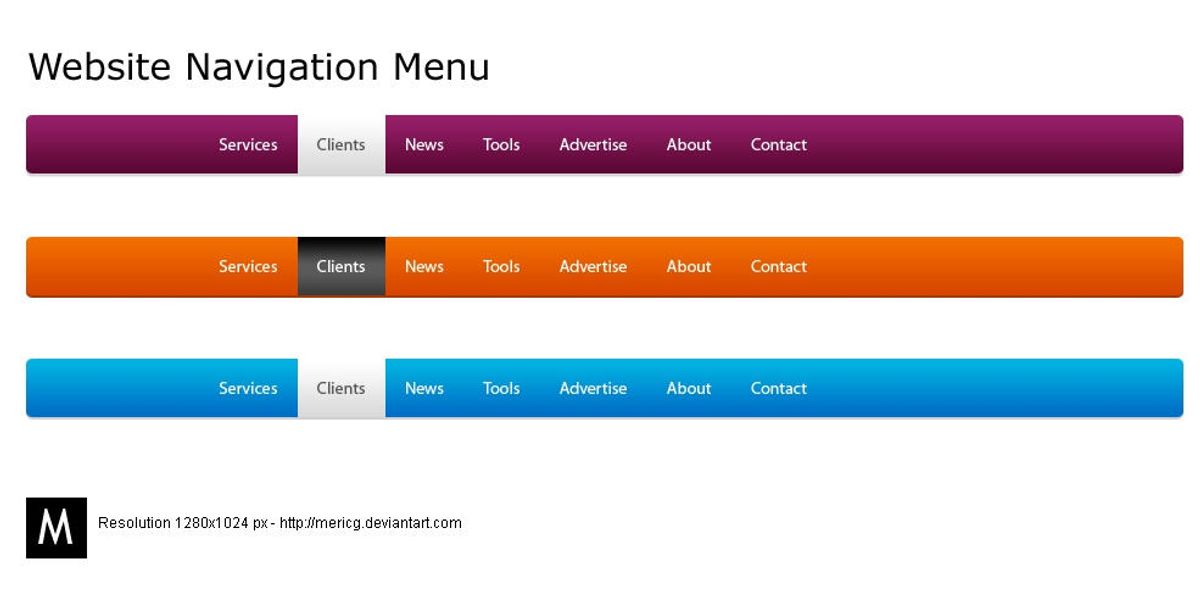
Consistent Navigation Across Pages
Maintaining consistent navigation across all pages is crucial for a seamless user experience. Users come to expect certain navigation elements to be in the same place, regardless of which page they are on. This familiarity reduces cognitive load and helps build user confidence in navigating your site.
Consistency in layout, navigation, and visual elements helps users feel comfortable and familiar with your digital presence.
To achieve this, ensure that your main navigation, footer links, and any side menus remain unchanged throughout the site. Here’s a simple checklist to follow:
- Use the same navigation structure on every page
- Keep the style and position of navigation elements uniform
- Ensure that interactive elements like buttons and links have a consistent design
Remember, a predictable navigation design allows users to focus on the content rather than on figuring out how to move around your website.
Optimizing Website Performance for Smooth Navigation
Improving Load Times and Responsiveness
A website’s performance is pivotal to user satisfaction and retention. Users expect quick and responsive interactions with web pages, and any delay can lead to frustration and abandonment. To enhance the user experience, it’s essential to focus on improving load times and responsiveness.
Effective navigation and performance optimization are crucial for user experience and SEO. Simplify navigation with clear paths and streamline UI design. Optimize speed, minimize load times, and prioritize user actions for better outcomes.
Here are some practical steps to optimize your website’s performance:
- Compress images to reduce file size without compromising quality.
- Minify CSS and JavaScript files to decrease the number of HTTP requests.
- Implement browser caching to store frequently accessed resources on the user’s device.
- Optimize the use of external scripts to reduce reliance on third-party resources.
By taking these measures, you can significantly improve the speed and fluidity of your website, providing a seamless experience that encourages users to stay engaged.
Effective Use of Caching and Minification
To ensure a smooth user journey, effective use of caching and minification is crucial. Caching stores copies of files so they can be quickly loaded without being fetched from the server again, leading to faster page load times. Minification removes unnecessary characters from code without changing its functionality, reducing file size and improving load times.
By strategically implementing caching and minification, websites can significantly reduce load times, enhancing the user experience.
Here are some steps to optimize caching and minification:
- Utilize tools like WP-Optimize for WordPress sites to easily minify CSS, JavaScript, and HTML files.
- Configure server-side caching to store static resources.
- Employ browser caching to reduce server load and speed up the user’s navigation.
- Regularly update and clean up your website’s cache to maintain optimal performance.
Remember, a well-optimized website not only retains visitors but also improves SEO rankings.
Image Optimization Techniques
Optimizing images is a crucial step in enhancing website performance and user experience. Compressing images without sacrificing quality ensures that your site loads quickly, keeping users engaged. It’s important to strike a balance between image quality and file size to maintain a visually appealing site that performs efficiently.
By implementing advanced image optimization techniques, you can significantly reduce the load time of your pages, which is a key factor in user satisfaction and SEO rankings.
Here are some best practices for image optimization:
- Use the correct image format (e.g., JPEG for photographs, PNG for graphics with transparency).
- Implement responsive images that adjust for different screen sizes.
- Utilize tools like image compressors and optimizers to reduce file sizes.
- Employ lazy loading to defer offscreen images until they are needed.
Remember, a faster website not only provides a better user experience but also contributes to higher conversion rates and improved search engine rankings.
Designing for Enhanced User Experience (UX)
Accessibility and Inclusivity in Design
Creating an inclusive environment on your website means ensuring that everyone, including people with disabilities, can access and interact with your content. This is not just a matter of social responsibility but also a strategic move that can lead to a higher chance of conversions. By building empathy and an inclusive design mentality, you’re fostering trust and a positive user experience.
Accessibility should be a key consideration from the outset, not an afterthought. It involves a commitment to universal design principles that accommodate a full range of human diversity.
To achieve this, web designers and developers must adhere to accessibility guidelines, such as the Web Content Accessibility Guidelines (WCAG). These guidelines provide a framework for making web content more accessible to people with a wide range of disabilities, including visual, auditory, physical, speech, cognitive, language, learning, and neurological disabilities.
Here are some key points to consider for an accessible website:
- Information and content should be perceivable by all users.
- All interactive elements should be operable by everyone.
- The user interface and information should be understandable.
- Compatibility with various assistive technologies is essential.
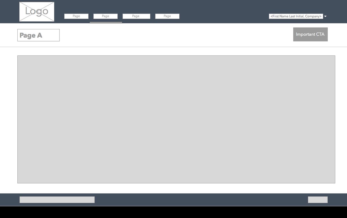
Clear Calls-to-Action and User Guidance
A website’s success hinges on its ability to guide users towards desired actions with clarity and precision. Clear calls-to-action (CTAs) are pivotal in steering visitors through the conversion funnel, from browsing to taking action. CTAs should be visually distinct, using language that resonates with the user’s intent, and placed strategically to capture attention at the right moment.
Effective CTA design is not just about aesthetics; it’s about functionality and ease of use. Consider the size and placement of buttons, ensuring they are accessible for all users, including those with motor limitations or using touchscreens. A well-designed CTA can significantly reduce user frustration and abandonment.
By simplifying the user journey with direct and unambiguous guidance, websites can enhance user experience and increase conversion rates.
To illustrate the importance of CTA design, here’s a breakdown of best practices:
- Use action-oriented language that prompts immediate response
- Ensure CTAs are visually striking with contrasting colors
- Place CTAs in high-visibility areas, like above the fold
- Size buttons for easy interaction, especially on mobile devices
- Test different CTA versions to find the most effective one
Remember, the goal is to make the user’s path as intuitive as possible. By following these guidelines, you can create a navigation experience that not only looks good but also performs well, leading to a more satisfying user journey.
Feedback and Interaction: Making Navigation Interactive
Interactive navigation elements are crucial for a seamless user experience. They guide users through your website, providing immediate feedback and making the journey intuitive. Consider implementing microinteractions, such as hover effects and visual responses to clicks, which can significantly enhance the user’s sense of control and predictability.
By optimizing website performance and ensuring clear labeling and logical hierarchy, you prioritize user needs. This approach, coupled with the strategic use of microinteractions, can transform navigation from a mere function into an engaging experience.
Leveraging analytics is also key to continuous improvement. By tracking how users interact with navigation elements, you can identify areas for enhancement. Below is a list of interactive features that can be monitored:
- Hover states and active link indicators
- Dropdown menu animations
- Responsive touch feedback for mobile devices
- Accessibility features like keyboard navigation cues
Remember, the goal is to create a navigation system that feels like a natural extension of the user’s intentions, leading to a more satisfying and efficient user experience.
Strategic Content Placement for Easy Navigation
Information Hierarchy and Content Prioritization
Creating an information hierarchy is crucial for guiding users through your website’s content effectively. By prioritizing content, you ensure that the most important information is immediately accessible, while secondary information remains easily discoverable. This approach not only enhances user experience but also contributes to a more structured and intuitive navigation.
Consider the following steps to establish a clear content hierarchy:
- Identify the core message or goal of your website.
- Determine the key pieces of information that support this message.
- Organize content in a logical order, with the most critical information at the forefront.
- Use headings, subheadings, and bullet points to break up text and highlight important details.
By meticulously organizing content and prioritizing the user’s needs, you create a seamless path that leads visitors to the desired action or information.
Remember, a well-defined structure not only aids in navigation but also in the overall comprehension of your site. It’s about creating a balance between what you want to convey and what your audience seeks. Effective content organization, speed optimization, and user feedback adaptation are key for seamless browsing. Breadcrumbs and clear categorization enhance navigation and accessibility for diverse audiences.
Using Visual Cues to Guide User Behavior
Visual cues are essential in guiding users through a website’s content and functionality. Effective visual cues can significantly enhance the user experience by making it clear what actions are available and how to perform them. For instance, color contrasts can make buttons and links stand out, while hover effects and animations can signal interactivity, encouraging users to engage with the content.
By strategically using visual elements, we can direct users’ attention to where it’s most needed, ensuring a smooth and intuitive navigation experience.
Here are some ways to implement visual cues effectively:
- Utilize color contrasts to draw attention to important elements.
- Implement hover effects to indicate clickable items.
- Use animations to highlight changes or transitions.
- Ensure buttons are sized appropriately for easy interaction.
- Provide clear labels and headlines to prevent user disorientation.
Balancing Aesthetic with Functionality
When designing a website, it’s crucial to strike the right balance between aesthetic appeal and functional design. A visually stunning site that’s difficult to navigate can frustrate users just as much as a bland but usable one. To achieve this balance, consider the following points:
- Ensure that the visual design enhances the site’s usability rather than detracting from it.
- Use design elements consistently to aid recognition and navigation.
- Prioritize clear, legible typography and appropriate color contrast to facilitate readability.
By focusing on a user-centric design approach, you can create a website that is both beautiful and easy to use, leading to a more satisfying user experience.
Remember, the goal is to guide users to the information they seek with minimal effort. This often involves simplifying design elements and avoiding unnecessary complexity. A well-balanced website will not only retain users but also encourage them to engage more deeply with the content.
Leveraging Analytics and User Feedback for Navigation Improvements

Tracking User Navigation Patterns
Understanding how users interact with your website is pivotal for enhancing navigation. Tracking user navigation patterns allows you to see which areas of your site are most engaging and where users may encounter difficulties. By analyzing this data, you can make informed decisions to streamline the user journey.
To effectively track navigation patterns, it’s essential to implement tools that capture user behavior. This includes heatmaps, click tracking, and the analysis of funnel drop-offs. Such insights enable the identification of bottlenecks and areas for improvement.
Utilizing analytics tools, you can gather quantitative data on user interactions. Here’s an example of how this data might be structured in a table:
| Page | Average Time on Page | Bounce Rate | Conversion Rate |
|---|---|---|---|
| Home | 2 minutes | 40% | 5% |
| Shop | 3 minutes | 30% | 10% |
| FAQ | 1 minute | 50% | 2% |
Remember, the goal is to create a seamless experience that guides users to their desired content with minimal effort. Regularly analyzing user behavior and implementing advanced navigation techniques are key to achieving this. Incorporate A/B testing and optimize search functionality to further enhance the user experience.
Gathering and Implementing User Feedback
User feedback is a goldmine of insights for enhancing website navigation. Incorporate user feedback to continuously refine navigation elements, ensuring that users can find what they need with ease. This iterative process involves analyzing user behavior to pinpoint areas for improvement and conducting A/B tests to gauge the effectiveness of changes.
By prioritizing information access based on user feedback, websites can create a more intuitive and user-friendly experience.
Balancing aesthetics with usability is crucial for a seamless user journey. Consideration of colors, layouts, navigation, typography, and graphics should all be informed by analytics insights and user feedback to optimize engagement. Here are some steps to effectively gather and implement user feedback:
- Conduct surveys and usability tests to collect direct input from users.
- Monitor analytics to track navigation patterns and identify friction points.
- Implement changes in small increments to measure impact.
- Engage with users through forums or feedback widgets to encourage ongoing dialogue.
Continuous Testing and Iteration for Optimal Navigation
The journey to perfecting website navigation is never-ending. It’s a cycle of testing, gathering feedback, and refining. To ensure that your website remains user-friendly and efficient, it’s crucial to engage in continuous testing and iteration. This process involves a series of steps:
- Conduct usability testing with real users to gather direct feedback on navigation ease and intuitiveness.
- Use analytical tools to track user navigation patterns and identify areas where users may be struggling.
- Implement A/B testing to compare different navigation structures and determine which is more effective.
- Make informed adjustments based on feedback and data, then test again to measure improvements.
By embracing this iterative process, you can incrementally enhance the user experience, ensuring that your website navigation is always evolving to meet user needs.
Remember, user experience strategies should be treated as an ongoing process of improvement. The goal is to create a seamless and intuitive navigation that not only meets but exceeds user expectations, fostering satisfaction and loyalty.
In today’s digital landscape, understanding how users interact with your website is crucial for success. By leveraging analytics and user feedback, you can make informed decisions to enhance your site’s navigation, ultimately improving user experience and engagement. Don’t miss the opportunity to optimize your website’s performance. Visit our website to explore our comprehensive services, including WordPress Development, eCommerce solutions, and custom web design that will help your business grow. Take the first step towards a more intuitive and user-friendly website today!
Conclusion
In conclusion, seamless website navigation is a pivotal aspect of user experience that cannot be overlooked. By simplifying navigation, ensuring responsive design, and optimizing load times, businesses can create an intuitive and satisfying experience for all users. Incorporating clear calls-to-action and maintaining a consistent design further guides users through the digital landscape with ease. As we’ve explored, the benefits of a well-structured website extend beyond user satisfaction to include improved SEO and increased conversions. It’s clear that investing in seamless navigation is not just about facilitating user movement—it’s about crafting a journey that resonates with users and aligns with the strategic goals of your business. Remember, the smoother the navigation, the deeper the engagement, and the greater the potential for success in today’s fast-paced digital world.
Frequently Asked Questions
How does a simplified navigation structure enhance user experience?
A simplified navigation structure makes it easier for users to find what they’re looking for with fewer clicks, reducing frustration and improving overall satisfaction with the website.
Why is responsive and mobile-friendly design important for website navigation?
Responsive and mobile-friendly design ensures that a website is accessible and easy to navigate on any device, providing a consistent user experience across desktops, tablets, and smartphones.
What are some effective ways to optimize website images for faster load times?
Effective ways to optimize website images include compressing image files, using appropriate image formats, utilizing responsive images that adjust to screen size, and serving images via a content delivery network (CDN).
How can accessibility and inclusivity improve website navigation?
Accessibility and inclusivity in website design ensure that all users, including those with disabilities, can navigate and interact with the website, which can lead to a wider audience reach and better user engagement.
What role do analytics play in improving website navigation?
Analytics help website owners understand how users interact with their site, identify navigation pain points, and make data-driven decisions to enhance the navigation experience.
Why is continuous testing and iteration important for website navigation?
Continuous testing and iteration allow for the identification and fixing of usability issues, adapting to user feedback, and keeping the navigation experience aligned with evolving user expectations and technological advancements.