Enhancing User Experience with Seamless Website Navigation

In the fast-paced digital world, a website’s navigation can make or break the user experience (UX). It’s not just about aesthetics; seamless website navigation ensures that visitors can find what they’re looking for quickly and effortlessly, leading to higher engagement, satisfaction, and conversion rates. This article delves into the multifaceted approach to enhancing UX through optimized website navigation, performance tweaks, and continuous quality assurance. We’ll explore strategies for intuitive navigation structures, performance optimization, and the vital role of quality assurance in delivering a superior user experience.
Key Takeaways
- Intuitive menu structures and breadcrumbs significantly improve site usability, guiding users through the content hierarchy.
- Site performance, including speed and mobile responsiveness, is crucial for user satisfaction and SEO rankings.
- Quality assurance processes, such as pre-launch testing and post-launch monitoring, are essential for maintaining a bug-free user experience.
- Incorporating user feedback and data analytics into the design and development process ensures continuous UX improvement.
- Performance optimization, through techniques like image compression and script minimization, directly impacts user engagement and conversion rates.
Strategies for Optimizing Website Navigation

Implementing Intuitive Menu Structures
To create a seamless user journey, it’s crucial to design intuitive site layouts with clear menu structures. This involves organizing menu items logically, reducing clutter, and using clear and concise labels. By prioritizing hierarchy, responsive design, and simplicity, websites can enhance user experience and navigation efficiency.
Effective website navigation is not just about the design; it’s about understanding user behavior. Incorporating user-centric features such as breadcrumbs and search functions can significantly improve the intuitiveness of menu structures.
Here are some steps to optimize website navigation and structure:
- Organize menu items logically to guide users through the site.
- Implement clear call-to-action buttons to prompt specific user actions.
- Use breadcrumbs to help users understand their location within the site.
- Ensure the navigation design is responsive across all devices.
By refining these elements, businesses can create a navigation experience that feels natural and effortless for the user.
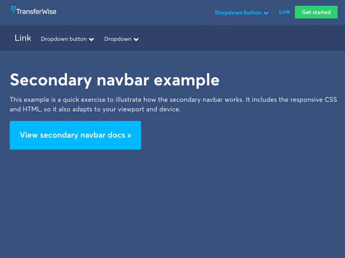
Utilizing Breadcrumbs for Enhanced Usability
Breadcrumbs are a critical element in creating a user-friendly website navigation system. They provide a clear path for users to follow, allowing them to understand their location within the site’s hierarchy at a glance. Implementing breadcrumbs can significantly enhance the user experience by making it easier for users to navigate back to previous sections without having to use the back button or start from the homepage.
- Breadcrumbs reduce the number of actions a user must take to return to a higher-level page.
- They help users understand the relationship between pages and the overall structure of the website.
- Breadcrumbs can improve the findability of website sections and pages, aiding in quick navigation.
By strategically placing breadcrumbs, websites can ensure that users have a sense of direction and can easily backtrack if necessary. This not only improves usability but also contributes to a more satisfying user journey.
Incorporating breadcrumbs should be done thoughtfully, with attention to design and placement to ensure they are effective without being obtrusive. They are particularly useful in websites with multiple layers of content, such as e-commerce sites, where users can benefit from a visual representation of their browsing path.
Leveraging User Data to Refine Navigation Paths
To create a website that resonates with users, it’s essential to analyze user data to understand their behavior and preferences. Tools like Google Analytics provide insights into traffic sources, page views, bounce rates, and conversion rates, which can be used to identify areas of friction such as confusing navigation or slow page loads.
By simplifying navigation menus and organizing items logically, users can find what they need with ease. Clear call-to-action buttons guide users through the conversion funnel, prompting specific actions that drive engagement and conversions.
Personalization plays a crucial role in refining navigation paths. Displaying personalized product recommendations and content based on user behavior and preferences can significantly enhance the shopping experience and increase conversion rates. Tailoring the website to individual users creates a more intuitive and satisfying journey, ultimately leading to increased customer satisfaction and loyalty.
Improving Site Performance for Enhanced User Experience
Speed Optimization Techniques
A fast website is not just a convenience; it’s a necessity in today’s digital landscape. Optimizing page load speed is crucial for enhancing user experience and can lead to improved search engine rankings, lower bounce rates, and higher conversion rates. Here are some key techniques to consider:
- Function optimization: Refactoring inefficient code, especially on data-heavy pages, can lead to significant performance gains.
- Image and content delivery: Employing compression, minifying code, and using CDNs can drastically reduce file sizes and speed up loading times.
- Server response time: Optimizing server configuration and database queries can minimize latency.
- Software updates: Keeping web servers and site software up-to-date can enhance speed due to performance improvements in newer versions.
- Caching: Implementing caching strategies saves resources and improves customer experience.
- Minifying scripts: Reducing the number of HTTP requests for CSS and JavaScript files, and optimizing file sizes, can improve load times.
- External scripts: Minimizing the use of external scripts and pixels can reduce unnecessary third-party requests.
Remember, optimization is an ongoing process. Regularly review and update your strategies to maintain peak performance.
By applying these techniques, you can meet user expectations and boost your performance. Tools like Google PageSpeed Insights or GTmetrix can help assess your current status and guide your optimization efforts.
Responsive Design for Mobile Users
In today’s digital landscape, mobile responsiveness is not just a feature—it’s a necessity. With the surge in mobile device usage, ensuring that your website adapts fluidly to different screen sizes is crucial for user retention and engagement. Responsive design employs flexible grids and layouts, as well as intelligent use of CSS media queries, to create a seamless experience across devices.
By prioritizing mobile responsiveness, you not only cater to the user’s convenience but also contribute to higher conversion rates and improved search engine rankings.
Testing across a variety of devices is essential to identify and rectify any compatibility issues. This process involves checking the website’s appearance and functionality on different operating systems, browsers, and screen resolutions. Here are some steps to ensure your website’s mobile responsiveness:
- Utilize flexible grids and images that adapt to the device’s screen.
- Implement media queries to apply different styles for different devices.
- Regularly test your website on various devices and browsers.
- Minimize server response time to enhance performance on mobile devices.
- Optimize images and content delivery to reduce loading times.
Regular Website Health Audits
Conducting regular website health audits is essential for maintaining optimal performance and ensuring a positive user experience. Regular audits provide insights into potential issues before they escalate, allowing for proactive improvements. A comprehensive audit covers several key areas:
- Performance: Checking for page load times and responsiveness.
- Security: Ensuring all software is up to date and secure.
- SEO: Verifying that the site is optimized for search engines.
- Usability: Assessing the ease of navigation and accessibility for users.
By systematically addressing these areas, you can enhance site reliability and user satisfaction.
Additionally, it’s important to have a structured approach to these audits. Here’s a simple checklist to guide the process:
- Schedule regular audits (monthly or quarterly).
- Use automated tools for continuous monitoring.
- Manually review key pages and user flows.
- Document findings and implement necessary changes.
- Re-evaluate post-implementation to measure impact.
Remember, a website that remains in peak condition is more likely to retain and convert visitors. As highlighted by Semrush, a clear picture of your site’s technical strengths and areas for improvement is invaluable.
The Role of Quality Assurance in User Experience

Pre-Launch Testing Protocols
Ensuring a website’s readiness before its official launch is critical for a smooth user experience. Pre-launch testing protocols are designed to meticulously evaluate every aspect of the site, from functionality to performance. This phase involves a series of checks and tests that aim to identify and rectify any potential issues.
- Functionality Testing: Verify that all features work as intended.
- Usability Testing: Assess the ease of use and intuitiveness of the site.
- Performance Testing: Ensure the site loads quickly and operates smoothly.
- Security Testing: Check for vulnerabilities and data protection measures.
- Cross-Browser Testing: Confirm compatibility across different web browsers.
- Responsive Design Testing: Test the site on various devices to ensure it adapts correctly.
By rigorously applying these protocols, we can preemptively solve problems that could detract from the user experience. It’s about delivering a website that not only looks good but also performs flawlessly under a variety of conditions.
The goal is to establish a seamless user journey from the first click, fostering trust and satisfaction. AM2 Studio’s approach to web development embodies this commitment to excellence, ensuring that every project is polished to perfection before going live.
Post-Launch Monitoring and Updates
Once a website is live, the journey towards maintaining a seamless user experience is far from over. Regular updates and monitoring are essential to ensure the website remains secure, functional, and aligned with user expectations. Post-launch, a website enters a critical phase where any undetected issues can surface and impact user engagement.
Quality assurance and post-launch monitoring are crucial for maintaining a high-quality website. Regular performance and security audits help ensure user satisfaction and site integrity.
To stay ahead, consider the following checklist for post-launch activities:
- Conduct weekly performance checks to identify any slowdowns or glitches.
- Implement daily security scans to detect vulnerabilities or malware.
- Schedule automated backups to prevent data loss and facilitate quick recovery.
- Review and update content regularly to keep the website fresh and relevant.
- Analyze user behavior and feedback to refine the user experience continually.
By adhering to these practices, businesses can swiftly address any issues and roll out necessary enhancements, thereby minimizing disruptions and maintaining a positive user experience.
Continuous Improvement through User Feedback
The journey to perfecting user experience (UX) is ongoing and heavily reliant on user feedback. This iterative process involves collecting insights from users to identify areas for enhancement and implementing changes that lead to a more intuitive and satisfying interaction with the website.
By embracing a culture of continuous improvement, businesses can ensure that their website evolves in alignment with user expectations and technological advancements.
To effectively harness user feedback, consider the following steps:
- Establish a systematic approach for gathering feedback, such as surveys or feedback forms.
- Analyze the feedback to discern patterns and prioritize areas for improvement.
- Implement changes based on the feedback and measure the impact on UX.
- Engage in regular dialogue with users to foster a sense of community and show that their input is valued.
Effective navigation and accessibility are key for user experience. Simplify design, prioritize accessibility, and utilize user feedback for iterative improvements. These efforts not only enhance the user’s journey but also contribute to the overall success of the website.
Leveraging Design and Development for Seamless UX
Creative Design Strategies
In the realm of web design, creative strategies are pivotal in crafting an engaging user experience. User-centric design emphasizes simplicity, clarity, and intuitive navigation, which are essential for retaining visitors and encouraging interaction. Key elements such as responsive design ensure that the website is accessible across all devices, while consistent branding instills trust and recognition.
- Responsive Design: Adapts to various screen sizes for a consistent experience.
- Clear Navigation: Guides users effortlessly through the website’s content.
- Consistent Branding: Reinforces brand identity across all pages.
- Accessibility: Makes the website usable for all, including those with disabilities.
By focusing on these core aspects, designers can create a seamless environment that resonates with users and supports the overall objectives of the website. It’s not just about aesthetics; it’s about creating a functional space that users want to return to.
Leveraging user data can further refine these strategies, tailoring the experience to meet the specific needs and preferences of the audience. Microinteractions, for example, can add a layer of engagement and sophistication to the user journey. Ultimately, the goal is to deliver a website that is not only visually appealing but also highly functional and user-friendly.
Development Best Practices for UX
In the realm of web development, best practices are the cornerstone of a superior user experience (UX). A well-structured codebase not only facilitates maintenance but also enhances performance, directly impacting user satisfaction. Here are some key practices to consider:
- Semantic HTML: Use HTML elements according to their intended purpose to ensure content is accessible and SEO-friendly.
- Progressive Enhancement: Start with a solid foundation that works for all users, then add advanced features that enhance the experience without excluding anyone.
- Mobile-First Approach: Design for the smallest screens first and progressively enhance the experience for larger screens.
- Performance Optimization: Regularly profile your website’s performance and optimize code to reduce load times.
- Accessibility: Ensure that your website is usable by people of all abilities by following WCAG guidelines.
By adhering to these practices, developers can create websites that are not only visually appealing but also functionally robust, providing a seamless experience that encourages user engagement and retention.
Furthermore, it’s important to integrate user feedback into the development process. This iterative approach allows for continuous refinement of the UX, ensuring that the website evolves in alignment with user expectations and technological advancements. Remember, a website that is easy to navigate and interact with will keep users coming back.
Integrating Feedback into the Design Process
The feedback loop is a critical component in evolving a website’s user experience. It involves the collection, analysis, and implementation of user insights to refine and enhance the design. This process is not a one-time event but an ongoing cycle that ensures the website remains aligned with user needs and expectations.
- Conduct user research to understand behavior and preferences.
- Improve search functionality with features like autocomplete and filters.
- Maintain uniformity in visual design elements across the site.
By integrating user feedback into the design process, we create a dynamic environment where the website continually adapts and improves, fostering a deeper connection with its audience.
Regularly updating the website based on user feedback leads to intuitive navigation, which is proven to boost conversion rates by enhancing the user experience. This approach not only meets the immediate needs of users but also anticipates future trends and behaviors, ensuring the website’s longevity and relevance.
Enhancing User Engagement Through Performance Optimization

Impact of Performance on Customer Satisfaction
The correlation between website performance and customer satisfaction is undeniable. A swift and responsive website is not just a convenience; it’s a necessity in today’s fast-paced digital landscape. Users have come to expect immediate access to information and services, and any delay can lead to frustration and abandonment of the site. This expectation underscores the importance of performance optimization as a critical component of user experience.
Performance optimization not only improves the responsiveness of a website but also contributes to a positive perception of the brand. It’s a silent yet powerful factor that influences user decisions and loyalty.
To illustrate the tangible benefits of performance optimization, consider the following impacts:
- INCREASE: Sales, conversions, and customer satisfaction.
- IMPROVE: User experience, engagement, and overall website usability.
- ENHANCE: Search engine rankings and visibility.
Regularly analyzing and refining website performance is essential. Tools like Google PageSpeed Insights and GTmetrix offer valuable insights into how a website is performing and where improvements can be made. By prioritizing performance, businesses can ensure that they are providing the best possible experience for their users, which in turn drives growth and maximizes the impact of their online presence.
Optimizing Website Speed and Loading Times
In the digital age, speed is synonymous with success. Websites that load quickly not only enhance user experience but also contribute to higher search engine rankings and improved conversion rates. To achieve this, a multi-faceted approach is essential.
Firstly, image optimization is crucial. Compressing images without sacrificing quality can drastically reduce load times. Implementing lazy loading ensures that images load only when they enter the viewport, which can significantly improve performance, especially on mobile devices.
Caching is another powerful tool. By storing copies of files, caching reduces server load and speeds up access for returning visitors. It’s a win-win for both server efficiency and user satisfaction.
Minification of scripts and stylesheets is also a key step. By removing unnecessary characters from HTML, CSS, and JavaScript, we can decrease file sizes and enhance site speed. Additionally, reducing the number of HTTP requests by combining files where possible will streamline the loading process.
Lastly, utilizing a Content Delivery Network (CDN) can greatly improve load times for users around the globe. A CDN stores a cached version of your website in multiple geographical locations, ensuring that users receive data from the closest server.
By focusing on these strategies, we can create a seamless experience for users and set the stage for improved engagement and conversions.
Strategic Image and Script Optimization
Optimizing images and scripts is a pivotal step in enhancing website performance and user engagement. Compressing images and minifying code are essential actions that reduce file sizes and improve loading times, contributing to a smoother user experience. By leveraging tools like ImageOptim and TinyPNG, we can strip unnecessary data without compromising visual quality.
Implementing caching mechanisms can lead to exponential benefits, not only conserving server resources but also elevating the customer experience. It’s crucial to minimize the use of external scripts and pixels, which can introduce additional requests and performance bottlenecks. Our approach includes a comprehensive checklist to regularly review and suggest improvements, ensuring that your website remains fast and responsive.
By focusing on mobile responsiveness and optimizing server configurations, we can significantly decrease latency and enhance overall website performance. This proactive strategy aligns with insights from GUVI Blogs, which emphasize the importance of a faster online experience for user satisfaction.
To further refine the optimization process, consider the following steps:
- Automate image conversion and compression to streamline performance.
- Efficiently optimize code based on functionality and the programming languages used.
- Reduce CSS and JavaScript HTTP requests to accelerate loading times.
- Keep WordPress and other CMS platforms updated to mitigate security risks and maintain performance.
Remember, a well-optimized website not only retains visitors but also improves search engine rankings, leading to increased visibility and potential growth.
At the heart of every successful online venture is a website that loads swiftly, provides a seamless user experience, and keeps visitors engaged. Our expertise in WordPress Performance Optimization is designed to elevate your site’s speed and efficiency, ensuring that your audience stays connected and converts. Don’t let slow load times hinder your success. Visit our website now to learn how we can turbocharge your digital presence and keep users coming back for more.
Conclusion
In the realm of website design and development, the significance of seamless navigation cannot be overstated. It is the cornerstone of a superior user experience, guiding visitors effortlessly through the digital landscape of your website. By implementing clear navigation, optimizing website structure, and ensuring fast loading speeds, businesses can foster user satisfaction, increase engagement, and ultimately, drive conversions. As we’ve explored various strategies and insights throughout this article, it’s clear that a thoughtful approach to UI & UX optimization is not just beneficial but essential for staying competitive in today’s fast-paced online environment. Remember, a website that is easy to navigate is more than just user-friendly—it’s a powerful tool for achieving business success.
Frequently Asked Questions
What are the key factors to consider for intuitive website navigation?
Key factors include clear and logical menu structures, easily accessible navigation bars, the use of breadcrumbs, and ensuring that the navigation is consistent across the entire website.
How does website speed impact user experience?
Website speed is crucial for user experience as slow loading times can lead to frustration, increased bounce rates, and lower overall user satisfaction, potentially decreasing conversions.
What is the role of breadcrumbs in website navigation?
Breadcrumbs provide a trail for the user to follow back to the starting or entry point of the website and help users understand the layout of the website and their location within it.
Why is responsive design important?
Responsive design ensures that a website is accessible and provides an optimal viewing experience across a wide range of devices, from desktops to smartphones, thus improving user engagement.
How can user feedback contribute to website improvement?
User feedback is invaluable for identifying issues, understanding user needs, and making informed decisions to enhance the website’s usability, functionality, and content.
What is the importance of regular website health audits?
Regular website health audits help identify and resolve issues related to SEO, performance, security, and usability, ensuring the website remains efficient, secure, and user-friendly.