Enhancing User Experience with Seamless Website Navigation

In the digital age, a website’s user experience (UX) can make or break its success. Among the various elements that contribute to UX, seamless website navigation stands out as a critical factor. It not only ensures that users can find the information they need without frustration but also enhances their overall engagement with the site. This article, ‘Enhancing User Experience with Seamless Website Navigation,’ delves into the strategies and best practices for creating an intuitive and user-friendly navigation system that supports a positive UX.
Key Takeaways
- Intuitive website navigation is foundational to a positive user experience, directly influencing user satisfaction and retention.
- Responsive design and accessibility are crucial for creating a seamless navigation experience across different devices and for all users.
- Website performance, including page load speeds and optimized scripts, plays a significant role in the navigation experience.
- User-centered design and analytics can help refine navigation paths and improve the overall effectiveness of a website.
- Continuous improvement post-launch, such as regular website health audits and updates, ensures navigation remains effective over time.
The Pillars of Intuitive Navigation
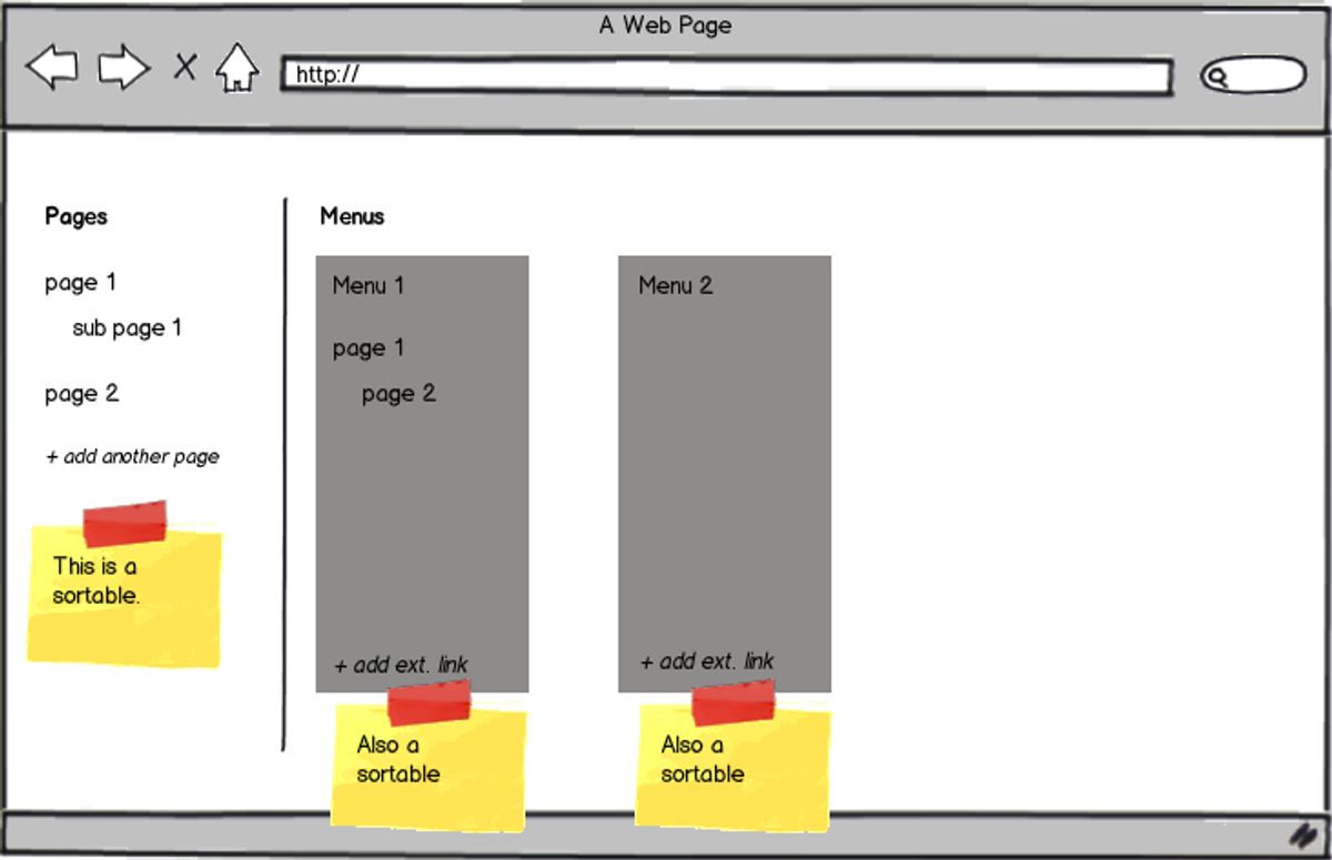
Implementing Clear Navigation Structures
To achieve intuitive website navigation, it’s crucial to understand user behavior and structure information in a clear, hierarchical manner. This not only enhances user experience but also fosters satisfaction and engagement. A well-defined navigation structure guides users effortlessly to their desired content, reducing frustration and increasing the likelihood of a positive interaction with your website.
Effective website navigation relies on understanding user behavior, structuring information hierarchically, and enhancing user experience for satisfaction and engagement.
Here are some key practices to consider:
- Use consistent layout and design for navigation across all pages.
- Ensure the navigation is responsive and adapts to different screen sizes and devices.
- Employ clear, descriptive labels for navigation links, avoiding confusing jargon.
By simplifying the navigation and making it responsive, users can find what they’re looking for with just a few clicks. Remember, a well-structured website is akin to a well-planned city—it makes navigation easy and the journey enjoyable.
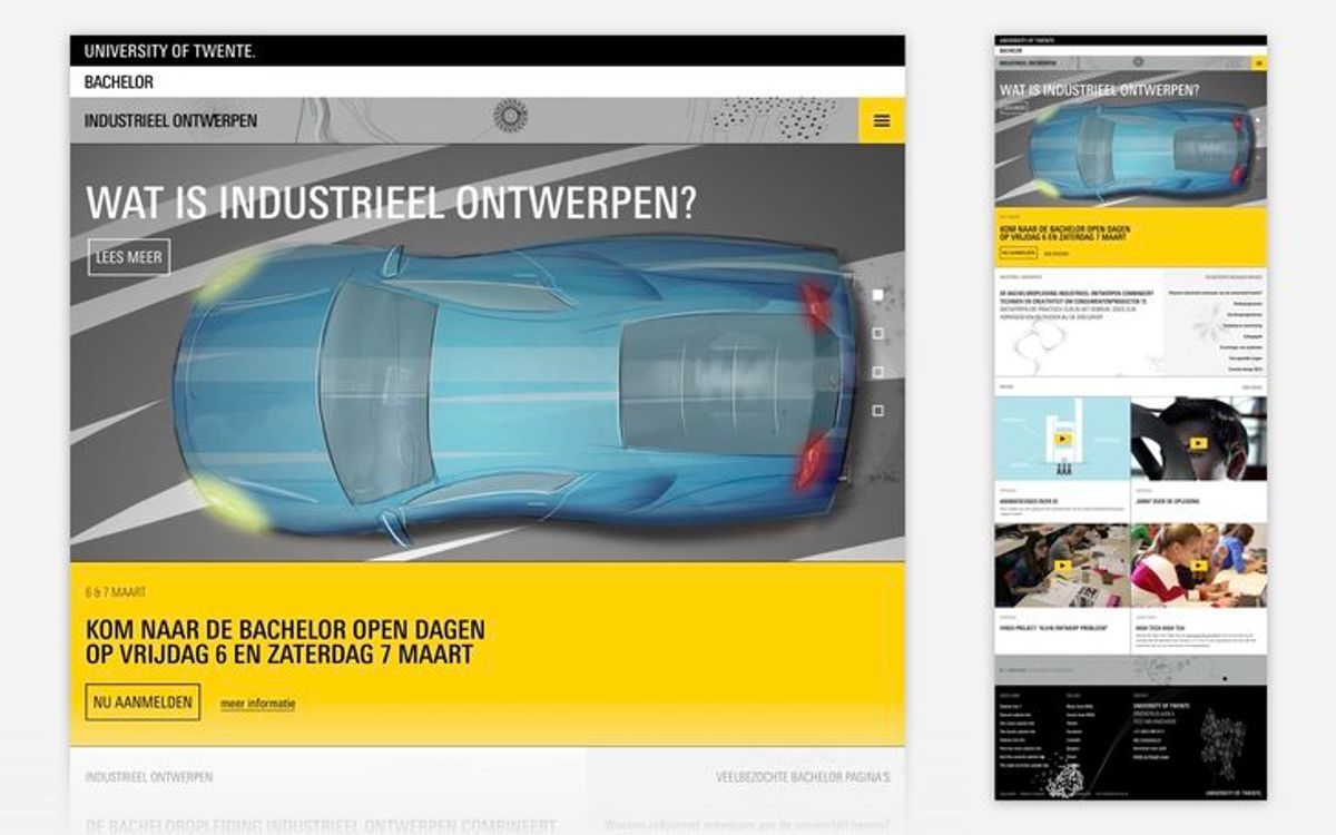
Utilizing Responsive Design for Cross-Device Compatibility
In today’s digital landscape, responsive design is not just a trend; it’s a necessity. With a myriad of devices in use, from smartphones to tablets to desktops, ensuring your website adapts seamlessly is crucial for user retention and engagement. By implementing responsive design, you cater to every user, regardless of their device, which leads to a more inclusive and accessible web experience.
To ensure a website is responsive, developers focus on key areas such as:
- Flexible Grid Layouts
- Adaptive Images
- Media Queries
These elements work together to create a fluid experience, where layouts and content scale appropriately to the screen size. A responsive website not only improves usability but also contributes to better SEO rankings, as search engines favor mobile-friendly sites.
Embracing a mobile-first approach can significantly enhance user experience. Starting with mobile design ensures that the most essential features are prioritized, and the experience is optimized for smaller screens before scaling up to larger devices.
Regular testing and updates are essential to maintain responsiveness. As new devices and browsers emerge, continuous monitoring ensures that your website remains compatible and performs optimally across all platforms.
Incorporating Accessibility Features for Inclusivity
Ensuring that a website is accessible to all users, including those with disabilities, is not just a moral imperative but also a strategic business decision. Accessible websites often rank better in search engines, reflecting the importance of inclusivity in user experience. By implementing features like alternative text for images and keyboard navigation, developers can create a more inclusive environment that benefits everyone.
Accessibility is not a feature; it is a social trend that demands attention and action.
To effectively incorporate accessibility, consider the following steps:
- Include a "Skip to Main Content" link to assist users with keyboard navigation.
- Ensure that all interactive elements are accessible via keyboard.
- Provide clear page titles, meaningful links, and a visible keyboard focus indicator.
- Maintain sufficient contrast ratios between text and background colors.
- Add descriptive alt text to images for screen reader users.
These measures not only aid users with disabilities but also enhance the overall user experience, leading to increased website reach and potentially higher search engine rankings.
Optimizing Website Performance for Seamless User Journeys
Improving Page Load Speeds
In the digital age, page load speed is a critical factor for user retention and satisfaction. A delay in loading can lead to a significant drop in user engagement and conversions. To combat this, several strategies can be employed to enhance the speed at which a page loads.
One effective method is to optimize images; this involves compressing them without compromising quality, thus reducing the time it takes for them to load. Additionally, minimizing HTTP requests by reducing the number of elements on a page, such as scripts and CSS files, can also lead to faster page rendering.
Implementing caching is another powerful technique. It allows frequently accessed data to be stored locally, reducing server load and subsequent page load times.
Furthermore, minifying scripts by decreasing the size and number of CSS and JavaScript files can have a substantial impact on load times. It’s also beneficial to optimize the use of external scripts to minimize unnecessary requests to third-party tools.
By focusing on these areas, we can significantly improve the user experience and maintain a competitive edge in the online landscape.
Leveraging Caching for Enhanced Responsiveness
Caching is a pivotal strategy for enhancing website responsiveness and user experience. By storing frequently accessed resources on the user’s device, websites can significantly reduce load times on subsequent visits. This not only improves the user’s interaction with the site but also conserves bandwidth and server resources.
Effective caching involves several key practices:
- Use Browser Caching: This allows parts of the website to be stored in the user’s browser, avoiding full reloads.
- Enable Compression: Gzip compression reduces the size of CSS, HTML, and JavaScript files, which are often larger than 150 bytes.
- Minify Scripts: Optimizing the file size of CSS and JavaScript can lead to fewer HTTP requests and faster loading times.
By implementing these caching techniques, websites can achieve better performance, which is crucial for retaining users and improving search engine rankings. It’s a direct response to the modern user’s expectation of instant access and can be a determining factor in the success of a website.
Minimizing HTTP Requests with Optimized Scripts
One of the most effective ways to enhance website performance is by minimizing the number of HTTP requests required to load a page. This can be achieved through various optimization techniques that streamline the delivery of content to the user’s browser.
- Image Optimization: Compressing images without losing quality helps reduce load times. Tools like TinyPNG or ImageOptim can significantly shrink file sizes.
- Browser Caching: Leveraging browser caching stores elements of the site locally, reducing the need to reload entire pages on subsequent visits.
- Minify Resources: Stripping unnecessary characters from CSS, JavaScript, and HTML files speeds up their processing and execution.
- External Scripts: Limiting the use of external scripts and third-party tools can decrease load times and improve overall site performance.
By focusing on these key areas, developers can create a smoother and more responsive user experience. It’s not just about reducing the number of requests but optimizing each element that contributes to page load.
Furthermore, search engines like Google consider page speed as a ranking factor, which means that faster websites may benefit from higher search visibility and increased organic traffic. This underscores the importance of optimization not only for user experience but also for SEO.
Designing with the User in Mind
Creating a Cohesive Visual Hierarchy
A logical hierarchy is the backbone of intuitive website navigation. It’s akin to building a house, starting with a solid foundation of main categories and adding subcategories as rooms to enhance functionality and comfort. This structure not only simplifies navigation but also significantly improves the user experience.
By focusing on content hierarchy, we guide users through the website in a way that feels natural and effortless. Neglecting this can lead to confusion, increased bounce rates, and a less effective website.
An effective visual hierarchy involves several key practices:
- Logical Structure: Organizing content to match user expectations, with the most important information presented first.
- Use of Headers: Employing H1, H2, H3 tags to structure content, making it easier for users to scan and find information.
- Internal Linking: Using the pillar-cluster model to create a strong internal linking strategy, akin to signposts guiding users through the website.
Remember, the goal is to accommodate non-linear customer journeys and optimize website navigation for speed, ensuring a seamless experience that encourages engagement.
Simplifying Forms and Calls-to-Action
To enhance the user experience and streamline the conversion process, simplifying forms and calls-to-action (CTAs) is crucial. A complex or confusing form can deter users, leading to a higher abandonment rate. Conversely, clear and straightforward CTAs can guide users effortlessly towards conversion, boosting satisfaction and conversion rates.
By reducing the number of form fields to the bare minimum, users spend less time and effort, which can significantly improve the user journey.
Effective CTAs should use action-oriented language like ‘Subscribe Now’ or ‘Download the Guide’ to convey the benefit clearly. Additionally, incorporating design elements such as white space can improve focus and readability, while consistent styling across the site helps users recognize patterns and navigate with ease.
Here are some strategies to simplify forms and CTAs:
- Minimize Form Fields: Only include necessary fields to reduce user effort.
- Clear, Actionable CTAs: Employ explicit verbs and phrases that indicate the action to be taken.
- Visible and Attractive Design: Make CTAs stand out with contrasting colors and ensure forms are easy to navigate.
- Error Handling and Validation: Provide real-time feedback to prevent submission errors.
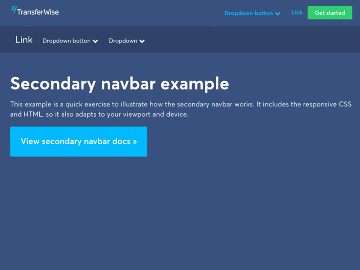
Ensuring Consistency in Navigation and Layout
Consistency in navigation and layout is crucial for a seamless user experience. Users expect to find navigation elements in familiar places as they browse through a website. This predictability allows for intuitive use, reducing the cognitive load and enhancing satisfaction.
- Consistent Navigation Design: Employing a uniform design across all pages aids users in quickly learning the site’s navigation structure.
- Responsive Navigation: Adapting navigation to various screen sizes ensures functionality across devices.
- Clear Labels: Utilizing descriptive labels for navigation links helps avoid confusion.
By maintaining a consistent and responsive design, you not only uphold visual harmony but also support user expectations and behavior patterns.
It’s important to test and iterate your navigation design to refine user journeys. Regular audits and user feedback can highlight areas for improvement, ensuring that navigation remains intuitive over time.
Leveraging Analytics to Refine Navigation Paths
Understanding User Behavior with Heatmaps
Heatmaps are a powerful tool for visualizing complex user interactions on your website. By aggregating user behavior data, heatmaps can reveal patterns that might otherwise go unnoticed. Spotting deviations in user behavior, such as unexpected clicks on non-interactive elements or attention to lower parts of the page, can inform strategic design changes. For instance, if a particular link is receiving significant interest, it may be beneficial to place it more prominently on the page.
Heatmaps can help you visualize user behavior on your website and identify areas for improvement.
To effectively use heatmaps, follow these steps:
- Identify high bounce rate exit pages using analytics tools like Google Analytics.
- Create heatmaps for these pages to analyze clicks, moves, scrolls, and rage-clicks.
- Overlay engagement zones on your heatmaps to discern what users focus on or ignore.
- Cross-reference heatmap data with session recordings to understand the context behind user actions.
By continuously analyzing and adapting to user behavior, you can enhance the user experience, making your website a digital rabbit hole that captivates and converts visitors.
A/B Testing for Navigation Effectiveness
A/B testing serves as a critical tool in the optimization of website navigation, allowing designers to make informed decisions based on user behavior. By comparing different versions of navigation elements, we can discern which layout, wording, or design resonates best with users, leading to improved engagement and conversion rates.
A/B testing is not just about choosing between two options; it’s about understanding the nuances of user preferences and creating a navigation experience that feels intuitive and effortless.
For instance, an e-commerce site might test two different menu structures to see which leads to a higher purchase rate. The results can be presented in a simple table:
| Menu Structure | Conversion Rate | User Satisfaction |
|---|---|---|
| Version A | 3.5% | 85% |
| Version B | 4.2% | 90% |
This data-driven approach ensures that changes are not based on assumptions but on actual user interaction. It’s essential to test one change at a time to isolate the impact of each variable. Remember, the goal is to enhance the user journey, making every click count towards a satisfying experience.
Utilizing User Feedback to Inform Design Decisions
In the realm of web design, user feedback is the compass that guides the enhancement of the user experience. It’s essential to establish multiple channels for users to share their insights, such as surveys, feedback forms, and usability tests. By analyzing this data, designers can prioritize features and adjustments that align with user needs.
The process of transforming user feedback into actionable improvements is a cornerstone of user-centered design. It ensures that the website evolves in a way that resonates with its audience.
A systematic approach to incorporating feedback involves several steps:
- Collect feedback through various methods like pop-ups, surveys, and direct user testing.
- Analyze the feedback to identify common themes and areas for improvement.
- Formulate hypotheses based on the insights gained.
- Implement changes and conduct A/B testing to validate the effectiveness of these modifications.
- Gather further feedback on the changes to refine and iterate the design.
This cycle of feedback and improvement fosters a dynamic and responsive web environment that continually adapts to user preferences and behaviors.
Maintaining and Improving Navigation Post-Launch

Conducting Regular Website Health Audits
Regular website health audits are crucial for maintaining optimal online performance and ensuring a seamless user experience. Conducting these audits allows for the early detection of issues that could disrupt navigation or slow down your site. A comprehensive audit covers various aspects such as performance, security, SEO, and usability, each playing a pivotal role in the overall health of your website.
By routinely checking these elements, you can identify potential problems before they escalate, keeping your website running smoothly and efficiently.
To effectively manage website health, consider the following steps:
- Review and update content regularly to keep the site fresh and engaging.
- Ensure consistent design across all pages for a cohesive user experience.
- Implement caching and optimize images to improve site speed.
- Minify scripts and reduce the use of external scripts to decrease load times.
- Analyze user interface for usability improvements to boost conversion rates.
Remember, a website that is well-maintained not only performs better but also instills trust and confidence in your users.
Implementing Continuous User Experience Testing
Continuous user experience testing is vital for maintaining and enhancing the quality of a website post-launch. Regular A/B testing is a cornerstone of this process, allowing for the comparison of different user interfaces and the identification of the most effective elements. Mobile optimization ensures that the website provides a consistent experience across all devices, which is crucial as mobile usage continues to rise.
Accessibility improvements should not be overlooked, as they make the website usable for a wider audience, including those with disabilities. It’s also important to maintain security standards through regular updates and audits. Effective monitoring systems are essential for quality assurance and to swiftly address any issues that arise.
By establishing measurable goals, we can focus our evaluation efforts and analyze the user experience based on specific criteria. This approach helps in refining the website navigation and enhancing the overall user journey.
To ensure a comprehensive understanding of user behavior, both quantitative and qualitative data should be collected. This includes tracking metrics such as bounce rate, page views, session duration, and conversion rates, as well as gathering user feedback through surveys and interviews. The insights gained from this data are invaluable for making informed design decisions that improve the user experience.
Staying Updated with Latest Web Navigation Trends
To maintain a competitive edge and provide the best user experience, it’s crucial to stay abreast of the latest web navigation trends. Keeping your website’s navigation aligned with current trends can significantly impact user engagement and satisfaction. For instance, the HubSpot Blog highlights trends such as Experimental Navigation and Kinetic Typography, which are reshaping how users interact with websites.
By regularly reviewing and integrating new navigation trends, you ensure that your website remains modern, functional, and appealing to users.
Adapting to new trends may involve embracing minimalist designs, innovative menu structures, or interactive elements that enhance the browsing experience. It’s not just about aesthetics; it’s about creating a seamless flow that guides users to their desired content with ease and efficiency. Below is a list of actionable steps to help you stay updated:
- Subscribe to industry blogs and publications.
- Attend web design and UX conferences.
- Participate in web design communities.
- Conduct competitive analysis regularly.
Remember, the digital landscape is constantly evolving, and so should your website’s navigation. By staying informed and proactive, you can deliver a user experience that not only meets but exceeds expectations.
Ensuring your website remains navigable and user-friendly after launch is crucial for retaining visitors and improving their experience. At [Highlight], we specialize in WordPress Development, including performance optimization and website health audits, to keep your site running smoothly. Don’t let post-launch challenges hinder your online success. Visit our website to learn more about our services and how we can help you maintain and enhance your website’s navigation.
Conclusion
In conclusion, seamless website navigation is a cornerstone of user experience, playing a pivotal role in guiding visitors through a digital landscape with ease and efficiency. By implementing strategies such as simplifying navigation, optimizing page speed, ensuring responsive design, and adhering to web accessibility standards, businesses can foster an environment where users feel empowered and engaged. The culmination of these efforts leads to higher user satisfaction, increased conversions, and a stronger online presence. As we’ve explored throughout this article, the path to a successful website is clear—prioritize intuitive navigation to create a harmonious user journey that resonates with your audience and supports your business objectives.
Frequently Asked Questions
How does a clear navigation structure enhance user experience?
A clear navigation structure helps users find what they’re looking for quickly and effortlessly, reducing frustration and increasing the likelihood of a positive experience, which can lead to higher engagement and conversion rates.
Why is responsive design important for website navigation?
Responsive design ensures that a website is accessible and navigable on various devices, from desktops to smartphones, providing a consistent and seamless experience for all users, regardless of their device.
What are the benefits of incorporating accessibility features in website navigation?
Incorporating accessibility features makes a website usable for individuals with disabilities, expanding the audience reach and complying with legal standards, while also demonstrating social responsibility.
How can website performance optimization impact user navigation?
Optimizing website performance, such as improving load speeds and minimizing HTTP requests, can make navigation smoother and faster, reducing bounce rates and enhancing the overall user experience.
What role do analytics play in refining website navigation paths?
Analytics provide insights into user behavior, such as which pages are most visited and where users drop off, allowing for data-driven decisions to refine navigation paths and improve user journeys.
Why is post-launch monitoring vital for maintaining effective website navigation?
Post-launch monitoring helps identify and fix any new bugs or issues that may arise, ensuring the navigation remains intuitive and the website continues to provide a high-quality user experience.