Crafting Memorable User Experiences with Intuitive Design

In the digital age, intuitive design is not just about aesthetics; it’s a fundamental component of creating memorable user experiences. By understanding the psychology of users, prioritizing usability and accessibility, and leveraging visual elements effectively, designers can craft interfaces that are not only beautiful but also function seamlessly. This article delves into the principles of intuitive design and explores strategies to engage users, build trust through transparency, and optimize conversions, ultimately leading to sustained growth and continuous improvement.
Key Takeaways
- Intuitive design is rooted in a deep understanding of user psychology, ensuring that interfaces meet users’ expectations and needs.
- Usability and accessibility are key to creating inclusive experiences that allow all users to navigate and interact with ease.
- Visual appeal, including the use of color and contrast, plays a crucial role in engaging users and guiding them through a visual hierarchy.
- Transparency in privacy policies and a commitment to data security are essential for building trust and respecting user preferences.
- Continuous improvement through agile design iterations, data-driven A/B testing, and a culture of innovation is vital for long-term success.
The Pillars of Intuitive Design
Understanding User Psychology
At the heart of intuitive design lies a deep understanding of user psychology. Intuitive design emphasizes user psychology and simplified navigation to create engaging and efficient experiences. By delving into the cognitive processes that guide user interactions, designers can craft interfaces that feel familiar and easy to use. This alignment with user expectations reduces cognitive load and enhances satisfaction.
To truly grasp user psychology, it’s essential to recognize the emotional responses elicited by design elements. Emotions play a crucial role in how users perceive and interact with a product. A positive emotional response can lead to increased trust and loyalty, while a negative one can drive users away. Designers must therefore be keenly aware of the emotional impact of their work.
By prioritizing user satisfaction, a website becomes a dynamic entity that evolves to meet changing expectations.
Understanding the different levels at which design influences user psychology is also key. Here’s a brief overview:
- Visceral: First impressions based on the overall look and feel.
- Behavioral: Subconscious evaluation of how the design facilitates goal achievement.
- Reflective: Conscious reflection on the overall experience after use.
Each level requires careful consideration to ensure that the design resonates with users on an intuitive level. By focusing on these aspects, designers can create products that not only meet users’ needs but also connect with them on an emotional level, ultimately leading to a more memorable and satisfying user experience.
Designing for Usability and Accessibility
To create an intuitive design, it’s essential to focus on usability and accessibility. This means developing interfaces that are easy to navigate and understand, ensuring that all users, including those with disabilities, can interact with your product effectively. Simplifying complex processes into smaller steps and using clear signposting can significantly reduce cognitive overload and enhance the user experience.
- Understand Your Users: Conduct user interviews and usability testing.
- Prioritize Functionality: Ensure users can accomplish tasks efficiently.
- Avoid Clutter: Keep designs clean and focused.
- Follow Accessibility Guidelines: Design for inclusivity.
By adhering to these principles, designers can craft experiences that are not only functional but also inclusive, catering to a wider audience and fostering a positive perception of the brand.
Remember, usability is not just about making things work; it’s about creating a seamless experience that feels almost invisible to the user. It’s about designing with empathy and consideration for all potential users, which ultimately leads to a more successful and widely-adopted product.
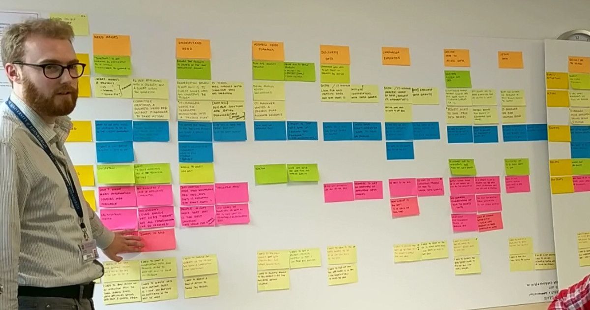
Incorporating Feedback Loops
In the realm of intuitive design, the incorporation of feedback loops is essential. These loops involve a continuous cycle of gathering, analyzing, and implementing feedback from various sources such as users, stakeholders, and usability tests. By actively seeking feedback early and often, designers can iterate and refine the user experience, ensuring that the final product resonates with its intended audience.
Feedback loops are a critical component in the design process, allowing for the evolution of a product that truly meets user needs and expectations.
The process of incorporating feedback can be broken down into several key steps:
- Collecting user feedback through surveys, interviews, and usability testing.
- Analyzing the data to identify patterns and areas for improvement.
- Implementing changes based on the insights gained.
- Repeating the cycle to further refine and enhance the design.
This iterative approach not only improves usability but also fosters a deeper understanding of user psychology, ultimately leading to higher conversion rates and a more seamless user journey.
Enhancing User Engagement Through Visual Appeal
The Role of Color and Contrast
The strategic use of color and contrast is a cornerstone of intuitive design, directly influencing user engagement and comprehension. Bold hues can command attention, guiding users to key areas of a website or application, while subtle shades can provide a backdrop for secondary information. For instance, a ‘Sign Up’ button in a vibrant color against a muted background is more likely to draw the eye and encourage action.
Effective color schemes are not only about aesthetics but also about functionality. They can enhance readability and highlight important data, as seen in the use of contrasting colors in key statistics. Consider the following list of design elements where color and contrast play a pivotal role:
- Navigation menus
- Call-to-action buttons
- Informational banners
- Interactive elements
- Data visualization
By thoughtfully applying color and contrast, designers can create a visual hierarchy that intuitively leads users through the user journey, from initial engagement to the desired action.
Incorporating user feedback and psychological insights, such as the association of blue with trustworthiness in banking, can further refine the use of color in design. It’s essential to balance visual appeal with the practical needs of users, ensuring that the design remains accessible to all, including those with visual impairments.
Balancing Aesthetics with Functionality
In the realm of user experience design, harmony between aesthetics and functionality is paramount. A visually appealing interface can captivate users, but it must also be practical and intuitive to navigate. Consider the following points:
- Aesthetics: It’s about the immediate impact of the design on the user, eliciting a positive reaction and setting the tone for their experience.
- Usability: The design must facilitate ease of use, allowing users to accomplish their tasks without confusion or frustration.
- Storytelling: A compelling narrative woven into the design can engage users on a deeper level, creating a lasting connection.
- Meaningful Interaction: Aim for interactions that are not only functional but also enrich the user experience.
By focusing on both aesthetics and functionality, designers can create experiences that are not only beautiful but also efficient and effective. This dual focus ensures that the design serves the user’s needs while also providing an enjoyable experience.
Avoiding common pitfalls such as cluttered interfaces and ignoring accessibility guidelines is crucial. A clean, focused design that complies with accessibility standards will be more inclusive and appreciated by a wider audience. Ultimately, the goal is to craft an experience that feels seamless and natural, where the design’s beauty enhances its usability, leading to a more satisfying user journey.
Creating a Visual Hierarchy
Establishing a visual hierarchy on your web page is crucial for guiding users through your content in a way that flows naturally and emphasizes the most important elements. High-quality imagery, bold fonts, and strategic placement of interactive elements like call-to-action buttons are essential tools for capturing attention and conveying information effectively.
- Captivating Visual Appeal: Engages users with color schemes and compelling visuals.
- Seamless Navigation: Achieves through well-organized layouts and intuitive icons.
- Balanced Aesthetics and Functionality: Ensures visual elements complement usability.
By meticulously crafting a visual hierarchy, designers can create a user experience that not only looks appealing but also facilitates ease of use and accessibility. This approach is integral to the success of any web design, as it directly influences user engagement and satisfaction.
Remember, the goal is to make the user’s journey through your website as intuitive as possible. A thoughtful visual hierarchy can lead to a more enjoyable and efficient user experience, which is paramount in a media-centric application.
Building Trust with Transparency and Privacy

Communicating Your Privacy Policy Clearly
In the realm of user experience (UX) design, the clarity of your privacy policy can significantly influence user trust. A transparent and easily understandable privacy policy reassures users that their personal information is handled with care. Here are some key steps to ensure your privacy policy is communicated effectively:
- Simplify the language: Avoid legal jargon and use plain language to make the policy accessible to all users.
- Highlight key points: Summarize the most important aspects of your policy at the beginning.
- Make it easily accessible: Place links to your privacy policy in visible locations, such as the footer of your website.
- Update regularly: Keep your policy up-to-date with the latest data protection regulations.
By balancing personalization with privacy, you create a positive user experience that respects user preferences and fosters trust.
Remember, privacy policies and user trust are not just legal requirements but are crucial in UX design. Transparency, data protection, and user control are key components that should be woven into the fabric of your design strategy.
Designing for Data Security
In the realm of user experience (UX) design, data security is a cornerstone that cannot be overlooked. Designers are tasked with the responsibility of creating secure pathways for users, guiding them towards the safest interactions with digital products. This is the main idea behind user experience security measures.
To achieve this, a multi-layered approach is often employed, encompassing various strategies:
- Encryption of data to protect sensitive information.
- Authentication mechanisms to verify user identity.
- Authorization controls to ensure users can only access what they’re permitted to.
- Regular security audits to identify and rectify potential vulnerabilities.
Building trust through design involves a commitment to privacy and security. This can be achieved through transparent practices and clear communication with users about how their data is handled.
Lastly, it’s crucial to stay abreast of the latest security trends and threats. Designers must collaborate with security experts to integrate robust protections that evolve with emerging risks, thereby safeguarding the user experience against potential breaches.
Respecting User Preferences and Consent
In the realm of user experience, respecting user preferences and consent is not just a legal obligation but a cornerstone of trust and transparency. Users should have control over their personal data and the freedom to choose how it’s used. This principle is echoed in the ‘The 7 Principles of Privacy by Design’, emphasizing a user-centric approach to privacy.
When designing for consent, clear communication is key. Users must be able to understand their choices and the implications of their decisions. This includes the ability to easily manage consent and preferences.
Below is a list of considerations for respecting user preferences and consent:
- Provide clear and accessible options for users to manage their cookie settings and data preferences.
- Ensure that consent mechanisms are as straightforward as withdrawing consent.
- Avoid using pre-checked boxes or default opt-ins that assume consent.
- Regularly update users on changes to privacy policies and give them the option to re-consent.
By prioritizing user preferences, businesses not only comply with privacy regulations but also foster a relationship based on respect and trust with their users.
Optimizing Conversion with Strategic UX

Analyzing User Behavior for Improved Conversions
To enhance conversion rates, a deep dive into user behavior analytics is essential. It entails examining various interactions such as mouse flow, clicking patterns, and scrolling habits. By understanding moments of hesitation or frustration, designers can pinpoint areas for improvement.
A user-centric approach to design iterations, based on behavior analysis, ensures that the user experience is continuously refined, leading to a dynamic website that evolves with user expectations.
The following steps are crucial in analyzing user behavior:
- Conduct user interviews and surveys to gather direct feedback.
- Implement tools to track user interaction and website performance.
- Analyze the data to identify patterns and areas of friction.
- Suggest and implement improvements to streamline the user journey.
By prioritizing user satisfaction and addressing their needs, websites can become more intuitive and conversion-friendly.
Streamlining the User Journey
To create an intuitive and seamless user journey, it’s essential to simplify complex processes. By breaking down tasks into smaller, manageable steps and using clear signposting, users can navigate through your product with ease, reducing cognitive overload.
Accessibility is a cornerstone of a streamlined user experience. Designing with accessibility principles ensures that all individuals, including those with disabilities, can use your product effectively. Key factors include color contrast, text readability, keyboard navigation, and screen reader compatibility.
Embracing white space in design not only improves readability but also enhances the overall clarity of the user journey. It creates breathing room around elements, allowing users to focus on what matters most.
Feedback is crucial for refining the user journey. Iterating based on user feedback leads to continuous improvement, ensuring that the user experience remains aligned with their needs and expectations. Below is a list of steps to consider when streamlining the user journey:
- Analyze user behavior to identify pain points.
- Optimize loading times for a seamless experience.
- Avoid overwhelming users with too many options.
- Implement strategic white space to guide user focus.
- Seek and incorporate user feedback regularly.
Leveraging Emotional Design for Conversion Optimization
Emotional design is the secret ingredient that transforms a good user experience into a great one. By tapping into the emotional responses of users, designers can create products that resonate on a deeper level, fostering loyalty and encouraging conversions. It’s not just about aesthetics; it’s about crafting experiences that feel personal and memorable.
Emotional design enhances user experiences by creating a meaningful and memorable connection. It goes beyond functionality, influencing how users feel about and interact with a design.
Understanding the emotional journey of users is crucial. Here are some key aspects to consider:
- Create a Connection: Products with emotional appeal can establish a bond with users.
- Reflective Design: Post-interaction, users will judge the performance and benefits, including value for money.
- Positive Reinforcement: Encouraging feedback can lead to repeat usage and brand advocacy.
By strategically incorporating emotional design, businesses can see a significant uplift in user engagement and conversion rates. It’s an investment in the user’s emotional experience that pays dividends in customer satisfaction and loyalty.
Sustaining Growth with Continuous Improvement

Embracing an Agile Approach to Design Iterations
In the realm of user experience design, agility is paramount. Embracing an agile approach means committing to a process where design iterations are not only expected but encouraged. This iterative cycle is driven by continuous user feedback, allowing for rapid refinements and adjustments that align closely with user needs and preferences.
- Feedback and Iteration: Regularly seek user feedback to inform design decisions and iterate accordingly.
- Embrace White Space: Strategically use white space to enhance readability and focus on key elements.
- Consistency is Key: Ensure design consistency across all elements to foster user familiarity.
- Mobile-First Approach: Prioritize mobile optimization to cater to a growing mobile user base.
By integrating these practices into the design workflow, teams can create products that are not only functional but also resonate with users on an emotional level. This connection is crucial for fostering long-term user engagement and satisfaction.
Iteration in UX is a cyclical process that involves refining and improving design solutions based on feedback, testing, and evaluation. It’s a core aspect of agile methodologies, which prioritize flexibility and responsiveness to change. By adopting an agile mindset, designers and developers can work collaboratively to enhance the user experience in a way that is both efficient and effective.
Utilizing A/B Testing for Data-Driven Decisions
A/B testing is a powerful tool for making data-driven decisions that can lead to significant improvements in website conversion rates. By comparing two versions of a web page (A and B), designers and marketers can determine which elements resonate best with users. The key to successful A/B testing is to define clear objectives and create variations that directly address those goals.
For instance, if the objective is to increase newsletter sign-ups, one might test different call-to-action button colors, placements, or messaging. The results can reveal user preferences and guide further design choices. Here’s a simplified process:
- Define the Objective: What is the goal of the test?
- Create Varied Versions: Develop the original and the variant.
- Run the Test: Expose your audience to both versions.
- Analyze Results: Use statistical analysis to determine the winner.
- Implement Findings: Apply the successful elements to your site.
A/B testing not only validates design decisions but also instills a culture of experimentation and continuous improvement. It’s a methodical approach that reduces guesswork and enhances user experiences.
Remember, A/B testing is not a one-time event but an ongoing practice. Regular testing and refinement are essential for staying ahead in the dynamic digital landscape.
Fostering a Culture of Innovation and Learning
In the realm of user experience design, fostering a culture of innovation and learning is not just beneficial; it’s essential for sustained growth. Innovation keeps solutions fresh and competitive, while a commitment to learning ensures that design teams stay on top of evolving user needs and technological advancements. To cultivate this culture, organizations must encourage curiosity, reward experimentation, and embrace failure as a stepping stone to success.
- Encourage team members to pursue new ideas, even those that seem unconventional.
- Reward experimentation and risk-taking, regardless of the outcome.
- Treat failures as valuable learning opportunities, not setbacks.
- Promote continuous education and professional development.
- Share knowledge freely within the organization to build collective expertise.
By embedding these practices into the core of a company’s ethos, it becomes possible to not only adapt to change but to drive it. A team that is always learning is a team that can anticipate and respond to user needs with agility and creativity.
It’s also important to recognize the role of user-centered design principles in this process. Intuitive navigation, visual clarity, responsive design, and iterative design are all facets that contribute to a product’s success. Companies like AM2 Studio understand this well, integrating user-centric design, feedback integration, and post-launch monitoring to ensure excellence.
At the heart of every successful business is the commitment to continuous improvement. Our custom web design and development solutions are tailored to ensure your business not only grows but thrives in the digital world. With over 700 projects delivered, we’ve refined a stress-free and efficient process that guarantees results. Don’t just take our word for it; explore our services and see how we can elevate your online presence. Visit our website now to start your journey towards sustained growth and excellence.
Conclusion
In the journey of crafting memorable user experiences, intuitive design stands as the cornerstone of user satisfaction and engagement. Throughout this article, we’ve explored the multifaceted approach to design that harmonizes aesthetics, usability, storytelling, and meaningful interaction. By prioritizing these elements, designers can create digital products that not only meet users’ needs but also resonate emotionally, fostering loyalty and advocacy. As we’ve seen through various examples, the impact of well-executed design is profound, influencing everything from conversion rates to brand perception. It is clear that in the digital realm, where first impressions are pivotal, investing in intuitive design is not just a creative endeavor but a strategic business move. Remember, the ultimate goal is to deliver a seamless, enjoyable experience that users will not only remember but will want to return to time and again.
Frequently Asked Questions
What are the core principles of intuitive design?
The core principles of intuitive design include understanding user psychology, ensuring usability and accessibility, and incorporating feedback loops to continuously improve the user experience.
How does visual appeal enhance user engagement?
Visual appeal enhances user engagement by using color, contrast, and a visual hierarchy to create a visually pleasing and navigable interface that balances aesthetics with functionality.
Why is transparency important in building trust with users?
Transparency in privacy policies and data security practices communicates honesty and respect for user preferences, fostering trust and a sense of safety among users.
How can UX design optimize conversion rates?
UX design can optimize conversion rates by analyzing user behavior, streamlining the user journey, and leveraging emotional design elements to create a compelling and persuasive experience.
What role does continuous improvement play in sustaining growth?
Continuous improvement, through agile design iterations, A/B testing, and fostering a culture of innovation, helps businesses adapt to user needs and market changes, sustaining long-term growth.
How do cookies and privacy policies affect the user experience?
Cookies enhance user experience by remembering preferences and enabling personalized content, while clear privacy policies ensure users understand and consent to data usage, contributing to a trustworthy relationship.