Enhancing User Experience with Seamless Website Navigation

In the fast-paced digital landscape, a website’s navigation system plays a pivotal role in shaping user experience. Seamless website navigation not only enhances the usability and accessibility of a website but also contributes to higher user engagement and satisfaction. This article delves into the intricacies of intuitive website navigation, offering insights into optimizing navigation structures, adapting to mobile devices, leveraging technology, and maintaining navigation elements to create a frictionless journey for all users.
Key Takeaways
- Intuitive navigation is achieved by understanding user behavior, designing for clarity, and implementing responsive design.
- User engagement is enhanced through simplified user journeys, data-driven improvements, and the use of visual cues.
- Mobile-friendly navigation prioritizes touch interactions, speed, and accessibility to accommodate on-the-go users.
- Advanced search features, AI personalization, and voice/gesture controls are technological advancements aiding seamless navigation.
- Continuous navigation improvement involves regular usability testing, user feedback incorporation, and performance monitoring.
The Pillars of Intuitive Website Navigation
Understanding User Behavior and Preferences
To truly enhance user experience, it’s essential to delve into the minds of your visitors. Heatmaps are invaluable tools that shed light on navigation patterns and popular click zones, while also pinpointing ignored elements. By aligning your website with the users’ mental models, you create a more intuitive navigation experience.
By leveraging data-driven insights from analytics tools like Google Analytics, you can track user behavior, such as browsing patterns and exit points, to continuously refine your website’s usability.
Understanding user behavior goes beyond mere observation. It involves actively seeking feedback through user surveys and A/B testing. This feedback can reveal preferences, expectations, and pain points, guiding impactful UX improvements. Regular monitoring of user behavior ensures that your website evolves with user needs, maintaining a seamless navigation experience that fosters engagement.
Designing for Clarity and Consistency
Achieving clarity in website navigation is paramount. It involves creating a straightforward and coherent layout that guides visitors effortlessly through the site. Simplifying the interface and content ensures that users can quickly grasp the purpose of each page and find what they need without confusion.
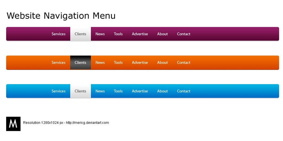
Consistency is the cornerstone of intuitive navigation. It fosters a sense of familiarity and comfort, allowing users to navigate with confidence. This means maintaining uniformity in menu placement, button styling, and overall design across all pages. Here are some key aspects to consider:
- Clear Navigation: Organize content intuitively with easily discoverable menus.
- Consistent Design: Keep visual and functional design uniform throughout the site.
- Fast Load Times: Ensure the website loads swiftly to reduce user frustration.
By focusing on these elements, we create a navigation experience that feels familiar and easy to use, encouraging users to engage more deeply with the content.
Remember, while creativity in layout is encouraged, it should not come at the expense of usability. Users have come to expect certain navigation elements in specific places, and deviating too much from these expectations can lead to confusion and a poor user experience. Striking the right balance between innovation and user expectations is key.
Implementing Responsive and Adaptive Design
In the realm of web development, responsive and adaptive design are not just trends but essential components for creating a user-friendly website. These design strategies ensure that a site is accessible and functional across a variety of devices and screen sizes. By employing fluid grids, flexible images, and media queries, developers can create a single website that adapts to the user’s device, providing an optimal viewing experience.
A methodical yet flexible approach to responsive design not only caters to the current spectrum of devices but also prepares for future technological advancements. It’s about delivering excellence in user experience from strategy to maintenance.
Key features of responsive design include:
- Fluid grid layouts that adjust to any screen size
- Flexible images and media that scale without distortion
- Media queries that apply different styles for different devices
- Prioritization of content and functionality based on device capabilities
Implementing these features requires a deep understanding of user behavior and preferences. It’s a continuous process that involves regular testing, updates, and optimizations to ensure that the website remains intuitive and efficient. As AM2 Studio suggests, performance and user experience are at the heart of web development services, from WordPress to eCommerce solutions.
Optimizing Navigation for Enhanced User Engagement

Simplifying the User Journey
To enhance user engagement, it’s essential to simplify the user journey on your website. This means creating a clear and intuitive path from the moment they land on your page to the completion of their goal, whether it’s making a purchase, finding information, or contacting support.
- Strategic placement of menus, buttons, and links is crucial. They should be located where users naturally expect them, aligning with their mental models and reducing the risk of confusion or abandonment.
- Minimizing steps to access content ensures that users can reach their desired destination with ease. Concealed or complex navigation can deter user interaction and engagement.
- Performance optimization is not just about speed; it’s about creating a smooth and responsive experience across all devices and platforms.
By focusing on these aspects, you can create a navigation system that feels like a helpful guide rather than a hurdle, leading to increased user satisfaction and loyalty.
Remember, a user-centric approach to navigation is not a one-time task but a continuous process. Regularly analyze user behavior, gather feedback, and make iterative improvements to keep your navigation structure aligned with user needs and preferences.
Leveraging Analytics for Navigation Improvements
The integration of analytics into website navigation design is a powerful tool for enhancing user experience. By analyzing user behavior, we can identify friction points and streamline the navigation process. This data-driven approach ensures that the most relevant information is easily accessible, leading to a smoother user experience.
Analytics allow us to measure the effectiveness of different navigation structures and make informed decisions about design changes. Regularly reviewing analytics data helps in maintaining an intuitive navigation system that adapts to user needs.
Here are some steps to optimize navigation using analytics:
- Review heatmaps to understand user interaction patterns.
- Conduct A/B testing to compare the performance of different navigation layouts.
- Analyze click-through rates to determine the most engaging content.
- Use funnel analysis to pinpoint where users drop off and optimize those areas.
By continuously monitoring and updating the navigation based on analytics, websites can personalize user journeys, leading to increased engagement and satisfaction. It’s not just about making the navigation work well; it’s about making it work well for your specific audience.
Utilizing Visual Cues and Feedback
Effective website navigation is greatly enhanced by the strategic use of visual cues and feedback mechanisms. Good feedback reassures users, confirming that their actions have been executed properly and providing guidance on their journey through your site. Just as a GPS provides real-time updates, visual feedback on a website can indicate progress, current location, and estimated time to completion.
To keep navigation straightforward, it’s essential to provide users with clear visual clues. This can be as simple as highlighting the currently selected menu item or using design changes to signify the active section. Missing feedback, especially during slow response times, can lead to user frustration and disengagement.
By optimizing website navigation with analytics insights, we can strike a balance between aesthetics and usability, ensuring a seamless user journey. Considerations should include colors, layouts, navigation structures, typography, and graphics.
Facilitating visitor feedback is another key aspect. Incorporating mechanisms such as contact forms, surveys, or interactive elements allows for the collection of valuable user insights. These insights can inform continuous improvements to the navigation experience, aligning it more closely with user preferences and behaviors.
Best Practices for Mobile-Friendly Navigation

Adapting Menus for Touch Interactions
In the era of mobile-first design, adapting menus for touch interactions is crucial for a seamless user experience. Collapsible menus, such as hamburger menus, have become a staple for conserving space on smaller screens. These menus remain hidden until tapped, making them ideal for touch interfaces.
- Implement Collapsible Menus: As screen sizes decrease, space becomes limited. Use collapsible menus to hide menu items and reveal them as needed.
- Touch-Friendly Buttons: Ensure buttons are sized for easy tapping without accidental activations.
- Swipe Gestures: Integrate swipe gestures for intuitive navigation.
Simplicity in design leads to a more intuitive and satisfying user experience. Complex or cluttered interfaces can frustrate users, potentially increasing abandonment rates.
It’s important to balance the number of options available. Too many can overwhelm, while too few may not provide enough guidance. Regular testing and optimization are key to maintaining an effective touch-friendly navigation system.
Prioritizing Speed and Efficiency on Mobile Devices
In the mobile-first world, speed is paramount. Mobile users expect quick access to information, and delays can lead to increased bounce rates and lost opportunities. To ensure your website meets these expectations, focus on optimizing elements that contribute to loading times.
- Optimized Images and Videos: Compress to reduce load times.
- Clear Call-to-Actions: Ensure they are easy to click on mobile.
- Testing Across Devices: Identify compatibility issues for consistency.
By optimizing for speed and efficiency, you not only enhance user experience but also contribute to better SEO rankings. Minimizing code, leveraging browser caching, and reducing server response times are additional steps that can make a significant difference.
Remember, a fast-loading website is more likely to retain users and convert visits into actions. Utilize tools and techniques that monitor and improve performance, and always keep the user’s journey in mind when making design decisions.
Ensuring Accessibility for All Users
In the realm of website navigation, accessibility should never be an afterthought. It is a critical aspect that allows individuals with disabilities to interact effectively with a website, thus expanding the audience base and promoting inclusivity. By adhering to the Web Content Accessibility Guidelines (WCAG), websites not only comply with federal law but also demonstrate a commitment to accommodating diverse user needs.
Accessibility enhances usability, ensuring that all users, regardless of their abilities, can easily engage with your website.
To achieve this, consider the following best practices:
- Accessible Typography: Ensure text is readable across devices by choosing legible font sizes and line spacing.
- Performance Optimization: Improve site load times, especially for users on slower networks or with limited resources.
- Simplifying the User Journey: Organize content with clear labels and intuitive menu structures.
- Responsive Design: Prioritize clarity and accessibility for mobile users.
Remember, a user-friendly website is not only a key component of a successful online presence but also a reflection of your brand’s dedication to all users.
Leveraging Technology for Seamless Navigation

Incorporating Advanced Search Features
Advanced search features are a cornerstone of modern website navigation, enabling users to quickly find the content they’re looking for. Implementing a robust search system can significantly enhance the user experience by providing accurate and relevant results. This can be achieved through the use of filters, predictive text, and search suggestions.
To further refine the search experience, consider the following steps:
- Indexing all website content effectively.
- Utilizing metadata to improve search result accuracy.
- Implementing auto-complete functionality to assist users in their search queries.
- Providing advanced search options to filter results by various criteria.
By prioritizing these search enhancements, websites can cater to the diverse needs of their audience, ensuring that users can navigate with ease and efficiency.
Regularly updating and maintaining the search feature is crucial for keeping up with the evolving content and user expectations. This ongoing process involves monitoring search trends and user feedback to make necessary adjustments.
Utilizing AI and Machine Learning for Personalization
The integration of AI and machine learning into website navigation is revolutionizing the way users interact with online platforms. Machine Learning algorithms can analyze a user’s browsing history, preferences, and behavior to create a dynamic and personalized experience. This not only enhances user engagement but also significantly improves the overall user experience.
By leveraging predictive analytics, websites can anticipate user needs and present relevant content and recommendations, streamlining the navigation process.
To effectively implement AI-driven personalization, consider the following steps:
- Collect and analyze user data to understand behavior patterns.
- Utilize machine learning models to predict user preferences and needs.
- Personalize content, navigation menus, and calls to action based on user data.
- Continuously refine algorithms with new data to improve accuracy and relevance.
The goal is to create a seamless and intuitive navigation experience that feels tailor-made for each user, thereby fostering a deeper connection with the website and its content.
Integrating Voice and Gesture Controls
The integration of voice and gesture controls into website navigation is a leap towards futuristic user interfaces. Voice commands and touch gestures are not just about convenience; they represent a significant shift in how users interact with digital content. By speaking commands or using simple hand movements, users can navigate through a website without the need for traditional input devices.
The goal is to create an effortless experience that feels natural and reduces the cognitive load on the user.
For users with disabilities, these technologies can greatly enhance accessibility. Gesture controls allow for touch gestures on touch-enabled devices, while voice recognition can interpret spoken commands, making the web more inclusive. Here’s a quick overview of the benefits:
- Ease of use: Natural interactions increase user satisfaction.
- Speed: Direct commands can result in faster navigation.
- Accessibility: Makes websites usable for a wider audience.
As we continue to refine these technologies, it’s crucial to gather user feedback for continuous improvement, ensuring that voice and gesture controls not only work seamlessly but also enhance the overall user experience.
Continuous Improvement and Maintenance of Navigation Elements
Conducting Regular Usability Testing
Regular usability testing is a cornerstone of maintaining a website that not only meets but exceeds user expectations. By observing real users as they interact with your site, you can identify pain points and areas for improvement that might not be apparent otherwise. This proactive approach allows for the refinement of navigation elements, ensuring they are both efficient and effective.
Enhance user experience through intuitive labels and breadcrumbs. Conduct usability testing to refine navigation, focusing on efficiency and effectiveness. Improve accessibility for all users.
Incorporating user feedback into the development cycle is crucial for continuous improvement. A structured approach to gathering and analyzing feedback can be outlined as follows:
- Conducting tests across various browsers, devices, and screen sizes.
- Analyzing user interface and suggesting improvements.
- Tracking conversions, performance, and user interaction for insights.
- Implementing changes based on data-driven decisions.
Remember, usability testing is not a one-time task but an ongoing process that adapts to user behavior and technological advancements. It’s about creating a seamless experience that keeps users engaged and satisfied.
Updating Navigation Structures Based on User Feedback
The process of refining website navigation is a continuous cycle that hinges on user feedback. Regular optimization and updates to navigation systems are crucial for user engagement. Different navigation structures cater to various layouts and content hierarchies, enhancing usability and accessibility. By analyzing user behavior and feedback, you can pinpoint areas that require improvement and make informed decisions about which aspects of your navigation to update or overhaul.
User-centric navigation is not a one-time task; it’s an ongoing process of refinement.
To effectively update your navigation structure based on user feedback, consider the following steps:
- Collect feedback through surveys, usability tests, and analytics.
- Identify common pain points and areas where users struggle.
- Prioritize updates based on the impact they will have on the user experience.
- Implement changes incrementally to measure their effectiveness.
- Continue to gather user feedback to inform further refinements.
This iterative approach ensures that your website remains intuitive and user-friendly, adapting to the evolving needs and preferences of your audience.
Monitoring Performance and Load Times
Ensuring that your website loads quickly and runs smoothly is not just about providing a good user experience—it’s also about maintaining your search engine rankings. Regular monitoring of performance and load times is essential to identify any issues that could be causing delays. Here are some steps to optimize your website’s performance:
- Minimize image sizes and use web-optimized graphics.
- Enable browser caching and utilize content delivery networks (CDNs).
- Compress CSS and JavaScript files to reduce load times.
By proactively addressing these areas, you can maintain a seamless experience for your users and keep your website competitive.
Additionally, it’s important to review third-party scripts and optimize server response time. Tools like WebPageTest or Pingdom can help you conduct a thorough audit and pinpoint areas for improvement. Remember, a fast-loading website is more likely to retain visitors and convert them into customers.
At the heart of every successful online venture is the continuous improvement and maintenance of navigation elements, ensuring a seamless user experience. Our team at AM2 specializes in elevating your digital presence through expert WordPress Development, eCommerce solutions, and performance optimization. Don’t let your website fall behind; visit our [Services] page to learn how we can support and maintain the health of your website, driving growth and customer satisfaction.
Conclusion
In conclusion, seamless website navigation is a cornerstone of exceptional user experience. By implementing clear, consistent, and intuitive navigation structures, we can guide users effortlessly to their desired content, enhancing satisfaction and engagement. Optimizing for multi-device use ensures accessibility and retains users who are increasingly on the go. Moreover, a well-organized website not only pleases visitors but also favors search engine rankings, driving more traffic and potential conversions. As we’ve explored various strategies and best practices throughout this article, it’s evident that investing in seamless navigation is not just about improving aesthetics but about fostering a positive, efficient, and inclusive environment for all users. Remember, the easier it is for users to navigate your website, the more likely they are to return, making navigation a key player in the success of your online presence.
Frequently Asked Questions
What are the key components of intuitive website navigation?
Intuitive website navigation is built on understanding user behavior and preferences, designing for clarity and consistency, implementing responsive and adaptive design, and ensuring fast load times and accessibility.
How can website navigation improve user engagement?
Simplifying the user journey through well-organized and logical navigation paths enhances user experience, reduces bounce rates, and encourages users to interact more with the website, leading to improved engagement.
What are some best practices for mobile-friendly navigation?
Best practices for mobile-friendly navigation include adapting menus for touch interactions, prioritizing speed and efficiency, ensuring accessibility for all users, and employing clear call-to-action buttons.
How can technology enhance website navigation?
Technology can enhance navigation by incorporating advanced search features, utilizing AI for personalization, and integrating voice and gesture controls to create a more seamless and user-friendly experience.
Why is continuous improvement of navigation elements important?
Continuous improvement ensures that navigation elements stay up-to-date with user needs and preferences, which can be achieved through regular usability testing, user feedback, and monitoring performance.
What role does performance optimization play in user experience?
Performance optimization is crucial for user experience as it leads to faster website load times, improved user satisfaction, and can contribute to higher conversion rates and better search engine rankings.