Enhancing User Experience with Seamless Website Navigation

In today’s fast-paced digital world, a website’s navigation can make or break the user experience. A seamless navigation structure not only guides users effortlessly to the information they seek but also enhances overall satisfaction and engagement. This article delves into the crucial aspects of creating user-centric navigation, optimizing design for user flow, managing technical details for smooth operation, and utilizing analytics to continuously improve the navigational experience.
Key Takeaways
- Strategic navigation design aligns with user intent and facilitates content discovery, improving user engagement and satisfaction.
- Intuitive menu structures and responsive design are fundamental for optimal user flow across various devices and screen sizes.
- Technical navigation elements like website performance, loading speed, and script optimization are key to a seamless user experience.
- Post-launch strategies, including quality assurance and user feedback, are vital for iterative improvement of website navigation.
- Analytics and testing play a critical role in understanding user behavior and refining navigation for enhanced user experience.
Strategic Approach to User-Centric Navigation

Understanding User Intent
At the heart of a seamless website navigation lies the understanding of user intent. It’s the driving force behind how users interact with your website and what they expect to find. Recognizing the different types of user intent is essential for creating a navigation structure that effortlessly guides visitors to their desired content.
For instance, navigational intent indicates that a user is looking for a specific website or wants to access a specific page within a website. Here are some examples of how to align your website with user intent:
- Provide clear and intuitive navigation to simplify the user’s journey.
- Offer content that satisfies the user’s search in terms of depth and relevance.
- Anticipate user needs and present information in an easily digestible format.
By aligning your website’s content and structure with user intent, you not only enhance the user experience but also improve your site’s relevance in search engine rankings.
Understanding user intent goes beyond just matching keywords; it involves predicting what users might search for next and adjusting the content accordingly. This personalized approach can significantly increase user engagement and reduce bounce rates, which are positive signals for search engines and can lead to better organic search marketing performance.
Aligning Content with User Needs
To create a truly user-centric website, it’s essential to align your content with the needs and expectations of your visitors. This alignment not only enhances the user experience but also contributes to higher engagement and conversion rates.
When users land on your website, they should be able to quickly ascertain that they’re in the right place. This means providing clear and intuitive navigation that guides them to the information or solutions they seek. A well-structured website with thoughtfully categorized content allows users to navigate with ease, reducing frustration and bounce rates.
By anticipating user needs and presenting content in an easily digestible format, you cater to both new and returning visitors, ensuring they find value in what you offer.
Incorporating features such as a search bar and navigation footer can significantly improve the user’s ability to find content, as suggested by Hotjar’s best practices. Below is a list of elements that contribute to aligning content with user needs:
- Provide answers and solutions that users are searching for.
- Offer content that meets their expectations in terms of depth, relevance, and value.
- Present information in a format that’s easily digestible and accessible.
- Include a search bar so users can find what they’re looking for anywhere on your site.
- Include a navigation footer so they don’t need to scroll up to the top.
The Discovery and Brainstorming Process
The discovery and brainstorming phase is a critical juncture in the journey towards seamless website navigation. It is here that teams converge to map out the user’s journey, identifying potential touchpoints and areas for intuitive interaction. This collaborative effort often involves a cross-functional team, including UX designers, developers, and content strategists, all working towards a common goal: a navigation experience that feels natural and effortless for the user.
During this stage, it’s essential to consider the insights provided by AM2 Studio’s approach to web development, which emphasizes strategic planning and creative design. Their process ensures that the end product not only meets but exceeds user expectations for a seamless experience.
Effective website navigation also hinges on a deep understanding of user behavior. By incorporating user-centric features such as breadcrumbs and search functions, and creating intuitive menu structures, the navigation design can significantly enhance the user experience. This is where the expertise of teams like those at AM2 Studio becomes invaluable, as they prioritize client satisfaction and the delivery of top-quality products through a seamless and enjoyable process.
By thoroughly exploring all possible avenues and meticulously planning each step, the team can anticipate user needs and craft a navigation system that aligns perfectly with user intent.
Designing for Optimal User Flow

Creating Intuitive Menu Structures
The foundation of a user-friendly website lies in its navigation structure. Creating intuitive site layouts with clear menu structures is essential for seamless user journeys. This not only aids in user satisfaction but also bolsters the likelihood of conversion. Simplified navigation paths allow users to find what they need with ease, reducing frustration and encouraging deeper engagement with your content.
Effective menu design should follow these principles:
- Reflect the natural flow of user tasks
- Group related information coherently
- Limit the number of menu items to avoid overwhelm
- Use familiar language that resonates with your audience
By prioritizing the user’s ease of navigation, we set the stage for a positive interaction with our website, which can lead to increased user retention and loyalty.
Responsive design and simplified navigation are not just buzzwords; they are critical components of a modern website that aims to serve its users efficiently. As your website grows, maintaining scalability without compromising on performance or user experience becomes a challenge that well-planned architecture can address.
Visual Hierarchy and Readability
The visual hierarchy of a website is pivotal in guiding users through the content seamlessly. By strategically using size, color, and layout, designers can highlight the most important elements, ensuring that users can find the information they need without feeling overwhelmed. This not only improves the user experience but also contributes to higher engagement and conversion rates.
Effective readability is achieved through the careful selection of fonts, spacing, and contrast. Content should be easy to scan, with headings, bullet points, and short paragraphs that facilitate quick comprehension. Below are key considerations for enhancing readability:
- Use clear and legible fonts
- Ensure adequate contrast between text and background
- Employ whitespace to reduce clutter
- Organize content with headings and lists
By prioritizing responsive design and intuitive navigation, we can create a user-friendly environment that caters to the needs of all visitors, regardless of the device they use. Visual hierarchy and readability are not just aesthetic choices; they are fundamental to a website’s success.
Remember, a website that is easy to navigate and read is more likely to retain visitors, turning them into loyal customers or followers. It’s essential to regularly review and adjust the visual elements of your site to maintain an optimal user experience.
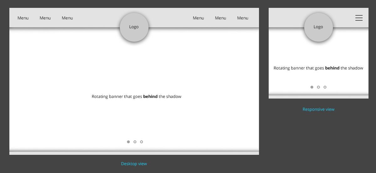
Responsive Design for Cross-Device Compatibility
In today’s digital landscape, responsive design is not just a trend but a necessity. As users switch between desktops, tablets, and smartphones, a seamless experience across all devices is crucial. Responsive design ensures that your website’s layout, images, and functionalities adapt effortlessly to the screen size and orientation of the device being used.
- Mobile-friendly design is recognized by search engines and can contribute to better search rankings.
- A clear navigation structure is essential for users to find what they’re looking for, regardless of the device.
- Optimizing images and scripts can significantly improve loading times, enhancing the user experience on mobile devices.
By implementing a responsive design, you not only cater to the user’s needs but also build a foundation for future technologies and screen sizes. It’s about creating an adaptable and forward-thinking online presence.
Ensuring that your website performs well on various devices is not just about aesthetics; it’s about providing a consistent and accessible user journey. From the initial design to the development phase, every aspect should be tested across different platforms to guarantee a unified experience. This approach not only retains users longer but also encourages deeper engagement with your content.
Technical Aspects of Seamless Navigation
Website Performance and Loading Speed
Ensuring that your website loads quickly is crucial for a positive user experience. Slow loading times not only frustrate users but also negatively impact search engine rankings. To maintain a competitive edge, it’s essential to focus on performance optimization strategies.
A website’s performance is often the first impression a user gets, and it sets the tone for their entire experience.
Here are some key strategies to improve website performance:
- Optimize Images: Compress and optimize images to maintain quality while reducing load times.
- Implement Caching: Utilize caching to save server resources and speed up content delivery.
- Minify Scripts: Reduce the size and number of CSS and JavaScript files to minimize HTTP requests.
- Responsive Design: Ensure your site is responsive to provide a seamless experience across all devices.
By employing these strategies, you can enhance user satisfaction and retention, leading to better overall performance and search engine visibility.
Implementing Effective Caching Strategies
Effective caching is a cornerstone of website performance, ensuring that repeat visitors experience faster load times and reduced server load. Caching stores frequently accessed data in a temporary storage space, allowing for quicker retrieval on subsequent visits. By setting appropriate expiration times and leveraging cache headers, websites can minimize the need to resend redundant data, thus enhancing the user experience.
Caching strategies can significantly improve website speed and responsiveness, which are critical factors in user retention and satisfaction.
To implement caching effectively, consider the following steps:
- Determine what data is frequently requested and suitable for caching.
- Set caching policies that define how long data should be stored before an update is required.
- Utilize cache headers to control the caching behavior of browsers and proxies.
- Regularly monitor and update your caching strategy to ensure optimal performance.
Minimizing and Optimizing Scripts
To ensure a website operates at peak efficiency, minimizing and optimizing scripts is essential. This process involves streamlining the code that powers your site, reducing the number of server requests, and shrinking file sizes. By doing so, you can significantly enhance site performance and user experience.
Here are some key steps to optimize your scripts:
- Minify CSS and JavaScript files to reduce their size without affecting functionality.
- Combine multiple scripts into a single file to minimize HTTP requests.
- Utilize asynchronous loading for scripts that do not need to be run immediately.
- Review and remove any unnecessary or outdated scripts that may slow down your site.
By adopting these practices, you can create a smoother and more responsive user experience, which is crucial for retaining visitors and improving SEO rankings.
Remember, a faster website not only satisfies users but also contributes to better search engine rankings. Regularly auditing your scripts and making necessary optimizations is a proactive step towards a more efficient website.
Post-Launch Strategies for Continuous Improvement
Quality Assurance and Bug Fixing
After a website’s launch, the journey towards perfection continues with rigorous quality assurance and bug fixing. This phase is critical to ensure that users encounter a flawless experience. The process involves a systematic approach to identifying and reproducing bugs, isolating them, and analyzing their impact. Once identified, the development of a fix is initiated, followed by thorough testing and verification. The final step is deploying the fix and monitoring its effectiveness.
The success of any website is heavily dependent on its ability to function without errors. Continuous monitoring and swift action to rectify issues as they arise are essential for maintaining user trust and satisfaction.
To streamline this process, consider the following checklist:
- Regularly schedule bug reviews and prioritize based on user impact
- Implement automated testing to identify issues early
- Foster a culture of feedback within the user community
- Maintain a detailed changelog for transparency and tracking
By adhering to these practices, websites can evolve and improve, delivering a seamless experience that meets and exceeds user expectations.
Post-Launch Monitoring and Updates
After a website goes live, the journey towards refining user experience doesn’t end. Continuous monitoring and regular updates are crucial to ensure the site remains secure, functional, and aligned with user expectations. Post-launch, it’s essential to integrate customer feedback and monitor for any bugs that may surface. This proactive approach allows for timely fixes and updates, maintaining a secure, fast, and reliable website experience.
The post-launch phase is also about learning and adapting. By analyzing user interactions and performance metrics, teams can make informed decisions to enhance the website’s navigation and overall user experience.
Regular updates are not just about fixing bugs; they also include performance improvements and security patches. It’s important to benchmark your current website performance metrics to track the success of your redesign post-launch. This data serves as a foundation for continuous improvement and helps in maintaining the website’s health and relevance over time.
Gathering User Feedback for Iterative Design
In the quest for a flawless user experience, gathering user feedback post-launch is a pivotal step. It’s not just about fixing bugs; it’s about understanding how real users interact with your website and what could enhance their journey. A structured approach to collecting and analyzing feedback can lead to significant improvements in navigation and overall user satisfaction.
By directly incorporating customer opinions into site architecture, the shopping experience becomes seamless, increasing customer satisfaction and fostering repeat purchases.
To effectively gather user feedback, consider the following steps:
- Implement user surveys and feedback forms on your website.
- Conduct usability testing with a diverse group of users.
- Analyze customer support tickets for common issues.
- Engage with users on social media and community forums.
Remember, continuously improving UX is an ongoing process that requires testing, analysis, and adaptation. By prioritizing user experience and aligning it with SEO strategies, you can create a website that not only ranks well but also provides a satisfying experience for your visitors.
Leveraging Analytics for Navigation Enhancement
Analyzing User Behavior and Pathways
To truly enhance website navigation, it’s crucial to analyze user behavior and pathways. This involves tracking where users click, how long they stay on pages, and what actions they take. Tools like Google Analytics provide insights into pages with the highest exit rates, indicating potential friction points.
By leveraging analytics, we can pinpoint areas where users may be experiencing confusion or difficulty, and make data-driven decisions to streamline their journey.
Understanding the flow of user interactions allows for a more personalized experience. For instance, AI-powered recommendations can adapt site structures to user preferences, leading to increased engagement. Below is a list of benefits when AI is integrated into the analysis:
- Predictive user experience
- Semantic content analysis
- Automated A/B testing
Ultimately, the goal is to reduce friction points for a smoother journey, enhancing engagement and conversions.
A/B Testing for Navigation Optimization
A/B testing is a powerful technique for optimizing website navigation and improving user experience. By presenting two variants of a page to different segments of website visitors, we can gather data on which version performs better in terms of user engagement and conversion rates.
To maximize your website’s potential, it’s essential to continuously test and optimize your navigation elements, such as CTAs, menu layouts, and link structures.
Effective A/B testing involves a cycle of hypothesizing, testing, analyzing, and refining. Below is a simplified process:
- Identify key navigation elements that may impact user behavior.
- Develop a hypothesis for how changes to these elements could improve performance.
- Create ‘A’ and ‘B’ versions of your navigation.
- Split your audience randomly to test the different versions.
- Collect and analyze the data.
- Implement the more successful version.
- Repeat the process to further refine and enhance navigation.
By systematically applying A/B testing, you can make data-driven decisions that lead to a more intuitive and user-friendly website navigation.
Using Heatmaps to Understand User Interaction
Heatmaps are a powerful tool for visualizing user behavior on a website. By aggregating user interactions, such as clicks, mouse movements, and scrolls, heatmaps provide a color-coded representation of the most engaging areas. This visualization helps identify patterns that might not be obvious through traditional analytics.
For instance, a heatmap can reveal if users are trying to click on non-clickable elements, indicating a potential area for improvement. It can also show whether important content is being ignored, suggesting a need for better placement or prominence.
The strategic use of heatmaps can lead to an enhanced understanding of user needs and preferences, informing decisions that make navigation more intuitive and user-friendly.
By continuously analyzing heatmap data, website owners can perform iterative refinement of their site’s design. This process aligns with the broader goal of enhancing user experience and website performance. The following list outlines key steps in leveraging heatmaps for navigation enhancement:
- Review heatmap data regularly to spot new trends or issues.
- Compare heatmaps before and after making changes to measure impact.
- Integrate heatmap findings with other data sources, such as user feedback, for a comprehensive view.
Ultimately, heatmaps are a valuable component in the toolkit for creating a seamless user experience. They enable a deeper understanding of how users interact with a site, which is crucial for making informed design improvements.
In today’s digital landscape, the power of analytics cannot be overstated. By leveraging advanced analytics, we can enhance your website’s navigation, ensuring that your visitors find exactly what they’re looking for with ease. Our team at AM2 specializes in WordPress Development, eCommerce solutions, and custom web design that not only looks stunning but also performs exceptionally. Don’t let your website be just another URL lost in the vastness of the internet. Visit our website to see how we can transform your digital presence and help your business grow. Let’s make your website not only functional but also a cornerstone of your marketing strategy.
Conclusion
In conclusion, seamless website navigation is a critical component of user experience that directly impacts a site’s success. By implementing intuitive navigation structures, ensuring mobile responsiveness, and optimizing page loading speeds, businesses can facilitate a smooth journey for users. This not only enhances user satisfaction but also contributes to better SEO performance, leading to increased organic traffic and higher conversion rates. Remember, a website that prioritizes user experience is one that stands out in the crowded digital space. It’s not just about attracting visitors; it’s about providing a valuable and enjoyable experience that encourages them to return.
Frequently Asked Questions
How does intuitive navigation enhance user experience?
Intuitive navigation simplifies the user’s journey through a website, allowing them to find what they need quickly and efficiently, which reduces frustration and encourages further interaction with the content.
What role does website performance play in user satisfaction?
Website performance, particularly loading speed, is critical for user satisfaction. Faster websites provide a smoother experience, leading to higher engagement, retention, and conversion rates.
Why is responsive design important for modern websites?
Responsive design ensures that a website provides a seamless experience across different devices, including desktops, tablets, and smartphones, which is essential as mobile usage continues to rise.
How can user feedback contribute to website navigation improvements?
User feedback offers direct insights into how real users interact with a website’s navigation. This information can be used to make iterative improvements that enhance the user experience.
What is the impact of visual hierarchy on website readability?
Visual hierarchy guides users’ attention to important elements on a page, improving readability and comprehension, which in turn facilitates a more enjoyable and effective user experience.
How does website navigation affect SEO performance?
Clear and well-structured website navigation helps search engines understand and index a site’s content more effectively, which can improve search rankings and visibility.