Enhancing User Experience with Seamless Website Navigation
In the digital world, a website’s navigation system plays a pivotal role in shaping the user experience. A seamless and intuitive navigation structure is essential for guiding visitors through a website’s content and ensuring they find what they’re looking for with ease. This article delves into the principles of effective website navigation, responsive design for multi-device compatibility, strategic link placement, and the impact of performance on user experience. By understanding and applying these concepts, website owners and designers can create a more engaging and user-friendly online presence.
Key Takeaways
- Intuitive website navigation is founded on understanding user behavior and expectations, which informs content structure and accessibility.
- Responsive design is crucial for seamless navigation across various devices, maintaining consistency and leveraging touchscreen features.
- Navigation menus must balance clarity and functionality, with best practices including effective dropdowns, mega menus, and sticky navigation.
- Strategic link placement, such as breadcrumbs, enhances user flow, while balancing aesthetics with usability is key for continuous improvement.
- Website performance, including load times and efficiency, plays a significant role in user experience, necessitating regular feedback and optimization.
The Fundamentals of Intuitive Website Navigation

Understanding User Behavior and Expectations
To create a website that truly resonates with users, it’s essential to grasp the nuances of user behavior and expectations. Users come with preconceived notions based on their past online experiences, anticipating features like a clear menu, search functionality, and logical content categorization. By adopting a user-centric approach, designers can reduce cognitive load, making the navigation intuitive and the content easily accessible.
Developing user personas is a strategic move that can significantly influence the design process. These personas, which encapsulate the characteristics, behaviors, and motivations of the target audience, serve as a constant reminder to align design choices with user needs. For instance, tech-savvy users might appreciate cutting-edge navigation, while others may value straightforward layouts.
It’s not just about creating a visually appealing interface; it’s about crafting an experience that feels familiar and effortless for the user.
Ultimately, the goal is to prioritize usability and clarity. This means steering clear of overly complex animations or unconventional layouts that could lead to confusion. Familiar patterns such as top menus, sidebars, and breadcrumbs should be the cornerstone of the design, ensuring that users can navigate the site with ease and confidence.
Structuring Content for Optimal Findability
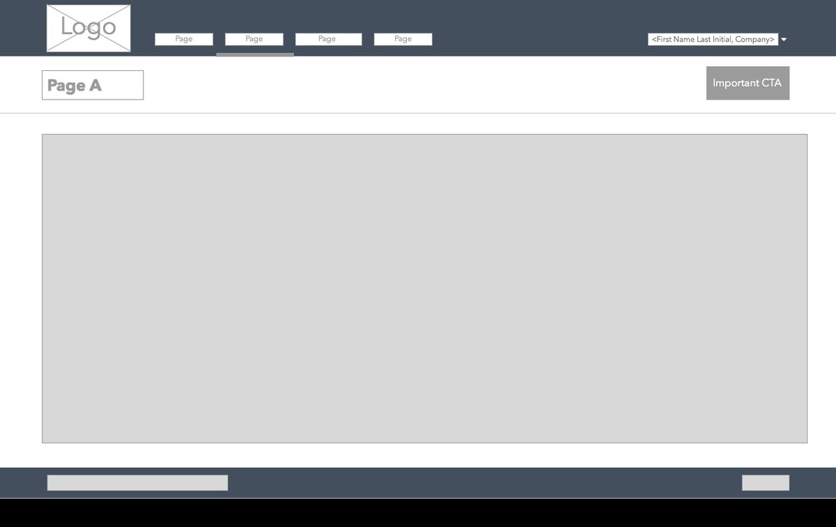
To ensure that users can find what they’re looking for with ease, content must be structured logically and intuitively. This involves organizing information in a clear hierarchy, from broad categories to specific subcategories. For example, a well-designed menu might look like this:
- Home
- About Us
- Company History
- Our Team
- Careers
- Services
- Consulting
- Training
- Support
- Contact
By maintaining a consistent and predictable structure, users can navigate your website with confidence, knowing where to find the information they need without unnecessary confusion.
Additionally, technical aspects play a significant role in findability. A robust search function with filters, meaningful URL structures, and clear breadcrumbs all contribute to a seamless user experience. It’s not just about aesthetics; it’s about creating a framework that supports the user’s journey through your site.
Designing with Accessibility in Mind
When designing a website, it’s crucial to ensure that it’s accessible to all users, including those with disabilities. Accessibility should be a priority, not an afterthought. This means incorporating features such as alternative text for images, captions for videos, and keyboard navigation options.
To adhere to best practices, websites must comply with the WCAG standards, which are based on four principles: perceivable, operable, understandable, and robust. These guidelines help in creating a user experience that is inclusive and ADA compliant. An accessibility audit is a valuable tool in identifying any potential issues, and services like AM2 Studio can provide expertise in this area.
By focusing on accessibility, we not only open our digital doors to more users but also enhance the overall user experience, making it more intuitive and user-friendly for everyone.
Remember, a website that is accessible to all is not just a legal or ethical requirement; it’s a testament to a brand’s commitment to inclusivity. With the right approach, you can ensure that your website is welcoming to every visitor, regardless of their abilities.
Responsive Design and Multi-Device Compatibility
Adapting Navigation to Various Screen Sizes
In today’s digital landscape, optimizing user experience across devices is not just a luxury—it’s a necessity. With a multitude of devices at our disposal, from desktops to smartphones, ensuring that your website’s navigation is responsive and adaptable is key to maintaining user engagement and satisfaction.
Responsive design techniques, such as fluid grids and flexible images, allow a website to adjust seamlessly to any screen size. This adaptability means that whether a user is on a desktop with a large monitor or on a mobile device with a small screen, the navigation remains intuitive and accessible. Here are some practical steps to achieve this:
- Employ a flexible layout that expands or contracts with the browser window.
- Integrate media queries to apply different styles depending on the device’s characteristics.
- Utilize a hamburger menu on mobile devices to condense navigation links into a single button, freeing up valuable screen real estate.
- Test navigation elements like buttons and links to ensure they are easily clickable across all devices.
By prioritizing responsive design, you not only cater to the current market but also future-proof your website against upcoming device innovations. This proactive approach can lead to higher conversion rates and foster brand loyalty.
It’s also crucial to conduct thorough testing across a range of devices to guarantee a consistent and enjoyable user experience. Remember, a navigation system that performs well on a desktop must be equally effective on a tablet or smartphone. This commitment to multi-device compatibility is a cornerstone of modern web design and a testament to a brand’s dedication to its users.
Ensuring Consistency Across Devices
In today’s digital landscape, ensuring consistency across devices is not just a convenience—it’s an expectation. With a significant portion of web traffic coming from mobile devices, a seamless experience when switching between different screens is crucial. A Deloitte survey highlights that 85% of professionals use at least two devices for work, underscoring the importance of a unified user interface.
To achieve this, consider the following steps:
- Establish a responsive design that adapts to various screen sizes.
- Utilize a consistent theme and branding across all platforms.
- Implement adaptive features that cater to the functionality of each device.
By maintaining a coherent look and feel, users can navigate your website with ease, regardless of the device they are using.
Remember, a clear and simple navigation structure not only satisfies user expectations but also contributes to a higher level of engagement and satisfaction. As Netguru suggests, simplicity and consistency are key to user-friendly navigation. Regularly testing your website on different devices ensures that navigation remains intuitive and accessible to all users.
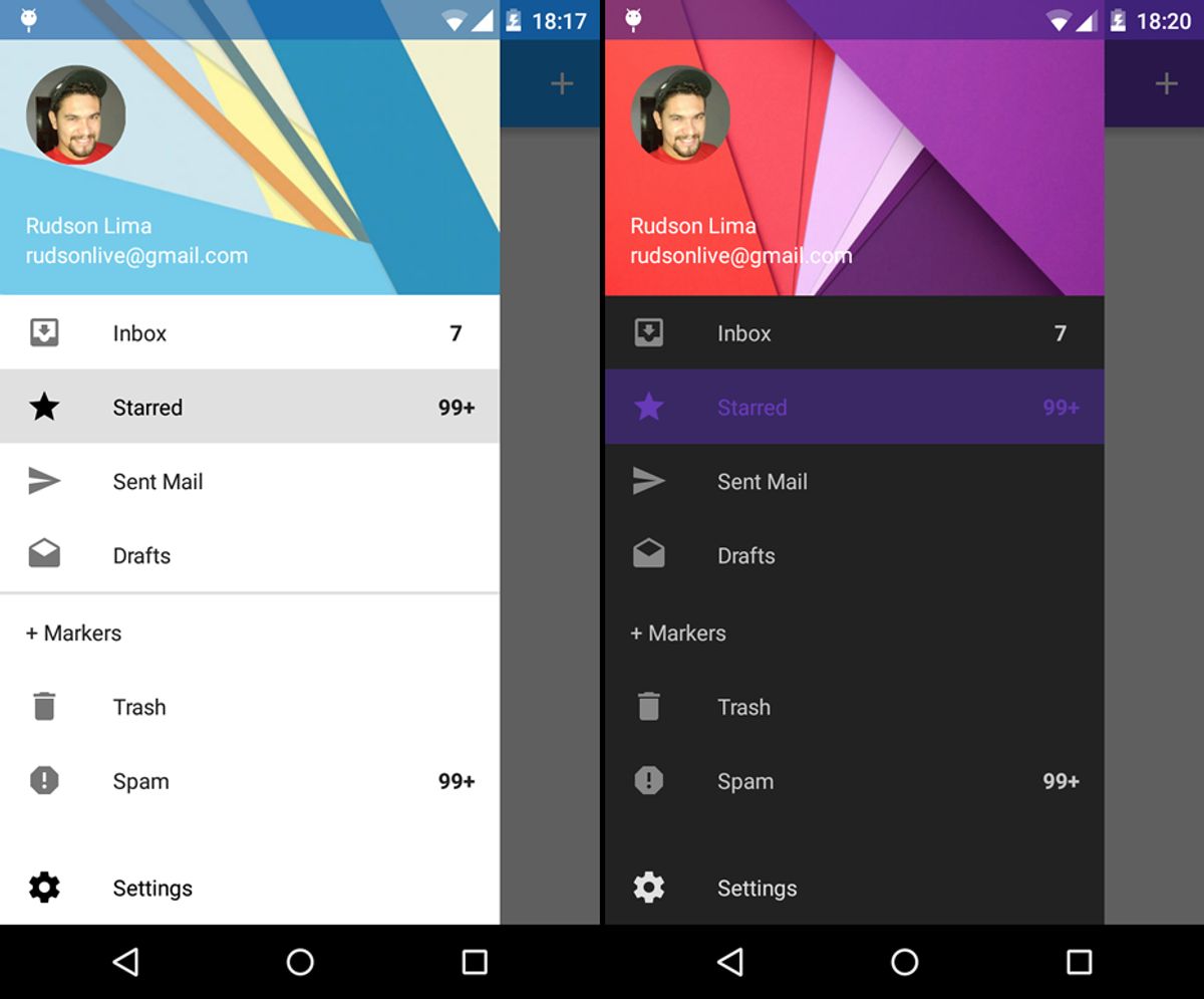
Leveraging Touchscreen Navigation Features
In the era of smartphones and tablets, touchscreen navigation has become an integral part of website design. To create a mobile-friendly environment, it’s essential to implement features that cater to touch interactions. Collapsible menus and swipe gestures are not just trends; they are necessities for enhancing the user experience on touch devices.
- Collapsible menus for mobile devices
- Swipe gestures for easy navigation
- Touch-friendly buttons for seamless interaction
Moreover, considering the ergonomic principles of touch interfaces is crucial. The ‘thumb-friendly’ zone, which is the natural range of motion for the thumb, should be a key consideration when designing UI elements. This ensures that all navigation components are within easy reach and do not strain the user’s hand.
By optimizing the navigation for touch, websites can provide a more intuitive and comfortable browsing experience, which can lead to increased engagement and satisfaction.
Finally, it’s important to continuously test and optimize these features. User feedback and analytics can provide valuable insights into how effectively the touchscreen navigation is performing and where improvements can be made.
Navigation Menus: Clarity and Functionality
Best Practices for Menu Layouts
Creating an effective menu layout is crucial for streamlining navigation and enhancing the user experience. A well-structured menu guides visitors through your site with ease, leading to improved usability and potentially higher conversion rates. Here are some best practices to consider:
- Consistent Labels: Use clear, concise labels for menu items to avoid confusion.
- Visual Cues: Highlight the active page or section to help users know where they are.
- Responsive Design: Ensure the menu adapts to different devices, using hamburger menus or collapsible sidebars for mobile.
Streamlining navigation with intuitive site layouts and clear menu structures enhances user journeys. Prioritize simplicity, consistency, and mobile responsiveness.
Avoid common pitfalls such as hidden navigation, overloading menus with too many options, and inconsistent labeling. Remember, familiarity breeds comfort, so maintain uniformity across pages. A robust search bar can complement the navigation, allowing users to find content directly. By following these guidelines, you can create a navigation menu that is both clear and functional, contributing to a seamless user experience.
Utilizing Dropdowns and Mega Menus Effectively
Dropdown menus are essential for websites with extensive content, allowing users to navigate through categories effortlessly. Utilize mega menus for complex site architectures to provide ease of access and visual appeal. However, it’s crucial to balance information to prevent overload and maintain navigability.
When designing dropdowns and mega menus, consider the user’s journey. A well-structured menu can lead to a reduced bounce rate and increased engagement, as users find the content they need without frustration.
Here are some tips for effective dropdown and mega menu design:
- Keep menu items clear and concise.
- Group related content to help users predict where to find information.
- Use visual hierarchy, such as font size and color, to indicate the importance of items.
- Test your menus on various devices to ensure they work seamlessly across all platforms.
Remember, the goal is to enhance the user experience by making site navigation intuitive and efficient.
Incorporating Sticky Navigation for User Convenience
Sticky navigation menus have become a staple in modern web design, offering users a consistent point of interaction regardless of their position on the page. By keeping the navigation bar in view, users can effortlessly access other sections of the site without the need to scroll back to the top. This feature is particularly useful for long pages that require significant scrolling.
The key to effective sticky navigation lies in its subtlety and utility. It should enhance the browsing experience without being intrusive or distracting.
To maximize the benefits of sticky navigation, consider the following points:
- Ensure that the sticky elements are minimally obtrusive to maintain content visibility.
- Use clear and concise labels for menu items to facilitate quick navigation.
- Prioritize important links such as home, contact, and services to keep them within easy reach.
Incorporating sticky navigation can lead to improved user engagement and satisfaction, as it simplifies the journey through your website. It’s a strategy that not only serves the purpose of convenience but also complements the overall design and functionality of your site.
Optimizing User Flow with Strategic Link Placement
Guiding Users with Breadcrumbs and Clear Pathways
Breadcrumbs serve as an essential tool for enhancing user experience by providing a clear trail of where users have been and how to return to previous pages. They are particularly useful for websites with multiple layers of content, allowing users to navigate with ease and without confusion.
Incorporating breadcrumbs into a website’s design not only aids in navigation but also contributes to a more organized and hierarchical structure. This can be beneficial for both users and search engines, as it clarifies the site’s layout. Below is a list of advantages that breadcrumbs bring to a website:
- Enhance usability with simplified navigation paths.
- Improve site structure for search engine crawling.
- Reduce bounce rates by enabling quick backtracking.
- Increase user engagement by providing context and control.
By strategically placing breadcrumbs and other navigational aids, we create a user-centric design that facilitates a seamless and efficient browsing experience.
It is crucial to balance the placement of these navigational elements with the overall aesthetic of the site to maintain a clean and uncluttered interface. Analyzing user pathways and feedback can lead to continuous improvements in the navigation system, ensuring that it evolves with the users’ needs.
Balancing Aesthetic Design with Usability
In the realm of web design, balancing aesthetics and usability is a delicate dance. The visual allure of a website draws users in, but it’s the ease of navigation and interaction that keeps them engaged. To achieve this harmony, designers must employ a user-centric approach, ensuring that the site is not only pleasing to the eye but also functional and intuitive.
- Research and Analysis: Understanding user preferences and behaviors is crucial. It informs the design process, leading to a layout that resonates with the target audience.
- Information Architecture: Organizing content logically makes for a smoother user journey. A well-structured site helps users find what they need without frustration.
- Visual Design: Employing the right color schemes, typography, and imagery enhances the site’s appeal without overshadowing its usability.
By prioritizing both visual appeal and usability, designers create experiences that are not only engaging but also empower users to accomplish their goals with efficiency. This dual focus is the cornerstone of user-centric web design, where form and function are in perfect alignment.
Analyzing User Pathways for Continuous Improvement
To ensure a website remains effective and user-friendly, continuous analysis of user pathways is essential. Regularly reviewing analytics and user feedback can highlight areas where navigation may be causing confusion or inefficiency. By implementing tools like heatmaps and session recordings, website owners can gain insights into user behavior, identifying which areas of the site are most engaging and which may need refinement.
The goal is to create a navigation experience that feels intuitive and effortless for the user.
A/B testing is another powerful method for optimizing user pathways. By experimenting with different navigation structures and analyzing the results, one can determine the most effective layout for user engagement and conversion. Below is a list of steps to consider in the process of analyzing and improving user pathways:
- Conduct usability testing to gather direct user feedback.
- Utilize analytics tools to track user behavior and navigation patterns.
- Apply heatmaps to visualize the most and least interacted areas of the website.
- Perform A/B testing to compare the effectiveness of different navigation designs.
- Iterate based on data and user feedback to enhance the navigation experience.
Performance and User Experience: The Role of Speed and Efficiency

Improving Load Times for Enhanced Navigation
In the digital age, speed is synonymous with success. Websites that load quickly provide a seamless navigation experience, keeping users engaged and reducing bounce rates. To achieve this, there are several strategies that can be implemented:
- Optimize Images: Large image files can significantly slow down page loading times. By compressing images and using appropriate formats, the visual quality is maintained while improving speed.
- Content Delivery Networks (CDN): Utilizing CDNs can distribute the load, serving content from the closest servers to the user’s location, thus reducing loading times.
- Minify Code: Stripping unnecessary characters from code, such as whitespace, can decrease file sizes and improve load times.
- Browser Caching: Leveraging browser caching allows frequently accessed resources to be stored locally in the user’s browser, reducing load times on subsequent visits.
By focusing on these areas, websites can significantly improve their performance, which not only enhances user experience but also contributes to better SEO rankings and increased mobile traffic.
It’s important to regularly monitor website performance and make adjustments as needed. This proactive approach ensures that your website remains fast and efficient, providing users with the quick access to content they expect.
Minimizing Clicks to Desired Content
In the pursuit of optimizing user flow, the goal is to reduce the number of interactions required to reach desired content. This not only streamlines the experience but also aligns with user expectations for quick and effortless navigation. A common misconception is the ‘3-click rule’, which suggests that users should find any information within three clicks. However, this rule has been largely debunked in favor of a more nuanced approach that focuses on the quality of the navigation experience rather than the quantity of clicks.
By prioritizing content relevance and intuitive design, websites can ensure that each click brings users closer to their goal, thereby enhancing satisfaction and reducing frustration.
To achieve this, consider the following strategies:
- Simplify the navigation structure: Keep menus and options clear and concise.
- Use predictive search features: Allow users to quickly find content by typing keywords.
- Implement progressive disclosure: Reveal information in a way that helps users digest content without feeling overwhelmed.
- Optimize for mobile: Ensure that the navigation is touch-friendly and accessible on all devices.
Remember, the key is not just to minimize clicks, but to make each click meaningful and efficient.
Monitoring and Responding to User Feedback
To maintain a seamless user experience, it’s crucial to monitor and respond to user feedback effectively. Regular user testing and feedback sessions are essential for identifying usability issues and areas for improvement. By paying close attention to user behavior, preferences, and pain points, you can refine your website’s navigation to better meet the needs of your audience.
- Usability testing for user feedback
- Data-driven decisions with analytics tools
- Constant optimization for improved user experience
By implementing a cycle of continuous feedback and improvement, you ensure that your website remains intuitive and user-friendly, ultimately enhancing customer satisfaction and loyalty.
Businesses that iterate based on user feedback often see better conversion rates and customer loyalty. It’s a process that involves not just collecting feedback but also analyzing it and making informed decisions to optimize the user flow. This proactive approach to website maintenance ensures that your navigation system evolves alongside user expectations.
In today’s digital landscape, speed and efficiency are not just desirable, they’re essential for a standout user experience. Our expert team at AM2 specializes in crafting custom web solutions that prioritize performance, ensuring your website operates at lightning-fast speeds. From WordPress development to eCommerce optimization, we have the tools and expertise to elevate your online presence. Don’t let a sluggish website hinder your success. Visit our website to learn how we can help you achieve seamless efficiency and keep your users engaged.
Conclusion
In the digital landscape, seamless website navigation is paramount to fostering a positive user experience. By prioritizing intuitive design, responsive layouts, and streamlined menus, businesses can guide visitors effortlessly through their online journey. This article has underscored the significance of user-centric navigation strategies that not only enhance usability but also contribute to improved SEO performance and increased mobile traffic. Embracing these principles ensures that users can navigate with ease, leading to higher engagement, satisfaction, and conversion rates. Remember, a well-designed navigation system is not just a pathway through your website; it’s a journey that can turn visitors into loyal customers.
Frequently Asked Questions
Why is intuitive website navigation important for user experience?
Intuitive website navigation is crucial as it helps users find information quickly and easily, reducing frustration and increasing the likelihood of user engagement and conversion.
How can responsive design improve website navigation?
Responsive design ensures that a website’s navigation is accessible and functional across various devices and screen sizes, providing a consistent experience for all users.
What are some best practices for designing navigation menus?
Best practices include having a clear, concise layout, using dropdowns and mega menus effectively, and incorporating sticky navigation to keep important links accessible.
What role does link placement play in optimizing user flow?
Strategic link placement guides users through the website, creating clear pathways and helping them navigate to desired content with minimal effort.
How does website speed impact user experience and navigation?
Faster load times contribute to a smoother navigation experience, reducing wait times and the number of clicks needed to reach desired content, which can improve user satisfaction and retention.
What is the importance of monitoring and responding to user feedback?
User feedback provides insights into navigation issues and user preferences, allowing for continuous improvement and optimization of the navigation experience.