Enhancing User Experience with Seamless Website Navigation
In today’s digital landscape, a website’s navigation can make or break the user experience. Enhancing user experience with seamless website navigation is not just about enabling users to find information quickly; it’s about creating intuitive, engaging, and accessible pathways that make the journey through a website as smooth as possible. This article delves into the various strategies and best practices that can help achieve this goal, ensuring that users not only find what they’re looking for but also enjoy the process.
Key Takeaways
- Intuitive website navigation hinges on clarity, responsive design, and adapting to user feedback for continuous improvement.
- Optimizing website performance, including page load speed and effective caching, is crucial for a seamless user journey.
- User-centric design, leveraging analytics, AI, and inclusive practices, enhances personalization and accessibility.
- Visual storytelling, through illustrations and interactive elements, can guide and engage users in a memorable way.
- Regular website audits and post-launch monitoring are essential for maintaining optimal user experience and website health.
The Pillars of Intuitive Website Navigation

Designing for Clarity and Ease of Use
Creating a website that is both visually appealing and easy to navigate is essential for a positive user experience. Designing for clarity and ease of use is not just about aesthetics; it’s about creating a pathway for users to effortlessly find the information they need. A clear and concise navigation structure is the cornerstone of intuitive design, ensuring that users can navigate your site without confusion.
- Use a consistent design across all devices to maintain a cohesive look.
- Implement clear and concise navigation to help users find what they’re looking for.
- Anticipate user needs by providing clear visual cues for navigation.
By focusing on these elements, we can create a user interface that feels familiar and intuitive, encouraging users to engage more deeply with the content.
In the realm of web development, AM2 Studio excels by emphasizing strategy, design, and maintenance, ensuring that websites not only stand out but also provide a seamless digital experience. The goal is to foster a connection between the user and the digital space, making the interaction as stress-free and enjoyable as possible.
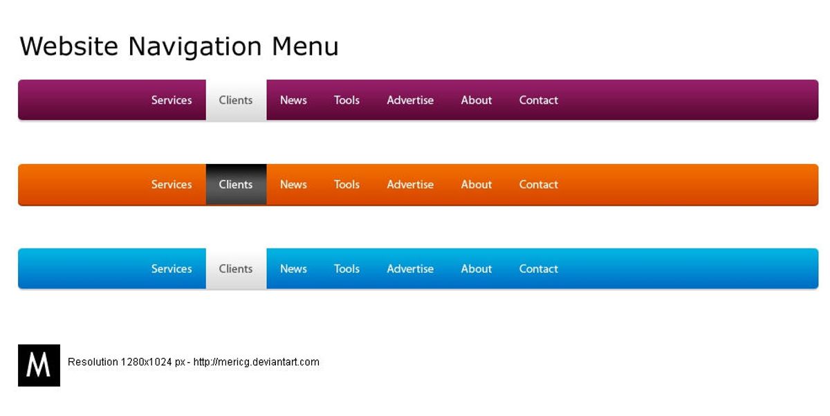
Implementing Responsive and Adaptive Menus
In the realm of web design, responsive design is a cornerstone for creating websites that offer a seamless user experience across various devices. A mobile-first approach is not just a trend but a best practice that prioritizes the needs of mobile users, who now dominate internet traffic. By designing with mobile devices in mind first, and then scaling up for larger screens, websites can maintain functionality and aesthetic appeal regardless of the device.
Responsive and adaptive menus are pivotal in ensuring that all users, regardless of their device, can navigate your website with ease. These menus should fluidly adjust to different screen sizes, maintaining clarity and accessibility.
To implement responsive design effectively, consider the following steps:
- Start with a mobile-first approach: Design for the smallest screens and progressively enhance the experience for larger screens.
- Utilize a responsive design framework: Frameworks like Bootstrap or Foundation provide a structured starting point.
- Employ fluid grids: These allow for flexible layouts that adapt to the user’s screen.
- Adapt illustrations and interactive elements: Ensure they are usable on all devices.
By embracing these practices, businesses can deliver captivating, personalized, and consistent user experiences, broadening their reach and fostering user engagement.
Leveraging User Feedback for Continuous Improvement
To achieve intuitive website navigation, it’s essential to embrace a cycle of feedback and refinement. A/B testing serves as a cornerstone in this process, allowing designers to compare different navigation elements and discern what truly resonates with users. By systematically gathering user feedback and employing AI-powered tools, insights can be rapidly translated into actionable improvements.
Emphasizing user-centricity, the continuous improvement loop ensures that navigation design evolves in tandem with user expectations and technological advancements.
The table below outlines key steps in leveraging user feedback for website navigation enhancement:
| Step | Description |
|---|---|
| 1. Collect Feedback | Utilize surveys, user testing, and analytics to gather diverse user perspectives. |
| 2. Analyze Data | Employ AI tools and data analysis to identify patterns and areas for improvement. |
| 3. Implement Changes | Make informed design adjustments based on the collected data and analysis. |
| 4. Monitor Results | Track the impact of changes on user behavior and satisfaction. |
| 5. Repeat Process | Continuously iterate to refine and optimize the user experience. |
By integrating user feedback into the design process, websites can adapt to changing user needs, ensuring a seamless and enjoyable navigation experience.
Optimizing Website Performance for Seamless User Journeys

The Impact of Page Load Speed on UX
In the digital age, user patience is at a premium. Websites that load quickly are not just a convenience; they are a necessity for maintaining user engagement and satisfaction. A delay of mere seconds can lead to increased bounce rates and lost revenue. In fact, studies have shown that a 1-second delay in page response can result in a 7% reduction in conversions.
Fast loading times are not only beneficial for the user experience but also contribute to higher search engine rankings, making it a critical aspect of website performance optimization.
To illustrate the significance of page load speed, consider the following statistics:
- 47% of consumers expect a web page to load in 2 seconds or less.
- 40% of people abandon a website that takes more than 3 seconds to load.
- A 1-second delay in page response can decrease customer satisfaction by about 16%.
Optimizing page load speed is a multifaceted process involving image compression, efficient coding, and the use of content delivery networks (CDNs). By prioritizing these areas, designers can ensure a seamless user experience and uphold the brand’s identity.
Effective Caching Strategies to Enhance Responsiveness
To improve website performance, effective caching strategies are essential. Caching reduces server load and speeds up page delivery by storing copies of files and data for quicker access. Here are some key caching techniques:
- Browser Caching: Stores static resources like stylesheets, images, and JavaScript files on the user’s device. This minimizes repeat downloads on subsequent visits, leading to faster load times.
- Server-Side Caching: Involves storing web pages or other elements on the server. This can include page caching, database query results caching, and object caching.
- Content Delivery Network (CDN): Utilizes a network of servers distributed globally to deliver content more efficiently based on the user’s location.
Implementing these strategies can significantly enhance speed, reduce server load, and provide a more seamless experience for users. Additionally, minification of CSS and JavaScript files can further reduce load times by decreasing file size and the number of HTTP requests.
By proactively managing caching, websites can ensure content is delivered with optimal efficiency, leading to improved user satisfaction and engagement.
Regularly updating and fine-tuning caching rules is crucial for maintaining performance. It’s also important to balance caching with the need for up-to-date content, especially for dynamic websites where content changes frequently.
Minimizing HTTP Requests for a Streamlined Experience
To achieve a streamlined user experience, it’s essential to minimize the number of HTTP requests a website makes. Each request can add to the page load time, affecting user satisfaction and SEO rankings. Here are some effective strategies:
- Optimize Images: Compress and optimize images without sacrificing quality to reduce their load time.
- Minify Scripts: Reduce file size by minifying CSS and JavaScript files, which can also decrease the number of HTTP requests.
- Use Caching: Implement caching to save server resources and speed up content delivery to the user.
- Limit External Scripts: Keep the use of external scripts to a minimum to avoid additional requests that can slow down the site.
By focusing on these areas, developers can significantly improve website performance, leading to enhanced user engagement and satisfaction.
Regularly employing a performance optimization checklist can help maintain these improvements over time. It’s not just about making changes once; continuous monitoring and updating are crucial for keeping a website fast and responsive.
Incorporating User-Centric Design Strategies

Understanding User Behavior Through Analytics
To truly enhance user engagement and satisfaction, it’s imperative to leverage analytics to understand how users interact with your website. By tracking metrics such as page views, bounce rates, and conversion paths, you can gain valuable insights into user behavior. This data allows you to identify areas where users may be experiencing difficulties, and subsequently, make informed decisions to improve the overall user experience.
By analyzing user behavior, you can pinpoint specific pain points and optimize navigation to create a more intuitive user journey.
For instance, if analytics reveal that users frequently abandon their shopping carts, this could indicate a need for a more streamlined checkout process. Similarly, high bounce rates on specific pages might suggest that content is not meeting user expectations or that the page layout is confusing.
Here’s a simple breakdown of key user behavior metrics:
- Page Views: Total number of pages viewed.
- Bounce Rate: Percentage of visitors who navigate away after viewing only one page.
- Conversion Path: Sequence of interactions leading to a desired action.
- Exit Pages: Last pages viewed before leaving the site.
Understanding these metrics is crucial for making user-centric improvements. It’s not just about collecting data, but about interpreting it to create a seamless and intuitive navigation experience that resonates with your audience.
Personalizing User Experiences with AI and Machine Learning
The integration of AI and machine learning into website navigation is revolutionizing the way users interact with online platforms. Dynamic navigation with AI integration enhances user experience by personalizing paths, predicting preferences, and improving site performance for seamless navigation. By analyzing vast amounts of user data, AI algorithms can tailor the website experience to individual users, making it more intuitive and engaging.
AI-driven personalization is not just about convenience; it’s a strategic approach to keep users engaged and satisfied.
For instance, e-commerce sites can leverage AI to suggest products or services based on browsing history and purchase patterns. This not only simplifies the user’s search but also increases the likelihood of conversion. Below is a list of key benefits that AI brings to user experience:
- Predictive personalization to anticipate user needs
- Real-time content adaptation for relevance
- Enhanced search functionality with natural language processing
- Automated customer support through chatbots
Embracing AI and machine learning for website navigation is not a futuristic concept—it’s a present-day necessity to stay competitive and deliver a superior user experience.
Creating Inclusive and Accessible Web Interfaces
In the realm of web design, inclusivity and accessibility are not just ethical imperatives but also practical necessities that can significantly enhance user engagement and conversion rates. By prioritizing intuitive navigation, responsive layouts, clear calls-to-action, and accessibility features, designers can create an environment where all users feel welcomed and capable of interacting with content effortlessly.
To set specific accessibility goals, it is crucial to understand the diverse needs of your audience. This understanding should be grounded in user research findings and aligned with established accessibility standards, such as the Web Content Accessibility Guidelines (WCAG).
Compliance with these standards is not a one-time task but an ongoing commitment to user experience. Here are some key considerations for creating accessible web interfaces:
- Use semantic HTML to structure content and make it understandable to assistive technologies.
- Ensure sufficient color contrast for text and interactive elements.
- Provide alternative text for images and multimedia.
- Design forms for easy navigation and comprehension.
- Implement keyboard navigation for users who cannot use a mouse.
By integrating these practices into the design process, we can build digital spaces that are not only legally compliant but also genuinely accessible to everyone, thus enhancing the overall user experience.
Leveraging Visual Storytelling for Navigation

Utilizing Illustrations to Guide User Flow
Illustrations are more than just decorative elements; they are powerful tools that can guide users through a website with ease and precision. By serving as visual cues, illustrations help users navigate complex information and access desired content without feeling overwhelmed. For example, a well-designed icon can instantly communicate the function of a button, and a strategically placed graphic can simplify the understanding of dense text.
Illustrations should captivate and communicate, ensuring that the user’s journey is not only aesthetically pleasing but also functionally seamless.
However, it’s crucial to strike the right balance between form and function. Overuse or improper application of illustrations can clutter the interface and hinder usability. To avoid this, consider the following tips:
- Make illustrations accessible and easy to interpret.
- Keep the design simple and avoid visual noise.
- Create a legend if using complex imagery or symbols.
- Ensure illustrations serve a clear purpose and support the content.
- Adapt illustrations for different devices to maintain a consistent experience.
By thoughtfully integrating illustrations, we can create a more engaging and intuitive navigation experience that resonates with users and encourages them to explore further.
Interactive Elements that Enhance Engagement
Interactive elements are not just embellishments; they serve crucial functions—from enhancing visual appeal to guiding users through a digital journey. They add personality and depth to websites, making them more memorable and distinct from competitors.
Furthermore, the interactivity of illustrations can enhance responsiveness. Interactive elements can adjust to user interactions and device capabilities, offering personalized experiences that are both engaging and accessible. For instance, micro-interactions are small, subtle animations or feedback mechanisms that provide users with a sense of delight and satisfaction. These interactions can make a significant difference in how users perceive and interact with a website.
By strategically placing interactive elements within call-to-action (CTA) buttons or sections, visibility and click-through rates can be increased, making these elements more enticing.
Another significant trend is the incorporation of motion and animation into illustrations, bringing static pages to life. Animated illustrations can guide users through a site, highlight important information, or simply add an element of fun to the browsing experience. This dynamic interplay between illustrations and animations enhances user engagement and retention.
Balancing Aesthetic Appeal with Functional Navigation
In the realm of web design, achieving a balance between aesthetic appeal and functional navigation is paramount. This delicate equilibrium ensures that a website is not only visually engaging but also easy to navigate. A minimalist design philosophy, which emphasizes simplicity and clarity, can be a strategic choice. By stripping away non-essential elements, designers can focus on the core features that users need to interact with.
The key is to integrate artistic elements in a way that they enhance, rather than detract from, the user experience. Illustrations, from simple icons to complex scenes, should not only add aesthetic value but also support usability and guide users through the website’s content seamlessly.
To this end, a list of design considerations can help maintain this balance:
- Use of whitespace to avoid clutter and highlight important content
- Consistent and intuitive placement of navigation elements
- Selection of color schemes and typography that ensure readability
- Incorporation of responsive design to adapt to various screen sizes
Ultimately, the goal is to foster a connection between the user and the digital experience, making information consumption more intuitive and enjoyable.
Maintaining Website Health for Optimal UX
Regular Audits for Performance, Security, and Usability
To ensure that your website remains a reliable and engaging platform for users, regular audits are essential. These audits encompass a variety of critical aspects such as performance, security, SEO, and usability. By systematically evaluating these areas, you can identify potential issues before they escalate into user-deterring problems.
Effective navigation is key for user experience. Maintain high performance and security with regular website health audits covering performance, security, SEO, and usability.
A comprehensive website health audit typically includes the following checks:
- Performance: Analyzing load times, optimizing images, and implementing caching strategies to improve speed.
- Security: Ensuring up-to-date SSL certificates, checking for vulnerabilities, and keeping plugins and themes current.
- SEO: Verifying that tags are correctly placed and tools for measuring success are operational.
- Usability: Assessing the user interface for intuitive design and ease of navigation to enhance conversion rates.
By addressing these areas, you not only boost your digital presence but also foster a more satisfying user experience.
Post-Launch Monitoring and Bug Fixing
Once a website is live, the journey towards maintaining a seamless user experience is far from over. Post-launch monitoring and updates are crucial for website maintenance, including security, performance, and user feedback. It’s essential to establish a routine for checking the health of your website, ensuring that any issues are identified and addressed promptly.
Usability testing enhances user experience through understanding user behavior.
Regular audits and performance reviews can reveal hidden bugs and areas for improvement. A structured approach to post-launch monitoring might include:
- Uptime monitoring with automated alerts
- Daily security scans to detect malware
- Frequent updates of core and plugins
- Performance checks to optimize loading times
- SEO monitoring to track ranking changes
By staying vigilant and responsive to the needs of your website, you can prevent minor issues from escalating into major problems that could impact user satisfaction and trust.
Support and Maintenance Best Practices
Ensuring the health and performance of a website is an ongoing process that extends well beyond the initial launch. Regular maintenance and adherence to best practices are essential for sustaining website longevity and security, ultimately contributing to a superior user experience.
- Regular updates of the website’s core, themes, and plugins are crucial to prevent security vulnerabilities and maintain compatibility with new technologies.
- Daily security scans and performance checks can detect issues before they escalate, allowing for prompt remediation.
- Automated backups serve as a safety net, enabling quick recovery in the event of data loss or website compromise.
By implementing a proactive support strategy, you can maintain a robust online presence and ensure that your website remains a reliable resource for users.
A/B testing and mobile optimization are not just one-time tasks but part of a continuous improvement cycle that keeps the website aligned with user expectations and technological advancements. Accessibility improvements are also a critical aspect of maintenance, ensuring that the website is usable by the widest possible audience.
In conclusion, a well-maintained website reflects the dedication to quality and user satisfaction. It is the silent guardian that works tirelessly in the background, supporting seamless user experiences and fostering trust with your audience.
Ensuring your website remains healthy is crucial for providing an optimal user experience. Regular health audits, performance optimizations, and maintenance are key to keeping your site running smoothly. Don’t let technical issues deter your visitors. Visit our website for a comprehensive Website Health Audit and ensure your digital presence is robust and user-friendly. Take the first step towards a flawless online experience for your customers – reach out to us today!
Conclusion
In the digital realm, seamless website navigation is not just a convenience—it’s a necessity for ensuring a positive user experience. Throughout this article, we’ve explored various strategies and best practices that can help create an intuitive and engaging journey for users. From the importance of consistent design and clear navigation to the use of custom illustrations and micro-interactions, each element plays a crucial role in guiding visitors effortlessly through your website. By prioritizing these aspects, businesses can foster an environment that not only retains visitors but also converts them into loyal customers. Remember, a well-navigated website is more than just a pathway; it’s an opportunity to impress, educate, and connect with your audience on a deeper level.
Frequently Asked Questions
How does website navigation affect user experience?
Website navigation has a direct impact on user experience by determining how easily and quickly users can find the information they’re looking for. Intuitive and clear navigation can lead to a satisfying user journey, while confusing navigation can result in frustration and higher bounce rates.
What are the best practices for implementing responsive menus?
Best practices for responsive menus include using a flexible layout that adapts to different screen sizes, simplifying menu items for mobile view, ensuring touch-friendly interface elements, and testing across various devices for consistency and usability.
Why is page load speed crucial for user experience?
Page load speed is crucial because users expect quick access to information. Slow loading can lead to impatience, dissatisfaction, and a higher likelihood of users abandoning the site, negatively affecting conversion rates and search engine rankings.
How can AI and machine learning personalize user experiences?
AI and machine learning can analyze user behavior and preferences to deliver personalized content, recommendations, and navigation paths, creating a more engaging and relevant experience for each individual user.
What role do illustrations play in website navigation?
Illustrations can guide users through a website, highlight important information, and create a visual narrative that enhances the overall user experience. They add aesthetic value and support usability by making information consumption more intuitive.
How often should a website undergo a performance and security audit?
Websites should undergo regular audits, ideally quarterly or biannually, to identify any performance issues, security vulnerabilities, and areas for usability improvements to maintain optimal user experience and website health.