Enhancing User Experience with Seamless Website Navigation
In the digital age, a seamless website navigation experience is essential for user satisfaction and engagement. A well-designed navigational structure not only helps users find information quickly and efficiently but also enhances the overall user experience, which can lead to increased conversions and customer loyalty. This article explores the best practices for creating intuitive and responsive website navigation, ensuring that users have a positive experience regardless of the device they use.
Key Takeaways
- Intuitive website navigation is grounded in understanding user behavior and implementing clear, consistent navigation patterns.
- Responsive design is key to a seamless multi-device experience, with mobile-friendly menus and accessibility being paramount.
- User engagement can be optimized by leveraging analytics for navigation refinement and incorporating strategic menu features like dropdowns and breadcrumbs.
- Effective navigation contributes to SEO by improving site structure for search engines and reducing bounce rates through better user experiences.
- Post-launch navigation monitoring and continuous optimization, informed by user feedback and website audits, are essential for maintaining an effective navigational structure.
The Pillars of Intuitive Website Navigation

Understanding User Behavior and Preferences
To deliver a user experience that truly resonates, it’s imperative to delve into the intricacies of user behavior and preferences. This involves conducting user research to unveil the motivations, needs, and pain points of your audience. Methods such as surveys, interviews, and user testing are instrumental in gathering this data.
By aligning your interface with users’ mental models, you create an intuitive navigation that feels familiar and easy to use.
Understanding these aspects allows for the design of interfaces that users find intuitive, significantly enhancing the user experience. Regular monitoring of user behavior through analytics tools like Google Analytics can shed light on areas needing improvement, ensuring that the website evolves with user preferences.
Here are some steps to consider:
- Conduct user surveys to gather specific feedback.
- Employ A/B testing to compare different navigation structures.
- Analyze user behavior metrics to identify and address pain points.
- Incorporate user feedback into design iterations for continuous improvement.
Designing for Clarity and Ease of Use
When it comes to designing for clarity and ease of use, the goal is to create a user interface that is both aesthetically pleasing and functionally intuitive. To achieve this, it’s essential to incorporate essential elements and user-friendly features that align with best practices in navigation design. Clear menus, an intuitive layout, and a logical structure are the cornerstones of a website that users can navigate without confusion or frustration.
- Simplify interactions: Reduce the number of steps required to complete tasks.
- Logical grouping: Organize related items together to help users find information quickly.
- Consistent design: Use a uniform visual language across all pages to reduce cognitive load.
- Clear labels: Employ concise and descriptive naming for navigation elements.
By focusing on these key aspects, you can significantly enhance the user experience, making it more likely that visitors will stay on your site, engage with your content, and ultimately convert into customers or followers.
Implementing Consistent and Predictable Navigation Patterns
Consistency in navigation design is key to a seamless user experience. Users come with preconceived notions of how a website should function, based on their past interactions with other sites. Deviating from these established conventions can lead to confusion and frustration. For instance, placing a ‘back’ button in an unconventional location goes against user expectations and can disrupt the navigation flow.
To ensure that navigation is intuitive, consider the following points:
- Use familiar layout patterns, such as horizontal navigation at the top or vertical navigation on the left side.
- Maintain consistent labeling and placement of menu items across different pages.
- Implement a sticky or fixed navigation menu to provide constant access to key sections, even when scrolling.
By adhering to predictable patterns, you not only enhance the user engagement but also contribute to better content discoverability.
Regular audits and user feedback are essential for maintaining an effective navigation structure. They help identify areas where users may struggle and provide insights for improvements. Remember, a navigation design that is easy to understand and use is more likely to keep users on your site and encourage them to explore further.
Responsive Design for Seamless Multi-Device Experience

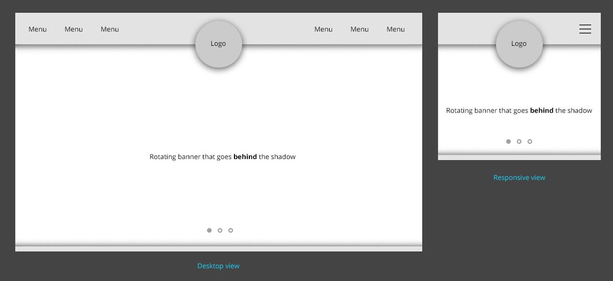
Adapting Navigation to Different Screen Sizes
In the era of ubiquitous computing, ensuring that navigation is adaptable to various screen sizes is paramount for a seamless user experience. With a multitude of devices at our disposal, from desktops to smartphones, each presents unique challenges in displaying content effectively.
- Implement Collapsible Menus: As screen sizes decrease, space becomes limited. Utilize collapsible menus to keep the interface uncluttered.
- Sticky Navigation Menus: Keep important navigation elements in view with sticky menus, especially on mobile where scrolling is prevalent.
- Concise Menu Labels: Opt for clear and concise labels to facilitate quick understanding and selection.
By prioritizing mobile-friendly features, such as responsive design and touch interactions, we cater to the needs of users on-the-go, enhancing accessibility and satisfaction.
Adapting navigation to different screen sizes isn’t just about aesthetics; it’s a strategic move to improve user engagement and SEO performance. A well-structured mobile navigation can lead to a more intuitive user journey, reducing bounce rates and aiding in content discovery.
Mobile-Friendly Menus and Touch Interactions
In the era of smartphones, responsive design is essential for optimal user experience on varied devices. Menus and navigation elements must be designed with touch interactions in mind to ensure seamless mobile navigation. Here are some key considerations:
- Collapsible menus that adapt to smaller screens, such as the hamburger icon, which condenses the main navigation.
- Swipe gestures that allow users to navigate through content effortlessly.
- Touch-friendly buttons and links, sized appropriately for finger taps to prevent mis-clicks.
Ensuring that these elements are intuitive and accessible will significantly enhance the mobile user experience.
It’s not just about aesthetics; it’s about functionality. Mobile-friendly features can make or break the user’s journey through a website. With the majority of internet users now accessing sites via mobile devices, neglecting this aspect of design can lead to frustration and, ultimately, a loss of potential engagement.
Ensuring Accessibility Across All Devices
In today’s digital landscape, accessibility is a cornerstone of user experience. A user-friendly website must cater to the diverse needs of its audience, regardless of the device they use. This means implementing responsive design strategies that adapt to various screen sizes and resolutions, ensuring content is accessible, legible, and visually appealing on desktops, tablets, and smartphones.
By focusing on simplicity and accessibility, websites can achieve higher conversion rates and foster brand loyalty.
It’s not just about visual design; it’s also about ensuring that all functionalities are fully operable on touch interfaces and that technical issues are addressed promptly. Cross-device compatibility is not an option but a necessity for optimizing user experience across devices. Here are some key considerations for achieving seamless accessibility:
- Use responsive design techniques and adaptive layouts.
- Conduct device testing to optimize websites for cross-device compatibility.
- Implement mobile-friendly menus and touch interactions.
- Regularly monitor and update the website to reflect the latest design and development standards.
Optimizing Navigation for Enhanced User Engagement

Leveraging Analytics to Refine Navigation Paths
The integration of analytics into website navigation is not just a trend; it’s a strategic approach to enhance user engagement. By analyzing user behavior data, website owners can make informed decisions to streamline the navigation process. This data-driven optimization can lead to a more intuitive user journey, balancing aesthetics with usability.
Analytics insights provide a clear picture of how users interact with a site, highlighting areas that may require attention or redesign.
For instance, high bounce rates on specific pages may indicate confusing navigation or lack of relevant content. Conversely, pages with longer average session durations suggest an engaging and well-structured layout. Here’s a simple breakdown of key metrics to monitor:
- Bounce Rate: Reflects the percentage of visitors who leave after viewing only one page.
- Average Session Duration: Indicates the average time spent on the site by a user.
- Pageviews: Shows the total number of pages viewed.
- Conversion Rate: Measures the percentage of visitors who take a desired action.
By continuously monitoring these metrics, businesses can iteratively refine their navigation structure, ensuring that it aligns with user expectations and preferences.
Utilizing Dropdowns and Mega Menus Strategically
Dropdowns and mega menus are powerful tools for improving site navigation, especially on websites with extensive content, such as e-commerce platforms. Utilize mega menus for extensive content sites like e-commerce platforms to provide a comprehensive overview of available categories and products. This approach not only enhances the user experience but also caters to user preferences by offering a clear and organized view of the site’s offerings.
Implementing dropdown menus requires careful consideration of labeling and organization. Clear labeling and logical organization are key for seamless navigation. Dropdowns should be used thoughtfully, with a focus on aiding the user in finding their desired content quickly and efficiently. Moreover, implement dynamic navigation based on user interactions to create personalized experiences that can lead to improved engagement.
Effective website navigation is crucial for user satisfaction. Thoughtful utilization of dropdown and mega menus can significantly enhance the user experience.
Remember, the goal is to guide users through your website with ease, making their journey intuitive and satisfying. By strategically implementing these navigation elements, you can ensure a smoother browsing experience that keeps users engaged and more likely to return.
Incorporating Breadcrumbs for Improved Wayfinding
Breadcrumbs serve as a critical navigational aid on websites, offering users a way to trace their path back through the site’s hierarchy. They enhance the user experience by providing clear, visual cues of their current location and the steps they can take to return to previously visited pages or ascend the site structure. This feature is not only beneficial for users but also for search engines, as it helps to clarify the website’s layout.
Breadcrumbs are particularly useful on websites with multiple layers of content, such as e-commerce sites, where users navigate through a series of categories and subcategories. They reduce the cognitive load on users by simplifying navigation and enabling them to maintain a sense of orientation within the site.
To effectively implement breadcrumbs, consider the following points:
- Ensure they reflect the site’s hierarchy accurately.
- Keep the design consistent and visually integrated with the rest of the site.
- Make each step in the breadcrumb trail clickable, providing a straightforward way to navigate.
- Update the breadcrumbs dynamically as the user navigates, to always show the most accurate path.
By attentively integrating breadcrumbs into your website’s design, you can significantly improve the navigability and user satisfaction, leading to a more engaging and efficient user experience.
Navigation and SEO: A Symbiotic Relationship

Improving Site Structure for Better Crawling and Indexing
A well-structured website is pivotal for search engines to crawl and index content effectively, which in turn enhances visibility in search engine results pages (SERPs). Creating a logical hierarchy in your site’s architecture not only aids search engines but also improves user navigation. Organizing content into clear categories and subcategories using a consistent naming convention is essential.
By simplifying the navigation, users can find information with ease, and search engines can discover and rank pages more efficiently.
To further optimize site structure, consider the following steps:
- Utilize a sitemap to ensure all pages are known to search engines.
- Implement a clear URL structure that reflects the content hierarchy.
- Use internal linking to guide both users and search engine crawlers.
- Employ breadcrumbs to provide a clear path back to higher-level pages.
These strategies, when combined with responsive design and performance optimization, lead to enhanced user experience and better SEO outcomes.
Using Descriptive Anchor Text for Internal Links
The strategic use of descriptive anchor text is pivotal in guiding both users and search engines through your website’s content. Descriptive anchor text not only enhances user experience by providing clear expectations about the linked page’s content but also contributes to SEO by conveying the relevance and context of the linked pages to search engines.
When crafting anchor text, it’s essential to balance brevity with descriptiveness. Avoid generic phrases like ‘click here’ or ‘read more.’ Instead, use specific and relevant keywords that accurately reflect the linked page’s topic.
For example, a blog post titled ’10 Tips for Effective Time Management’ might include anchor texts such as ‘strategies for better time management’ or ‘time-saving techniques.’ This approach not only improves navigation but also strengthens the internal linking structure, which is a key factor in SEO performance.
Remember, internal linking is not just about connecting pages; it’s about creating a navigational journey that enhances the user’s experience and supports your website’s SEO strategy.
The Role of Navigation in Reducing Bounce Rates
Effective navigation is crucial for keeping users engaged and reducing bounce rates. A poor or inaccessible website navigation structure can lead to frustration and prompt users to leave the site without interacting further. By analyzing user behavior and refining navigation paths, websites can create a more intuitive user journey, encouraging visitors to explore more pages and content.
- Clear and logical navigation reduces user confusion.
- Intuitive menus and links increase the likelihood of user interaction.
- Consistent navigation patterns build user trust and satisfaction.
Ensuring that users can easily find what they are looking for is not just about user experience; it’s also about keeping them on the site longer, which can positively impact SEO rankings.
Navigation optimization should be an ongoing process, informed by analytics and user feedback. Regular updates to navigation structures can reflect evolving content strategies and user needs, leading to a sustained decrease in bounce rates and an increase in time on site.
Post-Launch Navigation Monitoring and Optimization

Conducting Regular Website Health Audits
Regular website health audits are crucial for maintaining an optimal online presence and ensuring a seamless user experience. Addressing technical issues such as broken links, 404 errors, and slow server response times is essential to prevent negative impacts on user engagement. By conducting these audits, you can identify and rectify issues that hinder website performance and user satisfaction.
Regular technical audits and monitoring of website performance are ongoing challenges that marketers face in maintaining an excellent user experience.
Additionally, it’s important to monitor user behavior through tools like Google Analytics. This allows for the analysis of metrics such as bounce rate, time on page, and conversion rates, providing insights into areas that need improvement. Keeping track of these metrics ensures that the website is continually adapting to user preferences and enhancing the overall experience.
To ensure a comprehensive approach to website health, consider the following checklist:
- Optimize images and scripts for faster loading times
- Implement caching to save server resources and improve customer experience
- Conduct security checks to ensure the site is malware-free
- Perform frequent updates to WordPress core and plugins
- Monitor SEO performance and adjust strategies accordingly
By systematically addressing these areas, you can significantly improve your website’s performance, security, and usability, leading to better user engagement and satisfaction.
Gathering User Feedback for Continuous Improvement
Actively engaging with your audience to gather feedback is a cornerstone of enhancing the user experience. User feedback is invaluable for refining and enhancing your UX/UI design. It’s essential to establish mechanisms that encourage users to share their insights, such as surveys, user testing, and direct communication channels. By analyzing this feedback alongside user behavior metrics, you can pinpoint areas that need attention and make informed decisions to evolve your website’s navigation.
Incorporate feedback mechanisms and analytics to refine website navigation. Use analytics for insights, gather user feedback for continuous improvement, and prioritize simplicity and accessibility.
Here are some effective methods for collecting user feedback:
- Conducting user surveys to gather specific feedback and opinions.
- Analyzing feedback to identify pain points and user preferences.
- Implementing A/B testing to compare different navigation approaches.
- Utilizing usability testing to gain direct user experience insights.
- Tracking and measuring user interaction to suggest further improvements.
Updating Navigation to Reflect Evolving Content Strategies
As digital landscapes evolve, so must the navigation of a website to align with new content strategies and user expectations. Regular updates to the navigation structure ensure that users can find fresh content with ease, maintaining engagement and satisfaction.
A dynamic navigation setup not only caters to the changing content but also signals to search engines that the website is active and relevant, potentially boosting SEO performance.
To effectively update navigation, consider the following steps:
- Review analytics to identify popular content and potential gaps
- Solicit user feedback for insights into navigation improvements
- Implement changes in a staged approach to monitor impact
- Reassess the navigation periodically to keep it aligned with content and user needs
By staying responsive to content trends and user behavior, websites can offer a seamless experience that encourages exploration and interaction.
Navigating the digital seas after launching your website can be as crucial as the voyage of creation itself. At AM2, we specialize in steering your online presence towards success with our comprehensive WordPress Development and eCommerce solutions. Don’t let your website drift aimlessly; optimize its performance and enhance user engagement with our expert guidance. Ready to chart a course for success? Visit our website and embark on a journey of continuous improvement and digital excellence.
Conclusion
In the digital landscape, seamless website navigation is not just a feature—it’s a necessity for user satisfaction and business success. Throughout this article, we’ve explored various strategies to enhance user experience through intuitive and responsive design, mobile-friendly interfaces, and clear navigational paths. By implementing these practices, businesses can ensure that their website is accessible, engaging, and easy to use across all devices. Remember, the smoother the navigation, the deeper the engagement, and the higher the potential for conversion. As we continue to embrace a multi-device world, the importance of streamlined navigation will only grow, making it imperative for websites to adapt and optimize continuously.
Frequently Asked Questions
What are the key components of intuitive website navigation?
The key components include understanding user behavior and preferences, designing for clarity and ease of use, and implementing consistent and predictable navigation patterns to facilitate a smooth user experience.
How does responsive design contribute to a seamless multi-device experience?
Responsive design ensures that your website’s navigation is adaptable to different screen sizes, provides mobile-friendly menus and touch interactions, and maintains accessibility across all devices, offering a consistent user experience regardless of the device used.
Why is it important to optimize navigation for user engagement?
Optimizing navigation by leveraging analytics to refine paths, strategically using dropdowns and mega menus, and incorporating breadcrumbs can enhance user engagement by making it easier for users to find what they are looking for and navigate the site effectively.
How does website navigation impact SEO?
Navigation impacts SEO by improving site structure for better crawling and indexing, using descriptive anchor text for internal links, and reducing bounce rates, which can positively affect search engine rankings and visibility.
What should be done after launching a website to maintain effective navigation?
Post-launch, it’s important to conduct regular website health audits, gather user feedback for continuous improvement, and update navigation to reflect evolving content strategies, ensuring the site remains user-friendly and relevant.
How can performance optimization improve user experience and SEO?
Performance optimization, including image compression, caching, and script minification, can significantly enhance user experience by reducing loading times and improving site speed, which also contributes to better SEO rankings and increased conversions.