Enhancing User Experience with Seamless Website Navigation

In the digital realm, a website’s navigation structure plays a pivotal role in shaping the user experience. A well-designed navigation system not only guides users effortlessly through a site’s content but also enhances their engagement and satisfaction. The article ‘Enhancing User Experience with Seamless Website Navigation’ delves into the principles of crafting effective navigation, optimizing website performance, ensuring accessibility, leveraging user feedback, and integrating SEO, all aimed at creating a seamless and intuitive user journey.
Key Takeaways
- Effective website navigation is rooted in understanding user behavior and requires intuitive design that’s responsive across all devices.
- Website performance, including page load speed and content optimization, is crucial for maintaining user engagement and reducing bounce rates.
- Accessibility and inclusivity are key to reaching a wider audience, ensuring that the website is usable by people with various abilities.
- Continuous improvement through analytics and user feedback is essential for refining navigation and enhancing the overall user experience.
- SEO best practices should be integrated into navigation design to improve search engine visibility without compromising user experience.
Principles of Effective Website Navigation
Understanding User Behavior and Navigation Patterns
To create a website that offers a seamless navigation experience, it’s crucial to understand the systematic ways users interact with your site. This understanding allows for the design of an interface that aligns with user expectations and behavior patterns. By analyzing scrolling and clicking behaviors, designers can prioritize features and content, ensuring that key elements are easily accessible.
A website that adapts to user behavior encourages exploration and enhances satisfaction.
Usability testing and analytics are invaluable tools for identifying trends and pain points in navigation. These insights lead to data-driven optimizations that can significantly improve the user experience. For instance, simplifying navigation menus and ensuring they are touch-friendly can greatly enhance interaction, especially on mobile devices.
Below is a list of strategies to consider when aiming to understand and improve user navigation patterns:
- Conduct usability testing to gather direct user feedback.
- Monitor analytics to track user behavior and identify popular pages.
- Prioritize content and calls to action based on user preferences.
- Implement responsive design for optimal mobile user experience.
- Continuously refine the interface based on user behavior data.
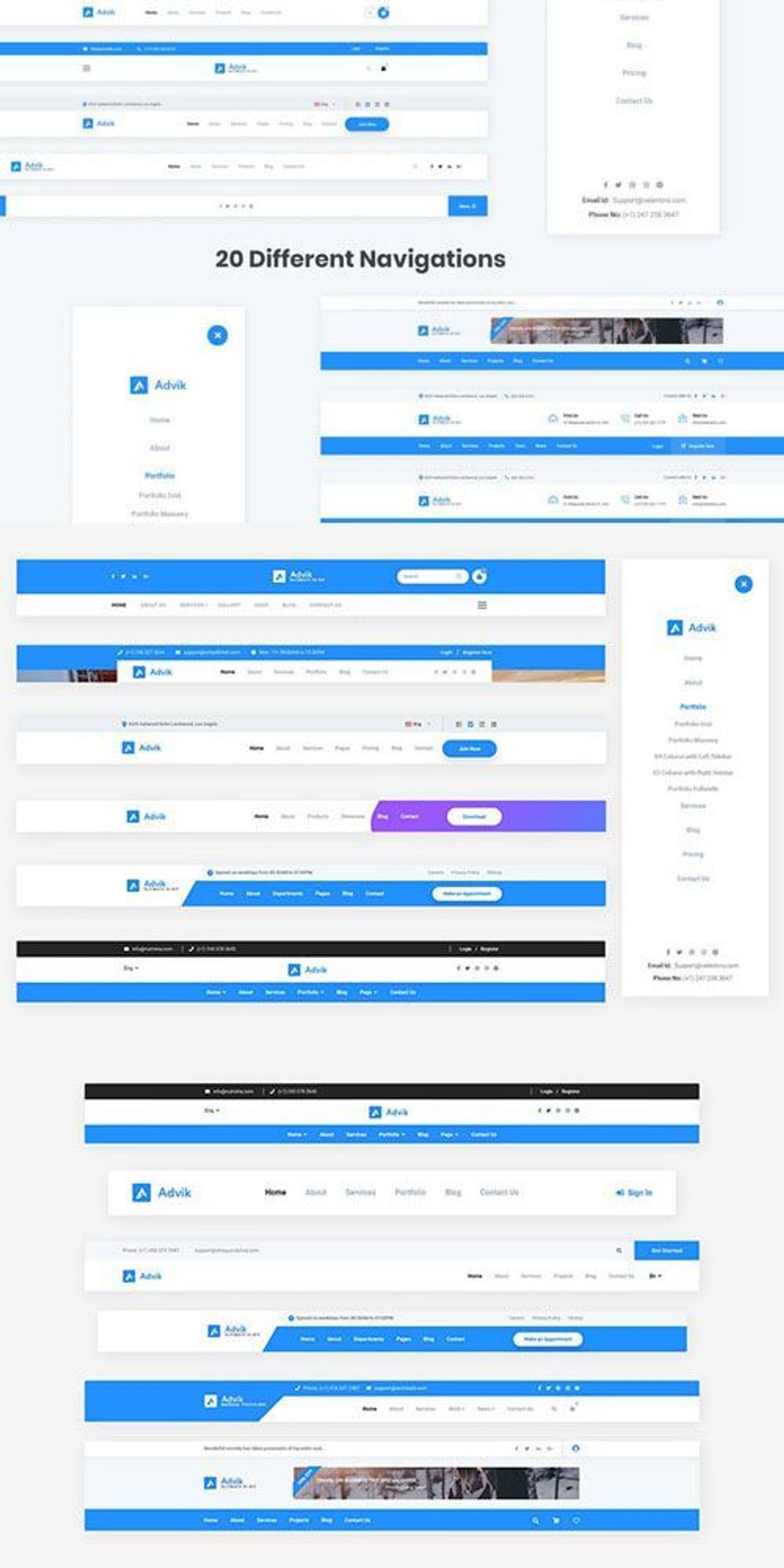
Designing Intuitive Menus and Site Structure
Creating an intuitive navigation structure is crucial for a seamless user experience. Streamlining navigation with intuitive site layouts and clear menu structures enhances user journeys. Prioritize simplicity, consistency, and mobile responsiveness for improved usability and conversion rates.
Effective navigation design begins with understanding the user’s needs and how they interact with your site. A logical flow from one page to the next, with a clear hierarchy, ensures that users find what they’re looking for with minimal effort. Consider these key elements:
- Clear labeling of navigation elements
- Logical grouping of related content
- Consistent navigation patterns across the site
- Easy-to-use search functionality
By focusing on these aspects, you can significantly reduce user frustration and bounce rates, while increasing engagement and the likelihood of conversion.
Remember, the goal is to guide users to their desired content with as few clicks as possible. This not only improves the user experience but also supports your business objectives by directing traffic to key areas of your site.
Implementing Responsive Navigation for Mobile Users
In the realm of responsive design, navigation must be adaptable to various screen sizes to ensure a seamless user experience. A mobile-first approach is often recommended, focusing on the critical elements that mobile users need to access quickly. This strategy simplifies the interface and prioritizes content, making navigation intuitive regardless of the device used.
By embracing a mobile-first design, we ensure that all users, especially those on mobile devices, have immediate access to the most important features of the website.
Best practices for mobile navigation include collapsible menus, touch-friendly elements, and clear visual cues for interactive items. Below is a list of key considerations when implementing responsive navigation:
- Prioritize essential information and functionality
- Use a collapsible menu or hamburger icon for space efficiency
- Ensure buttons and links are large enough for touch interaction
- Implement swipe gestures for ease of use
- Test navigation on various devices for consistency
AM2 Studio’s commitment to a methodical yet flexible approach in web development is crucial for crafting such responsive navigation systems. Their services, which range from design to audits, are tailored to maintain optimal performance and user satisfaction.
Optimizing Website Performance for Seamless User Experience

The Impact of Page Load Speed on User Engagement
The speed at which a website loads is a critical factor in user engagement and satisfaction. Poor loading times can affect how people find and interact with your website, leading to a higher bounce rate as visitors may leave if a site takes too long to load. A responsive design not only adapts to various screen sizes but also contributes to faster loading times, which is vital in an era where users demand instant access to information.
Optimizing website performance is essential for maintaining user interest and encouraging exploration. Strategies such as compressing images, minifying code, and leveraging caching mechanisms can significantly improve site performance across devices. By prioritizing performance, you ensure a streamlined loading process for all users, enhancing their overall experience.
Performance optimization is not just about speed; it’s about creating a seamless user experience that encourages visitors to stay and engage with your content.
Understanding the direct correlation between page load speed and user engagement is crucial for website success. Here are some key points to consider:
- A delay of just a few seconds can drastically reduce user satisfaction.
- Mobile users, in particular, expect quick access to information, making responsive design and optimization imperative.
- Google considers site speed in its ranking algorithm, affecting your site’s visibility in search results.
Regularly reviewing and improving website performance is an ongoing process that can lead to increased user engagement, higher conversion rates, and a stronger online presence.
Strategies for Image and Content Optimization
Optimizing images and content is crucial for enhancing website performance and user experience. Compressing images while maintaining their quality is a key step in reducing page load times. This can be achieved through various techniques such as resizing images, using appropriate file formats, and employing compression tools.
Effective content optimization involves not only the visual elements but also the underlying code. Minifying scripts and stylesheets by removing unnecessary characters without changing their functionality can lead to significant performance improvements. Additionally, implementing caching mechanisms can save resources and speed up content delivery to the user.
By focusing on these optimization strategies, websites can ensure that they are not only visually appealing but also efficient in resource utilization, providing a seamless experience for all users.
Here is a checklist for optimizing your website’s images and content:
- Employ AI algorithms for image optimization
- Reduce file sizes for images and code
- Leverage caching for faster content delivery
- Minify CSS and JavaScript files
- Limit the use of external scripts to reduce third-party requests
Remember to regularly review and update your optimization strategies to keep up with the evolving web standards and user expectations.
Leveraging Caching and Minification Techniques
To achieve a seamless user experience, optimizing website performance is crucial. By implementing browser caching, you can store frequently accessed resources on local devices, reducing load times on subsequent visits. Minification of CSS, JavaScript, and HTML files is another essential technique; it removes unnecessary characters from code without changing its functionality, leading to faster page rendering.
By prioritizing performance, you ensure a swift and responsive interaction for users, which is vital for retaining engagement and reducing bounce rates.
Here are some practical steps to enhance your site’s performance:
- Utilize tools to automate image compression without losing quality.
- Implement caching to save server resources and improve customer experience.
- Minify scripts to reduce the number of HTTP requests and optimize file sizes.
- Limit the use of external scripts to minimize third-party requests and boost performance.
Remember, these optimizations not only enhance user experience but also contribute to better SEO rankings, as search engines favor fast-loading websites. Personalizing the user journey with adaptive navigation and dynamic content can further tailor the experience to individual users.
Accessibility and Inclusivity in Web Design

Ensuring Screen Reader Compatibility and Keyboard Navigation
Creating an accessible website is not just a matter of compliance; it’s about providing an inclusive experience for all users. Screen reader compatibility and keyboard navigation are fundamental to this goal. These features empower users with visual impairments to understand and interact with your content effectively.
- Screen Readers: Ensure all non-text content has alternative text.
- Keyboard Navigation: Make all functionality available from a keyboard.
- Focus Indicators: Provide visible focus indicators for interactive elements.
- Semantic HTML: Use proper HTML elements to convey meaning and structure.
By focusing on these aspects, we not only adhere to accessibility standards but also enhance the overall user experience. Remember, a website that is accessible to all is a website that is usable by all.
Integrating breadcrumbs and clear categorization not only enhances website navigation but also supports screen readers in providing context to users. Accessibility is not an afterthought; it’s a critical component of web design that touches on perceivability, operability, understandability, and robustness. Prioritizing accessibility from the start not only benefits users with disabilities but improves usability for everyone, reinforcing the importance of inclusive design practices.
Designing for Diverse Audiences with Different Abilities
Creating an accessible website is not just a matter of compliance; it’s a commitment to inclusivity. By considering diverse abilities from the outset, designers can craft experiences that are welcoming to all users. This approach not only benefits individuals with disabilities but also enhances the overall user experience, making it more intuitive and user-friendly for everyone.
- Screen reader compatibility and alternative text for images ensure that visually impaired users can navigate and understand content.
- Keyboard navigation options allow users with motor impairments to interact with the site without a mouse.
- Multimedia elements like videos and infographics cater to different learning styles and preferences, enriching the user experience.
Embracing the full spectrum of user abilities is not just ethical; it’s smart business. An accessible website reaches a wider audience, potentially increasing engagement and customer loyalty.
Accessibility considerations must be woven into the fabric of website design. This includes fluid grid layouts, flexible images for responsive design, and descriptive headings that provide clear information. By doing so, we present ourselves as a brand that is inclusive, credible, and reliable.
Maintaining Compliance with Web Content Accessibility Guidelines (WCAG)
Ensuring that your website adheres to the Web Content Accessibility Guidelines (WCAG) is not just a matter of legal compliance; it’s a commitment to inclusivity and providing equal access to all users. Compliance with WCAG is a critical step in removing barriers that prevent interaction with, or access to websites, by people with a range of disabilities.
When designing for accessibility, consider the following:
- Use of alternative text for images to convey meaning for screen reader users.
- Keyboard navigation must be logical and intuitive to support users who cannot use a mouse.
- Adequate contrast ratios for text and background colors to assist users with visual impairments.
By integrating these accessibility features, we not only support users with disabilities but also enhance the overall user experience, making it more seamless and intuitive.
Regular audits and updates are necessary to maintain compliance as standards evolve. This proactive approach demonstrates a dedication to user-centric design and can have a positive impact on user engagement and conversion.
Leveraging Analytics and User Feedback for Continuous Improvement

Utilizing Web Analytics to Understand User Interactions
Web analytics play a crucial role in understanding how users interact with a website. By tracking user behavior, designers and developers can gain insights into which areas of the site are engaging and which may require optimization. Tools like Google Analytics and Hotjar offer a wealth of data, from the most visited pages to the paths users take as they navigate through the site.
The use of analytics goes beyond mere observation; it enables the implementation of data-driven strategies to enhance the user experience. For example, if analytics reveal that users frequently abandon a shopping cart, targeted improvements can be made to streamline the checkout process.
By analyzing user behavior patterns, we can predict and examine how different elements, services, or products are explored, tailoring the user interface to meet the needs of the audience.
Incorporating AI tools can further refine this process, personalizing the user experience by predicting user needs and offering tailored content. This not only improves user satisfaction but also boosts website performance by keeping users engaged.
Incorporating User Feedback into Navigation Design
To create a navigation design that truly resonates with users, it’s essential to incorporate feedback mechanisms and analytics. This process involves a continuous feedback loop, where user insights are gathered, analyzed, and then implemented to refine the navigation experience. By prioritizing user experience, websites can see enhanced engagement and improved usability.
The feedback loop for user experience improvement is not just a one-time task but an ongoing cycle of enhancement. It includes the critical steps of gathering, analyzing, implementing, and re-evaluating feedback.
For instance, usability testing sessions can reveal pain points that may not be immediately obvious. Coupled with direct user feedback, these insights can drive significant improvements in navigation design. Here’s a simple list to ensure a robust feedback integration process:
- Establish clear feedback channels for users
- Monitor user behavior through analytics
- Implement changes based on user feedback
- Reassess the navigation design to measure improvements
By following these steps, designers can create intuitive navigation that not only meets user expectations but also drives conversion rates.
A/B Testing for Optimizing User Experience
A/B testing is a powerful technique for improving website navigation by directly comparing different versions of a page or element. By analyzing the performance of each variant, designers can make informed decisions that enhance the user experience. This method involves presenting two versions (A and B) to users at random and using statistical analysis to determine which one performs better in terms of user engagement and conversion rates.
A/B testing is not just about choosing the better option, but understanding why one option outperforms another. This insight is crucial for making strategic improvements that resonate with users.
The process of A/B testing should be iterative, with successive tests refining the navigation elements based on user feedback and behavioral data. Below is a list of steps typically involved in A/B testing for website navigation:
- Identify key navigation elements to test.
- Develop hypotheses for why one version might perform better.
- Create the variants for testing.
- Run the test and collect data.
- Analyze the results to determine the winning variant.
- Implement the successful navigation changes.
- Repeat the process to continuously improve user experience.
Integrating SEO Best Practices into Navigation Design
Creating SEO-Friendly URLs and Navigation Elements
Crafting SEO-friendly URLs and navigation elements is a pivotal step in enhancing a website’s visibility and user experience. Descriptive URLs that incorporate relevant keywords not only aid in search engine optimization but also provide users with a clear understanding of the content they can expect to find on a given page. Here are some key considerations for creating effective URLs:
- Use clear, logical, and readable URL structures.
- Include targeted keywords that reflect the page’s content.
- Avoid lengthy URLs; keep them concise and focused.
- Utilize hyphens to separate words, making them more readable.
- Steer clear of using unnecessary parameters and dynamic URLs when possible.
By implementing best practices for URL structure, you can create SEO-friendly URLs that accurately reflect your web page content. This approach not only improves search engine rankings but also enhances the user’s navigation experience, leading to increased engagement and satisfaction.
In addition to URLs, navigation elements such as menus and breadcrumbs should be designed with both users and search engines in mind. They should be intuitive, consistent across pages, and structured in a way that reflects the importance and hierarchy of the content. This clarity in design helps users navigate your site with ease and encourages deeper exploration of your content.
Balancing User Experience with Search Engine Requirements
Achieving a strategic balance between user experience (UX) and search engine optimization (SEO) is crucial for a successful website. Both elements are essential: UX focuses on the visitor’s journey, ensuring the site is intuitive and satisfying, while SEO targets visibility, drawing users to the site in the first place. To harmonize these goals, consider the following points:
- Optimize on-site search with a prominent search bar, advanced filters, and auto-suggestions to enhance user navigation for a seamless UX.
- Implement dynamic menus and personalized user paths for tailored experiences, catering to both new visitors and returning users.
- Ensure that SEO efforts, such as keyword integration and meta descriptions, do not detract from the readability and natural flow of content.
By carefully integrating SEO elements without compromising UX, websites can provide value to users while also appealing to search engines.
It’s a delicate dance of give-and-take, where the end goal is a website that not only ranks well but also retains and converts visitors. Regularly reviewing analytics and user feedback can help maintain this balance, making adjustments as user behavior and search engine algorithms evolve.
The Role of Site Maps and Structured Data in Navigation
Site maps and structured data play a pivotal role in both enhancing user experience and improving a website’s SEO. A well-organized site map allows users to grasp the layout of a website quickly, facilitating easier navigation. It also enables search engines to crawl a website more effectively, ensuring that all pages are indexed and improving the site’s visibility.
Incorporating structured data, such as schema markup, helps search engines understand the content and context of a website’s pages. This can lead to richer search results with enhanced features like breadcrumbs, ratings, and even quick answers directly in the search results page.
By clearly defining the relationship between pages and providing detailed metadata, site maps and structured data make a website more accessible to both users and search engines.
Here’s how structured data can impact a website’s presence in search results:
- Rich Snippets: Display additional information like ratings or prices.
- Knowledge Graph: Contribute to a more prominent display in search results.
- Breadcrumbs: Offer a clear path back to higher-level pages.
Ensuring that your site map is up-to-date and that structured data is implemented correctly can significantly boost a website’s discoverability and user engagement.
To elevate your online presence, it’s crucial to weave SEO best practices into the very fabric of your website’s navigation design. Our expert team at AM2 specializes in creating custom web solutions that not only look stunning but also rank higher in search results. By optimizing your site’s structure and user experience, we ensure that your visitors find exactly what they’re looking for with ease. Don’t let your website get lost in the digital abyss—visit our [Services] page to learn how we can help your business thrive online.
Conclusion
In conclusion, seamless website navigation is a pivotal factor in enhancing user experience. By implementing responsive design, optimizing for mobile devices, and ensuring fast loading times, businesses can provide a consistent and intuitive interface across all platforms. Accessibility features like screen reader compatibility and keyboard navigation further extend the reach to users with disabilities, promoting inclusivity. Moreover, a well-structured navigation system not only improves usability but also contributes to better SEO performance, driving more organic traffic. Ultimately, investing in seamless navigation is not just about aesthetic appeal; it’s about creating a user-centric environment that fosters engagement, satisfaction, and conversion.
Frequently Asked Questions
What are the key principles of effective website navigation?
Effective website navigation is based on understanding user behavior and navigation patterns, designing intuitive menus and site structures, and ensuring the navigation is responsive for mobile users.
How does page load speed impact user engagement?
Page load speed is crucial for user engagement as slow loading times can lead to increased bounce rates and decreased user satisfaction. Users expect instant access to information, and delays can deter them from exploring a website further.
What are some strategies for optimizing images and content on a website?
Strategies for optimizing images and content include compressing images without losing quality, using appropriate file formats, lazy loading media, minimizing text while conveying the message effectively, and utilizing content delivery networks.
How can I ensure my website is accessible to users with disabilities?
To make a website accessible, ensure screen reader compatibility, provide keyboard navigation options, use descriptive headings and labels, and follow the Web Content Accessibility Guidelines (WCAG) to cater to users with diverse abilities.
What role do analytics and user feedback play in website navigation design?
Analytics and user feedback provide insights into how users interact with a website, highlighting areas for improvement. They are crucial for continuous improvement, allowing designers to refine navigation based on real user data and feedback.
How can SEO best practices be integrated into navigation design?
Integrating SEO into navigation design involves creating SEO-friendly URLs and navigation elements, balancing user experience with search engine requirements, and using site maps and structured data to help search engines understand site structure.